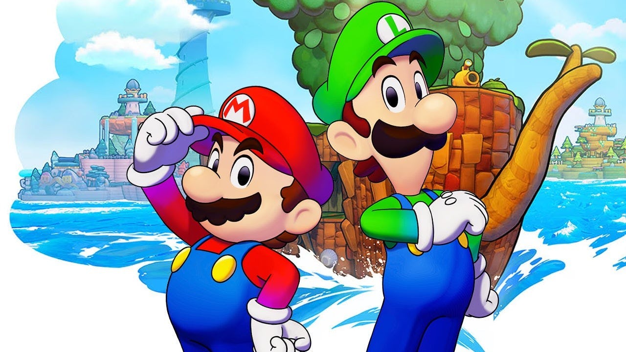
Mario & Luigi: Brothership sees the two bros sail the seas in hopes of saving the world from certain peril, in a journey that lasts dozens of hours. Along the way, Mario and Luigi have to talk to tons of new characters and old ones, in an animation style updated for the Nintendo Switch.
The latest edition of Nintendo’s recurring “Ask the Developer” series dives into Brothership, giving loads of details on why Nintendo partnered with Acquire, and how the studio toyed with multiple visual styles — including some concept art for an “edgier” version of Mario. It’s a fascinating in-depth look into the development of the game, something we don’t always see for Nintendo titles.
The first interesting tidbit in the interview deals with why Nintendo chose Acquire to work on Brothership, and it was quite a deliberate choice. Producer Akira Otani from Nintendo says the company had been having internal discussions about a new entry for a while and wanted to “aim for something new that would keep up with hardware advancements while maintaining the appeal of the classic Mario & Luigi games.”
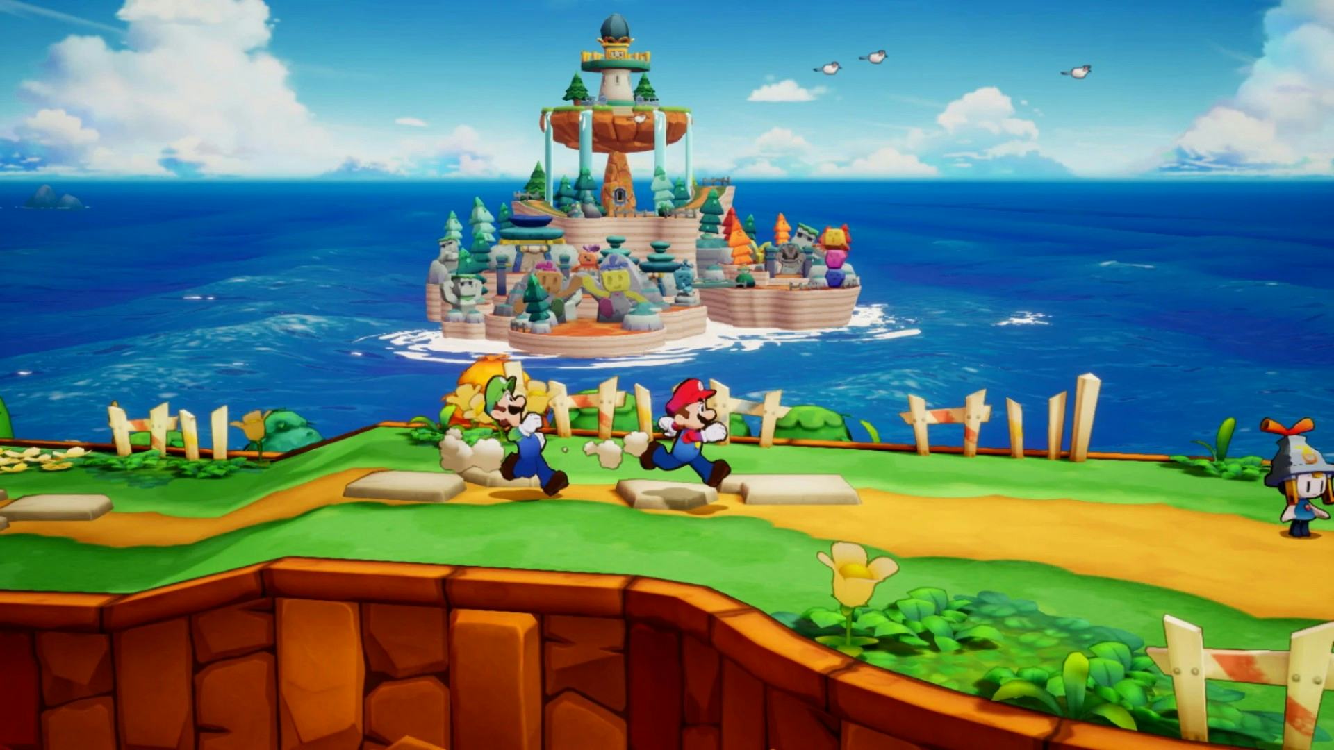
With that in mind, Acquire looked like an ideal candidate due to their experience with RPGs on Octopath Traveler, and experience on action games with Tenchu. This was Acquire’s first time partnering with Nintendo on development, and according to the game’s director, Haruyuki Ohashi, that came with some growing pains. That’s where things get really interesting.
“There was a point where I thought an HD-2D approach like Octopath Traveler could be a possibility,” Otani says, “However, previous Mario & Luigi Games were pixel art, and the artwork on the packaging, etc., consisted of drawn illustrations.”
It’s tantalizing to think of what an HD-2D Mario game could have looked like, and maybe there’s room for it in the future, but Otani references the disconnect between packaging and in-game graphics as a key reason it wasn’t chosen. They wanted to ensure that what was on the box would properly represent exactly what people would play.
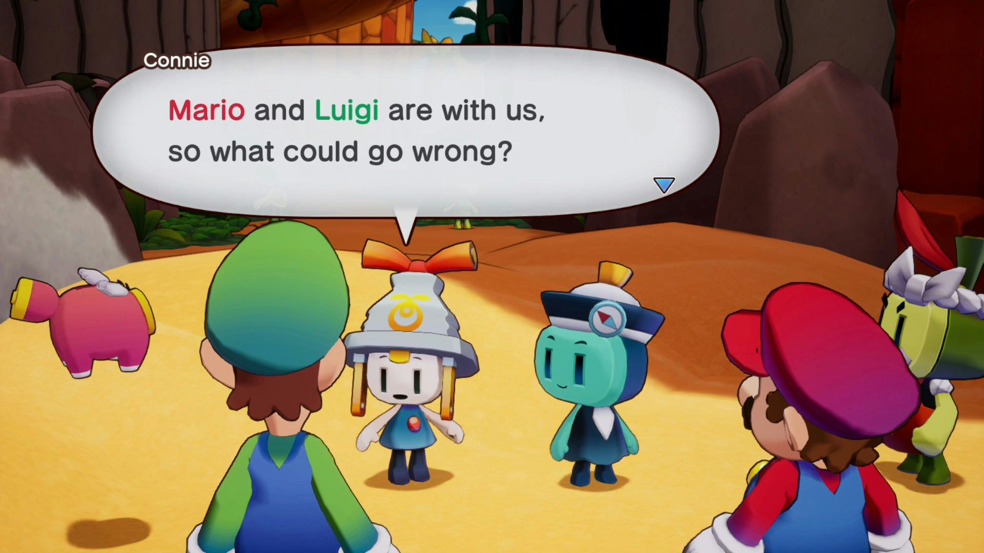
But there’s an extra wrinkle with the design the team landed on, as initially, Acquire was opting for a much different take on the iconic plumber.
“Our challenge was to develop 3D visuals that would bring out the unique appeal of the Mario & Luigi series and differentiate it from other Mario games,” says art director Hitomi Furuta, “I'm ashamed to say it, but we weren't conscious of that when development started, which led to us making a huge detour. And in our search for a new Mario & Luigi style, at one point we ended up trying to present an edgier, more rugged Mario instead.”
You can see that design below.
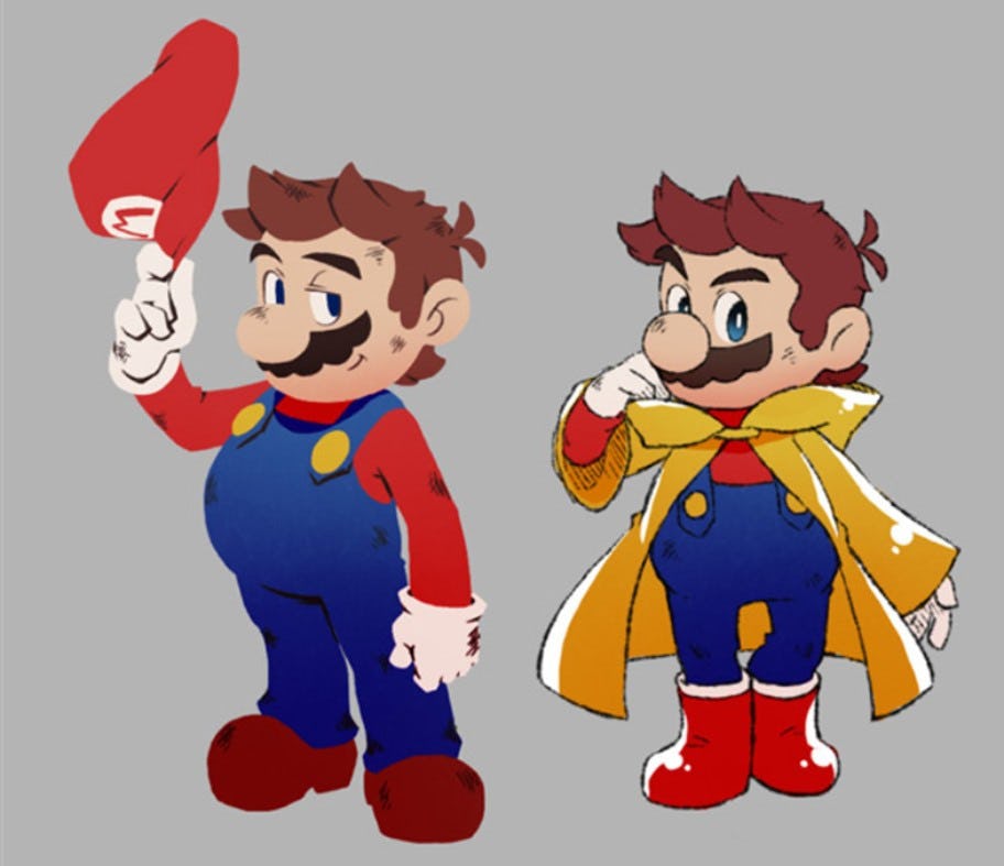
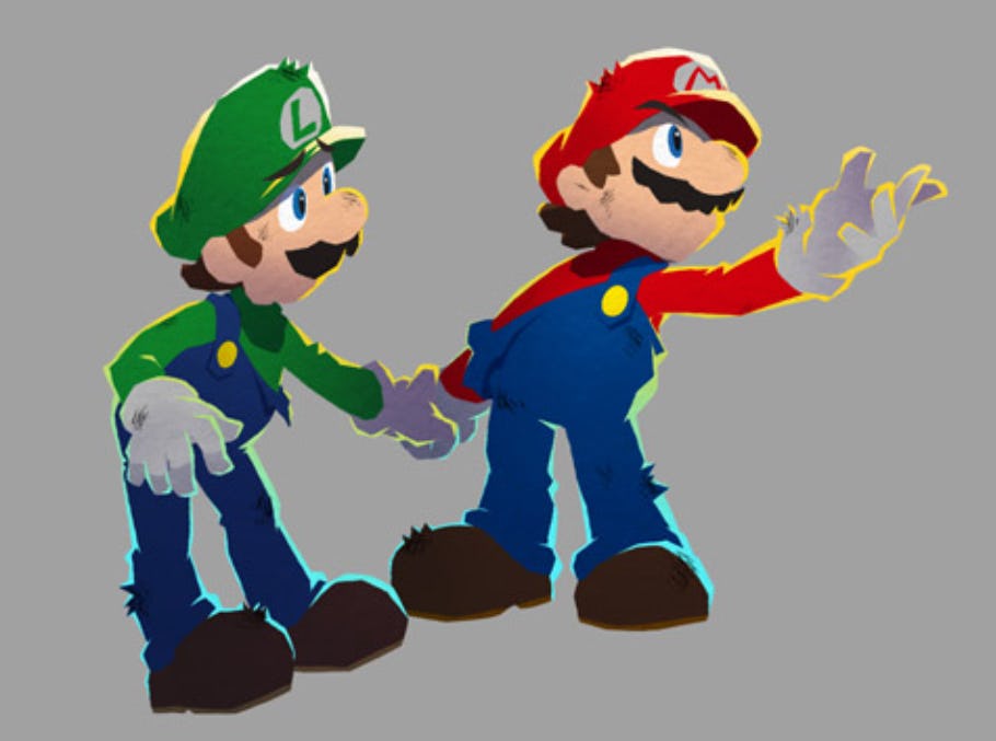
I have to admit I kind of love the “drunk uncle” style of that first Mario, and his red galoshes are incredibly cute. But apparently, upon reviewing the design, Nintendo’s perspective was that it “gave the impression of something different that just resembled Mario.”
During a meeting, Nintendo showed Acquire a document describing what “defines Mario and Luigi in the Mario & Luigi series” and that caused Furuta to worry about the player’s perspective, ultimately resulting in an overhaul to the game’s visual style.
From there, the second part of the interview dives into some incredibly in-depth description of how Acquire crafted the games’ 3D style while trying to emulate the expressiveness that the original 2D games evoked. It’s extremely interesting stuff, but far too in-depth to summarize here, so I’d recommend you go and read it.
Nintendo is oftentimes such a secretive company, recently taking to not even announcing who’s developed a game right up until release. But Brothership is part of an interesting trend where Nintendo is partnering with more third-party studios on its flagship series — this has also happened with Hyrule Warriors, Fire Emblem: Three Houses, Princess Peach: Showtime, Super Mario RPG remake, and more. It’s a smart move that, hopefully, is a good sign of what’s to come with the Nintendo Switch 2 — a rich diverse roster of games, both big and small. At the same time, hopefully, we see even more of Ask the Developer in the future, because it’s always illuminating.


