The Minnesota Timberwolves have unveiled a fresh new brand identity, bringing the iconic basketball team into an exciting new era. Rebranding a sports logo doesn't come without risk, as fans are typically pretty opinionated when it comes to redesigns, but it seems the Timberwolves have won them over with the confident new look.
Alongside the new logo, fresh uniforms and court designs create a perfect blend of old and new, bringing a modern clarity to fan favourite details. Built for the fans, the new Timberwolves logo is a prime example of how refinement can be just as powerful as an all-out rebrand.
new vision. new edge. and now, a new look. 🐺 pic.twitter.com/bWzftESoMyJune 7, 2026
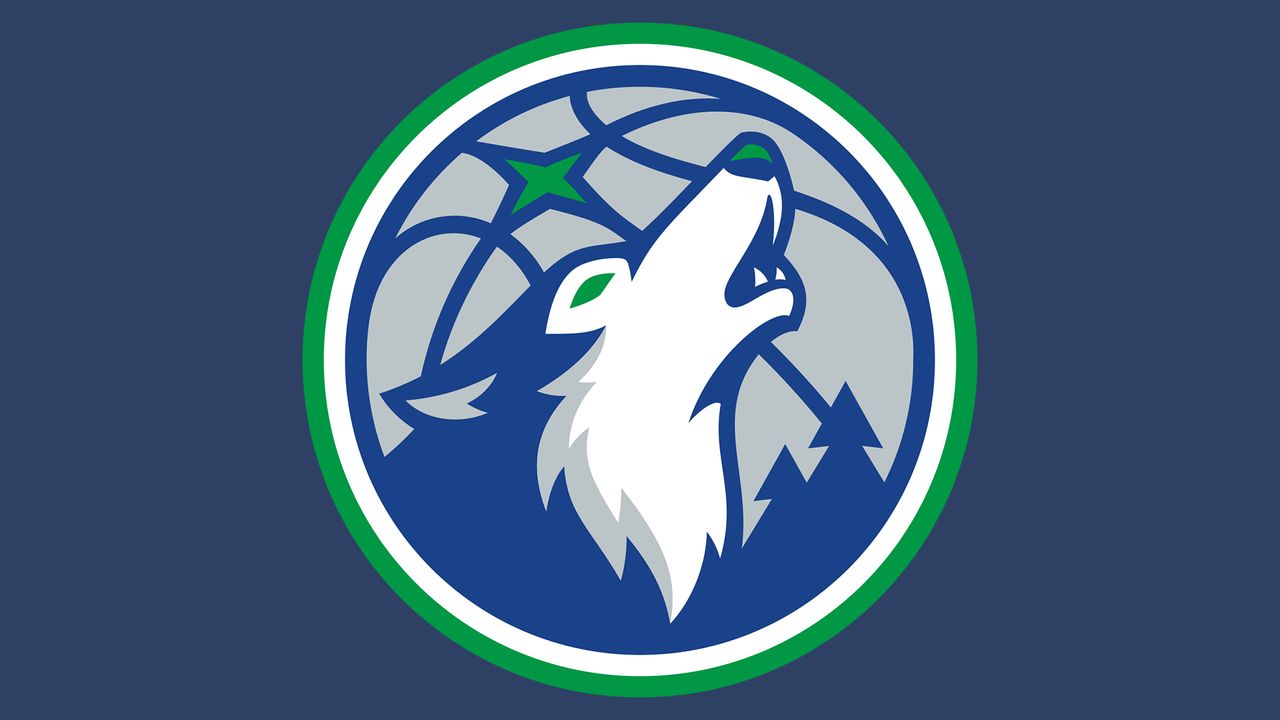
The new Timberwolves logo features a vibrant take on the old identity, brightening the colour palette to a dreamy blue and green combo. Once menacing, the signature howling wolf has been softened for a more triumphant look, while a forest motif gesture to the team's iconic tree-lined uniforms
“This franchise means something different to every generation of fans,” says Timberwolves & Lynx CEO Matt Caldwell. “We wanted this new look to reflect the pieces of Timberwolves basketball fans have always connected with, while also feeling true to the team and culture surrounding this franchise today. More than anything, we wanted to create something that reflects where this organization is headed and what the entire state can rally behind.”
A post shared by Minnesota Timberwolves (@timberwolves)
A photo posted by on
Most fans were suitably impressed with the new look, with one calling it, "Super dynamic, exciting, bold and original," while another claimed, "They knocked it out of the park." While most were pleased, of course, there had to be a few critics – the highlight being one naysayer who wrote "That wolf looks like someone's fursona."
For more sports insight, check out the best NBA logos or take a look at the creative trends defining this year's World Cup advertising.