
With the news that Pepsi has announced a new logo, it's time to say goodbye to one of the more divisive designs of the 15 years. Fans are already calling the simpler, straighter and bolder new logo a "massive improvement" over the slanted 'globe' introduced in 2008. But as well as that logo, people are also saying farewell to perhaps the most ridiculous, hilarious design document of all time.
A leaked PDF offers an utterly mind-boggling glimpse into Pepsi's million-dollar rebrand from 2008. The design refresh centres around the word 'breathtaking' and, well, that's certainly one way of putting it. (Looking for inspiration? Check out the best logos of all time.)
The work in progress document was allegedly created by New York-based brand consultancy agency Arnell Group, and was leaked by an "industry insider" on Reddit in 2009. The whole thing is so ridiculous that some believe it's a hoax.
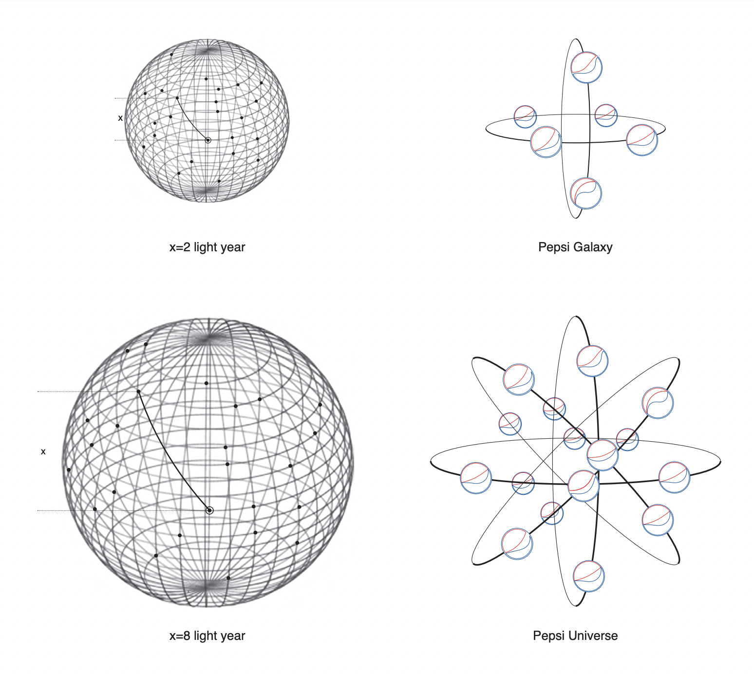
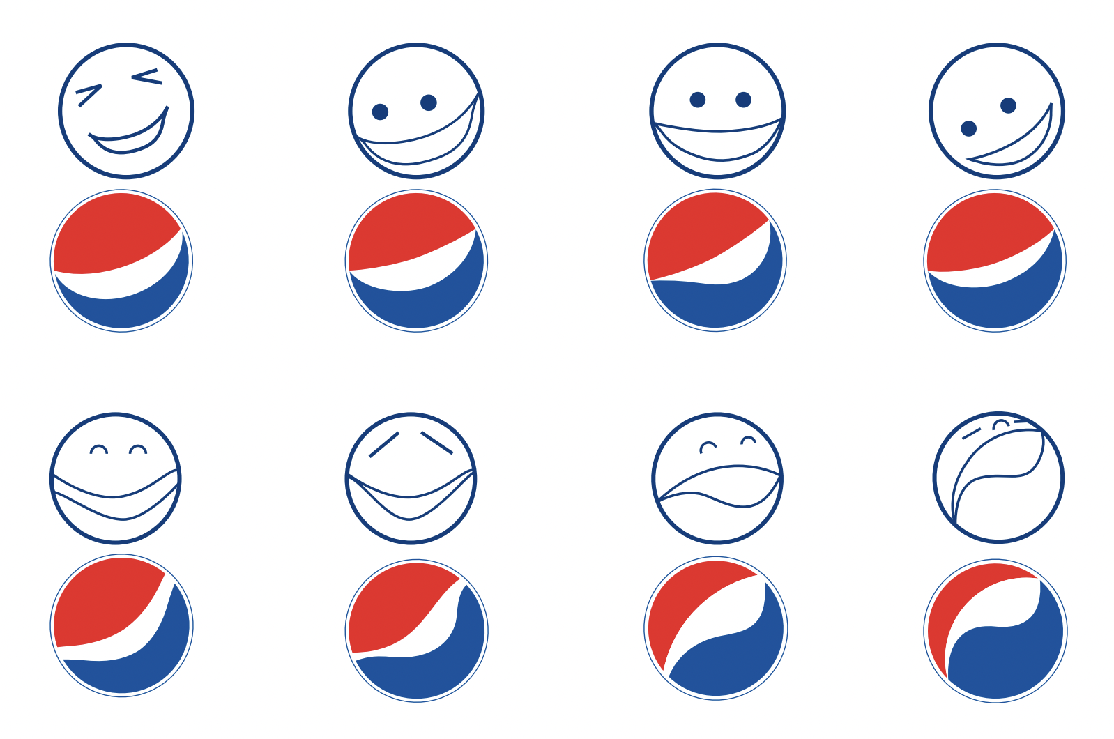
The 27-page document starts relatively normally. The designers talk about the golden ratio, and it's cool to see how those circles take inspiration from Pepsi logos throughout history. But things then move in some, er, unexpected directions. Things get deep.
goodbye to the pepsi logo whose designer was clearly insane https://t.co/ys0BP8M8rE pic.twitter.com/TfTsiXxq6bMarch 28, 2023
In memoriam to the last Pepsi logo, here's once again fragments of the utterly unhinged design document. pic.twitter.com/93JkVAcSjBMarch 28, 2023
the pepsi logo is getting replaced so lets all remember the Gravitational Pull of Pepsi in it's honor pic.twitter.com/VZN82W0EImMarch 28, 2023
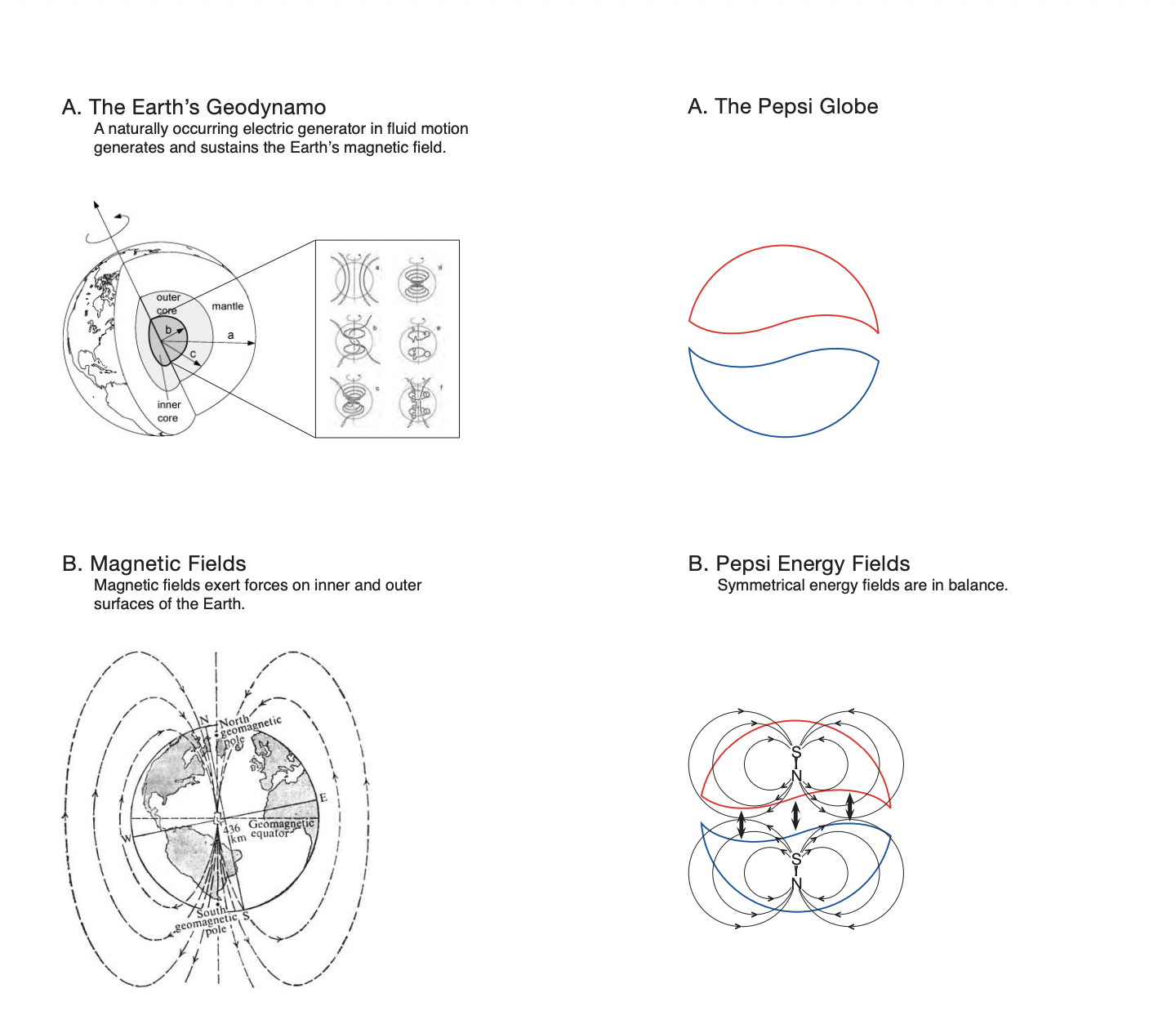
We're told about the "Emotive forces shape the gestalt of the brand identity". We are introduced to the Pepsi planet, the Pepsi galaxy and, of course, the Pepsi universe. We learn about the earth’s geodynamo – a naturally occurring electric generator in fluid motion which generates and sustains the earth’s magnetic field. And inspired the Pepsi logo, obviously. And perhaps the most preposterous claim in the entire document is that the Pepsi logo is based on the Mona Lisa.
Indeed, it's one of the most infamous documents in the world of graphic design, and it's just as outrageous today as in 2009. Lots of logos have fascinating histories, from the story of the Apple logo's missing bite to Mercedes Benz's hybrid design. But there's only logo out there that can claim to take inspiration from the exponential expansion of the universe on the basis of the positive and negative definite matrices and optimisation theorem.