Netflix is testing a significant redesign of its smart TV app, but it'll be a while before it rolls out. It's smoother and more streamlined, with information going to where your eyes are already looking.
The recent addition of My Netflix was a huge redesign of the Netflix mobile app. And now a similarly dramatic redesign is coming to Netflix on your TV. Netflix is currently testing a dramatic redesign of its smart TV app and of its Apple TV app, and the result should make it much easier to find something worth watching.
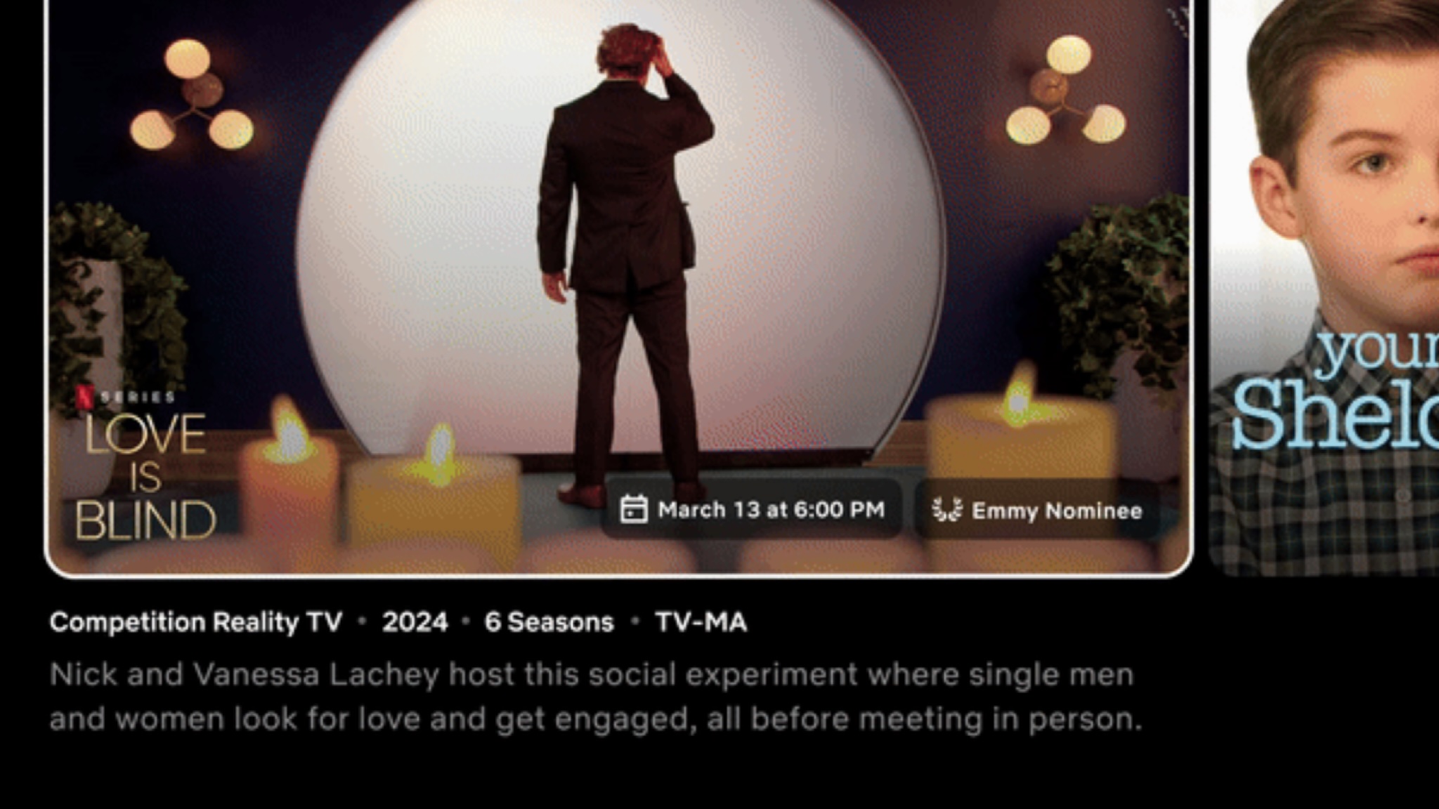
Speaking to The Verge, Netflix senior product director Pat Flemming explained that "We often see members doing gymnastics with their eyes as they’re scanning the home experience". That's because at the moment, when you scroll over a title the Netflix app displays the trailer and other information at the top of your TV. With the redesign, that information will go to the bit of the screen your eyes are already looking at.
What will the new Netflix design deliver?
The new design will make titles pop out when you hover over them, with their tile enlarging and, if you don't move onto something else, showing the trailer within it. Underneath the image or trailer you'll then see key information such as the genre, the year it came out and the synopsis; if it's a TV show you'll also see how many episodes there are.
The redesign also removes the menu at the left hand side of the screen. Instead, there's a simpler strip at the top of the screen with your profile icon at the very top and a central section with just five items: the search icon and then links for Home, Shows, Movies and My Netflix. That latter link takes you to recommended movies and shows as well as recently watched or saved titles. If you'd rather browse by category, that option now lives in the search tab.
The new homepage is currently being tested by a small group of subscribers but Netflix says that "if this goes well, which we are enthusiastic and hope that it will," it'll roll out to most of us "in the coming months and quarters".
In addition to smart TVs, the redesign should also roll out to the Apple TV – but Netflix will continue to exist outside Apple's combined interface, where your Apple TV homescreen enables you to see recently watched shows and recommendations from multiple streaming apps. Netflix has chosen not to be part of that unified interface and that policy looks like it'll continue.


