
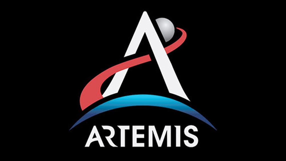
The NASA branding has become iconic, entwined with our very conception of space exploration. The Artemis logo is a more recent addition to the system. Only time will tell whether it will prove to be as memorable as the meatball and worm logos but it certainly does a lot in terms of the amount of meaning built into its design language.
Amid the stunning images from Artemis II, you might not have given the logo design much attention – isn't it just a letter 'A' with a couple of abstract lines? But every element of the Artemis logo has significance, and the symbol alludes to NASA's most ambitious goal.