
Get all your news in one place.
100's of premium titles.
One app.
Start reading
The Conversation
The Conversation
Environment
Ed Hawkins, Professor of Climate Science, University of Reading

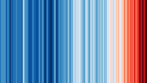
My new dark red climate stripe for 2024 shows it’s the hottest year yet

Global warming stripes show average global temperatures, 1850-2024. Blue stripes denote cooler years, red are warmer. Ed Hawkins, CC BY-NC-ND

The data is in. 2024 was the warmest year on record, and probably in the whole of human history – about 1.6°C warmer than the period before widespread industralisation. More than 1 billion individual thermometer measurements, made by thousands of people over many decades, have been condensed into a single number.

But, are these simple numbers helpful for telling the story of all this data and what it means for people living today? Does my simple graphic help? I hope so.

Sign up to read this article
Read news from 100's of titles, curated specifically for you.
Already a member? Sign in here
Related Stories
Top stories on inkl right now
One subscription that gives you access to news from hundreds of sites
Already a member? Sign in here
Our Picks
Fourteen days free
Download the app
One app. One membership.
100+ trusted global sources.