It's Typography Week here at Creative Bloq, and we've been catching up with graphic designers around the world to talk all things type. Every designer has a favourite font or typeface (although let's be honest, it's likely to keep changing). For more typographical inspiration, take a look at our guide to the best free fonts.
Viviana Caponnetto is an Italian graphic designer based in Catania, Italy. Through Viviana Graphics, she shares her love for design and helps businesses stand out in the market. With years of experience in design and a degree in Visual Communication Design, she now creates fun and helpful content on Instagram, TikTok, and YouTube.
What's your favourite typeface?
I bet that this is a very difficult question to answer for any designer, but especially for someone like me who’s obsessed with type. I don’t have a specific typeface that comes to mind, but usually I tend to go for bold and quirky display fonts. An all time favourite is Freitag by Zeta Fonts: when I first saw this font I immediately felt drawn to it and I think it describes me and my style perfectly.
Can you tell us about a project you've used it for?
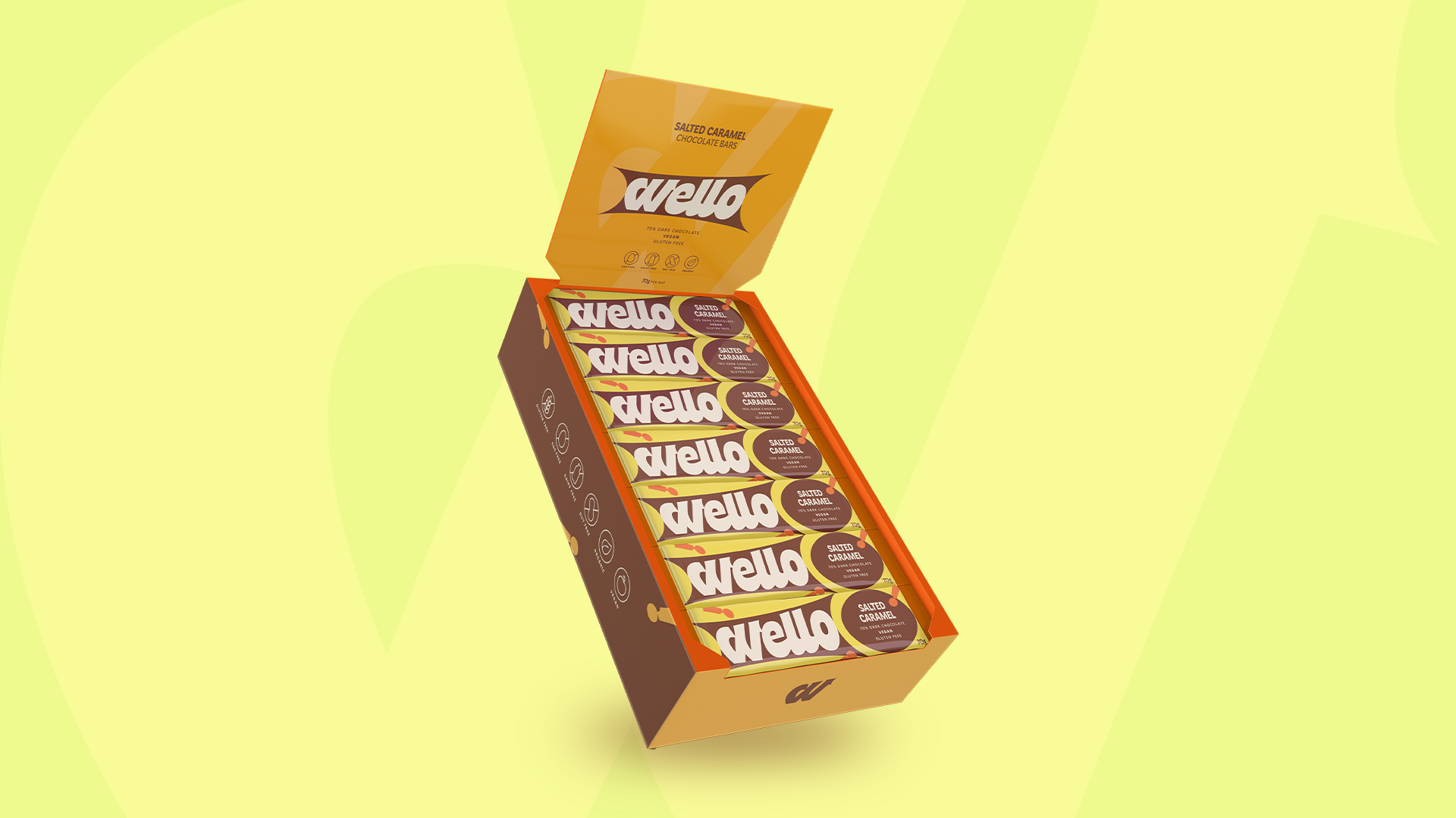
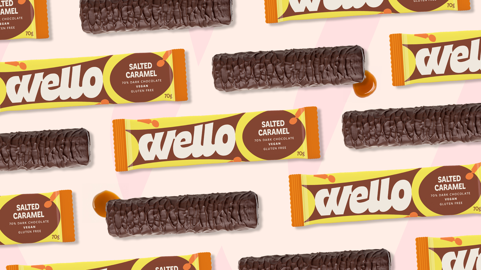
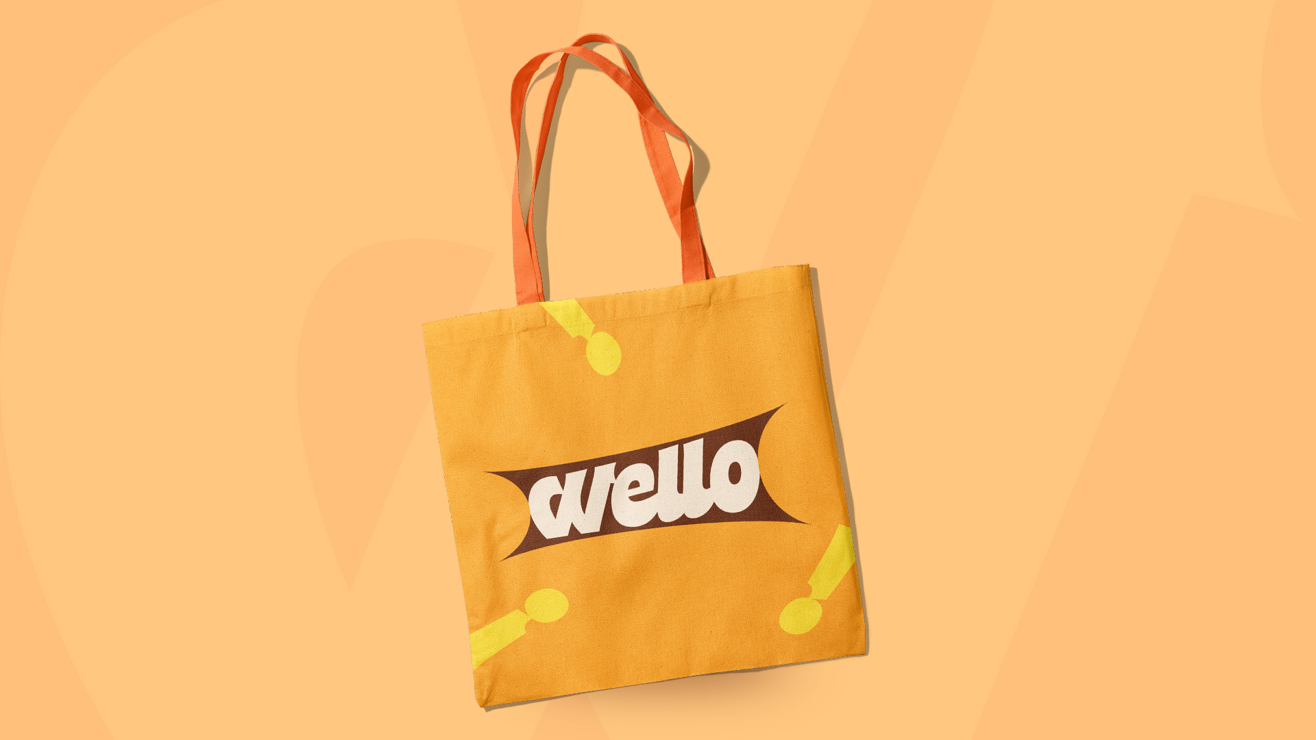
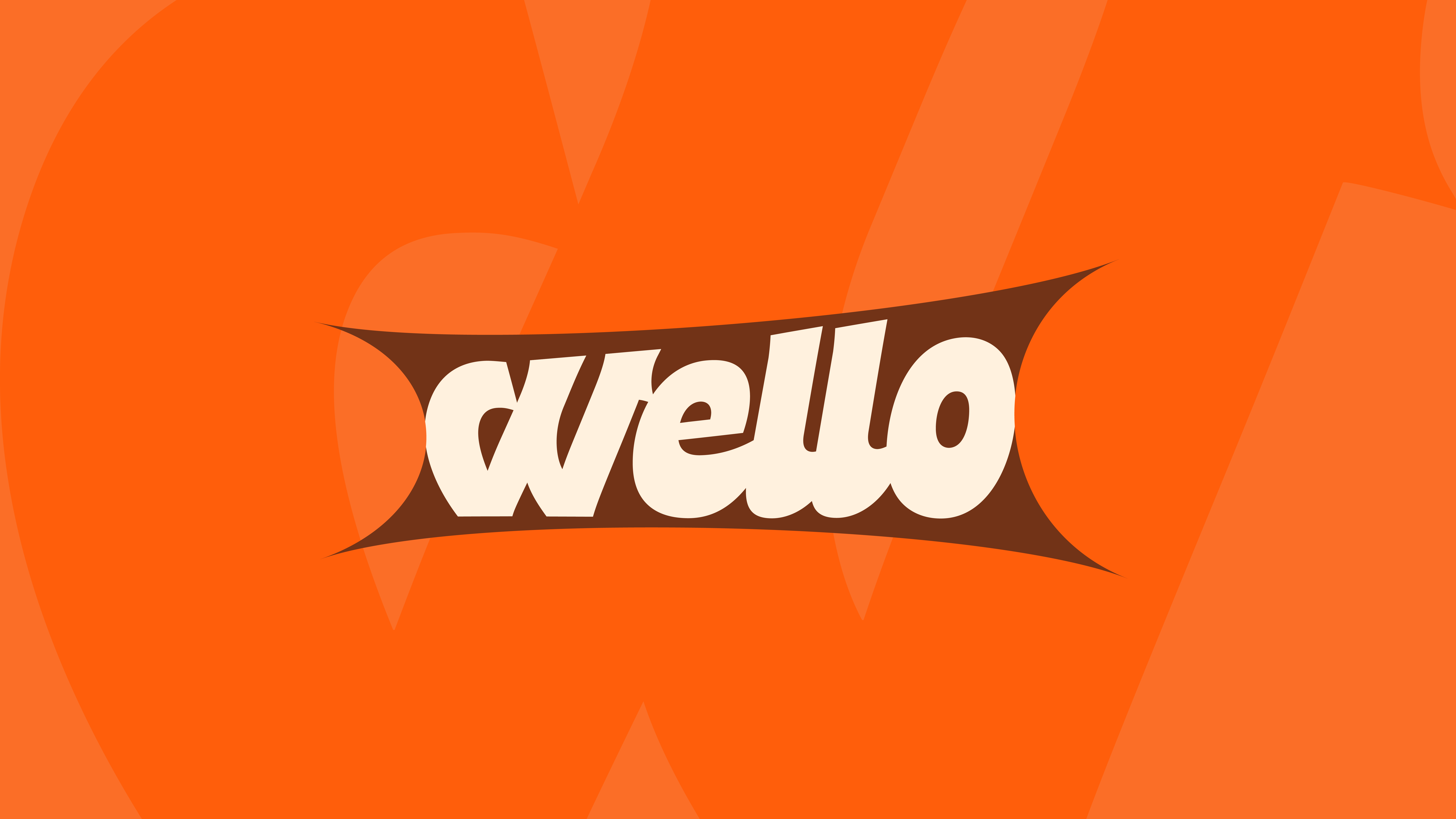
I used Freitag a few times, but my favorite was for a passion project I worked on a while ago: Wello, a vegan caramel-infused chocolate bar. The goal for this project was to create something that would appeal to both adults and kids, so the type had to be quirky but legible and trustworthy. Freitag was already a great base for the logo and text on the packaging, and so I had to make only a few adjustments to give it a bit more personality and convey a friendly and approachable feeling. I particularly focused on making the logo more dynamic and eye-catching.
What makes this typeface unique?
Freitag is such an incredible typeface! I think that what always stood out to me was the curves on every letter, but especially the lowercase a, d, e, g, k, w and y and the uppercase A. It’s a design that I don’t see that often and that’s probably why I find myself going back to this font over and over again. I love how it combines modern trends, but with a touch of vintage, especially in its Display version - which is actually my favorite. It’s pretty rare to find a font this versatile!
How would you describe its personality?
Freitag is fun and friendly and it immediately puts you in a good mood when you see it! It has a strong and confident personality, but one that’s relatable and welcoming. Freitag is funky and exuberant, it’s bubbly and joyful but also a bit psychedelic. It’s never shy, but it gets more charismatic as you get to know it and discover all its facets. This font likes to make a statement and stand out without trying too much. Freitag is a fun hippie girl at a festival in the 70s!
What kind of response do you think it elicits from the viewer?
This font has a good and positive aura. It lets the viewer understand from the first moment that the brand or the asset they’re being exposed to is friendly and approachable, but it makes it clear that it's one-of-a-kind and not like anything else they’re used to seeing. I think Freitag leaves the viewer with a smile on their face and a curiosity to learn more. Since it’s very versatile, the viewers also feel very safe and like they can trust it.
