
After largely skipping North America with the launch of the Razr 2022, Motorola is finally making its foldable comeback in the United States and doing so in a big way (or small, depending on how you wanna frame it) with the new Razr+ (or Razr 40 Ultra if you're outside the United States). I got a brief moment to play around with the phone while in New York City, and I must say, I like what the company has done here.
While Google has drummed up plenty of hype for its new Pixel Fold, Motorola is keeping its foldables small by launching clamshell foldables, something I wish Google had done. It's an approach that proved popular with the Galaxy Z Flip line, and even though Motorola launched the first commercially available foldable phone, the company's efforts haven't quite caught on in the United States. However, the Razr+ shows that Motorola is not out of this fight.
Motorola Razr+: The cover screen is begging to be used

The headlining feature of the Razr+ is the new cover screen. At 3.6 inches, the pOLED panel is large and in charge, beating out other competing foldables like the OPPO Find N2 Flip. The screen takes the best part about clamshell foldables and blows it up into something quite useful. Users get access to up to nine "panels" that can consist of a series of widgets or apps, including Spotify, Google Fit, Calendar, and just about whatever you need. You can quickly access these by swiping across the screen or swiping down to access quick settings.
But beyond the widgets, you can access nearly any app that you would use the main display for on the cover screen. That means navigation, rideshares, games, and social media apps can be pulled up on the smaller screen without needing to open the phone. This makes it easy to scan your airport pass without opening the phone, for instance. And Motorola says apps don't need to be optimized for the screen and should just work, although you'll find a "small percentage" of apps that may not function when trying to open in landscape.
There's very little you can't do with the cover screen on the Razr+.
When there's content on the screen that's obstructed by the dual camera setup when the app takes up the full panel, tapping and holding the navigation bar will shift the app content up and out of the way so so that the actual app takes up less of the screen. Still, you'll be able to see whatever content the cameras were blocking. Otherwise, the external screen can act as your main screen for most interactions.
Motorola has some built-in games that take advantage of the cover screen. I played the marble game that requires users to navigate a series of mazes, and I have to say, I was kind of obsessed with it. It makes great use of the display and really shows off the phone's pretty decent haptics.
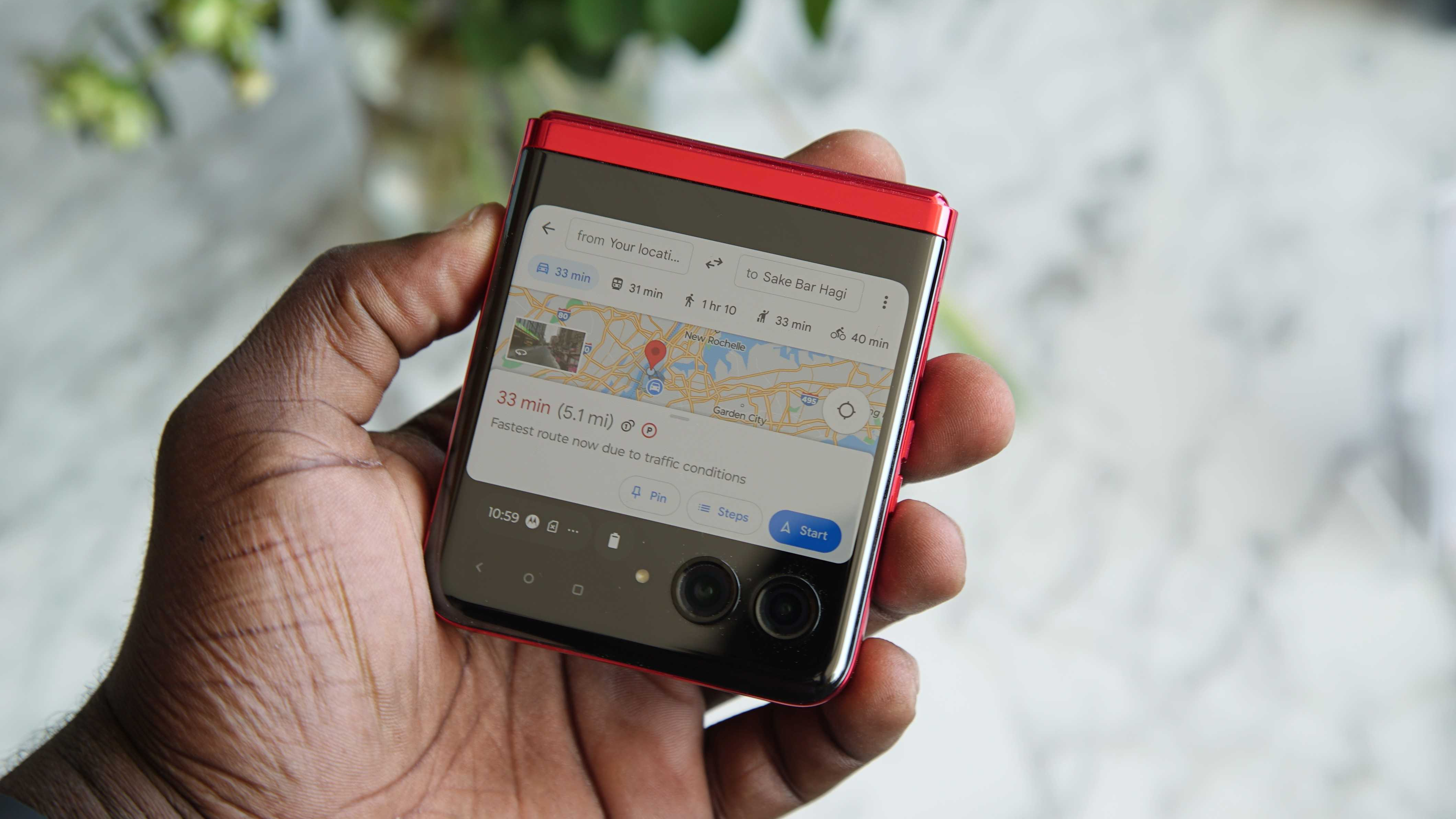
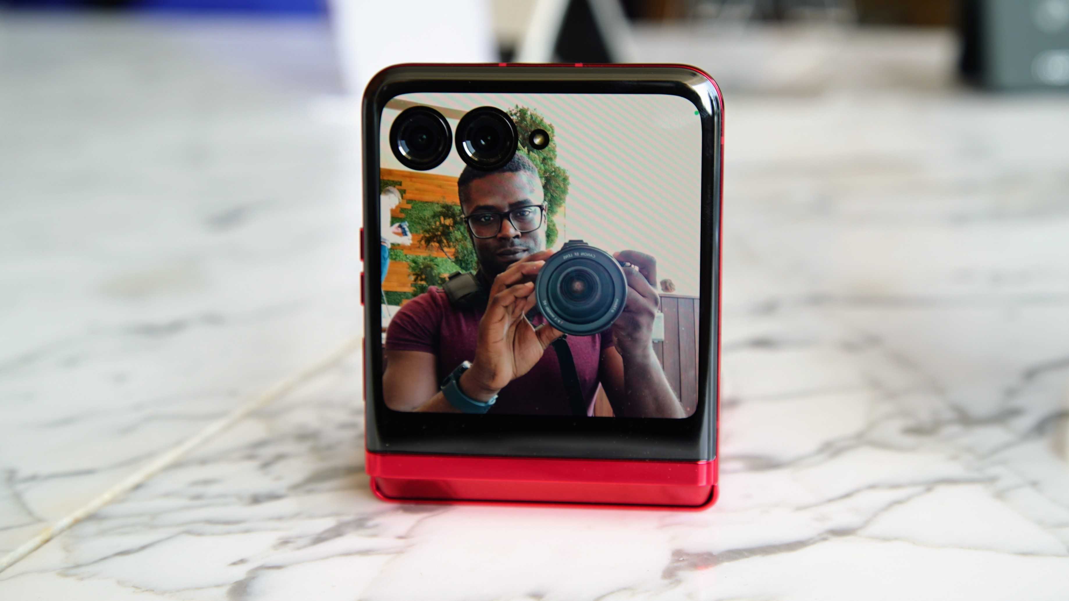
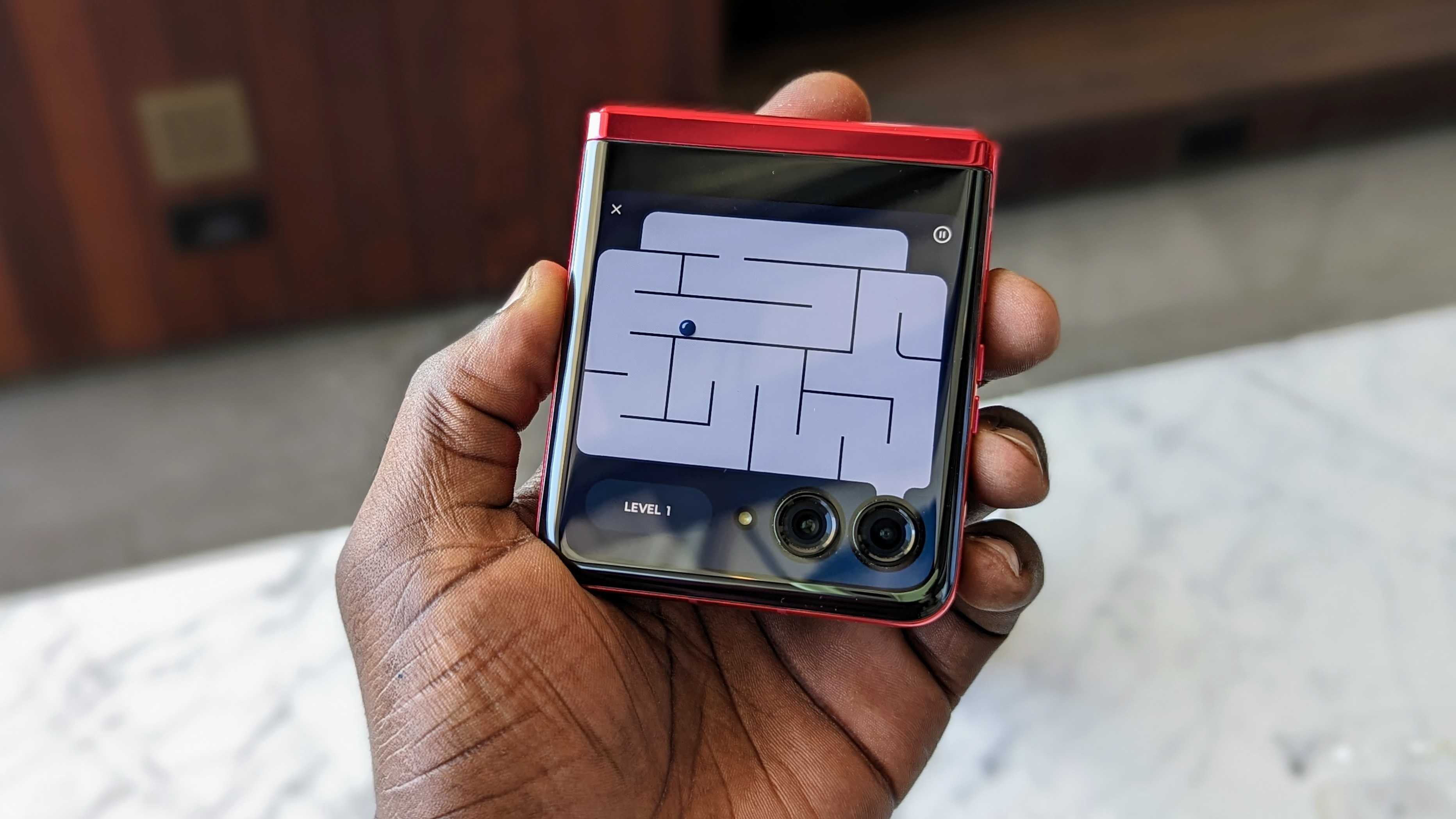
If you're using an app on the main display and close the phone, a notification will appear that you can tap to continue whatever you are doing on the external screen. Frankly, I'm pretty impressed, and things like this make me think Motorola really put thought into making the phone's software pretty seamless.
And, of course, you can use the outer display to do things like take selfies with the 12MP primary camera or 13MP ultrawide, check notifications, respond to texts and emails, and much more. Motorola really wants you to be able to do anything you want with this large cover screen. The goal was to make it "immersive, functional, personal, and fun," and with just my short time handling the phone, it seems like that was achieved.
Motorola Razr+: A design that stands out
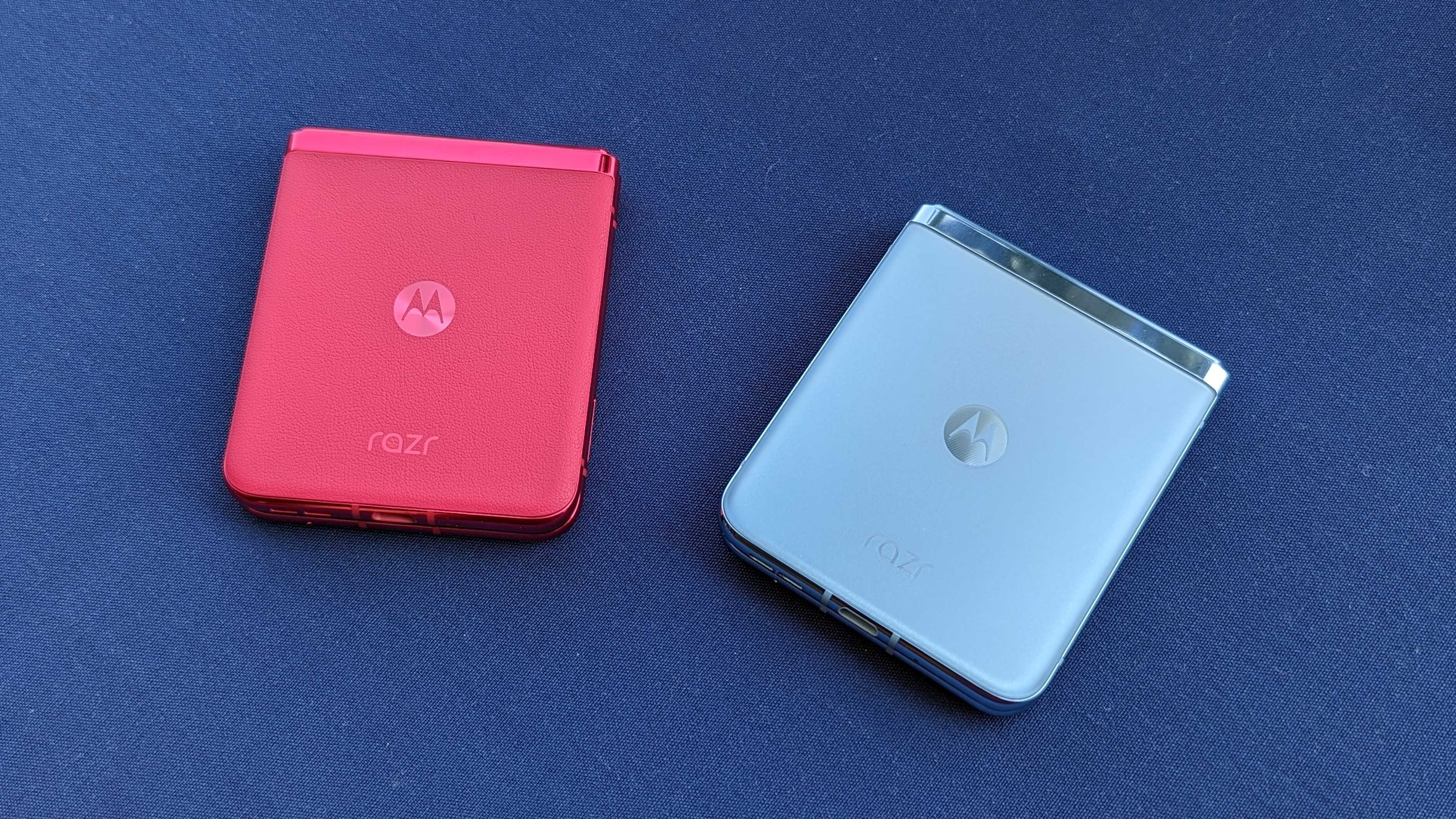
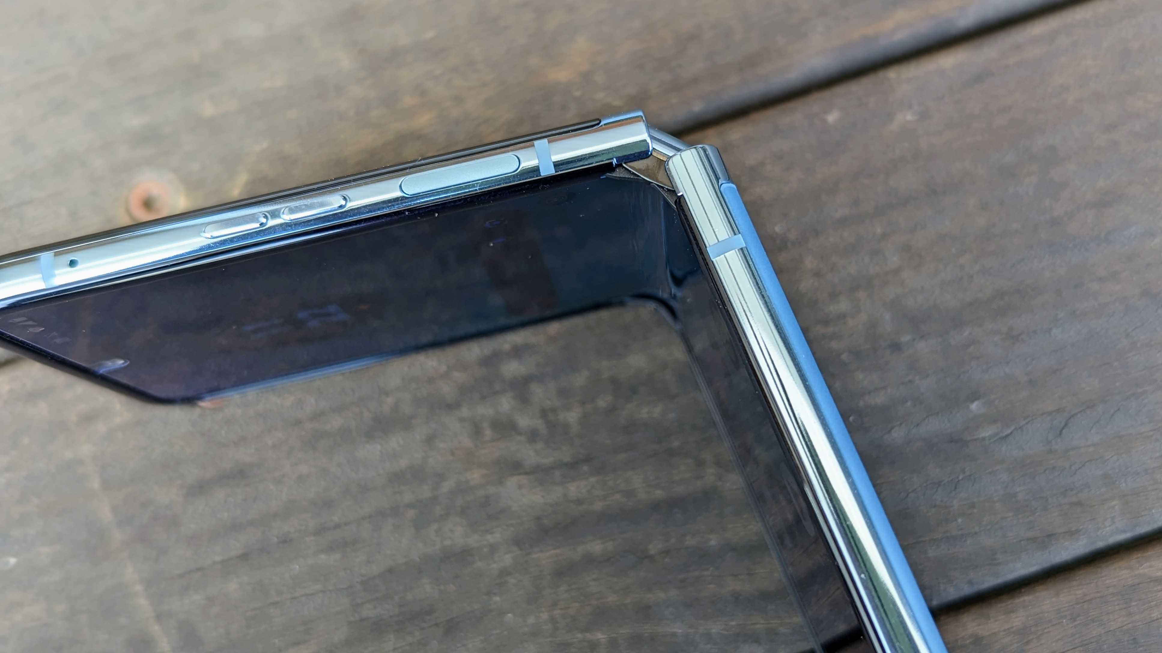
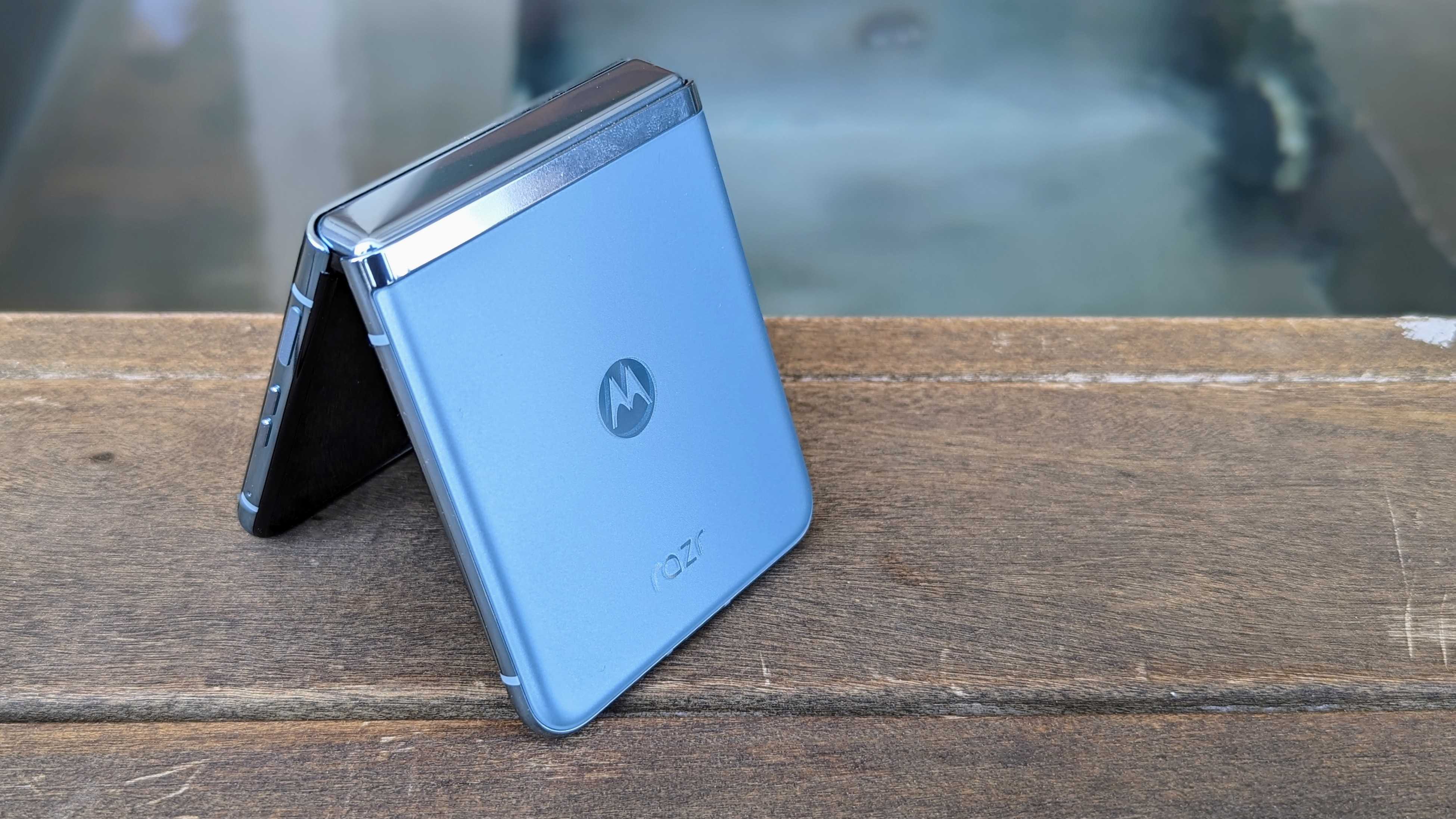
But beyond the cover screen, Motorola has done some impressive things with the rest of the phone, with a design that leaves me in awe every time I look at it. The Razr+ feels strong and durable, thanks to the "aircraft-grade aluminum" that makes up the frame. Gorilla Glass Victus also keeps the phone protected on the front and back, and Motorola has a redesigned, dual-axis hinge that has been tested to withstand 400,000 folds, which is more than Samsung tests for with its foldables.
When the phone is completely shut, it's completely shut with no gaps, which is a good way to keep dust and things away from the main display. At 15.1mm when folded, Motorola says it's the thinnest clamshell foldable, which helps keep things compact since you're essentially doubling its thickness.
It also just feels incredibly solid in hand, whether open or closed, and it has a nice heft to it. At 188g (or 184g, depending on the color), it's not exactly light, but not particularly heavy either.
When open, the 6.9-inch pOLED display does have a bit of a crease, but it's not too noticeable unless you're looking for it. When touching the display, it definitely feels different from a standard smartphone display, but it's very slight.
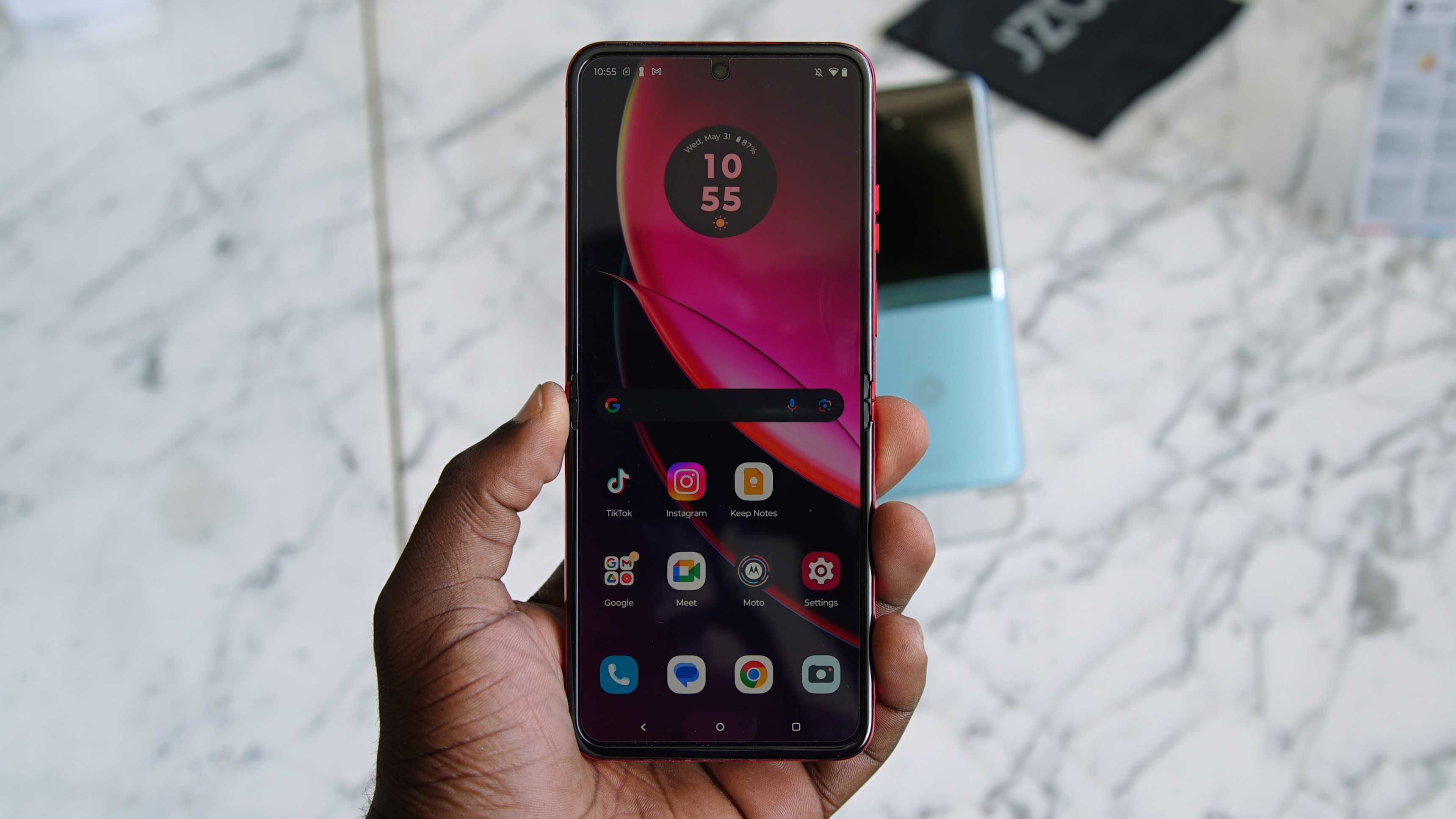
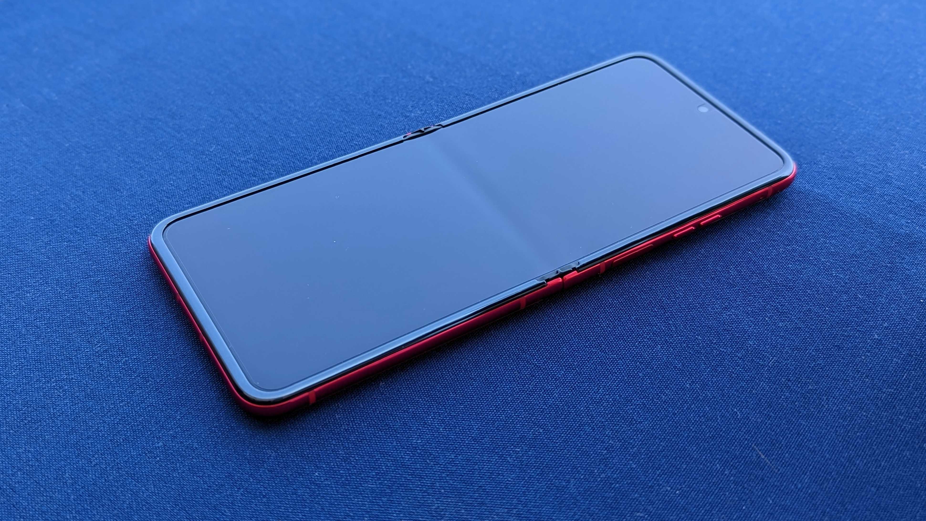

The Full HD+ LTPO display also looks great, and it's helped by not only the HDR10+ support but also the 165Hz refresh rate, which (to my knowledge) is the fastest on a foldable phone. Everything is just buttery smooth, but I'll want some more time with the phone to really get a feel for the display (literally). It's also pretty bright at 1400 nits, although it seemed a little warm for my liking and a little hard to view in certain lighting conditions. Again, I'll have to spend more time with it to really test out the display.
The external screen is also a 144Hz panel, which feels like overkill, but it gets the job done.
Opening the phone does take a bit of effort, but that's mainly due to the new hinge. The Razr+ was designed "with content creators in mind," and it's fairly rigid to allow the phone to remain at anywhere from 45° to 130° when in Flex View mode. If you've used or even seen a Galaxy Z Flip 4, this similarly allows users to use the cameras to capture content without needing a tripod.
Motorola hopes features Flex View, dual capture, Night View mode for videos, and Horizon Lock will help capture the younger audience, especially as TikTok use continues to grow.

The phone was also designed to stand out. Aside from the large external screen, the phone sports comes in three colorways, including Infinity Black, Glacier Blue, and Viva Magenta. The last one was Pantone's color of the year for 2023 and was featured on the Edge 30 Fusion. It's pretty striking, especially in hand, thanks to the vegan leather finish on the back, while the other two colorways feature a soft matte finish that's still pretty nice in hand.
Motorola Razr+: A few concerns
There's a lot to like about this phone, but there are some things that make me squint. The Snapdragon 8+ Gen 1 is the least among them, as it's still a great chip that's much more efficient than its predecessor. However, the phone's battery is not exactly large, sitting at 3,800mAh. While it's larger than the Galaxy Z Flip 4, the battery life on that phone isn't exactly stellar, and Motorola has a much larger external display to power and a higher-refresh-rate internal display.
It's likely Motorola is banking on owners using that external display much of the time, which is probably why it's so large, but it remains to be seen how that translates to actual real-life use and longevity. Fortunately, there's 30W wired charging, and while wireless charging is nice to see, the 5W wireless charging doesn't sound encouraging.
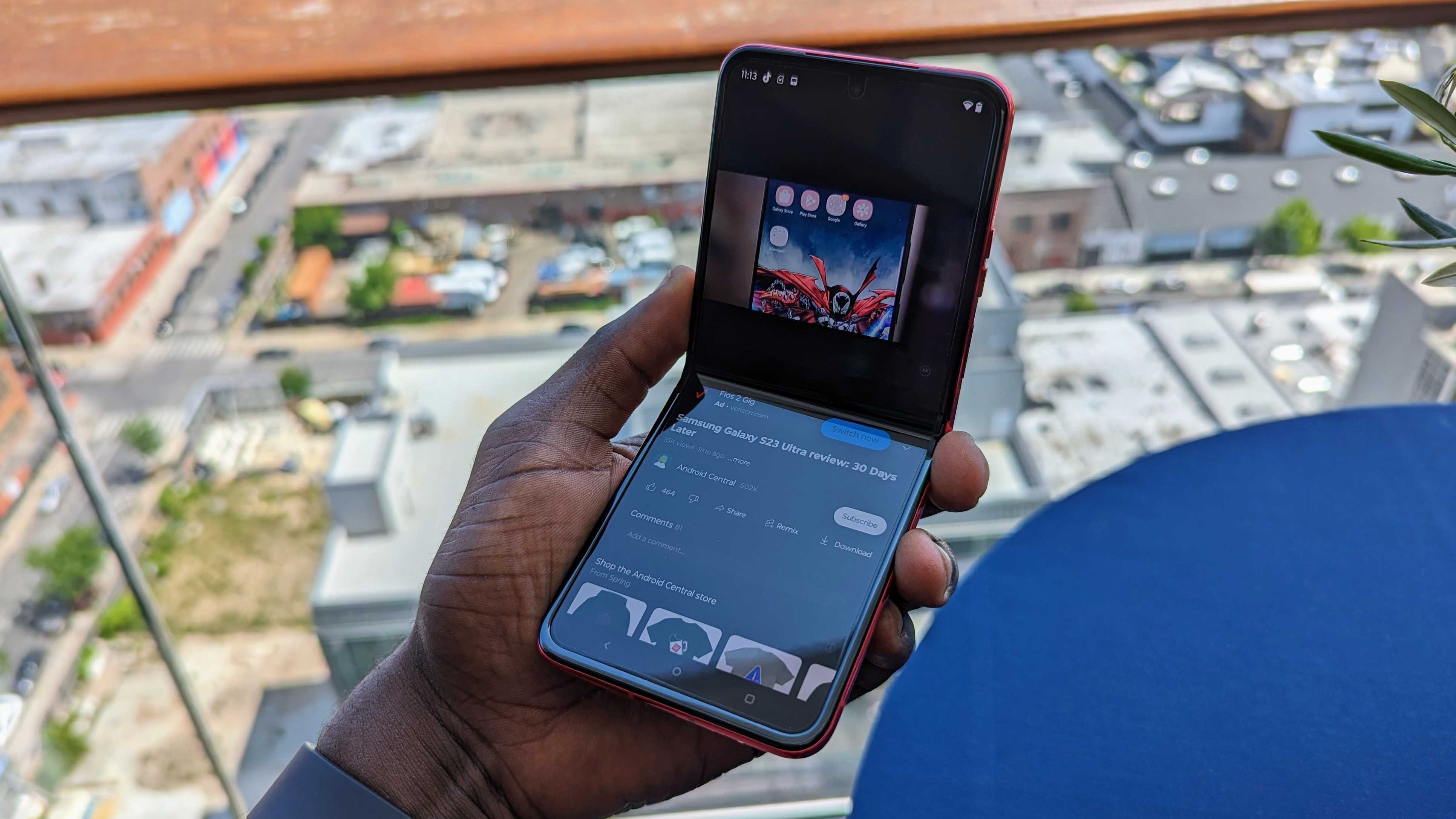
And speaking of real-life use, I live in Seattle, where it's known to be rainy and wet. More OEMs are launching foldables with substantial water resistance, whereas the Motorola Razr+ only has an IP52 rating. Granted, the presence of dust resistance is nice to see, but the water resistance rating is pretty weak and leaves me concerned about just how well it'll withstand inclement weather.
I also wish there were more storage options than 256GB. I personally don't need more, but given the absence of a microSD card slot, this would be nice for users looking for more storage for videos and content.
Of course, software support is always a concern when it comes to Motorola phones. Fortunately, the company is getting better with that and promises three OS upgrades along with four years of bi-monthly software updates. Still, that's easier said than done, so I won't hold my breath for timely updates.
There's a lot to like about the Razr+, but the phone isn't perfect.
Lastly, it's not really a concern, but the camera system gives me reason to squint (metaphorically). Motorola isn't the best at image quality, and while that's also improving with recent phones like the Motorola Edge+ (2023), I wasn't exactly blown away by the images I snapped on the phone.
That said, clamshell foldables, in general, aren't known for having the most advanced cameras. I'll have to play around more with the phone before I can really give the cameras my full judgment, particularly with low-light images. Still, with Motorola focusing on that large cover screen, the rear cameras are going to be playing double duty with selfies, too, so they need to be good.
Motorola Razr: Foldable on a budget
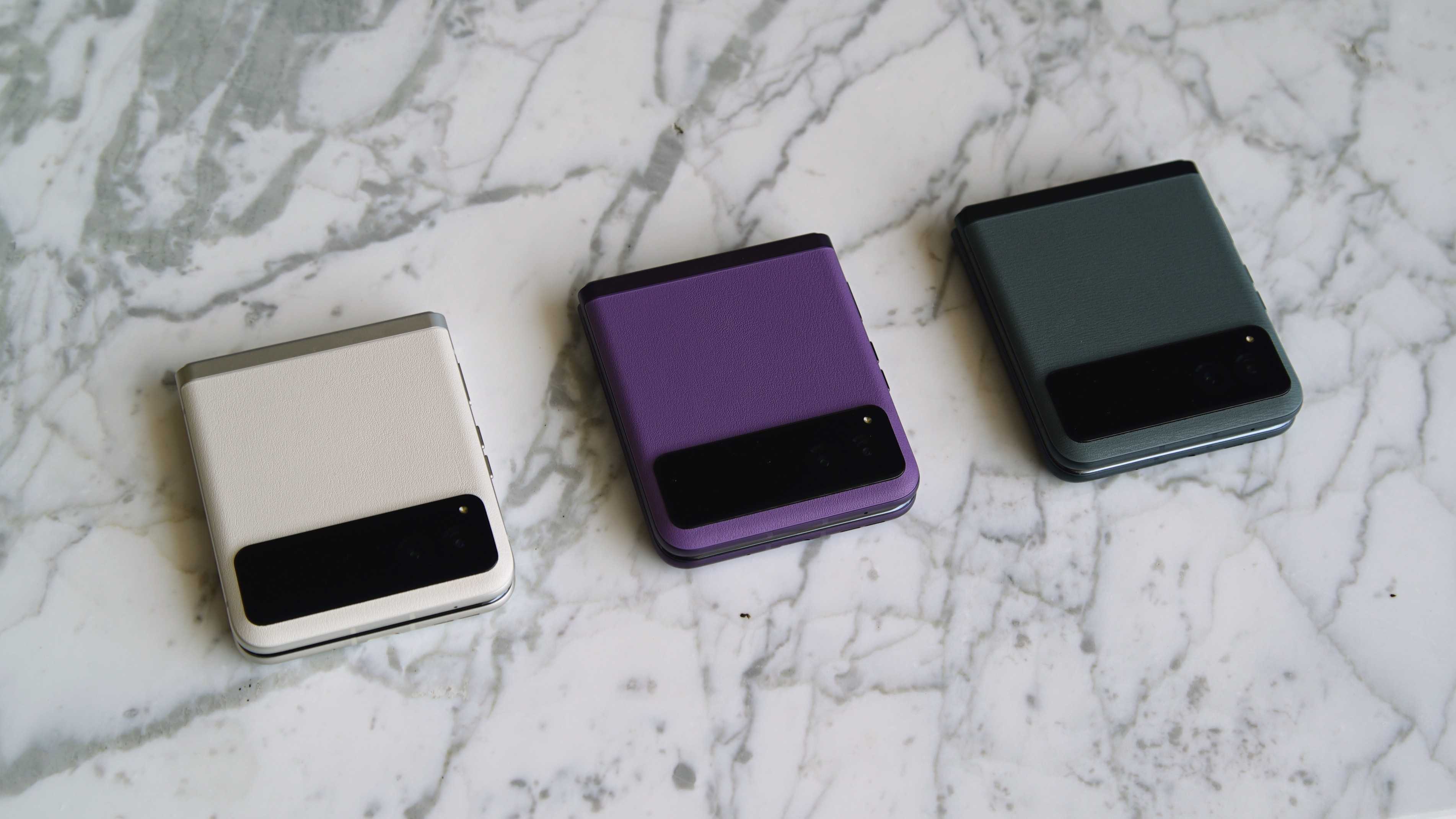
You might be noticing I'm missing the "+" in that header. That's because Motorola is also launching the Razr, a more affordable version with a smaller external display. You can still interact with it to check notifications, interact with widgets, and other things "at a glance," but you have a lot less screen real estate with the 1.5-inch panel.
At 1000 nits, it's not exactly the brightest screen around, but because it's so small, it's likely you won't interact with it as much as you will the main display. Still, you can swipe through panels and even access quick settings, which is nice.
This phone has a few differences from its flagship sibling. The battery is larger at 4,200mAh, the primary camera is a 64MP sensor, and the phone is powered by the Snapdragon 7 Gen 1. The main display is a 144Hz panel, and all colors come with a vegan leather finish. Otherwise, it has much of the same mechanical hardware, with a flexible hinge design rated for long-term use.
Aside from the smaller cover screen, the Razr actually feels nearly identical to its flagship sibling, and I expect performance should hold up pretty well with the Snapdragon chip. Motorola says the Razr is "designed with digital minimalists in mind," meaning users that may not want a large cover screen to distract them. It will launch with an 8GB/128GB configuration instead of the 256GB we see on the Razr+, which should also help keep costs down a bit.
Speaking of costs, Motorola hasn't disclosed how much the Razr will be, but it will be "meaningfully cheaper" than the $999 MSPR of the Razr+ when it launches in the coming months.
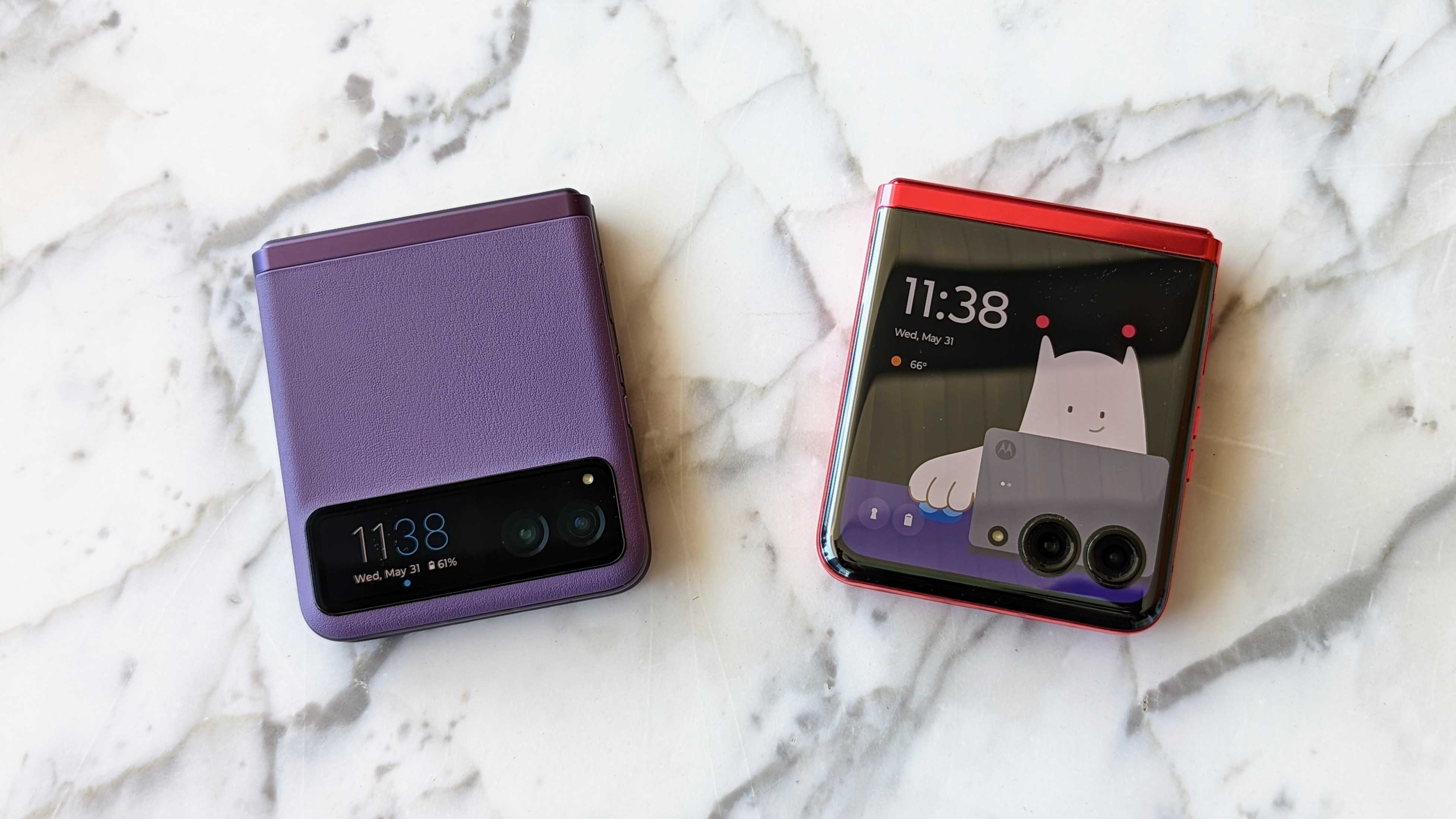
Overall, I'm very impressed with what Motorola is bringing to the table. Being able to interact with a cover screen for notifications and the like is the reason why I like clamshell foldables, because I don't need to open the phone. Motorola is leaning into that in the best way possible with the Razr+ while really nailing the design and the software.
We've seen a number of foldable phones launching this year, but so far, only the Pixel Fold is taking on Samsung in the United States. With the Razr+ and Razr, Motorola has what it takes to bring the fight to Samsung's most popular foldable phone and pull even more consumers in with an even cheaper model to undercut the competition.
After playing with the new Razr phones and seeing other recent flagship launches like the ThinkPhone, I have to agree with Android Central's Nicholas Sutrich: Moto got its groove back. With the Razr+, everything is there… I just hope the execution can truly live up to expectations.


