Looking at this home in the exclusive Pacific Heights neighborhood, overlooking San Francisco Bay, would you guess that its recent redesign owed its look to bespoke Saville Row tailoring and the classic British sports car brand Aston Martin? Perhaps not, but the elegant and livable house design was inspired by exactly those things.
The young homeowner approached interior designer Benjamin Dhong, asking for a modern revamp of his home, to create a space where he could entertain his friends in style. 'I think modern design can be so sterile without a strong point of view,' says the designer. 'The client was a young English investment banker. He was quite polished, wore fine suits and drove an Aston Martin, and I felt that we should give him a more cultivated and sophisticated home. He wanted both a home to impress his friends but also feel comfortable and livable. He says that we gave him both in abundance.'
Take the tour, as the designer explains how he balanced these seemingly opposing style elements in his transitional design scheme.
Every room in this home now includes a pleasing mix of modern and traditional furnishings, nothing clashes however in these expertly curated spaces.
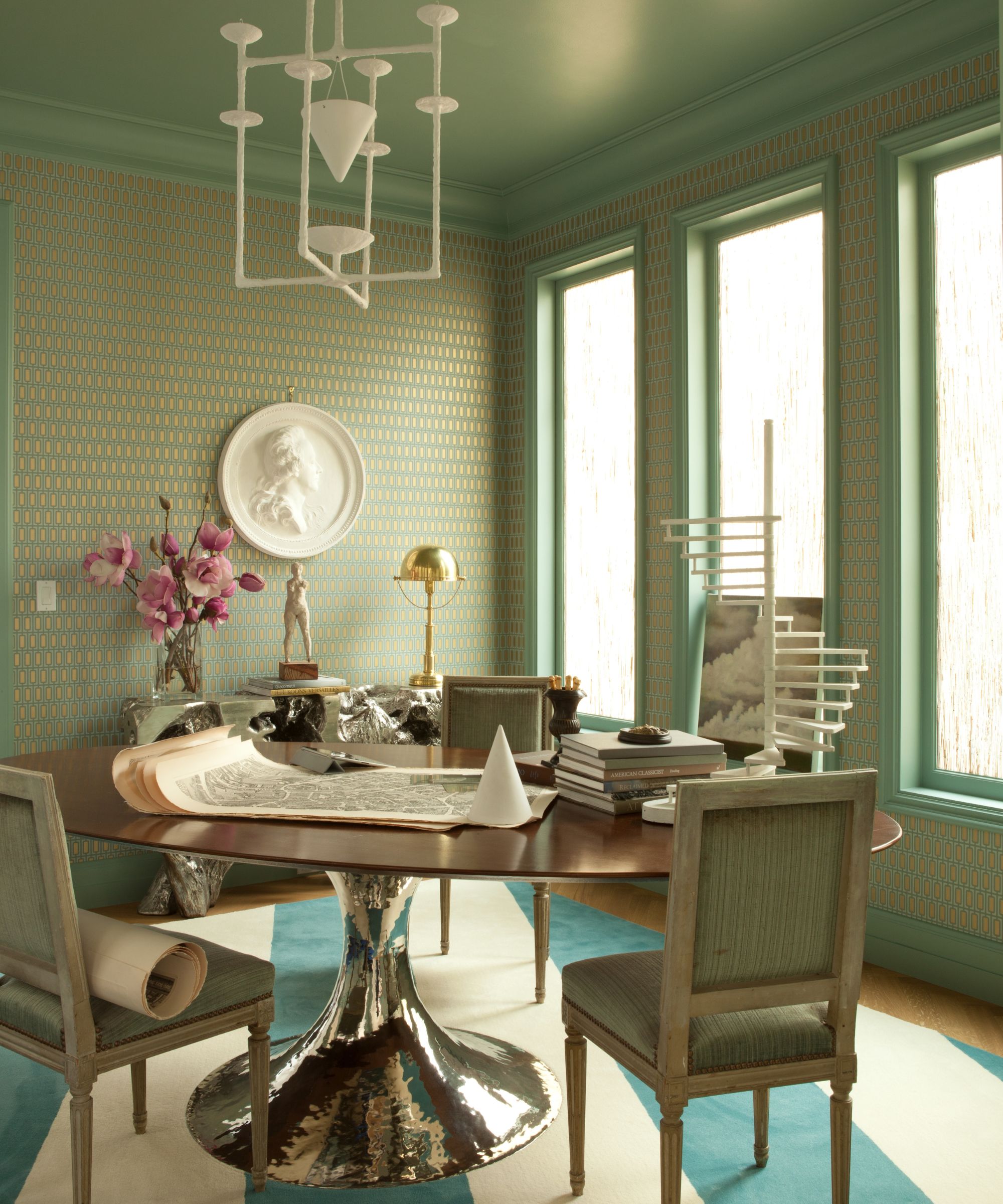
Explaining his dining room ideas, designer Benjamin says: 'We mixed classical and modern here to elevate the space. A modern Knoll table paired with Louis XVI chairs is both unexpected and chic. And a contemporary plaster pendant from Alexandre Logé is more interesting than a boring and predictable crystal chandelier.'
The wallpaper is a modern Swedish design, but adds extra glamour with its gold elements. Overseeing it all is a plaster bas-relief of King Gustaf of Sweden.
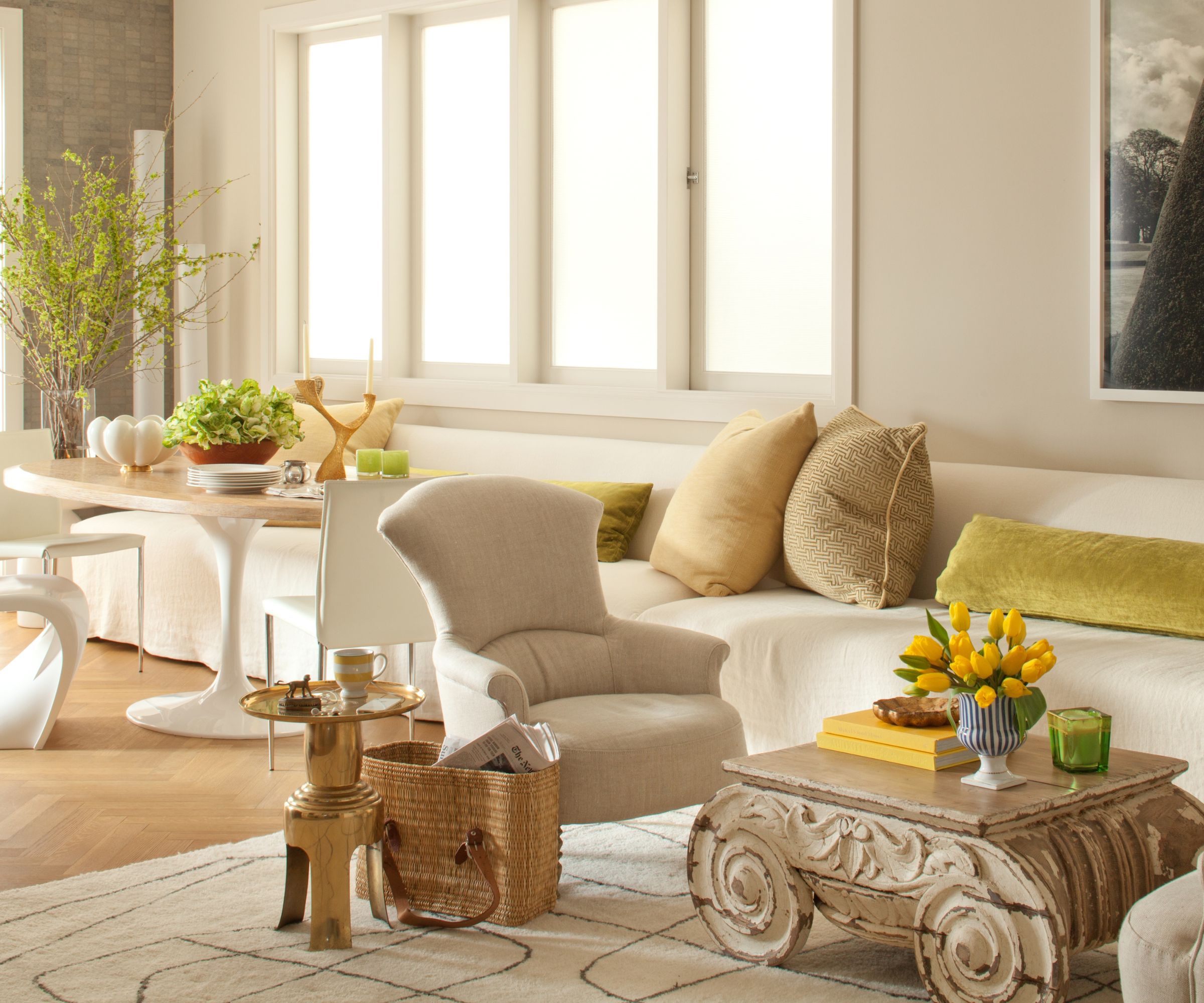
The working part of the kitchen was in good condition so designer Benjamin was able to focus his attention on the room's dining nook and seating space.
The key to his kitchen ideas was to create a more open layout for easy entertaining. 'The previous homeowners had added a sofa for TV watching in here, which cut the room in half,' says Benjamin. 'We removed that and created a 20-foot-long banquette, which allows both for dining and lounging. The client can entertain 20 people here now.' The flexible layout allows the space to be configured as a smaller eat-in kitchen with an adjoining lounge area for more cozy gatherings.
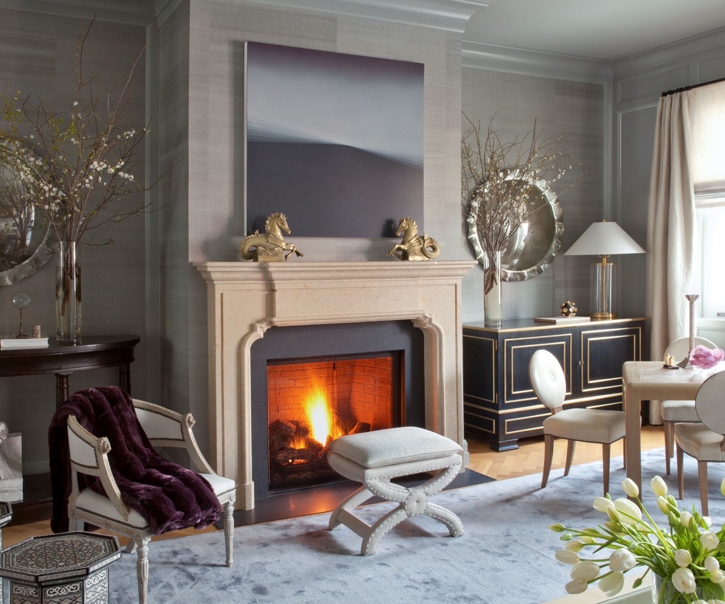
'We made this space feel more like a London club, ' says the designer, talking about his living room ideas.' A vintage game table brought life and function to a dead open space. Layers of blue in various textures of grasscloth, velvet, and fabrics create an ambient cocoon.'
The grasscloth wallcovering is by Phillip Jeffries, the scalloped edge mirrors are from Downtown Co. in LA.
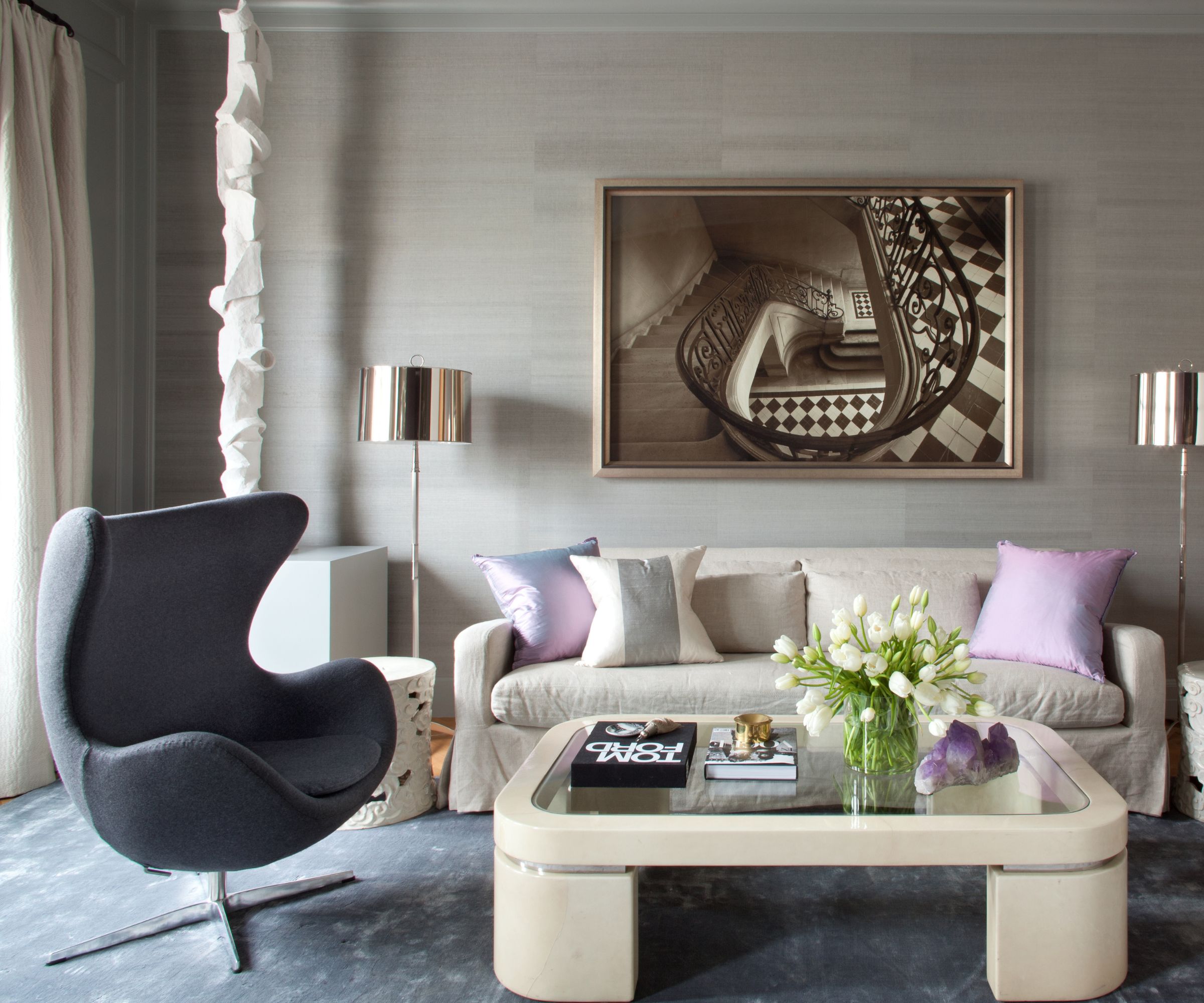
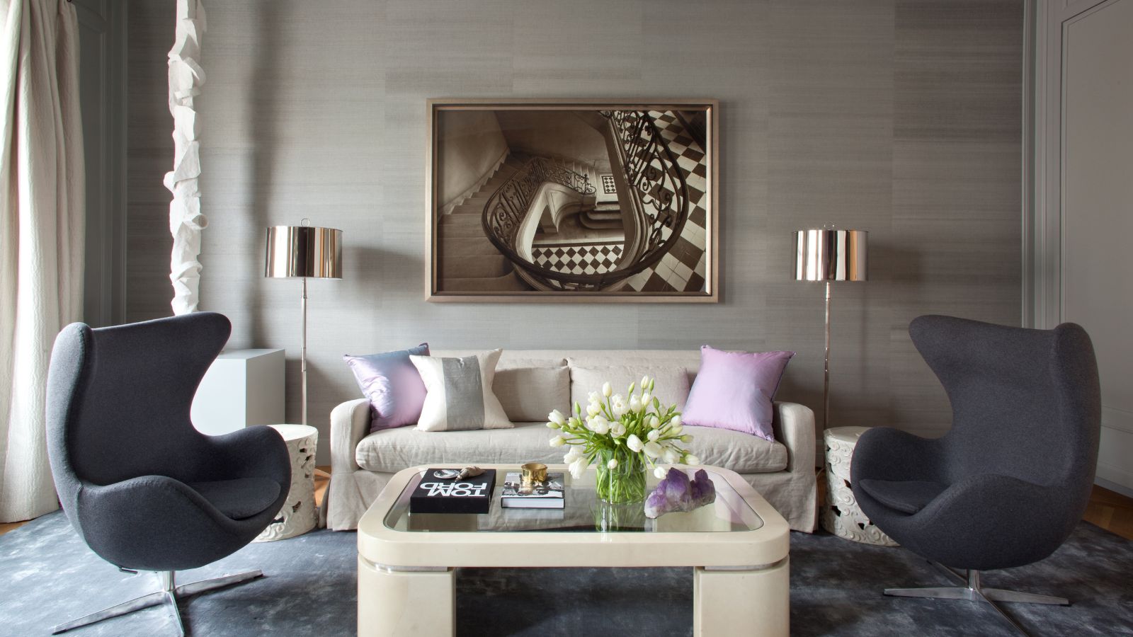
At the other side of the living room, there's a more contemporary vibe, with statement swivel chairs and a blocky coffee table. 'We removed a rather large and unattractive glass display space and created a nook for a banquette – perfect for gossip and flirting,' says the designer, who sourced the sofa and staircase photo from Restoration Hardware. The Nickel floor lamps are from Abbey Lighting.
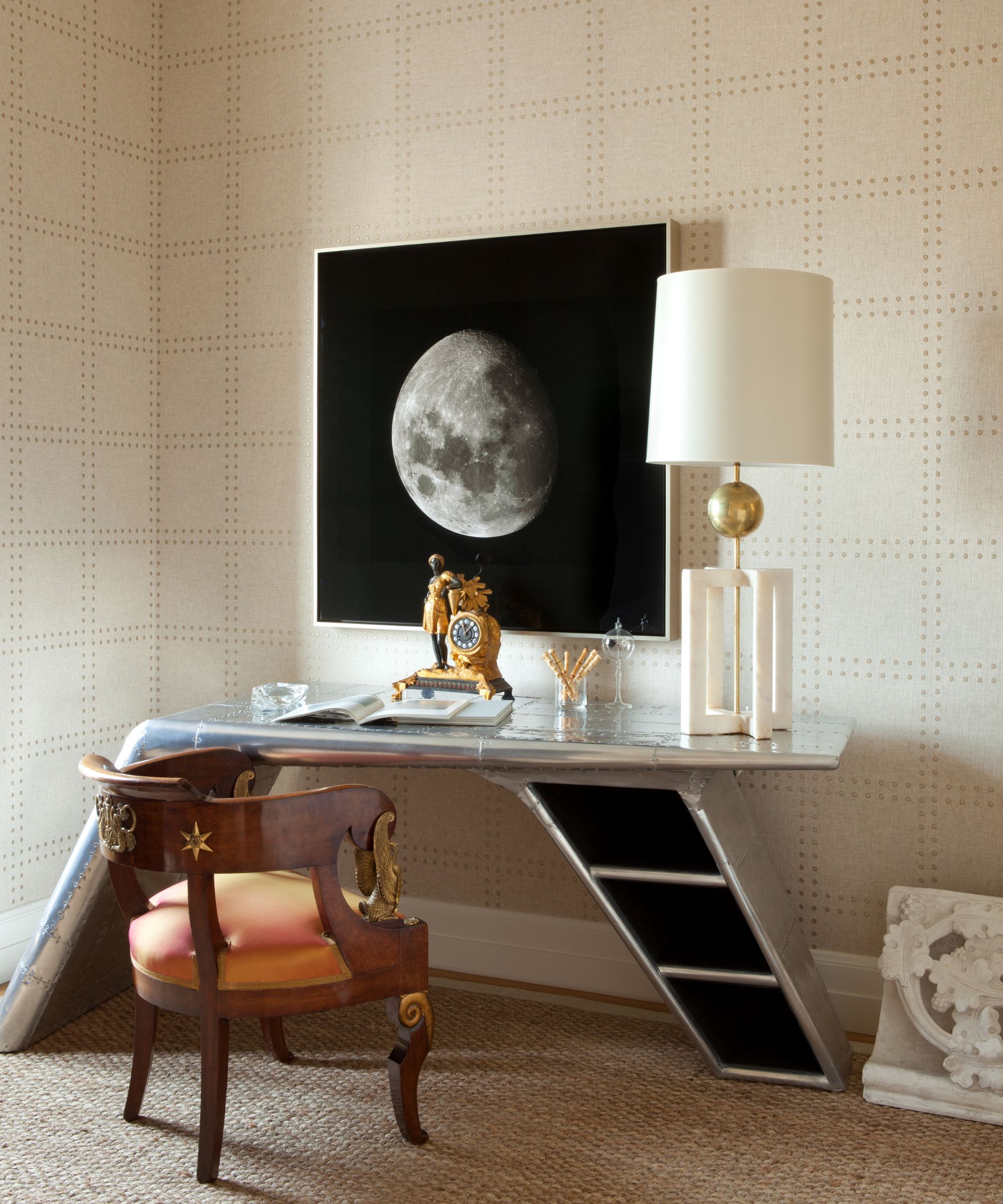
Contemporary and traditional styles merge in the designer's playful home office ideas.
'I call this the Master of the Universe office, from the Fritz Lang movie Metropolis,' says Benjamin. 'Rivet wallpaper from Phillip Jeffries brings a decidedly masculine mathematical grid to the space and provides a handsome background to the pieces. A desk from Restoration Hardware, based on an old airplane wing, brings in adventure, and a French antique desk chair makes it all Steam Punk. We reproduced a very old photograph of the moon and printed it on aluminum and you would think you were traveling in space. A mid-century table lamp is extra tall and the round ball repeats the moon imagery. A French horloge desk lamp completes the steam punk vibe of an office of the future.'
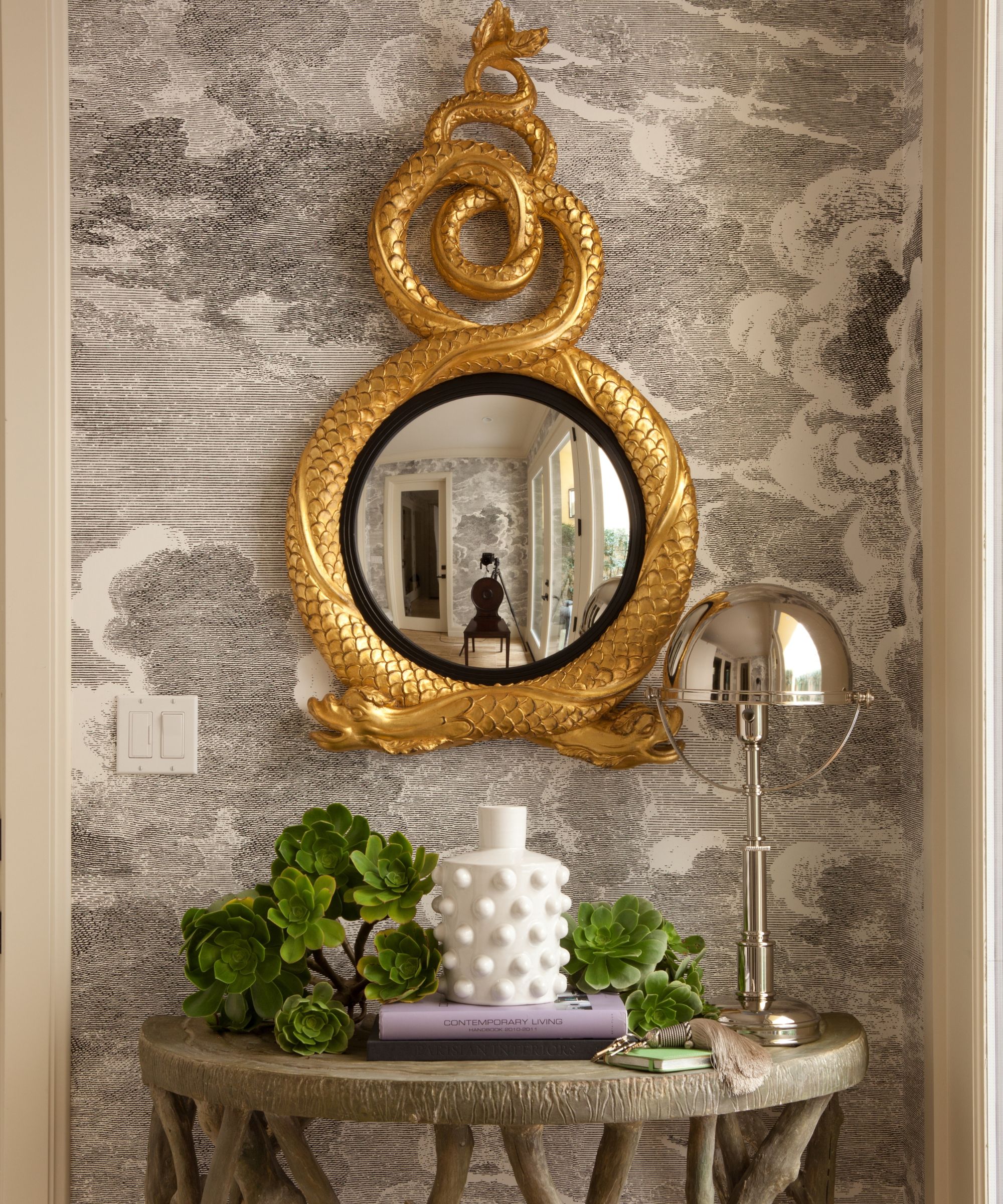
Among the entryway ideas creating a lasting first impression with a touch of sass, is a serpent mirror by Carvers Guild, Nuvole wallpaper from Cole & Son, and a new faux bois demilune console from Oly Studio.
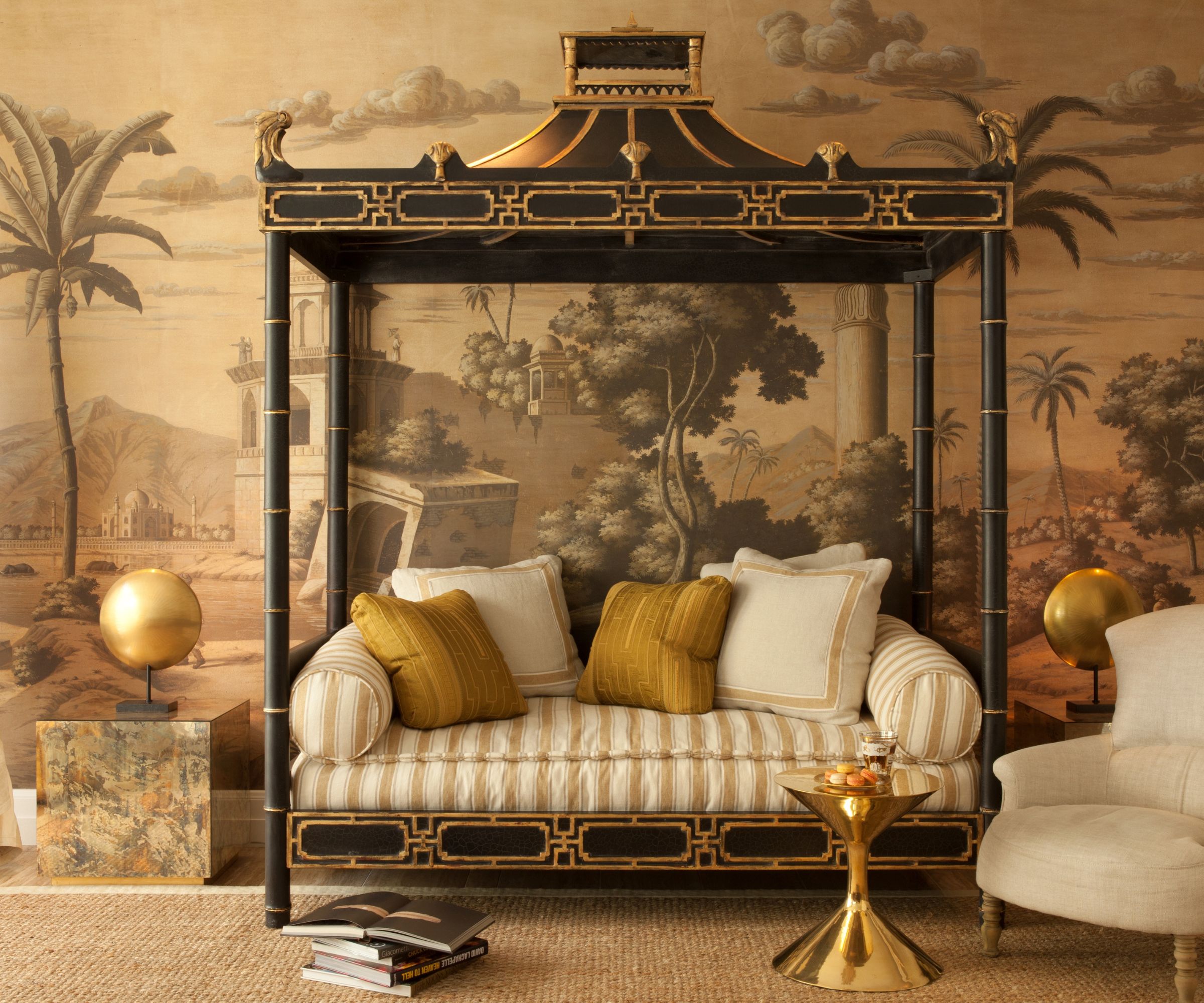
Up on the second floor is a second sitting room, a family room that can double up as an extra bedroom when needed. Here, the designer truly went to town with an Eastern-inspired theme featuring a de Gournay wallcovering and a chinoiserie daybed from Ceylon et Cie. Gold accents layer on the opulence.
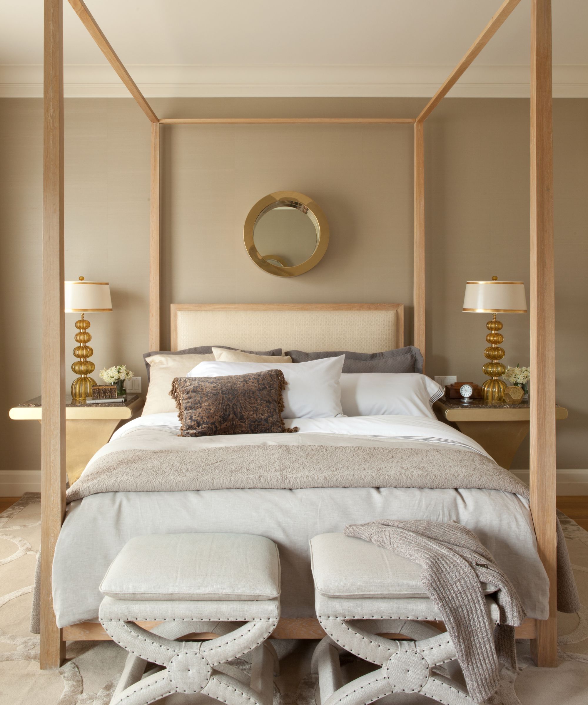
In contrast to the rest of the home, the main bedroom is a quieter space, but nonetheless luxurious. Designer Benjamin explains the thinking behind his bedroom ideas. 'This room is tailored and masculine. We designed an extra tall modern canopy with round brass mirrors by Curtis, a nod to a captain's cabin,' he says.
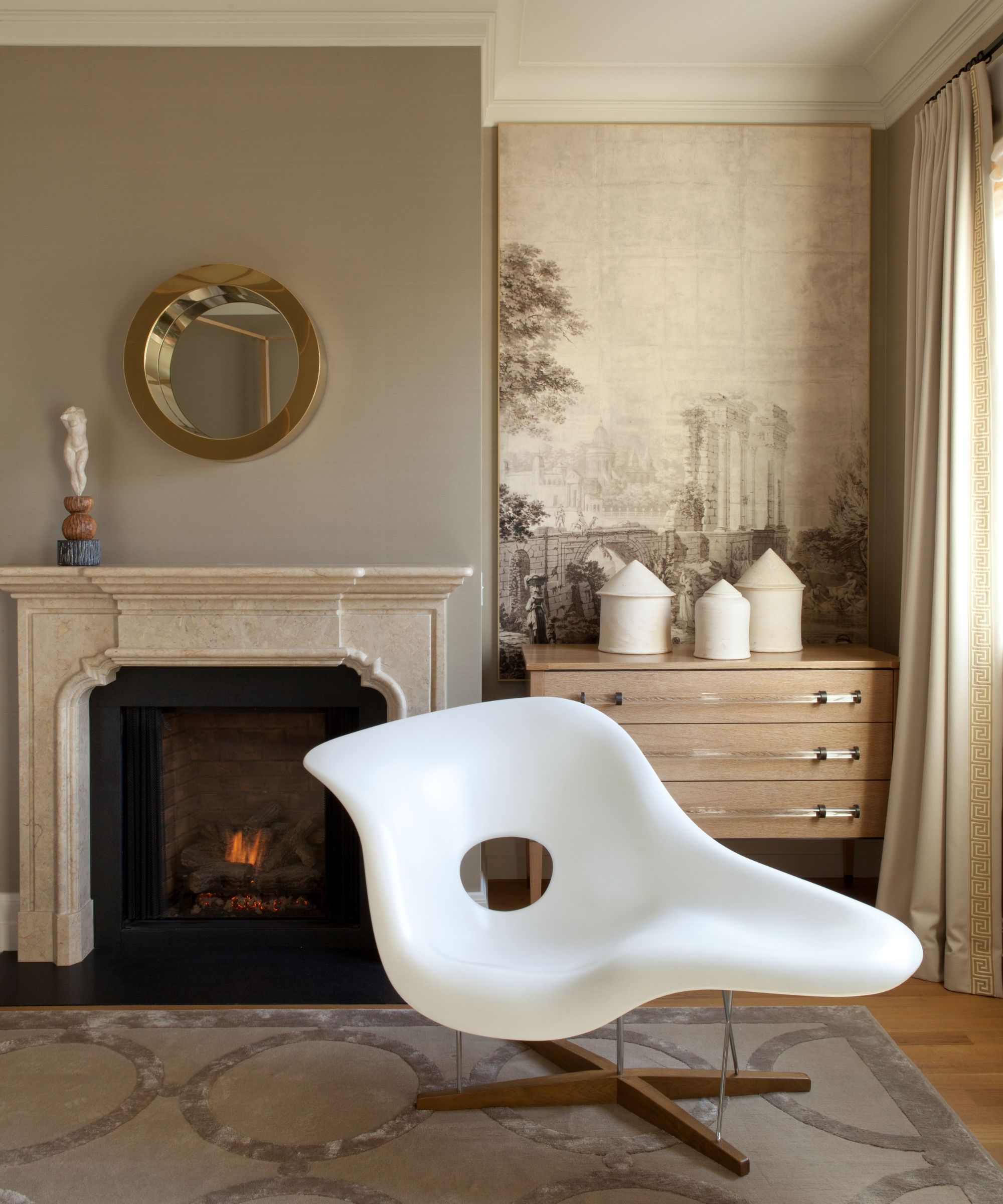
The cozy fireplace alcove is beautifully curated to reflect the transitional old and new style blend. 'La chaise by Eames is like a piece of sculpture in the room, while a modern version of a Louis XVI commode has been reinterpreted in oak with lucite pulls to create modern classicism,' says Benjamin. 'Draperies are plain but as they're wool sateen, they are quietly sumptuous. We did not want distracting pattern in here so a pair of grisaille panels provides the art and interest.'
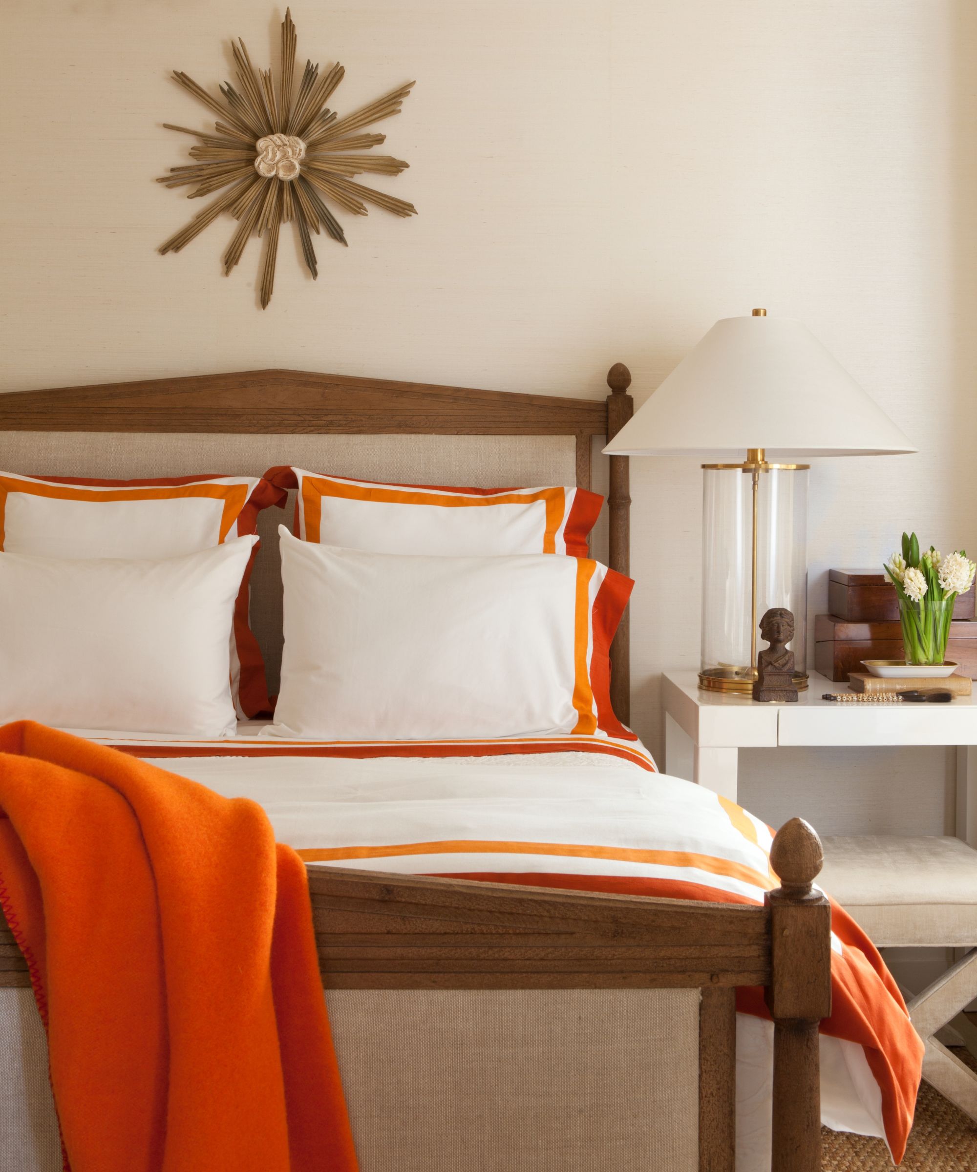
There's an unexpected pop of color in the guest room, which was one of the first spaces Benjamin redesigned. The bed is from Restoration Hardware and the lamp is by Visual Comfort.
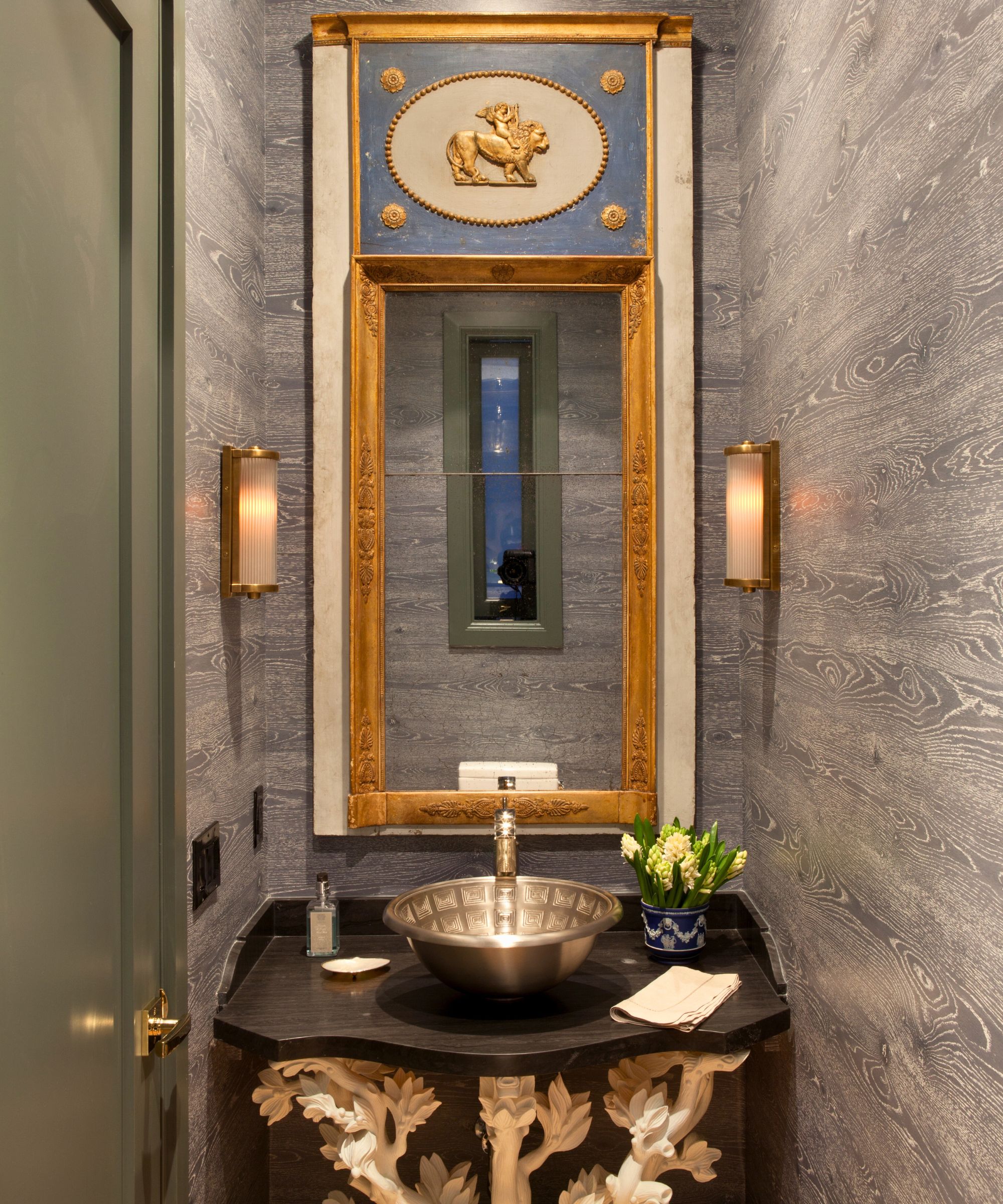
It's a small space, but there are plenty of lofty powder room ideas worth a steal in here. 'We started with a tree of life console which we turned into a vanity with a vessel sink based on the dome of the pantheon,' says Benjamin 'A directoire mirror above in blue brings a classical element, while the sconces add a1930s vibe. The dark blue faux bois wallpaper makes it a bit less formal.'
Interior design: Benjamin Dhong Interiors
Photography: Lisa Romerein
