In 2001, Martha Stewart introduced the 'Color it Black' theory to the world – and more than 23 years later, its power is yet to waver. The idea, which was first penned in an issue of Martha Stewart Living, is the act of painting mismatched furniture in a single color for a unified look – in this case, black.
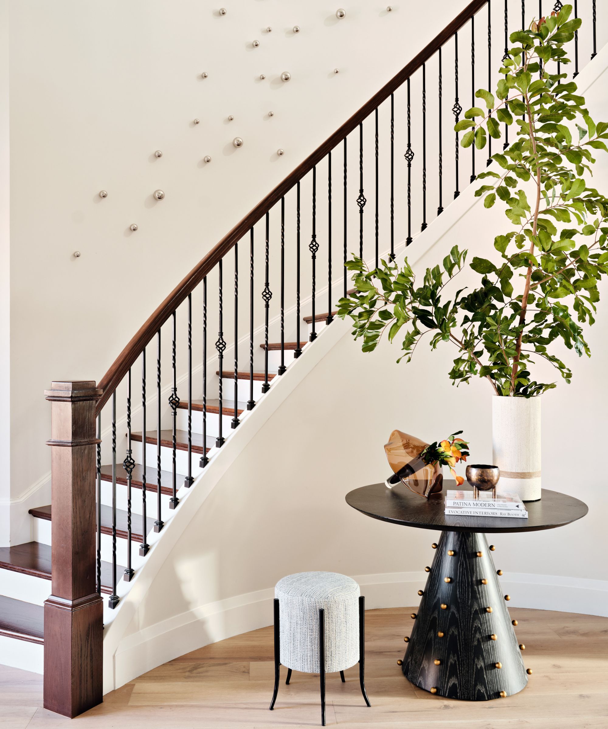
.When designing her Turkey Hill Road guest house (above the garages and studio kitchen), Stewart introduced the 'Color it Black' in abundance. She introduced black via the furniture, window treatments, hardware, and other accessories that, together, created a streamlined, contrasting aesthetic that looks just as good now as it did that fall.
According to 'Martha's Moments' (an Instagram account that pays homage to archival photos from Stewart's life), the home was already light and open, but Stewart painted the walls a cream-colored walls (with a putty-tone trim) – a decision that allowed the black accents to stand out further.
While decorating with black can come with its challenges (considering this hue is so powerful), Stewart's theory makes things simple. The secret is in how you unify your furniture pieces so they feel coordinated – while a lighter base is always a failsafe way to go.
Shop the look

Classic and streamlined, this console table lends a modern coastal feel to your entryway or living room. It's one of the closest matches we could find to the one in Stewart's guesthouse above (and, of course, it comes in a rich black hue).

Made from high-quality cast iron material with a lacquered process, this candle holder is rust-proof and ultra-long-lasting. It's a similar alternative to the one we spotted atop Stewart's console and looks great in a set of three, just as she demonstrates.

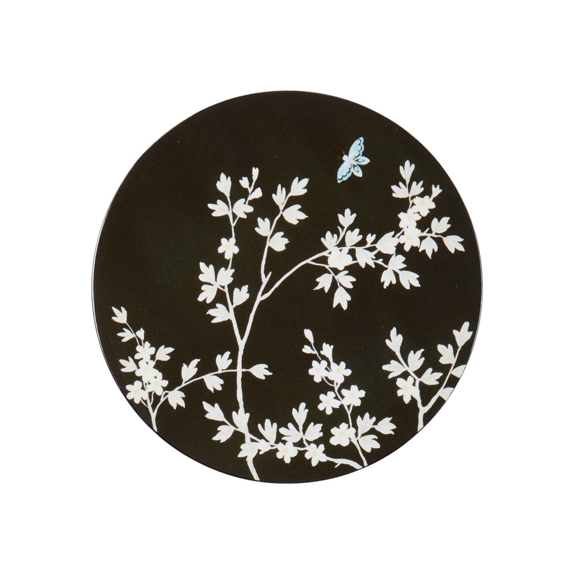
This black ornate coaster results from Addison Ross's original Chinoiserie collection with celebrity-favorite designer Martyn Lawrence Bullard. It's the perfect way to introduce black in a space where you might want to start with small pockets (but we're sure you'll move to painting your furniture soon after that).

The black hooks seen in Turkey Hill just got even more accessible. With ten triple hooks, this wall-mounted coat rack has space for whatever you want to hang in your entryway. However, we confess these black accents are almost too good-looking to cover up with coasts or umbrellas.

We admit, this isn't black, but it is still inspired by Stewart's space. The traditional, ornate-style frame gives any artwork a vintage feel, and it looks perfect when paired alongside black-painted furniture, just as the design guru has done.

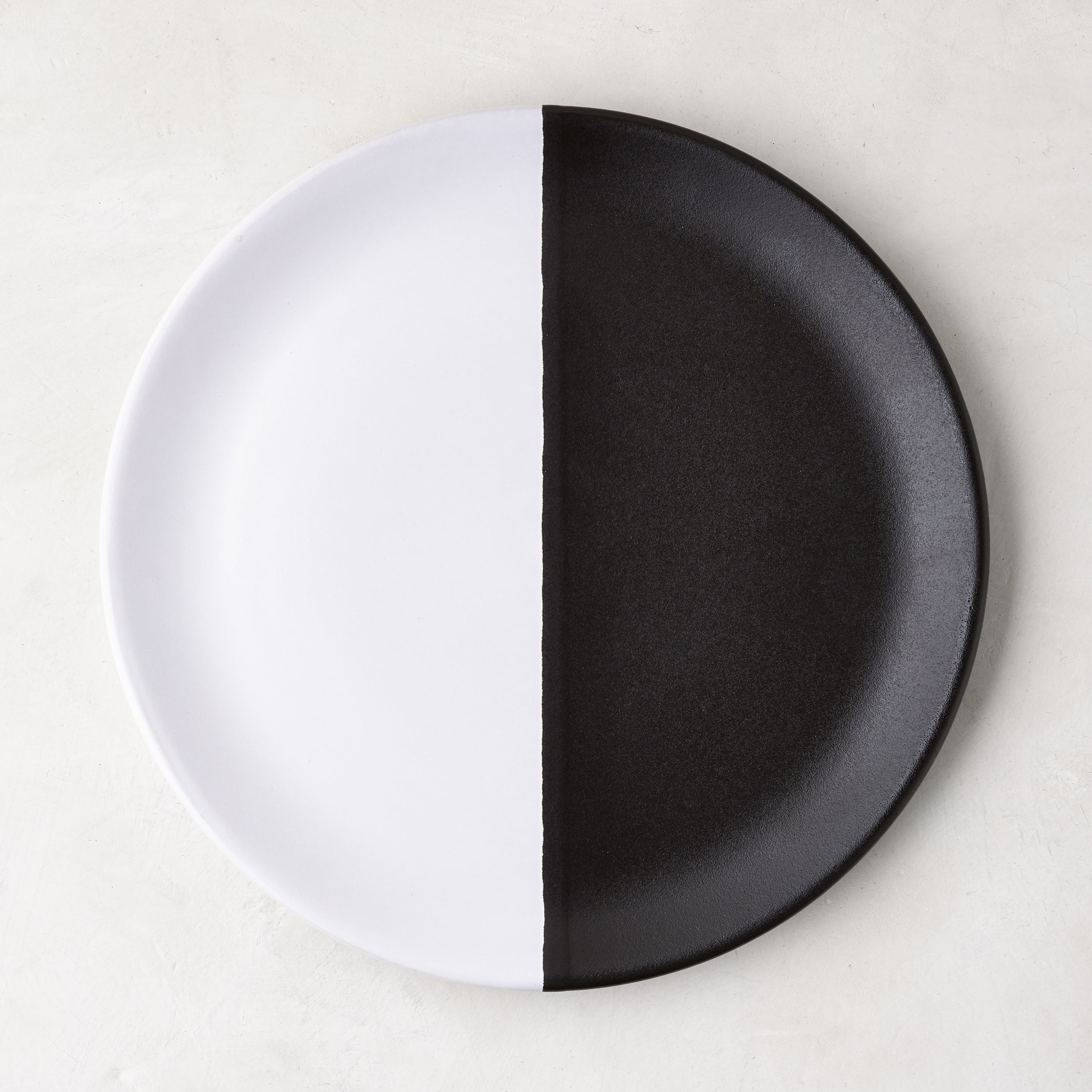
What happens if you take the black and white plate in Stewart's Turkey Hill home but then make the contrast even bolder? You're left with a statement piece such as this. It looks perfect on any console or coffee table but is just as impactful as part of a dinner party tablescape.
Considering Stewart is responsible for the theory, we do not need any convincing to follow suit. It's unsurprising, therefore, that top designers agree with the concept.
'Adding a black accent to a room - whether it’s a piece of furniture or artwork - can instantly ground the space and make it feel more balanced. It creates depth and contrast while also adding a touch of sophistication,' comments Jethro Huie, the founder and principal architectural designer at Huie Designs.
'Black works especially well to highlight textures or to bring out the character of lighter tones around it. Even in small doses, it draws the eye and gives the design a timeless, modern edge.'

Claire Garner, the director of Claire Garner Design Studio, agrees – emphasizing further how the surrounding color is important in allowing the black accents to pop.
Black acts as a grounding element in interior design, creating a visual anchor that helps define the space and prevent it from feeling too soft or washed out. Even subtle touches, such as a piece of artwork, a lamp, or a piece of furniture, can draw the eye and add a crisp, modern edge to the design. Black accents also emphasize surrounding colors and textures, making them appear more vivid.


