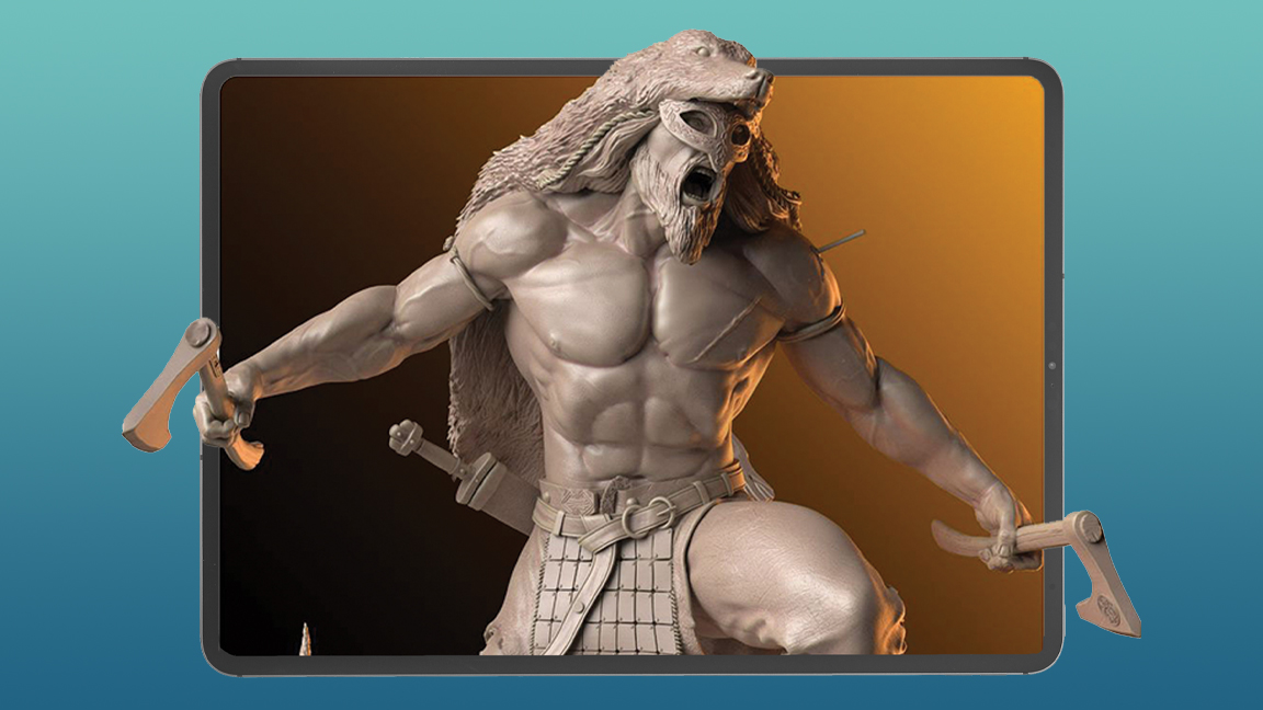
ZBrush for iPad is here, largely because Apple finally caught up with what 3D modellers need. According to Paul Gaboury, the ZBrush lead 3D application engineer for Pixologic, the new series of M-chip iPads, stacks of RAM and one terabyte (TB) of storage, has meant ZBrush artists can finally sculpt massive 90 million polygon models while sat on the train (or sofa). Read our ZBrush for iPad review to get our verdict, but below Paul explains how the team at Pixologic managed to get ZBrush onto the iPad.
“This is a very big project,” reflects Paul as we sit down to chat about bringing ZBrush to iPad. “This was not something that was easy, you've got 20-plus years of code that has been built for a desktop, and now we’re trying to port that over onto an iPad… this is a very monumental, huge task.”
He adds: “We couldn't just take ZBrush and throw it on the iPad, so it's almost like we had to start from scratch. Then the difficult part was, but we still have 25 years of code and users, and how do we integrate this? It felt like, honestly, there were times where I was with the team and it felt like we're making a new app. Honestly, like we're starting from scratch, almost because of the stuff that the team came up with.”
That task has meant redefining the ZBrush UI, refining the brush system and implementing new touch and gesture controls. The goal has been to bring the desktop version of ZBrush to iPad but make use of every advantage the tablet has, including the stylus; it’s possible to customise the Apple Pencil double tap or Pencil Pro squeeze to handle framing a mesh or turning on PolyGroup. In many ways, as our ZBrush for iPad review showed when Glen Souther tested the app, this version of ZBrush is redlining how sculpting should work, just as Pixologic did 20 years ago.

When the team began building ZBrush for iPad, Paul says “there were a lot of discoveries, a lot of design, a lot of thought going through how can we take advantage of the touch, what are the things we can do with the device itself, the iPad,” which informed the idea of “embracing the pencil… Let's embrace the ability to have touch and gestures and allow for things that you can't do on a desktop version”.
A big note on the white board was consistency. The team didn’t want to break ZBrush and force desktop users to rethink how the software they love works now, but replicated the same ZBrush experience, the same tools, workflow and brushes but on an iPad. So while the launch ZBrush for iPad “doesn’t have every single feature” it does have the core tools and the familiar ZBrush way of doing things. In recent weeks the team has even implemented a customised UI, a must for anyone who uses the desktop version.
“As we continue to develop and to continue to grow, we'll be adding some of the features that we weren't able to get in the initial release,” explains Paul. “And then from this point on, anytime we're doing new features, it's going to go into both platforms. It's going to go into our iPad and into our desktop.”
This synergy between the two apps, desktop and iPad is vital, reveals Paul. While current desktop users will likely pick up ZBrush for iPad to expand their workflow, many new artists are going to be drawn to the app on iPad, and will discover 3D modelling through this new release, and then onto the desktop version.
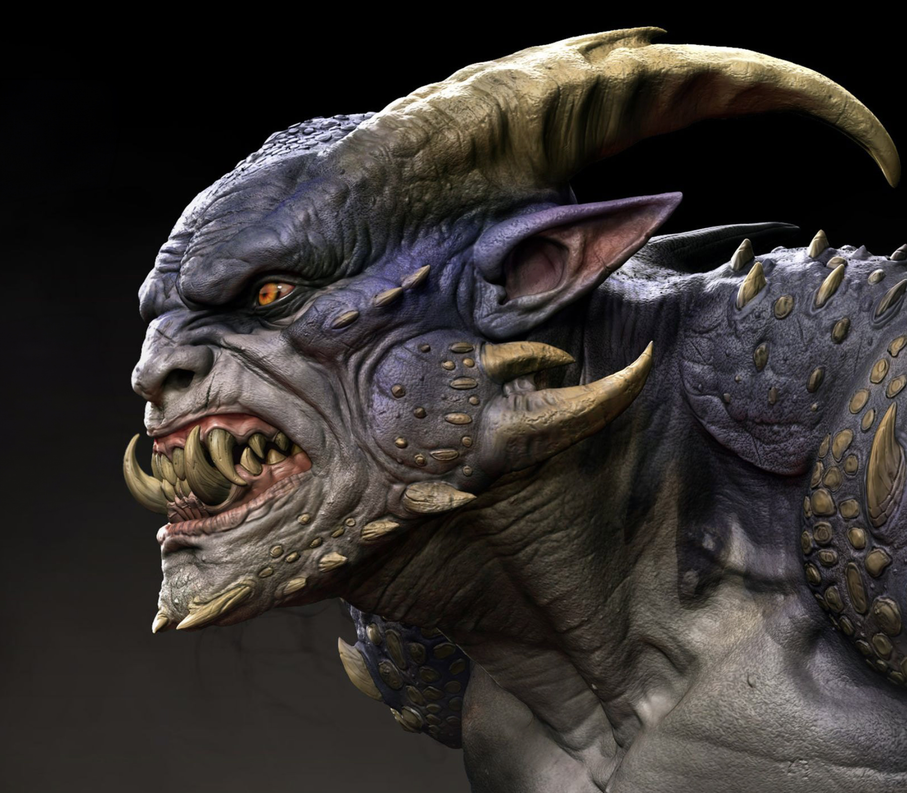
It took the team months to figure out the balance between the two apps and how the UI works on iPad. “I think we've really landed it,” brags Paul. Having used ZBrush for iPad myself in beta I tend to agree. The UI is simple with quick access to core tools and features; the sculpt can be spun and manipulated, and menu of ‘quick start’ ZSpheres, premade shapes, enable newcomers, like myself, the ability to get up and running.The ability to use long presses to fund new brushes is great too.
“Really that’s the goal for ZBrush, it's always a goal for ZBrush, even on the desktop,” says Paul as we discuss the ease and accessibility of the iPad release. “As an artist, I don't want to live in the UI. I don't want to be clicking buttons and sliders. That's not what I want to do. I want to make it, like, I am literally right now holding a ball of clay and just doing this [he squeezes and pinches imaginary clay]. That's my goal, right? So that's also the goal that we were really pushing for with ZBrush, for iPad.”
On iPad this becomes a reality. Zbrush for iPad takes advantage of Apple Pencil and finger gestures to speed up the process of sculpting. The UI is streamlined and simpler to navigate. But Paul highlights the new brush selection process and menus as something he’s most proud of; on desktop selecting a new brush pings open a menu and hundreds of new brushes are deployed into the viewer, like something out of The Matrix. (ZBrush itself has tens of thousands of brushes.) On iPad brushes are in folders and categorised, there’s even a Favourites folder and a Recents folder as well as folders set by use.
Brushes can also be added to the swipe bar at the bottom of the UI and customised. Paul explains: “Customisation is one of our pillars, and one of the things is a bottom bar. Artists are going to be able to put whatever brushes they want down there; materials, textures, alphas that they regularly use. You can swipe through multiples of them, so we have five total. So for example, for me, I would make one tab called Organic Brushes, and then swipe for Hard Surface Brushes.”
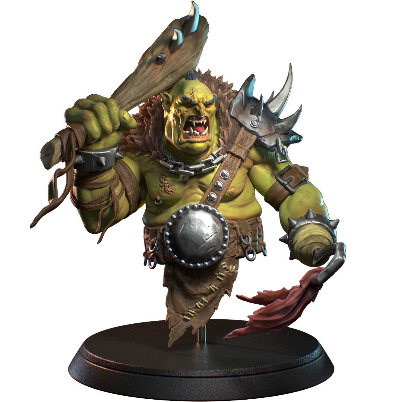
The team has even found time to improve on ZBrush, adding in new features iPad has made possible. For example, when zooming into a sculpt you can now rotate at the same time, something not possible with the desktop version. This can affect how an artist can brush across a sculpt in a more dynamic way, and coupled with using Apple Pencil to directly connect a sculpt, it can feel more intuitive. “That kind of thing elevates, I think, the way you can work and how much faster you can do things within ZBrush for iPad,” comments Paul.
After using ZBrush for iPad I can see how this accessibility could draw in new artists, and ZBrush has always been the app 2D artists have been inclined to try out; you simply launch a sphere of polygonal clay and start pulling and pushing it. On iPad even more 2D artists could give it a go, and there’s even scope to ape the success of Procreate.
Paul says, when using ZBrush, “You don't have to know what the heck a polygon is, what a vertex point is, what the heck are UVs. ZBrush has always been ‘okay, I get it, I can just grab this brush and this move makes sense, grab this brush, do this’.”
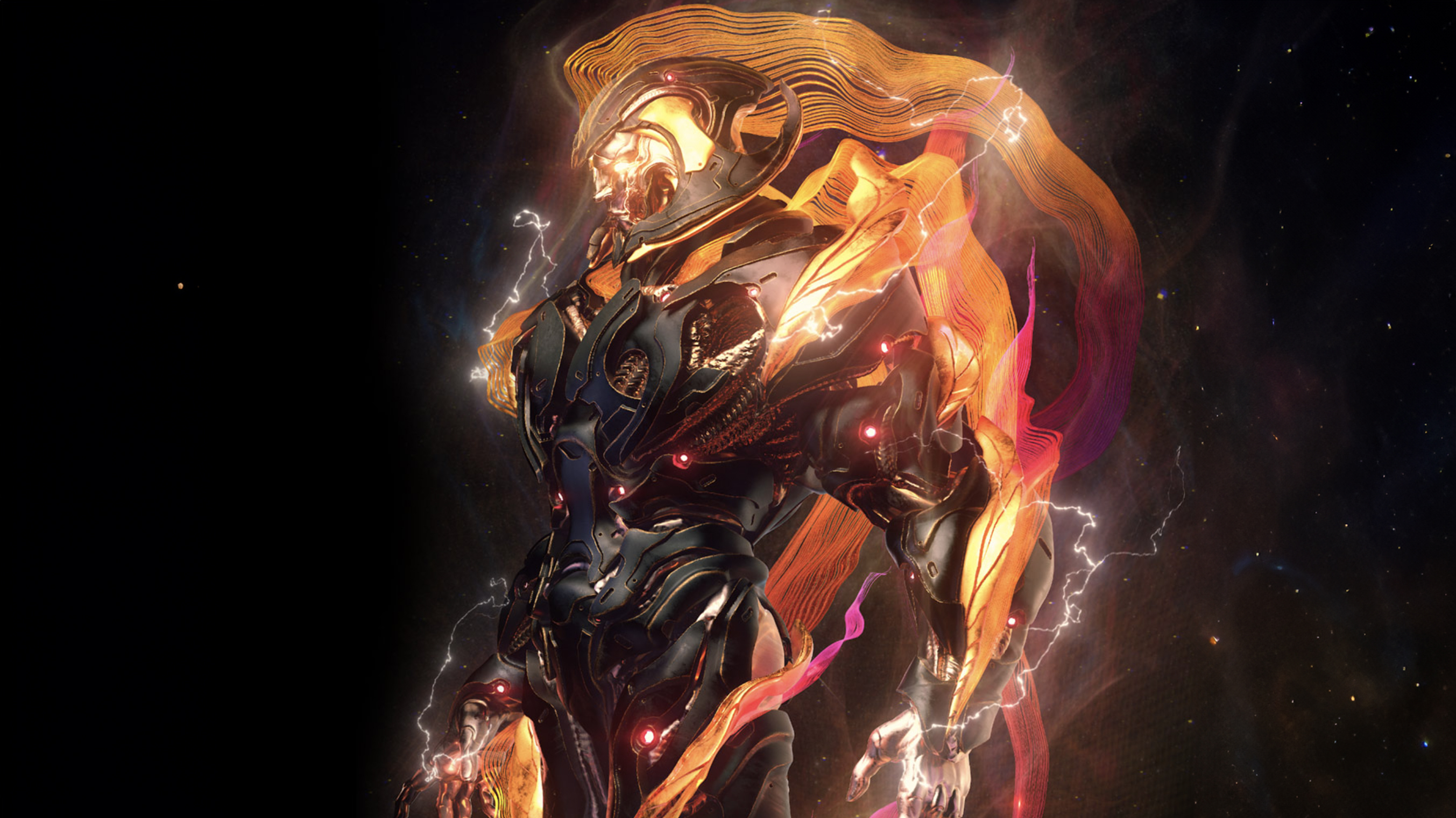
The iPad version is streamlined, there’s no 2.5D canvas, for example, which was a decision the team made early on to bring in new users, and was based on feedback from ZBrush Core and ZBrush Mini. “We saw that it was easier for users to get engaged, get involved, get happier moments quicker, where they have ‘AHA moments’ and they just want to keep creating.”
This is just the start, too. There are things in ZBrush for iPad that desktop users will miss, for example there’s no render engine to get realistic lighting, but the initial goal of recreating ZBrush on iPad, to make use of gesture and touch controls, to streamline and finisesse, and even improve on areas of this legacy 3D modelling tool, has been met and then some. Our reviewer called it “historic”. And Pixologic’s Paul Gaboury is clear there’s more to come, saying: “What we've come up with as a group to streamline creating art on an iPad, I think, is very exciting, and we're only just beginning.”
ZBrush for iPad is available now in the App Store, visit the ZBrush for iPad website for more information. Or read our ZBrush for iPad explainer for all you need to know.


