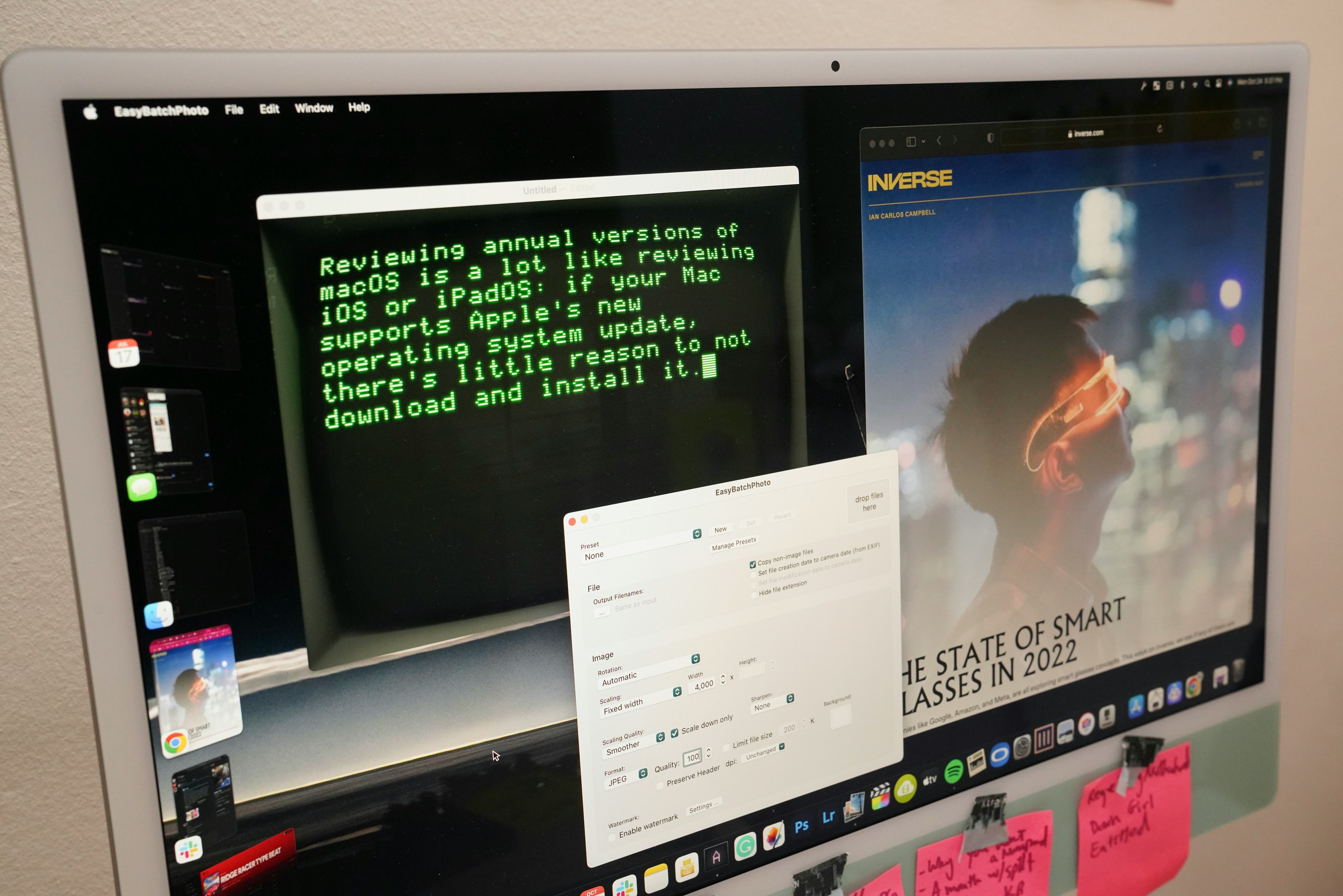
Reviewing annual versions of macOS is a lot like reviewing iOS or iPadOS: if your Mac supports Apple's new operating system update, there's almost no reason to not download and install it.
The only two reasons I can think of to not update a supported Mac to macOS Ventura are: 1) you have specific apps that could break or 2) you're worried your older Mac will become sluggish. Otherwise, macOS Ventura is free and there are more features to like than dislike.
macOS Ventura is not a visual overhaul. That came in 2020's macOS Big Sur. At times it feels like maybe Apple should take macOS off the annual update cycle. But new updates help sell Macs and add just enough features to keep existing Mac users from going to Windows. Not everyone will appreciate every new feature, but as always, there's a little bit of something for everyone.
The best of macOS Ventura
4. Passkeys replace logins and passwords
Existing login and password systems are terrible because they’re difficult to manage and so prone to hacking. And while two-factor authentication (2FA) adds more security, it's also extremely inconvenient. For 2FA, you need to use an authentication app or get a code sent to your phone. Like I said: it's a hassle.

macOS Ventura is a major step toward eliminating passwords, 2FA, and password managers thanks to passkeys, a way to securely log into online and app accounts using Touch ID or Face ID. I made a passkey for my eBay account and now logging into it is a finger press on my MacBook Pro's Touch ID button. If you don't have a Mac with a Touch ID keyboard, you can still use passkeys — it works with external security keys like a YubiKey or you can use your phone (even an Android) to scan a QR code and then login through a matched key that's synced to your iCloud account.
TL;DR: passkeys are awesome. They're not an Apple-exclusive feature and other companies such as Microsoft and Google are throwing their weight behind it.
3. Unsend and schedule emails in Mail
I was a Mail user on Mac for many years, but then I stopped because the features I needed, like unsending and scheduling an email for my Gmail accounts, were only available through a browser. These two features didn't leave a strong impression on me when I used the macOS Ventura betas during the summer, but they've made me switch back to Mail. I'm once again a Mail app guy, and it feels great because the new Gmail layout is a disaster in my opinion.
Oh, and search in Mail no longer sucks. For big, bloated inboxes, Mail is able to parse through them with greater confidence. On my M1 iMac, searching an inbox didn't take as long as it did in macOS Monterey.
2. Use an iPhone as a wireless webcam
Apps like Camo were first to turn your iPhone into a high-quality webcam, so it was only inevitable that Apple would bake the feature right into macOS. And that's exactly what Apple did with Continuity Camera in macOS Ventura.


So long as your iPhone (iPhone XR or later) is running iOS 16, you can turn it into a wireless webcam. Just fire up FaceTime or Zoom and select your iPhone as the camera. The only downside is draining your iPhone's battery, but if you have it plugged into your Mac or a battery pack, you're good to go. Using your iPhone as a webcam beats buying a separate high-res one like the Opal C1.
1. FaceTime across Apple devices
Whoever at Apple suggested "Wouldn't it be great to be able to transfer FaceTime calls between Macs and iOS devices" as a macOS Ventura feature deserves a raise. Anybody who uses FaceTime knows what a pain it is to start a FaceTime on one Apple device and then have to hang up and restart it from another. The new FaceTime Handoff works seamlessly and is such a no-brainer.
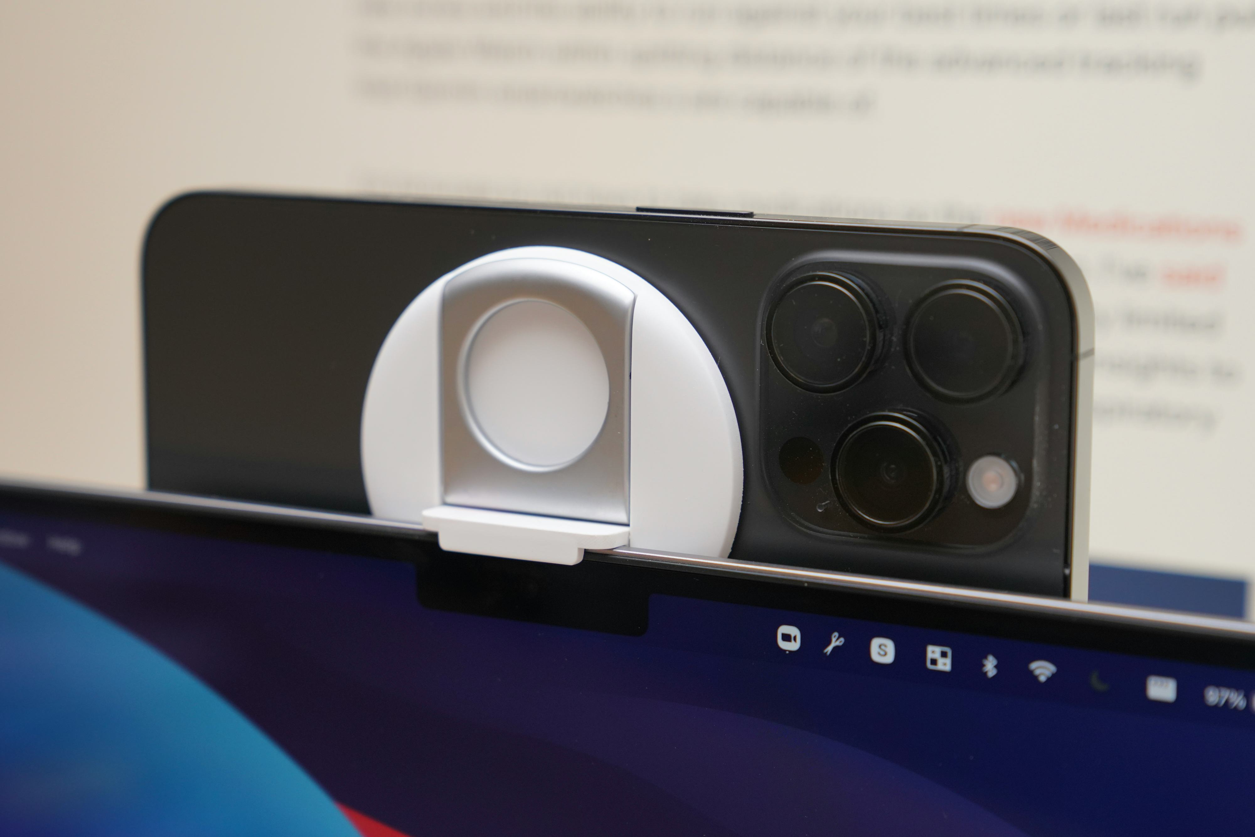
The Belkin iPhone MagSafe ($30) mount for MacBooks is pretty neat, too. It has a piece that pops out to clip onto the top of a MacBook; the magnet is relatively strong. The mount also doubles as a kickstand for propping up your iPhone (great for YouTube videos) and has a metal ring so that you can keep your iPhone firmly in your grip. My only complaint is that the mount doesn't work on monitors. Belkin is supposedly releasing a mount for displays like Apple’s Studio Display (a great 5K display with a really bad built-in webcam).
The worst of macOS Ventura
4. What is going on with System Settings?
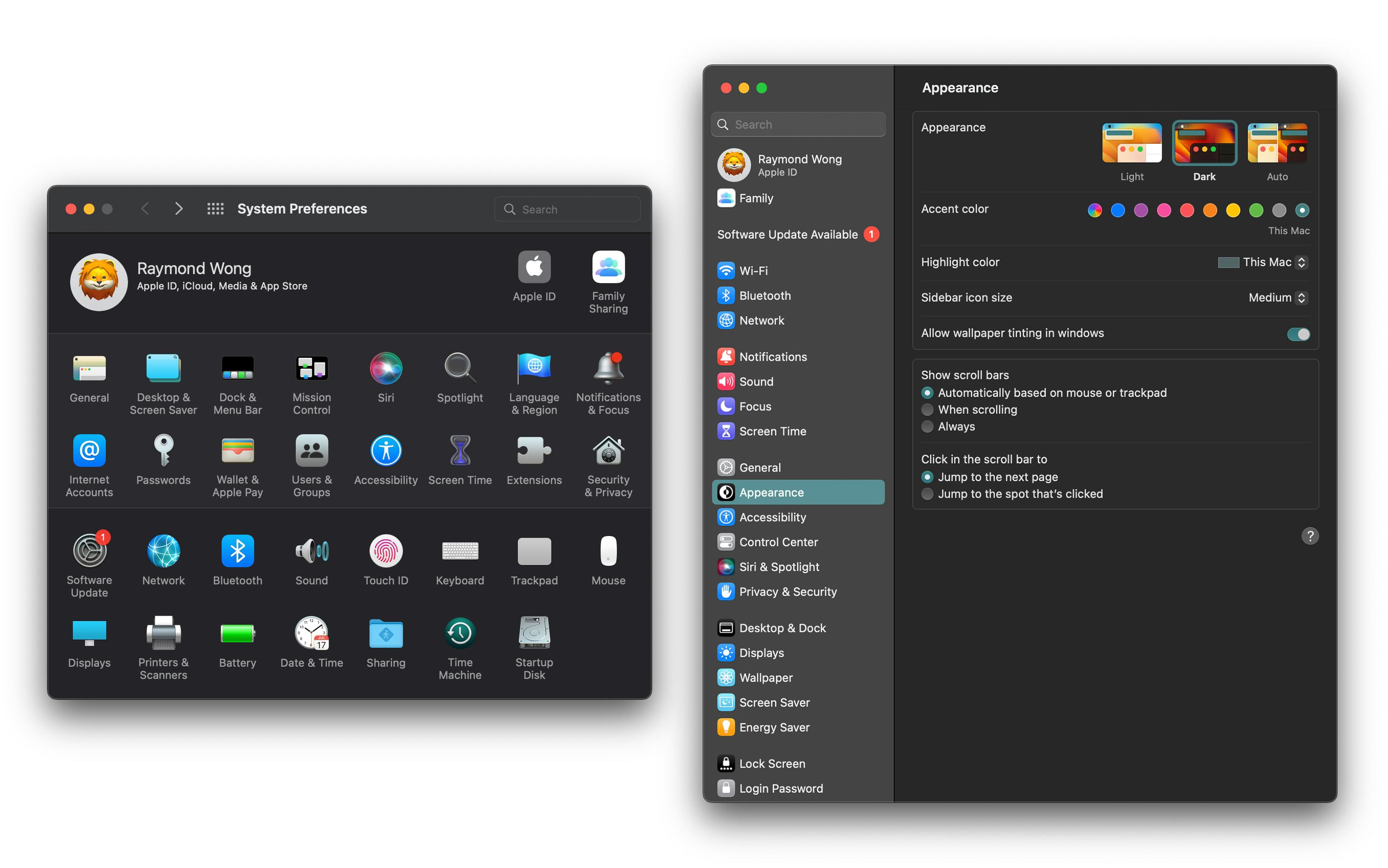
Ask any veteran Mac user and they'll tell you about their love-hate relationship with System Preferences. In macOS Ventura, Apple renamed the app "System Settings" to mirror the Settings app in iOS and iPadOS. While a good idea, the execution was not. For some inexplicable reason, Apple ditched the row of icons for a scrolling list, which is not harder to navigate, but as some have pointed out, there are UI inconsistencies everywhere. System Settings is not a good app; it doesn't look or work like a native Mac app.
3. Stage Manager is weird
Stage Manager is a buggy, confusing, and disjointed experience in iPadOS 16.1, and honestly not much better in macOS Ventura.
Apple touts Stage Manager as a new way to manage workspaces and apps. The problem is that the mode — and it is a mode that you activate in Control Center — isn't a good way to juggle apps. Just like in iPadOS 16.1, Stage Manager wrangles apps into groups, which some people have jokingly called "piles," located to the left of your desktop. Click on each group and it'll open up a pile of app windows. This is supposed to help with grouping apps together (i.e. Chrome and Notes) so that you can better manage windows.
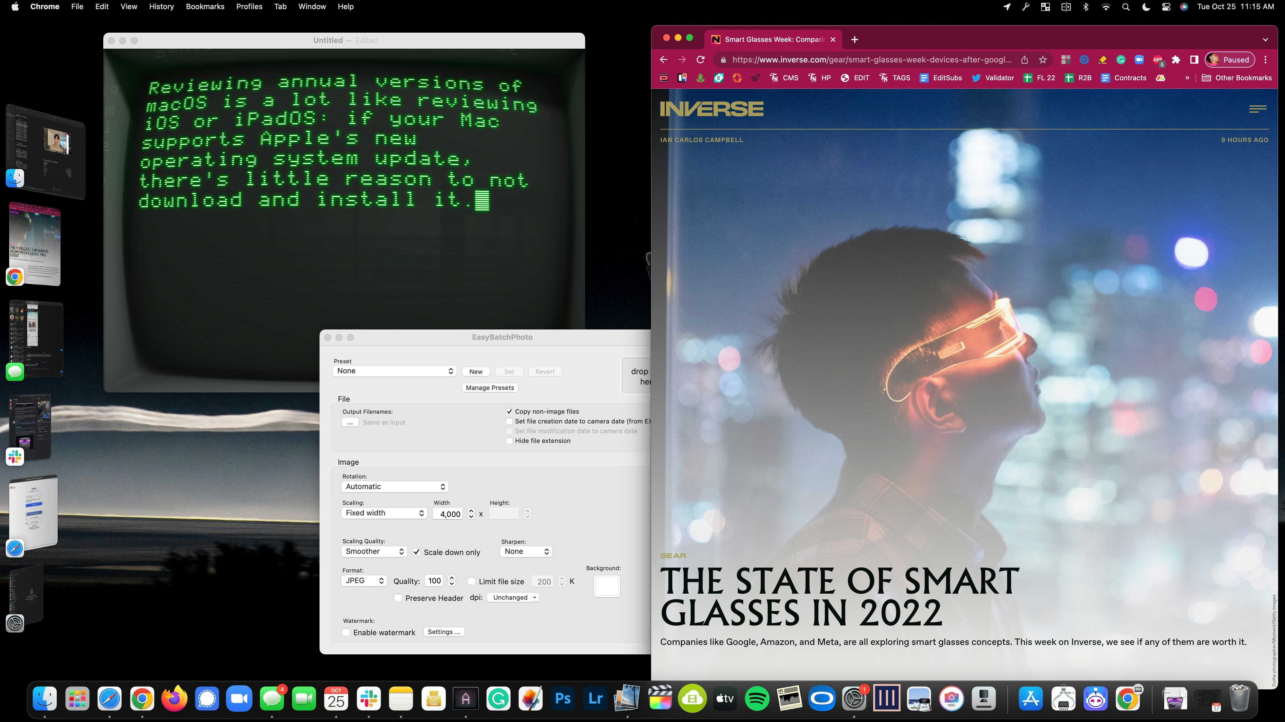
Apple is clearly going for parity with iPadOS 16.1, but I found Stage Manager more confusing than helpful. My biggest gripe with Stage Manager is that you can't access your desktop from an open group of apps — the mode doesn't feel connected to the rest of macOS at all. Stage Manager resembles a focus mode more than it does a new multitasking paradigm in macOS.
Fortunately, as a mode, you don't need to use Stage Manager at all, which is what I've been doing. I never turn it on, and it's as if the mode doesn't exist. I agree that managing workspaces and apps with macOS's Mission Control and Spaces could be made simpler, especially for new Mac users, but Stage Manager isn't the solution in its current state. I'm sticking to using Command + Tab to hop between open apps, and gestures on a trackpad and keyboard shortcuts for opening Mission Control and moving between virtual desktops.
2. Desk View is a gimmick
In Apple's brightly lit demo rooms, Desk View, which uses an iPhone with an ultrawide lens to create a top-down camera shot, is impressive. At home or in an office where the lighting is often softer or unadjustable, Desk View falls apart with its low resolution and noisy image.
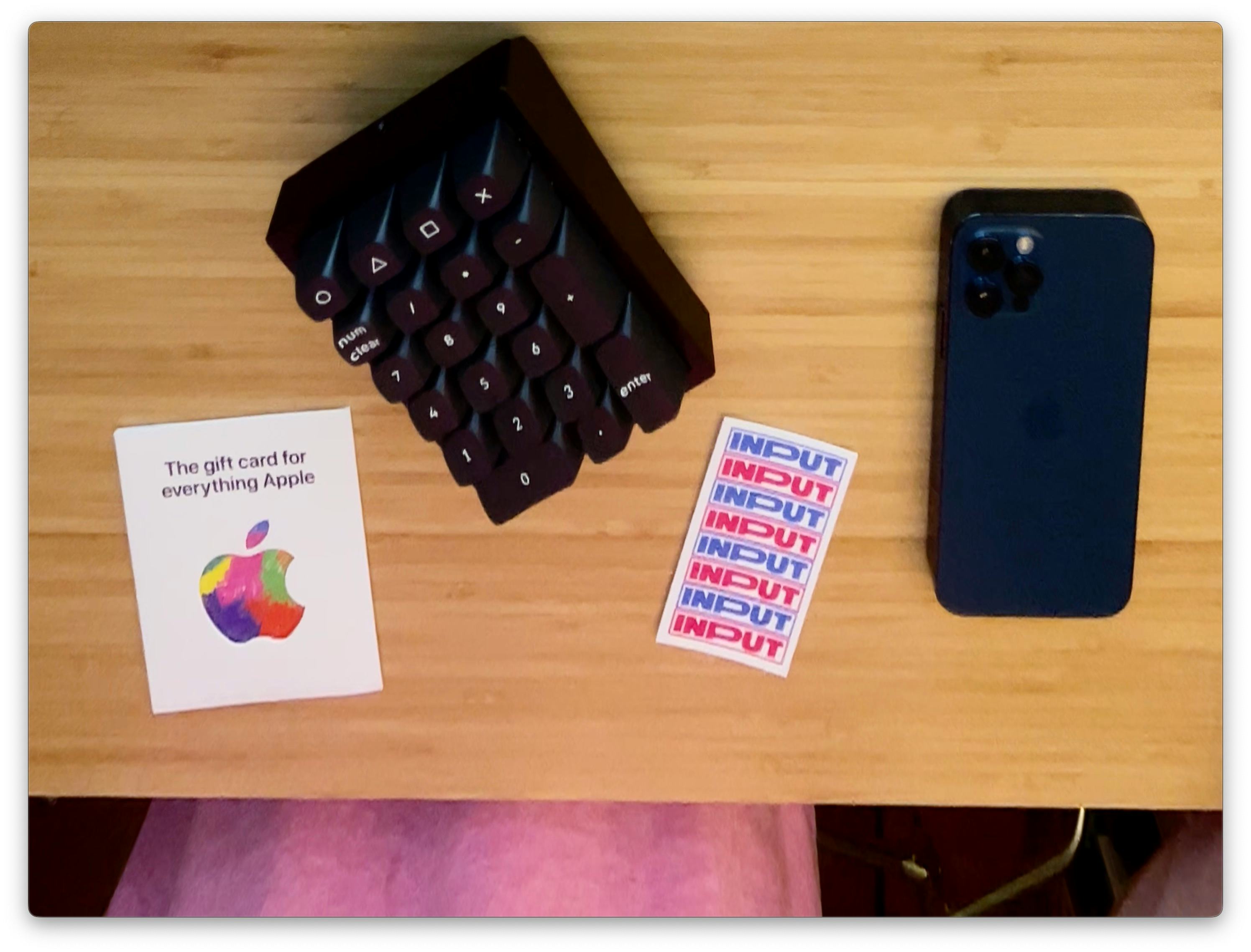
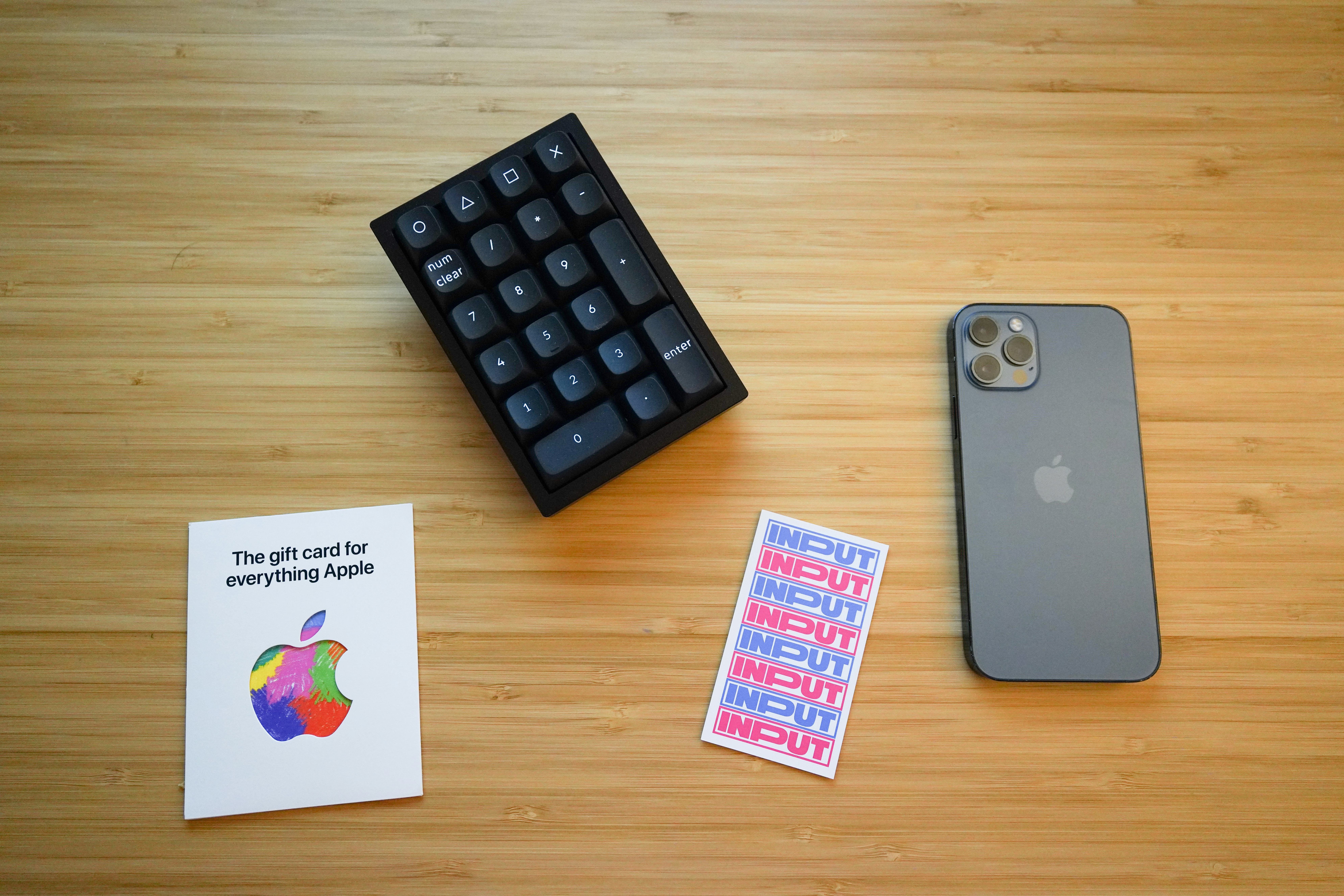
The feature deskews the ultrawide lens so that it appears like an overhead view. In reality, the de-morphing makes it all but impossible to display anything that isn't flat like paper. Any objects with depth will look like they have been stretched incorrectly. Kudos to Apple for improving the initial setup experience with virtual guidelines for where on your desk the ultrawide will be covering with a top-down view. But the overall experience could use more work.
I also haven't been able to get Desk View to work smoothly every time; my iPhone 13 Pro Max with iOS 16 has no lag, but my iPhone 14 Pro is often unusable for some reason (I tried again with the just-released iOS 16.1 and the bugginess persists).
1. Doesn't support Macs released before 2017
How many years of software updates should a Mac support? It's not an easy question to answer because, especially when new features can run slower on older machines or require new hardware. It's even tougher when a new operating system update is released for hardware on different types of architecture — Macs that support macOS Ventura are split between Intel's x86 and Apple's Arm-based custom silicon.
Five years is the rough average for when computers start to kick the bucket so Apple isn't way off base with its list of supported Macs. However, it's somewhat disappointing to hear that a 2016 Mac is essentially considered old.


