
Adaptability is a key trait in the modern designer, who often has to tackle design, illustration, UI, animation and more. Some take to these new horizons like a duck to water, while others are more hesitant or simply cannot afford the expanding roster of expensive software needed. It's for these people that Linearity Move exists. First released in 2017, it serves as a stopgap between inadequate free animation software and hard hitters like After Effects or Cinema4D.
Linearity Move: Interface
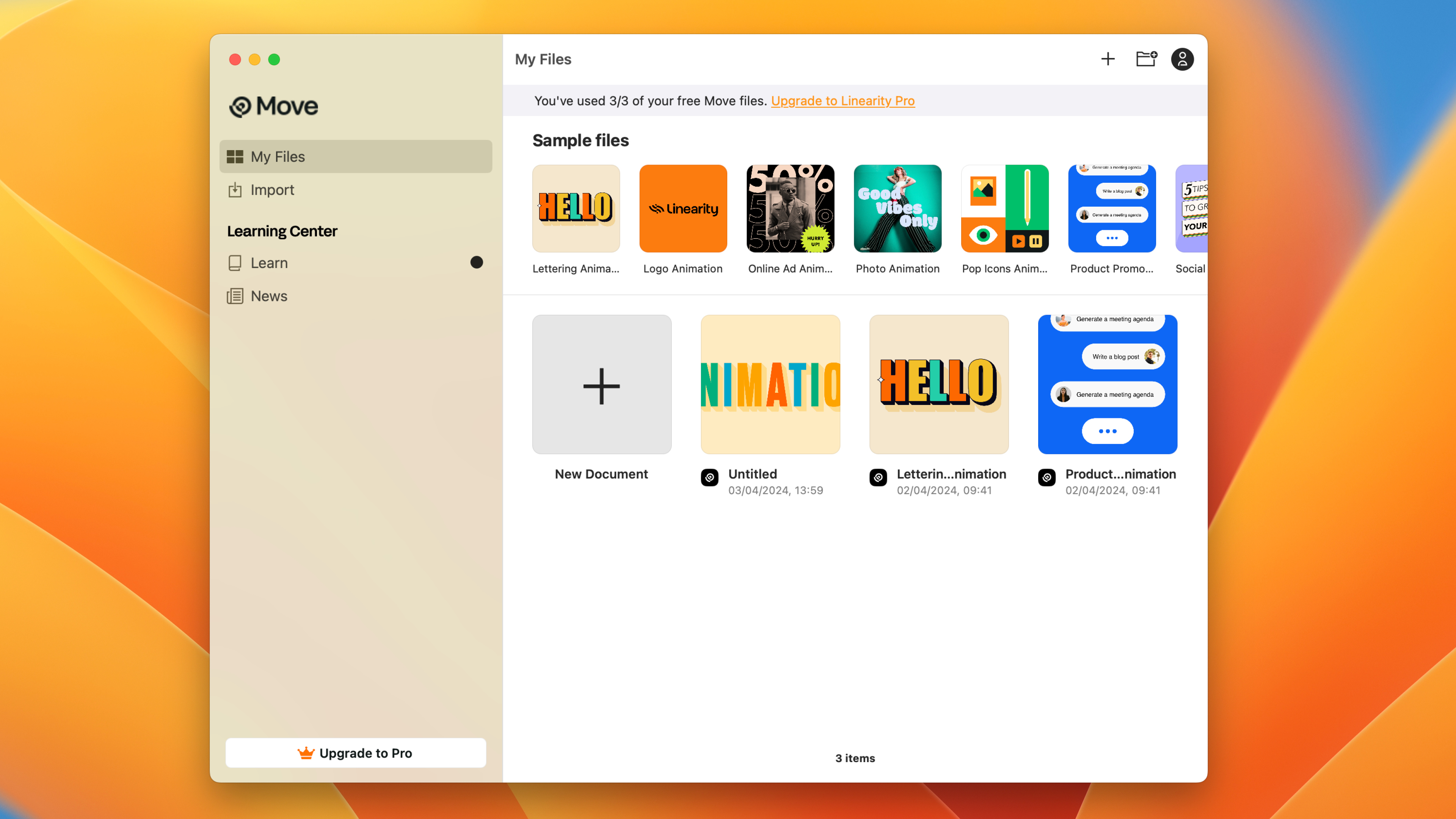
Linearity Move has been designed to suit beginners to animation, presenting a blocky interface with simplified controls. In some respects the layout more resembles PowerPoint than other animation software, with an Inspector panel controlling most of the project settings as well as basic preset animations.
Upon opening the app, you're met with the Home screen, which contains a selection of Sample files to help you get started. These are helpful and contain most of the processes you're likely to need in your own projects (and are complemented by online video tutorials). Alternatively you can create a New Document, Import files and Learn about new updates and tutorials. On the free trial you're able to create three documents before you're prompted to upgrade to the Pro version.
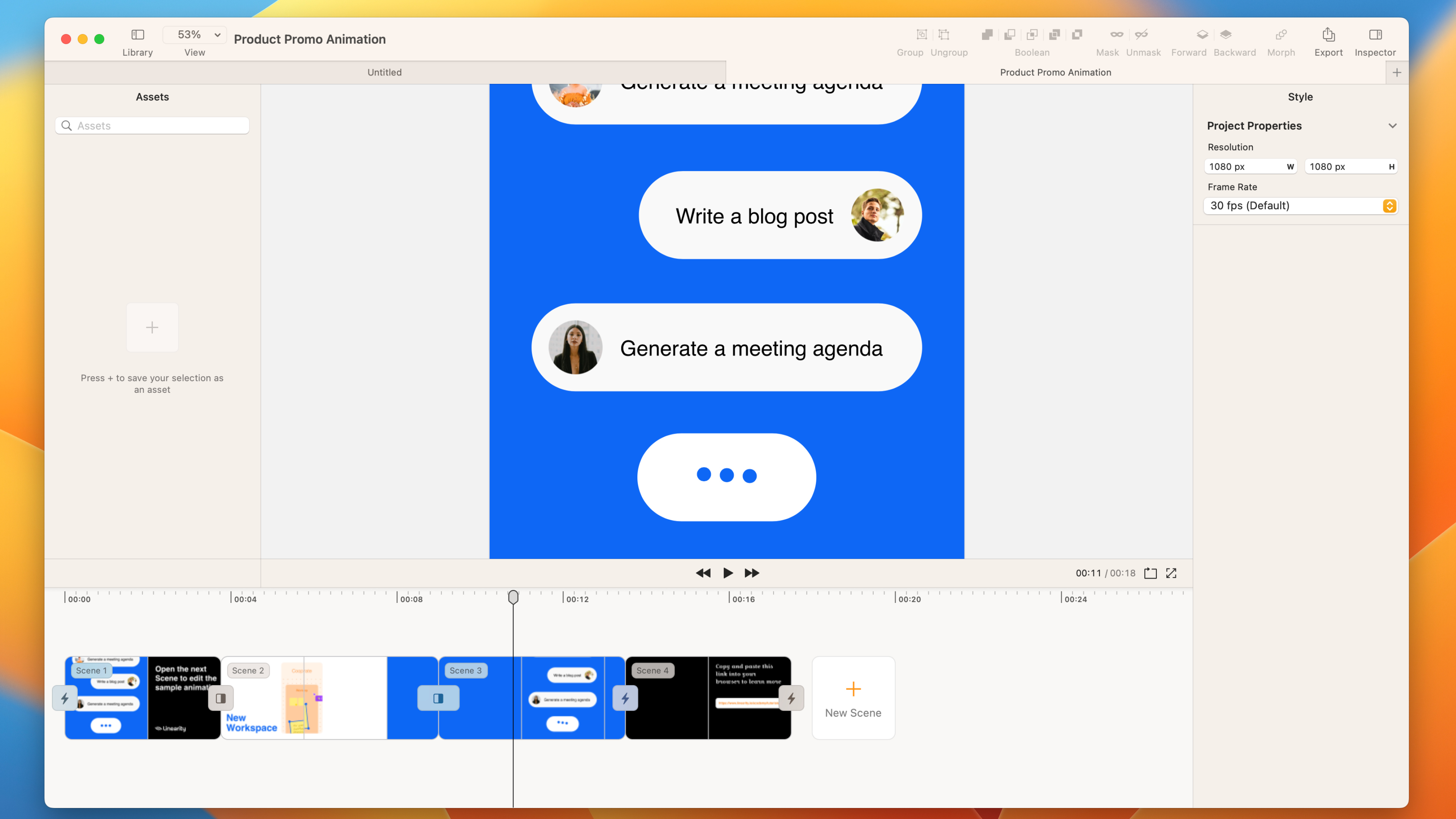
Creating a document launches a new Project window. This works along the lines of non-linear editing, stitching together multiple Scenes and adding transitions between. Composition settings are found in the Inspector panel, where you can edit Resolution and FPS.
Each scene can be edited by double-clicking on it in the timeline or pressing the Edit button in the viewer window. Within a Scene are distinct Design and Animate modes – clearly delineated to keep the two processes separate. It isn't immediately obvious what the benefit of keeping them apart is and feels like an unnecessary extra step having to toggle between them.
The ever present timeline doesn’t display layers in the same style as other apps – keyframes are represented as large blocky thumbnails at the top, which can then be edited in the layers below. For the most part this helps visualise what's going on, but more complicated Scenes, with lots of keyframes, can get a little messy and confusing.
Linearity Move is also supported on iPad, so you can take your project around with you.
Linearity Move: Import and design
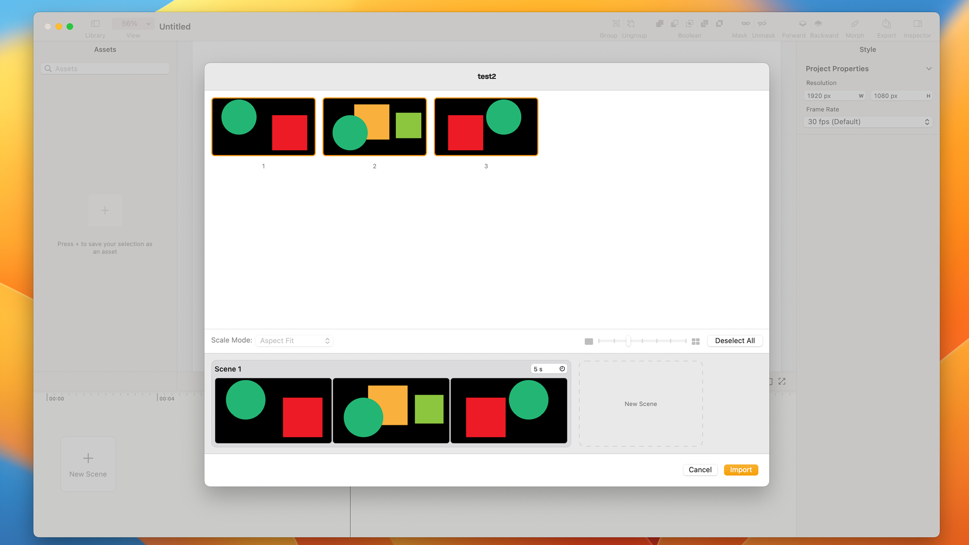
This app is compatible with a range of apps, including Linearity Curve, Figma and Illustrator. When you import a file, you are prompted to drag artboards onto a timeline, where Linearity Move will perform an auto-animate action, adding basic animations like Position and Fade. If you simply want to add some basic motion to a social graphic or banner, then this could be just for you. It's simple and it's quick. The layers will be retained from the document, so you can go in and edit it afterwards.
The Toolbar has options to add Text and Shapes – select from Rectangle, Line, Oval, Polygon, Star and Spiral. It also has a direct selection tool, so you can edit the shapes after they have been drawn and even Boolean controls for combining or cutting shapes. These can be used as visible objects in the video or as masks for other content.
The Text tool uses the fonts from your own computer library, though many seemed to drop out when I was testing it. All the standard tools are included, such as tracking, leading and alignment. Text can also be converted into Outlines.
For someone who uses the delete key a lot, it is annoying that you have to use the backspace to delete objects.
Linearity Move: Animation
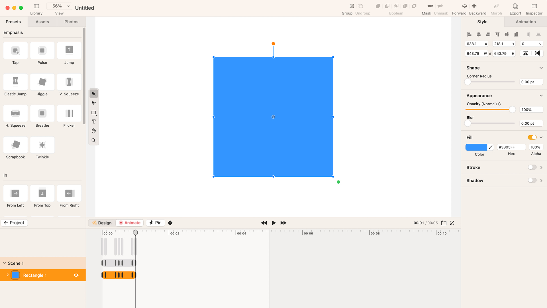
The power of Linearity Move comes in its auto-animation and basic animation presets. These allow an absolute beginner to produce something usable with very little tinkering.
Although many aspects of animation have been simplified, it still relies on a keyframing system to add movement. The keyframes are automatically set to ease (smoothing the start and end of an animation). This suits the style of modern socials, but can be changed to Linear in the Inspector panel, where you can also change the timing (for ease of use you would do this in the Timeline). The main things you can change are Position, Opacity, Colour and Scale. It's surprising how much you can achieve with these simple effects, combined with things like masking and scene transitions.
Where it does improve on other animation software is the ability to group content together and animate both individual objects at the same time as the whole without having to mess around with things like pre-comps and null objects.
Missing content

While I understand this must be viewed as a budget alternative, some tools I would expect to find are frustratingly missing. At the time of writing, the only two export formats are .mov and .mp4 – it would be nice to have an additional .gif option as well as more export controls. You cannot currently import video clips, only vectors and still images. There is no Pen tool, so you are limited to preset shapes. While there are x and y coordinates, no guides or smart snapping exist. Other notable absences include motion blur, particle effects, 3D options and audio editing.
It's unfair to pick this app up on what it's missing, but you should understand before purchasing that it is not currently a replacement for bigger animation apps, but might suit the purpose for people wanting a cheap option for simple jobs.
Linearity Move: Price
Linearity Move has a free option for anyone who wants to demo it, letting you create three projects before being locked out. The standard price for a Pro licence is $119.99 per year or $9.99 per month, although they currently have an intro offer of $7.99 a month.


