It's Typography Week here at Creative Bloq, and to mark the occasion we've been catching up with designers across the globe to learn about their approach to type, and how fonts impact their work.
Viviana Caponnetto is an Italian graphic designer based in Catania, Italy. Through Viviana Graphics, she shares her love for design and helps businesses stand out in the market. With years of experience in design and a degree in Visual Communication Design, she now creates fun and helpful content on Instagram, TikTok, and YouTube.
Can you tell us about a recent creative project that involved typography?
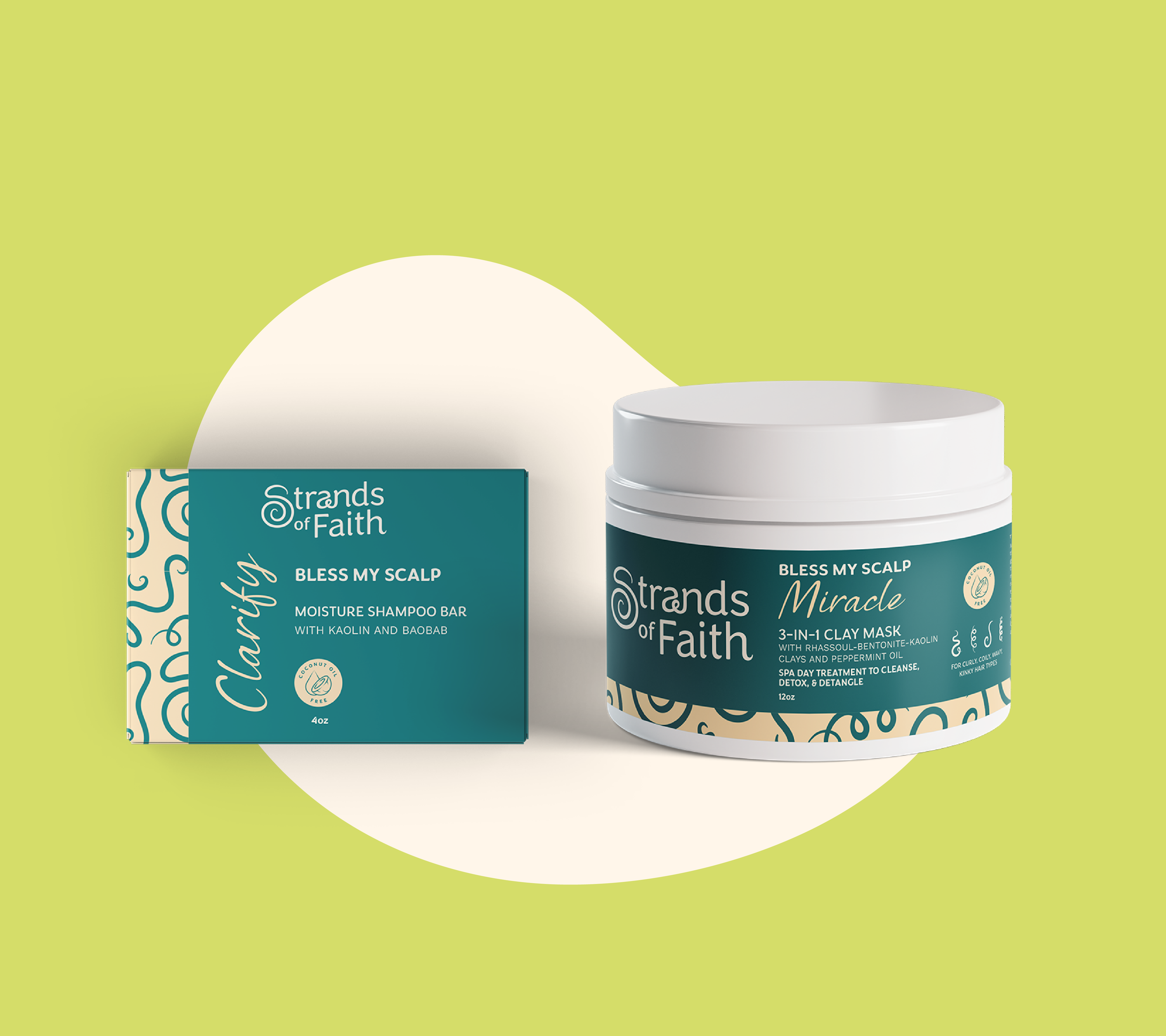
Recently I had the chance to work on a rebranding project for Strands of Faith, a hair care line that specialises in textured hair. The client wanted a clean look for the new logo, so she wanted to focus on the typography to convey a feeling of elegance and sophistication - but with a touch of fun. We explored different directions for the new look and ultimately landed on a round sans serif called Congenial. Then, through type manipulations, I added a custom S and played with some of the letters to connect the logo suite to the brand’s core value. The result was a sleek and friendly visual identity - perfect to attract the brand’s target audience.

What were the challenges and rewards involved with this project?
The main challenge to me was making sure to convey the desired message through the type. This project was slightly out of my comfort zone, as I usually work on bold and quirky brands, so I had to be careful and find the right balance when customizing the letters. My biggest reward was to see the client happy, especially because I know how much their business means to them. For this one specifically, I felt a lot of responsibility to get it right going into it and I’m so glad that, in the end, the client was just as excited as I was to re-launch!
How do you think your use of type impacted the overall result?
Choosing the right fonts was probably the most important aspect of this project, especially because we had quite a lot of packaging to design and so I had to make sure the type would work in different sizes and layouts. For the logo specifically, I wanted a bold-ish font that would seem elegant but with a warm and approachable personality. Congenial ended up being the perfect match, not only because it had all the characteristics I was looking for, but also because each letter curled at the end and so it was great to represent a hair care line.
What are the benefits of collaborating with a type foundry like Monotype?
Monotype is a dream come true for designers like me! When describing my design style, I always say that I use typography to convey the essence of a brand, and so choosing the right type suite is at the heart of every project I work on. Monotype’s library allows me to do in-depth research and explore different directions, to use tags to find exactly what I’m looking for or give me new ideas. The fact that I can test the fonts immediately so I know if something might work or not is also incredibly helpful - given the restricted timelines I have most times.

Do you have any advice for designers considering embarking on a type-led design project?
Using just typography to create a unique and impactful brand identity can be a real challenge. My advice is to do a lot of research on the brand before you start looking for fonts, so you know what to look for once you get to that stage. Let the typography speak for the brand! Any little quirk that a font has can be exactly what the brand needs, but you will know that only after understanding the brand to its core. You can go for a font with a strong personality or a simpler one, if you plan to manipulate it - as long as you make sure you can make it unique to the brand and represent it well.
This article was produced as part of Typography Week, held in association with Monotype.


