
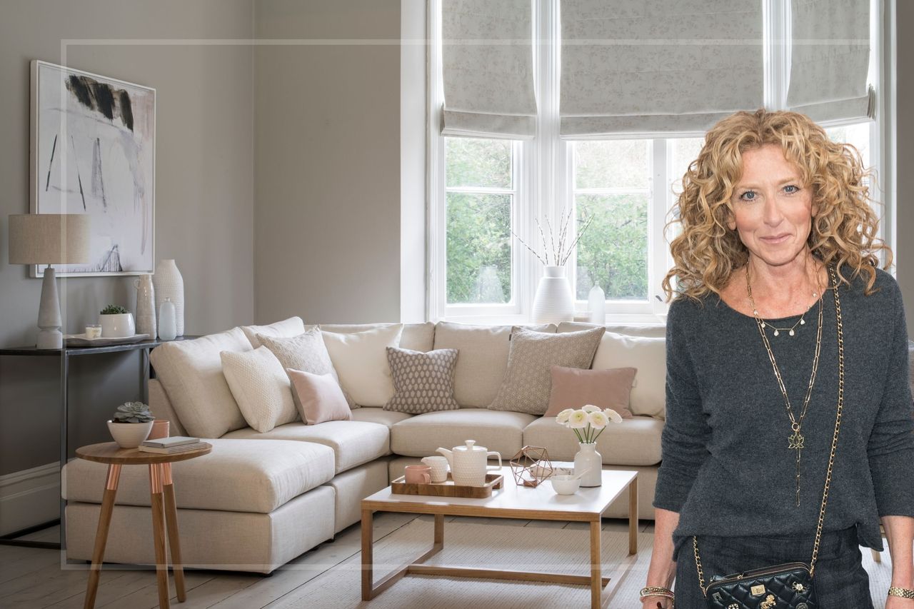
She’s the queen of interior design and style, so it’s worth paying attention when Kelly Hoppen CBE shares her expert opinion on things we should be avoiding.
From warning against making one common cushion mistake to her essential tips for getting a bedroom summer-ready, Kelly condenses her decades of experience into actionable, useful bits of advice to help style our homes.
And now she’s sharing the sort of thing that stands out for all the wrong reasons as soon as she enters a room. That’s right. You could be making a less-than-polished first impression without realising it. Are you committing one of her easily fixable design mistakes, including pushing all your furniture against the wall or sticking rigidly to symmetry?
A post shared by Kelly Hoppen CBE (@kellyhoppen)
A photo posted by on
Posting to her Instagram @kellyhoppen, Kelly starts by explaining, "A few things that I notice when I walk into rooms that I see instantly is furniture that's pushed up against a wall like a dentist's waiting room.
"Move your furniture in. It's okay to walk around chairs and sofas into a room. You don't have to have everything put to one wall."
If you’re not quite sure where to start with this yourself - since so many resort to thinking sofas against the wall is a space-saving tip, especially in smaller living room layouts - consider placing your sofa in the middle of the room and getting a sense for how it works.
Giving furniture breathing space can surprisingly open up even smaller rooms - and you can pull armchairs closer towards a central point to create a layout that feels connected and not cluttered.
To amp up the intentionality behind this (perhaps unconventional) layout, a large area rug will anchor items and create a more purposeful flow.
A more practical reason behind Kelly’s aversion to furniture pushed up against walls is that, in the winter, anything in front of a radiator might stop the flow of warm air. Follow the 30cm furniture rule instead.
Furniture wasn’t all of Kelly’s complaints, though. She argues against displaying photo frames at an angle. Instead, she advocates having them straight and overlapping each other.
Another? Sticking to symmetry when it comes to items on the mantel - like candlesticks. Kelly says, "Candlesticks, either side of a mantelpiece. No, together on one side."


This touches on an age-old debate in design between symmetry and asymmetry.
Symmetry has its place, but too much can give off the sense of a show home or obsessive planning. The occasional bit of asymmetrical styling can create focal points, play with layering and perception and foster a more creative, playful way of transforming a space.
The final tip worth taking note of? "Chairs, straight on, on a worktop in a kitchen. Sometimes better at an angle if you only have two. If you have three, put them in a straight line."
Consider Kelly Hoppen's list of dos and don'ts a masterclass in interior design in record speed. As Kelly herself says at the end of her video, "You’re welcome".