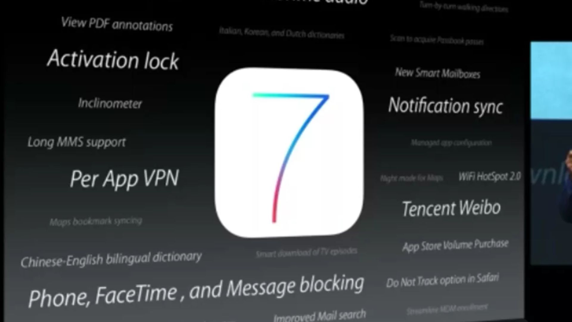
I remember watching WWDC back in 2013. Tim Cook and the team took the stage as usual and, to everyone’s surprise, announced iOS 7. Okay, the announcement itself wasn’t surprising — everyone knew iOS 7 was coming — but instead of Tim Cook showing it off, the company played a four-minute-long video of Jony Ive introducing and explaining the thought process behind the radical design change.
With iOS 7, Apple was saying goodbye to skeuomorphism, the design language it had used since the iPhone launched back in 2007. Jony Ive, Apple’s Chief Design Officer, had previously taken over the design of both hardware and software at the company, taking the reins from Scott Forstall, previous software design lead, who had been ousted.
Ive’s design philosophy has always been minimalistic, and iOS certainly... wasn’t that before he got control over it. However, with iOS 7, the designer was able to bring a minimalistic approach to the iPhone’s software for the first time, a huge change from the organized but ornamented approach that the company had taken beforehand.
I remember sitting there, watching Ive unveil the new direction, and thinking, “This is incredible. And this is also going to piss a lot of people off.”
It’s how we got to where we’re at
Before I dive into why I think the iPhone, and the industry, has been better off moving away from skeuomorphism, let’s take a quick history lesson on what exactly skeuomorphism is. There’s no need to try to explain this myself, so here’s what Dictionary.com says it is:
“An ornament or design on an object that mimics the form of the object when made from another material or by other techniques, usually one that reflects a previously functional element, as an imitation metal rivet mark found on handles of prehistoric pottery.”
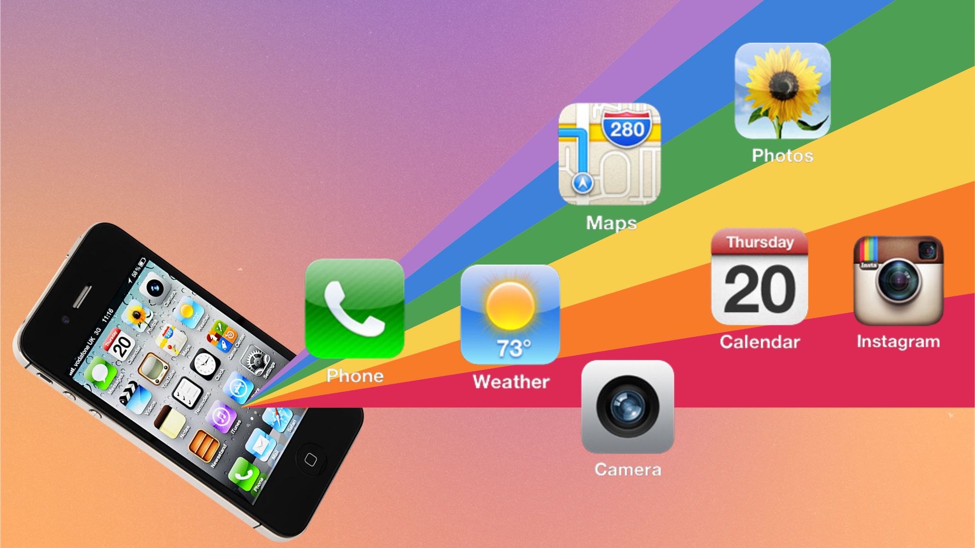
In iOS, skeuomorphic design was used to make digital things appear as close to their real-world counterparts as much as possible. It’s a simple idea — if the digital thing looks like the physical thing you already know, you’ll know how to use the digital thing. That’s why the Notes app looked like a physical notepad with yellow ruled paper and your notes would live on the lines of that paper, same as you’d physically write into a notepad.
The Newsstand app, which is where magazines used to live before Apple News, would feature magazines on shelves like you would find in a bookstore. The Game Center app featured a heck of a lot of felt, something you would recognize from a lot of games like... pool? Well, that’s about all I can think of for that case. But everyone can recognize felt as being associated with a pool table, so you can see Apple's train of thought at least.
The Newsstand app, which is where magazines used to live before Apple News, would feature magazines on shelves like you would find in a bookstore.
While I’m about to talk about all of the ways I prefer skeuomorphism falling to the wayside in favor of a more minimalistic approach to design, I do need to give a ton of credit to the design language carrying all of us through the iPhone’s formative years. I don’t think the transition into smartphones would have been nearly as smooth as it was if the iPhone didn’t use a skeuomorphic approach to design first.
Imagine getting an iPhone for the first time and not only having to figure out the fact that it doesn’t have a physical keyboard and one gigantic Home button that is used for multiple functions, but seeing a ton of minimalist icons that mean nothing to you. Skuemorphic design certainly made learning this whole new approach to phones easier for everyone to learn, so we have to be thankful for skeuomorphism for easing that transition — but as we became more accustomed to digital variations on everyday tasks, so too was a new style, fitting the new medium, required.
I’m glad it’s dead
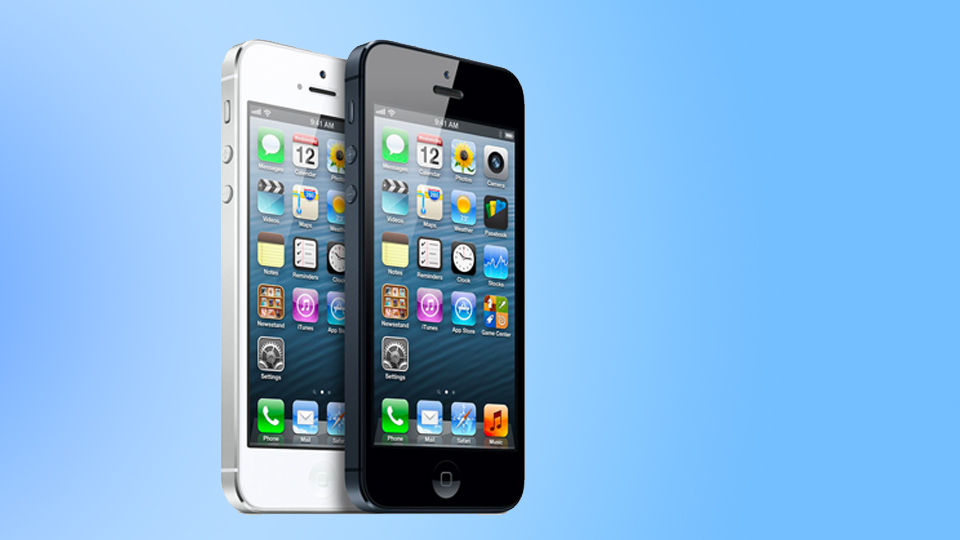
Going too hard in the direction of skeuomorphism comes at the cost of aesthetics. When you look at iOS 6 and iOS 7, iOS 6 looks like trash in comparison. It looks older, less clean, and more cluttered than the next generation of software that succeeded it. However, with that satisfying, more minimalistic design, you can always create issues with usability. As Ive said, iOS 7 was about “bringing order to complexity,” and I think they did that really well.
While iOS 7 became more minimalistic, it didn’t crawl too far up its own ass and make the software unrecognizable from what came before it. While the Photos app dropped the flower, the design still looked like a flower with multiple colored petals. While the Notes app didn’t look like a physical notepad anymore, it retained the general colors and lined design of the original. The Camera app actually looked even more like a camera, opting for the outline of a camera instead of just a lens.
The Camera app actually looked even more like a camera, opting for the outline of a camera instead of just a lens.
I personally loved iOS 7 and the entire direction that iOS has gone since then. Even though Apple has moved away from the software being totally flat like iOS 7 was, the shading has still kept the design minimalist enough to feel incredibly clean and enjoyable to use.
iOS shifting away from skeuomorphic design also dragged the rest of the industry along with it. If you’ve seen Google’s Material You design language, which is making its way through all of the company’s products, there isn’t a shred of skeuomorphism in there. Even the clock widget can be turned into an amorphous blob with a couple of arrows.
Think about it. Are there pieces of software with what you’d consider good design that feature skeuomorphism? At this point, such design language would make a piece of software feel incredibly old and tired. I wouldn’t want to use it. I think I would actually be compelled to switch to a different piece of software if one looked like that in 2023.
Where we go next
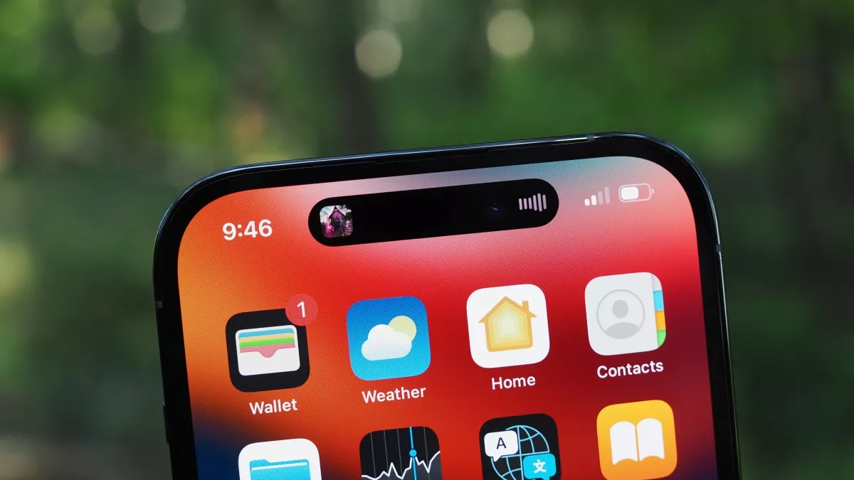
I can’t help but wonder where Apple’s design language goes next. The last big change came with macOS Big Sur back in 2020 when the company finally brought a lot of the benefits of iOS to the Mac’s software without losing the essence of what made the Mac great. We all love iOS and iPadOS but we also never want macOS to become iPad-with-keyboard-and-trackpad-and-no-touchscreen-OS.
The real interesting move in design language when it comes to software is going to be when Apple finally unveils its mixed reality headset, which the company is expected to do so at WWDC in June. With the Apple VR headset, Apple will also need to showcase realityOS, the operating system that will power the headset. If skeuomorphic design was ever going to make a comeback, a VR/AR experience is definitely the place to do it.
While Apple would never go back to the felt-packed design as it was back with old-school iOS, I can see the company bringing together its design philosophies across its entire history to make the experience as easy to adapt to for users. For anyone who has worn a Meta Quest headset, or specifically anyone who has put a Meta Quest headset on a parent, you know the importance of familiarity when it comes to user experience.
I’ll be curious to see if skeuomorphism makes a temporary comeback, but I doubt it. While Apple may use design elements from the philosophy, the mixed reality headset is about the future, and its software design will likely reflect that.
So, goodbye forever skeuomorphism! Thank you for your sacrifice.
