When asked which two colors are consistently safe to use in a kitchen, gray and white are likely to come out on top. Both hues are known and loved for their reliability, but in their safeness, they risk falling on the wrong side of boring. One way to avoid this is to bring the two together in a clever technique best seen in Jennifer Coolidge's kitchen.
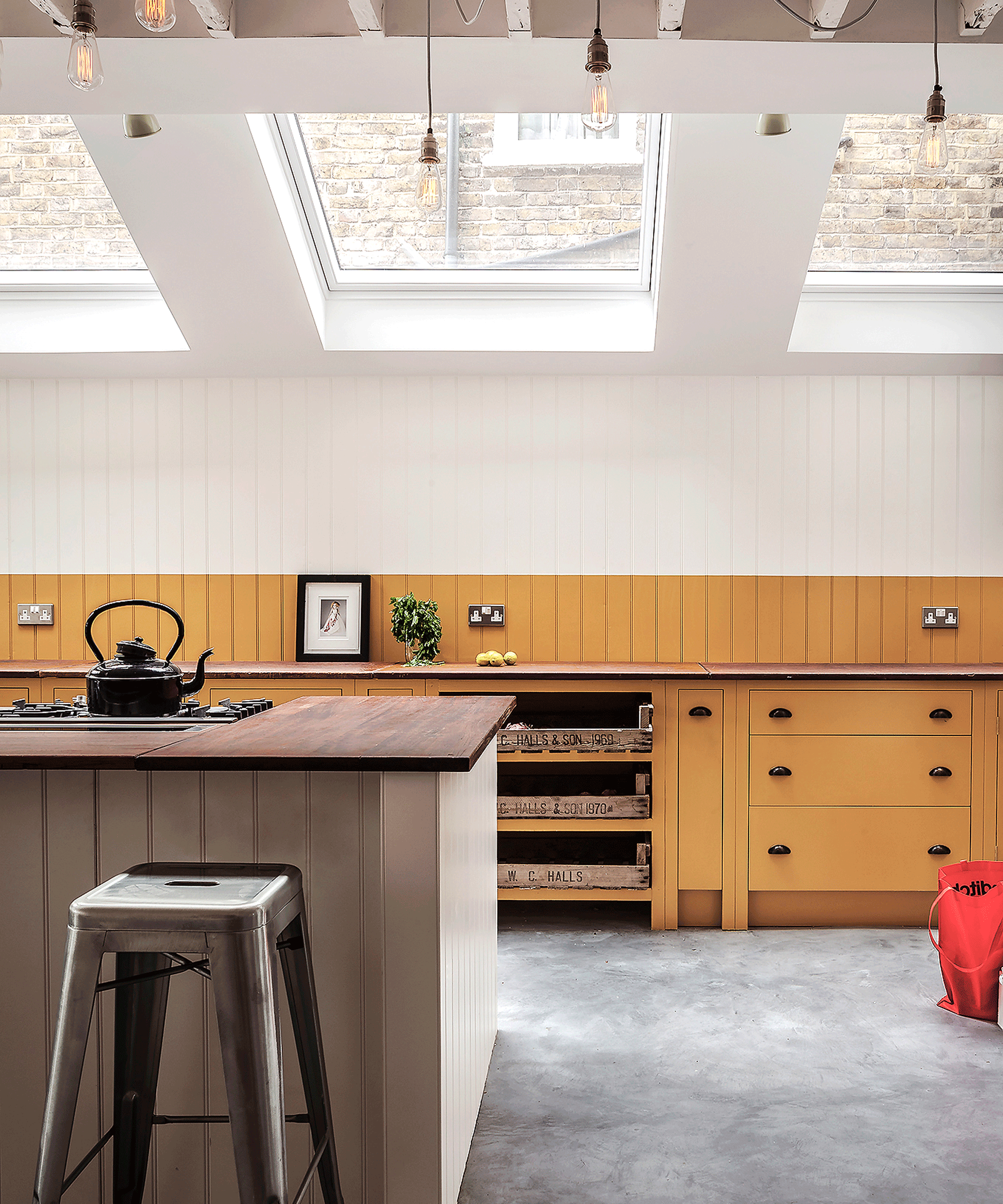
Two-toned kitchens are often associated with cabinets and islands, but in Coolidge's case, this paint method is best exhibited on her walls. The actress painted the bottom half of her walls (the wainscoting) a dusty gray hue – the exact same tone seen on her cabinets. Meanwhile, the top half of the wall is a classic white – and when used together, the colors feel anything but boring. Instead, her space looks well-curated and timeless (because what better way to preserve your room's longevity than with two tones that are known to transcend trends).
Coolidge's kitchen color idea is refreshingly easy to follow, but as experts explain, its impact is unmatched. The actress's space serves as a failsafe inspiration point – exhibiting the darker color on the bottom half of the wall, which they recommend.
'A two-tone approach can also manipulate how we perceive space. Darker shades on the lower half of walls create a grounding effect, while lighter tones above can make ceilings appear higher. Conversely, a bold accent on one wall draws attention and creates a focal point,' comments Tori Young, the associate director of interior design at HollandGreen.
The similarities of Coolidge's two neutrals also haven't gone unnoticed by Young, who suggests choosing hues from a similar color family.
'When selecting two colors for a room, I always consider the space’s function, the desired style, and how natural light filters in. Whether I choose two shades from the same palette or opt for contrasting tones depends on the mood and atmosphere I want to create,' she explains.
'Using colors from the same palette, often called tonal or monochromatic schemes, creates a seamless and harmonious feel. This approach works particularly well in bedrooms, where soft combinations – like soothing grey paired with deeper charcoal or pale lavender with amethyst – create a calming, layered environment perfect for relaxation,' she says. 'These combinations evoke a soothing, aquatic vibe that complements the calming purpose of these rooms.'

Lastly, Young reminds us how two-toned walls can be used to split one room into separate zones. In Coolidge's case, she used both tones on one wall for a more dramatic effect, but using different colors across multiple walls is a subtler way to bring two colors into your kitchen.
'I often opt for a dual-color palette to achieve a few key effects. For instance, in open-plan spaces, two colors can help differentiate areas without the need for physical partitions. A dining area might be painted in a warm tone, while the adjacent living space features a cooler hue.'
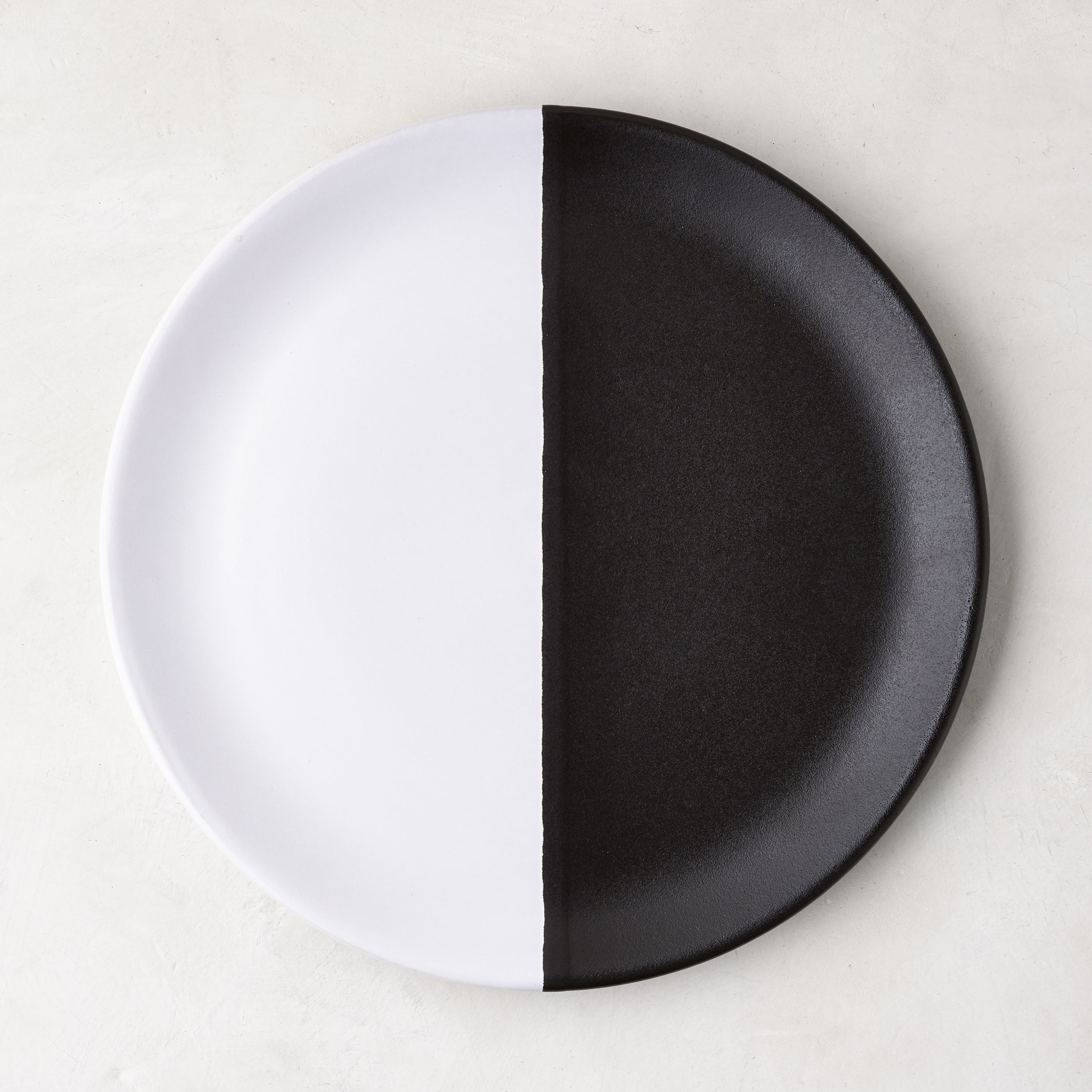
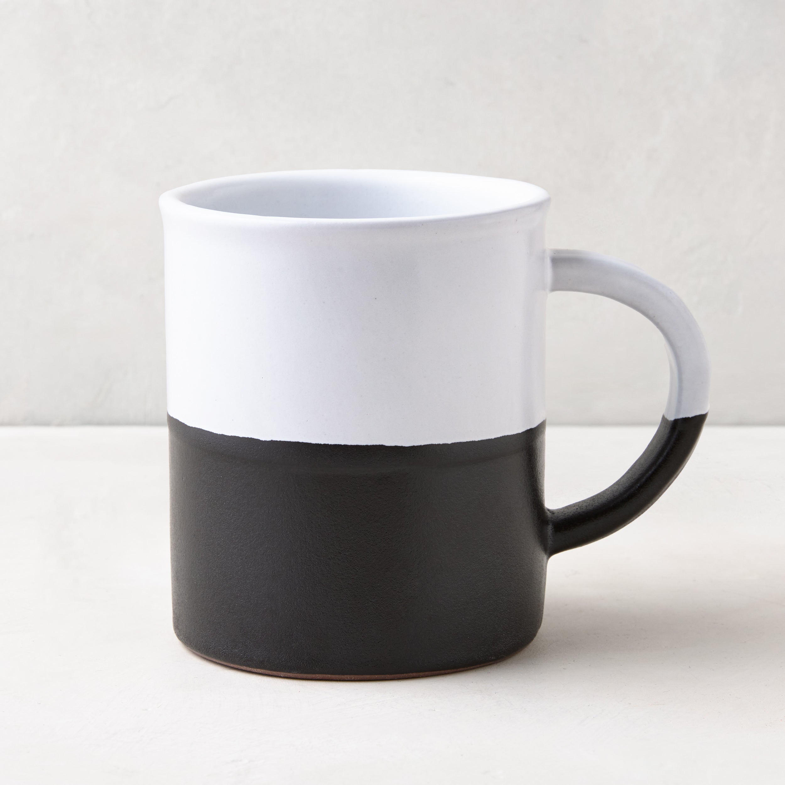
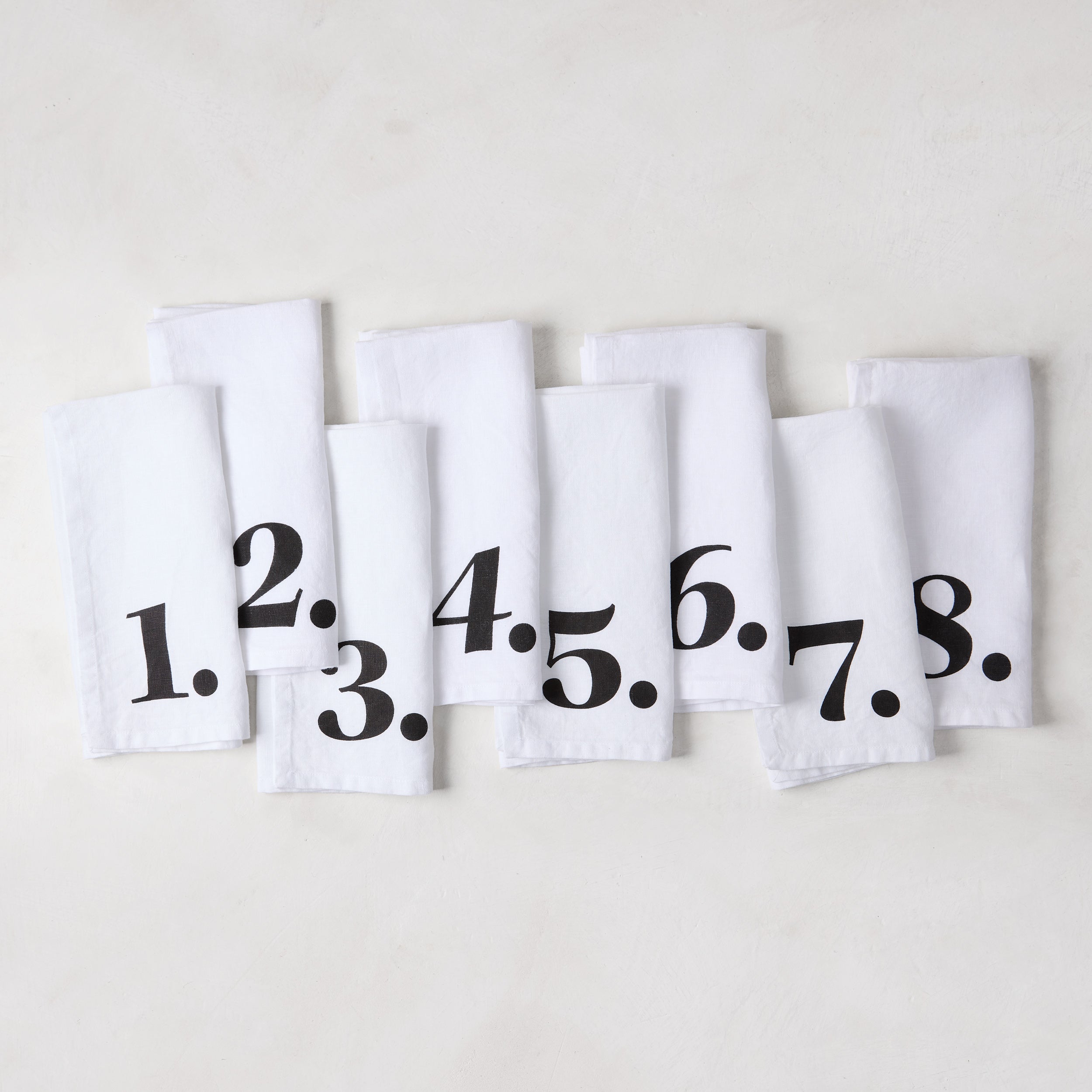
Alternatively, we love two-toned accessories – especially those that create a monochromatic contrast that, like the wall, will always stand as a stylish talking point. These pieces, designed by Hollywood counterpart Diane Keaton, are consistently among our top picks.

This plate is accurately described as a contemporary twist on a classic domino set. Each piece was crafted in Portugal and designed to combine iconic style with long-lasting versatility.

Nothing can elevate our morning coffee routine quite like this bold twist on the most classic color palette of all. Its sharp pattern and clean lines are designed to mix and match seamlessly with any other pieces in your cookware collection.

Diane Keaton designed her collection to bring a playful touch to any dining experience, and nothing achieves this quite like these napkins. Each napkin features a bold number that brings a modern flair to any table setting.


