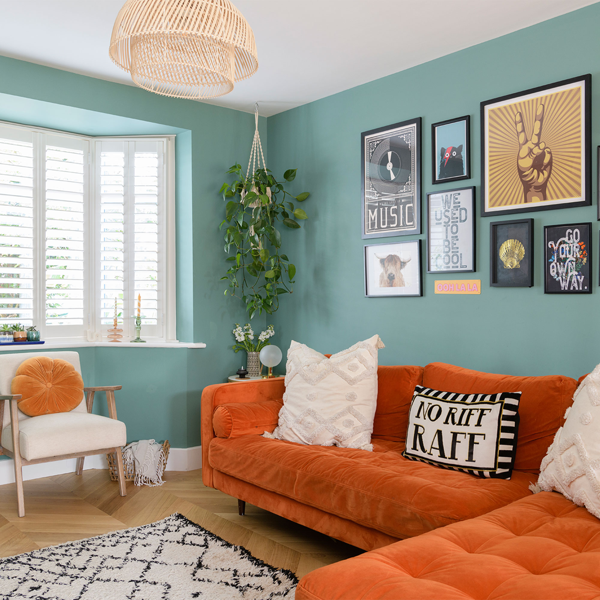
Moving into this Victorian four-bed semi in 2016, these homeowners jumped straight in to spruce the place up initially. But with time to think about and plan for a full reno, they were eventually able to transform the property completely and turn it into the house of their dreams.
‘We were living in a great little flat right by the beach, but parking was a nightmare and after our daughter was born we wanted more space and a private garden,’ says the homeowner. ‘We couldn’t afford anything this big that was “move in ready” so knew we would need to take on a project.’
‘Our budget was tight but we were in no rush, waiting to find something that we could take our time over. Although originally a three-bedder, this place had the most potential longterm to extend out and up. We moved straight in and although it was really dated, thankfully it was clean and well maintained, so all very liveable.’
The living room

‘‘The living room fireplace was the first big job we did, fitting it within two months of moving in, and it was our first big splurge.'
'Coming from a flat, we loved the thought of having a log burner so were excited to see the chimney breast, and although it was blocked up, plastered over and had a dodgy gas fire at the front, we decided to rip it all out and see what was behind.'
'Luckily we discovered the beautiful exposed brick which was in good condition so it felt like an absolute win.’
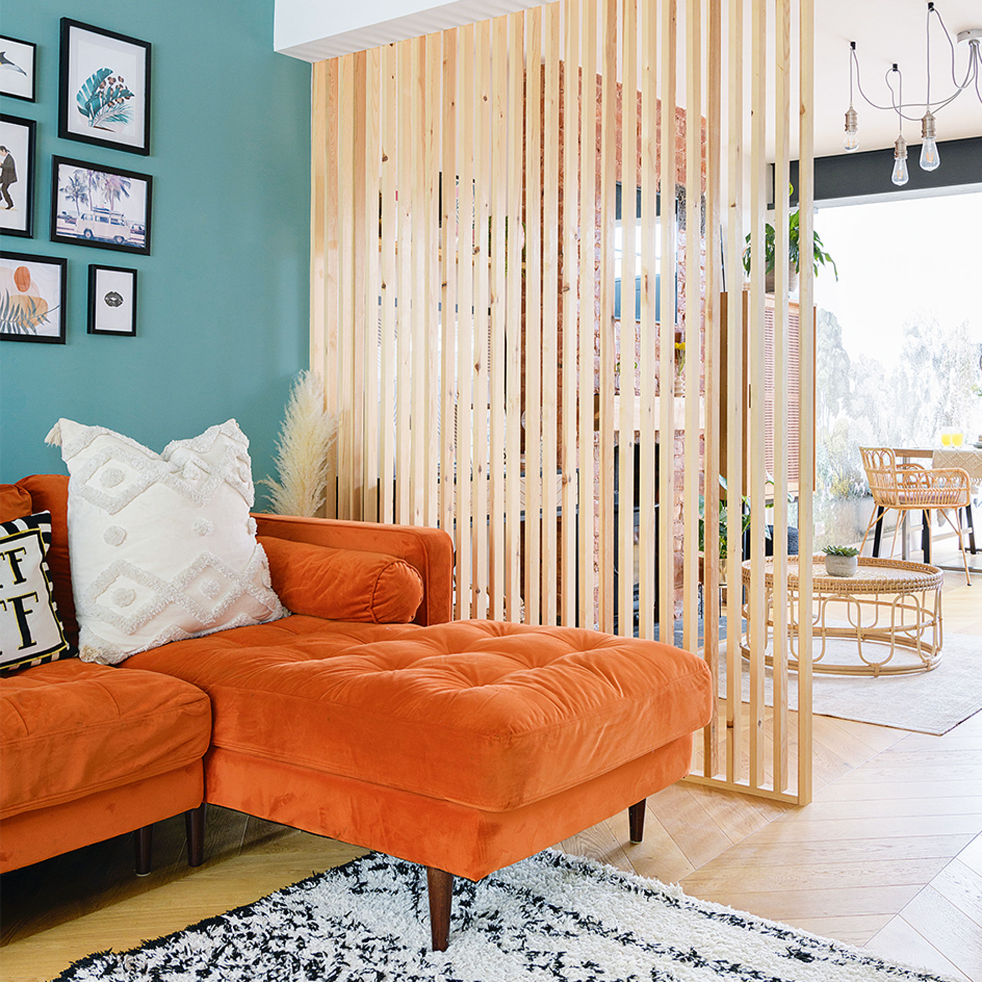
‘The dining area and living space were already open plan but the original galley kitchen was separate, so we knocked down the internal wall to create one large room. Initially we installed the lowest budget kitchen we could find, as the idea was to eventually extend out into the garden.’
‘We didn’t want to invest too much initially but I’d already bought the orange sofa so when I redecorated in Lick Green 04 after the main build, it was specifically to complement the sofa.’
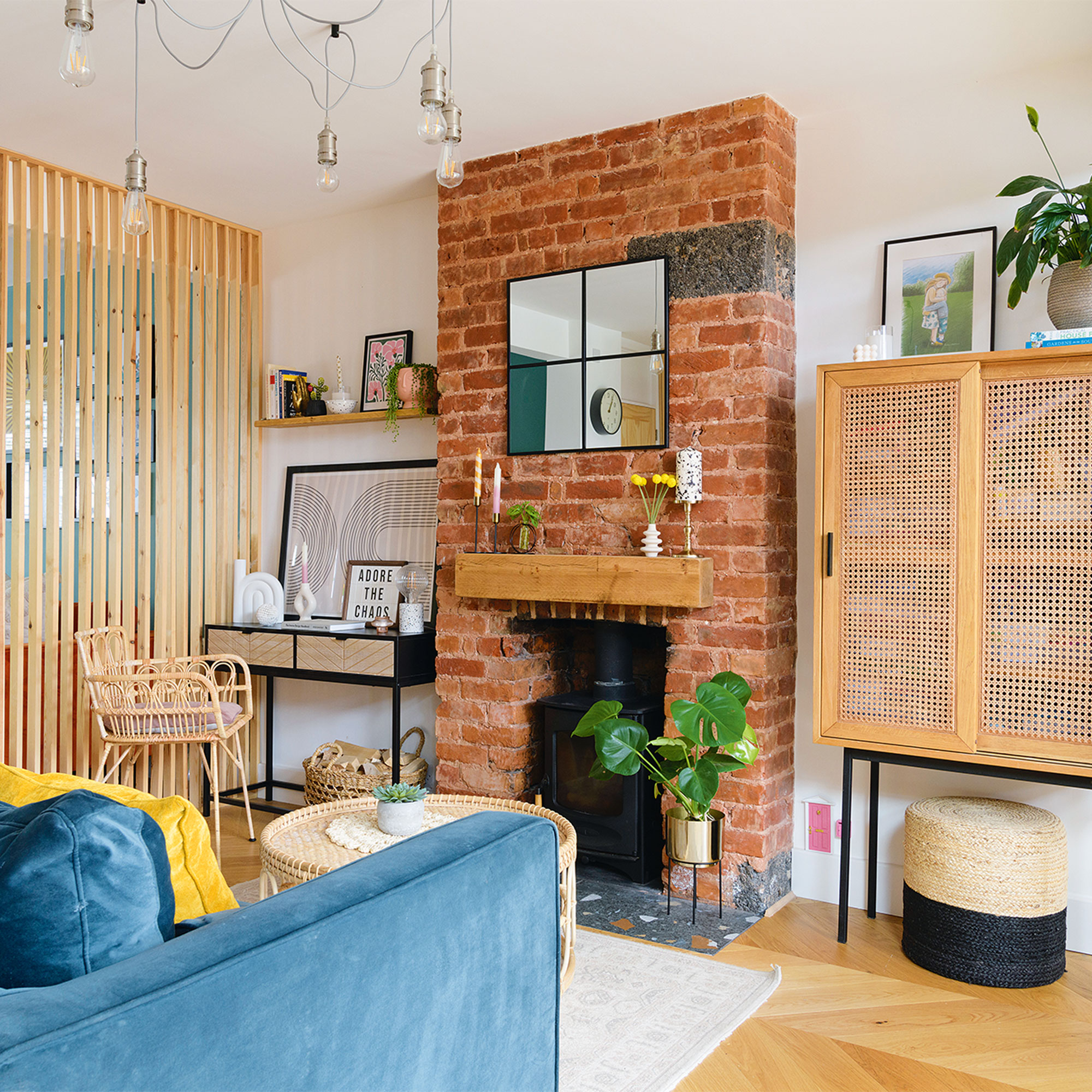
‘I went through loads of different options when considering a device to zone the living space, including rebuilding the dividing wall, having a half wall or a wall of glass, or maybe even having a pocket door.'
'But then I fell upon the idea of the slatted screen as a room divider after realising that we didn’t need anything fancy or expensive, so I worked with the builders to draw up the look and they created and installed the bespoke piece.’
‘The slatted wall allows the space to flow but gives some separation, helping zone the large open-plan room.’
The dining area
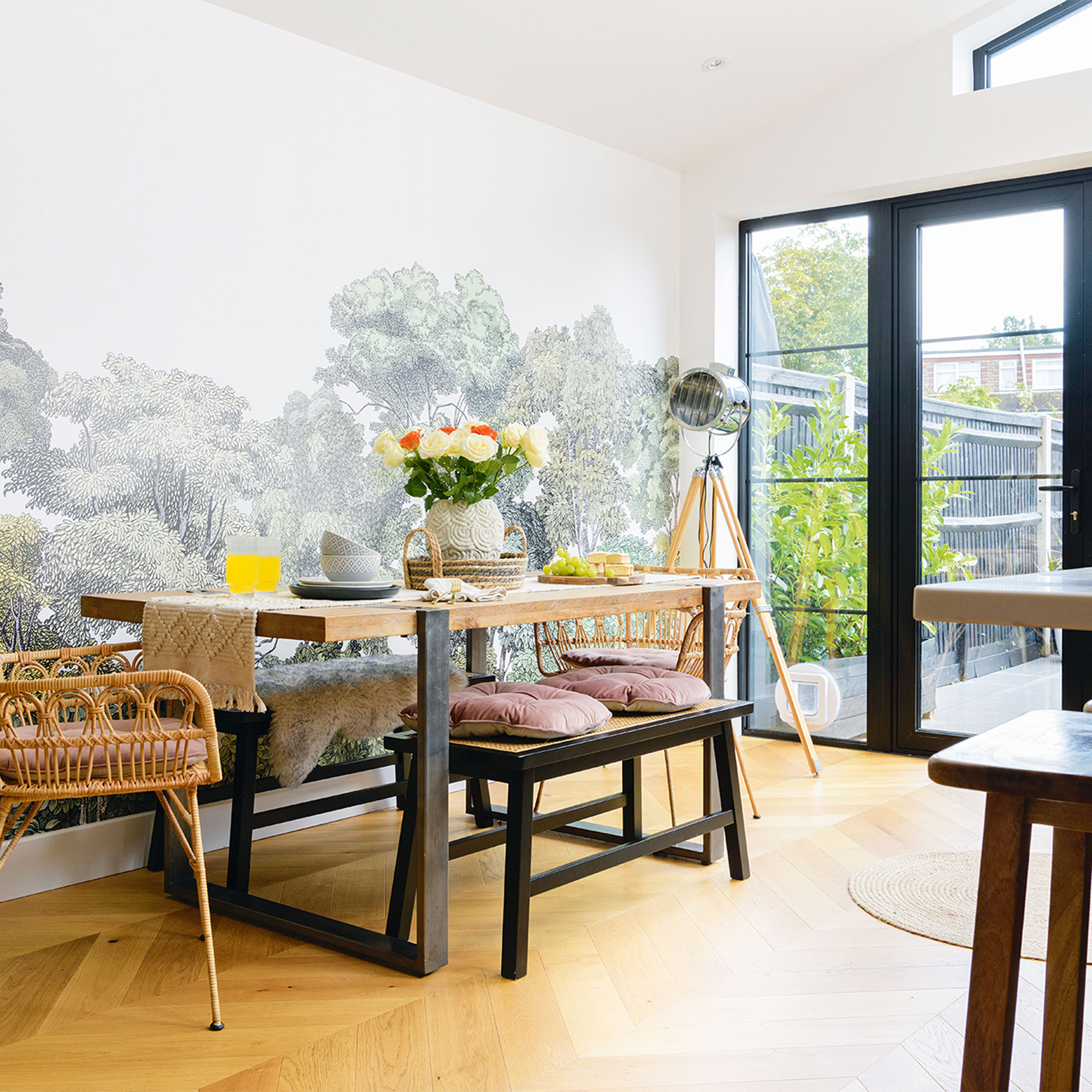
'I also wanted to enjoy the view into the garden which led to the position of the dining area, mirroring the vista with the nature-inspired woodland wallpaper mural from Rebel Walls. The mural was a real splurge, although definitely worth it, but I got a professional decorator to hang it to make sure everything lined up exactly.'
‘We bought the solid wood table when we moved in as an investment as it’s so sturdy and durable. I’ve chosen rattan chairs and a bench, from Dunelm, to soften the look. And I love the way the engineered chevron floor draws the eye out to the garden.’
The kitchen
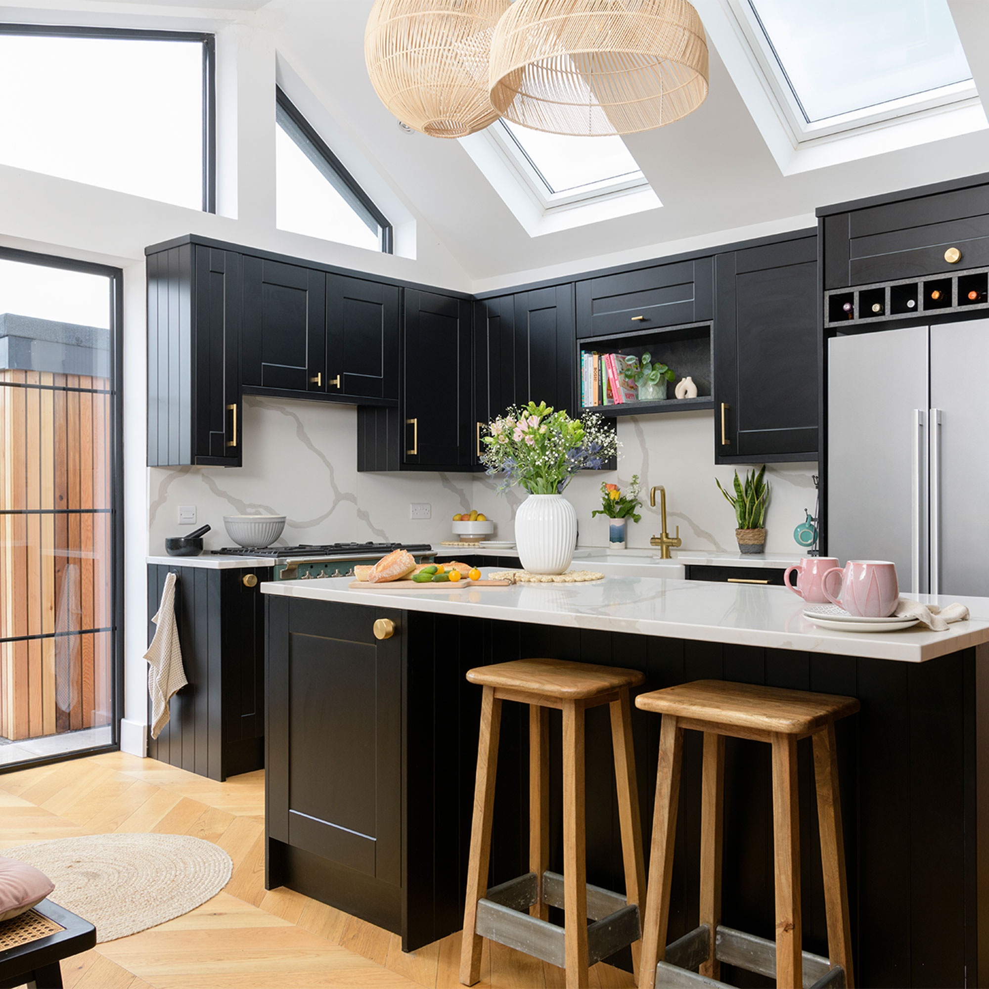
‘The bargain off-the-shelf kitchen that we fitted initially, lasted us for four years until we had enough funds to begin the big reno. I spoke to an architect, explaining I wanted something with ‘wow factor’, and he came up with the A-symmetrical pitch of the kitchen extension, and floor-to-ceiling glass doors into the garden, giving height and drama to the room.’
‘When it came to the kitchen design I wanted to include a big fridge freezer, a double Belfast sink and a range cooker, and I also wanted to make sure we had an impactful island to include as much storage as possible whilst providing stool seating.’
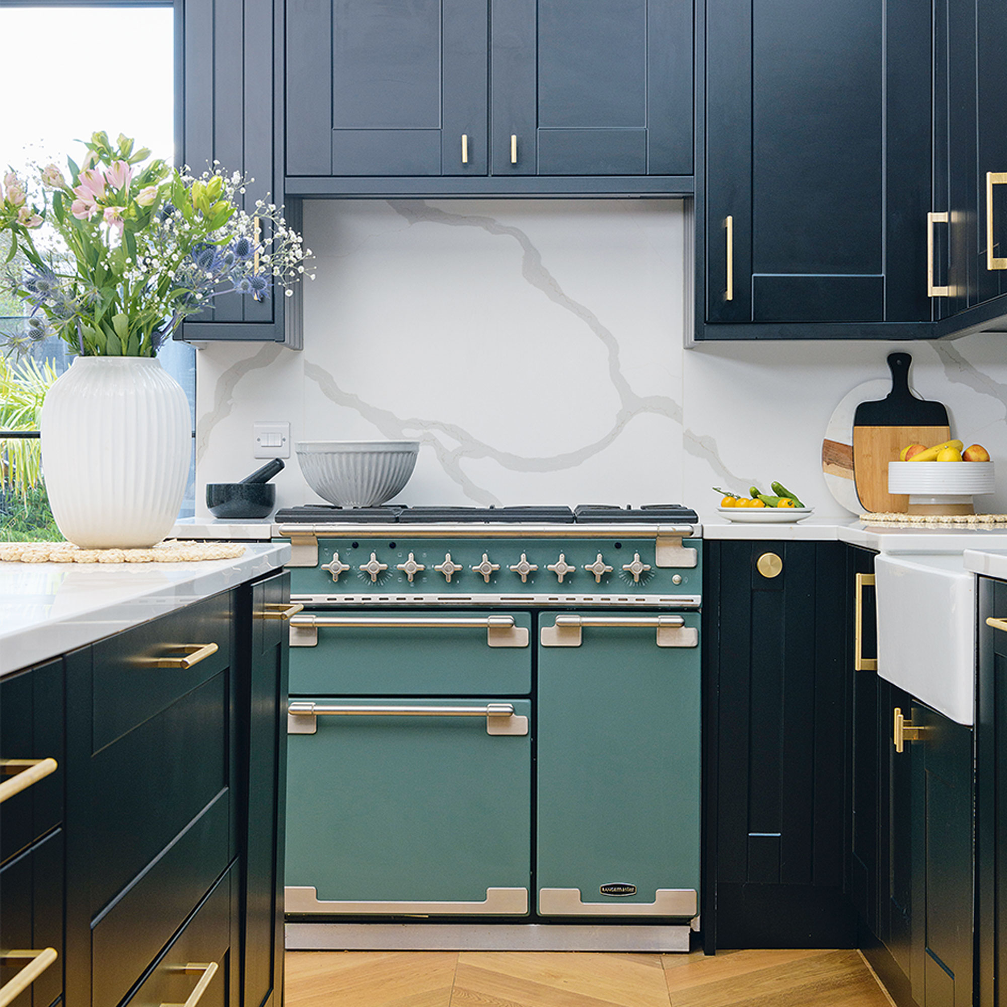
‘When it came to the kitchen decor I future proofed the space by choosing bold black cabinets, from Wren Kitchens, which can be styled with any colour, and the luxurious brass fittings can be easily updated.’
‘The worktop is marble-effect quartz and the large vein running through it gives the space a real wow look. Adding the splashback was much more expensive than tiling but it blends seamlessly into the worktop and gives that final finish.’
‘Incorporating a utility and downstairs loo into the design needed some thinking about because I didn't want to block the view from the front door to the end of the kitchen, so we came up with the idea of hiding those elements behind a series of disguised slatted doors.’
The hallway
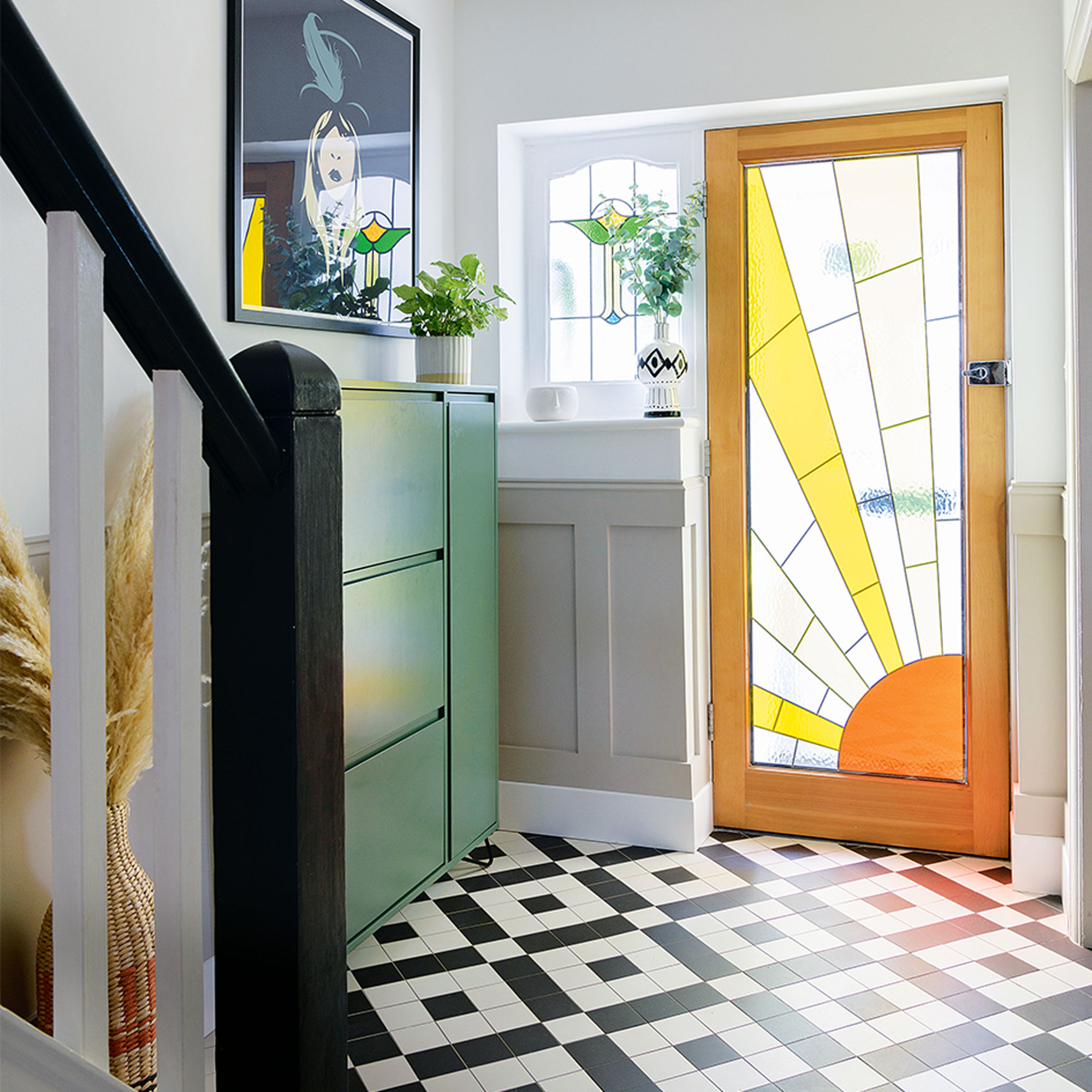
‘I wanted traditional Victorian hallway floor tiles but Topps Tiles were having a sale and my second option were so much cheaper, and still look stylish, so I went for them.’
‘I had this space earmarked for a large print that would add an element of drama and bold colour, and the Stevie Nicks picture, from Iamfy, felt like the perfect fit.’
The loft bedroom
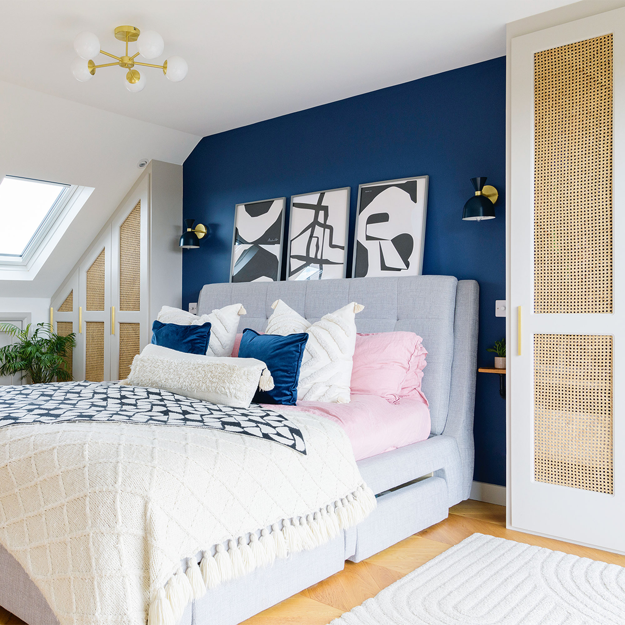
‘The loft was originally simply boarded out but with no door, so it was useful as a hobby space to begin with and my husband worked up there during lockdown before we started on a loft conversion to change the space into a bedroom.’
‘Although some people have cut the space in half and created a dressing room for their conversion, it doesn’t create a dramatic effect which we wanted, so when it came to our design we went for one dual-aspect room, giving us views and light from both sides.’
‘I worked with the builder to design the fitted wardrobes and used every possible alcove as when we converted the loft into a bedroom we lost so much storage space. I wanted the cane webbing to provide a bit of texture as well as complement the other rattan elements that flow though our home.’
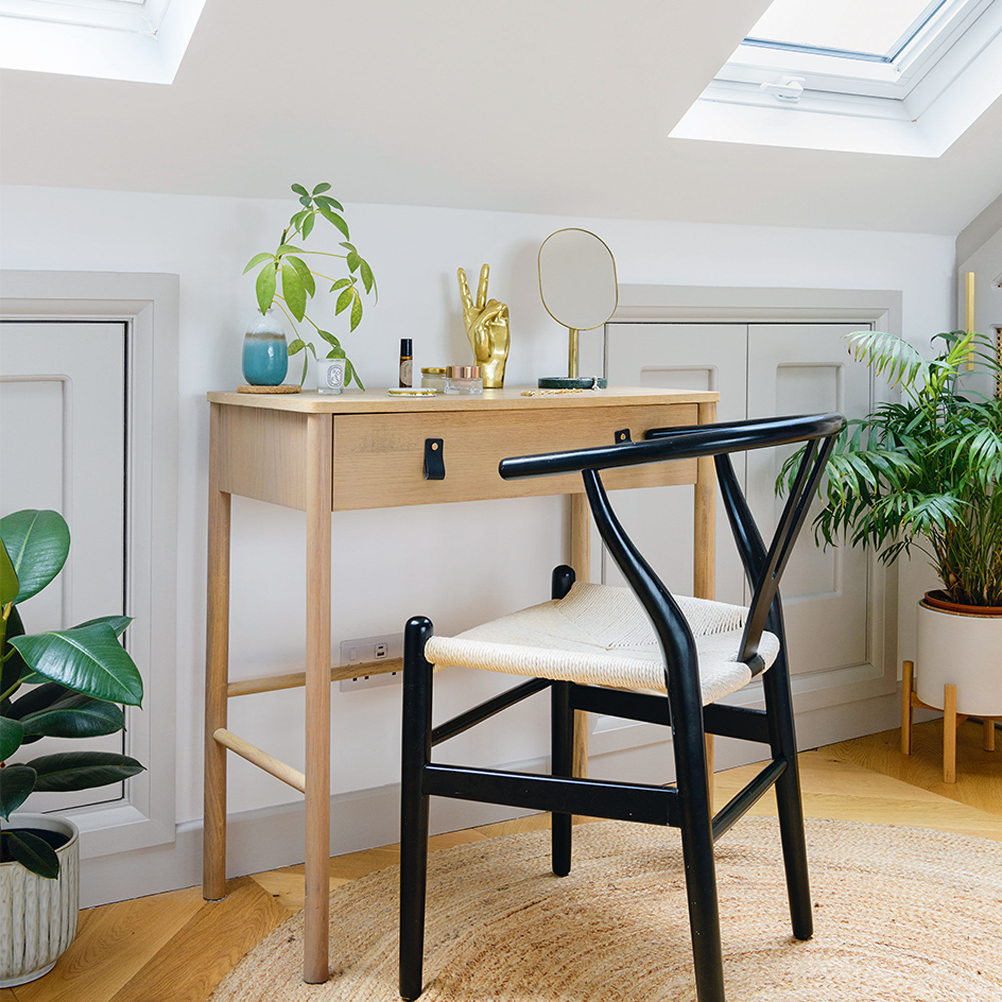
‘I found this little table in Dunelm that fits perfectly in the spot between the two eaves to create a small dressing room area, and with the added cute mirror from Oliver Bonas, it’s the perfect place to do my make-up.’
The boys bedroom
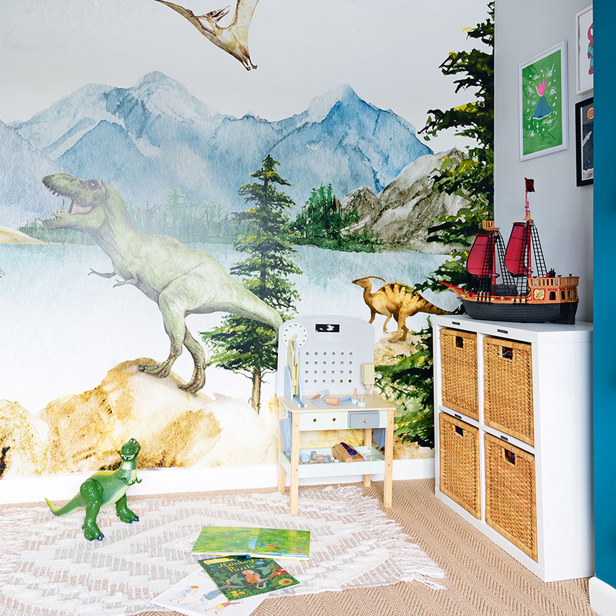
‘Having already used the stunning mural wallpaper in the dining room, I found this fun dinosaur design from Photowall; not too scary but something that will last until our son wants more of teenager’s bedroom.’
The bathroom
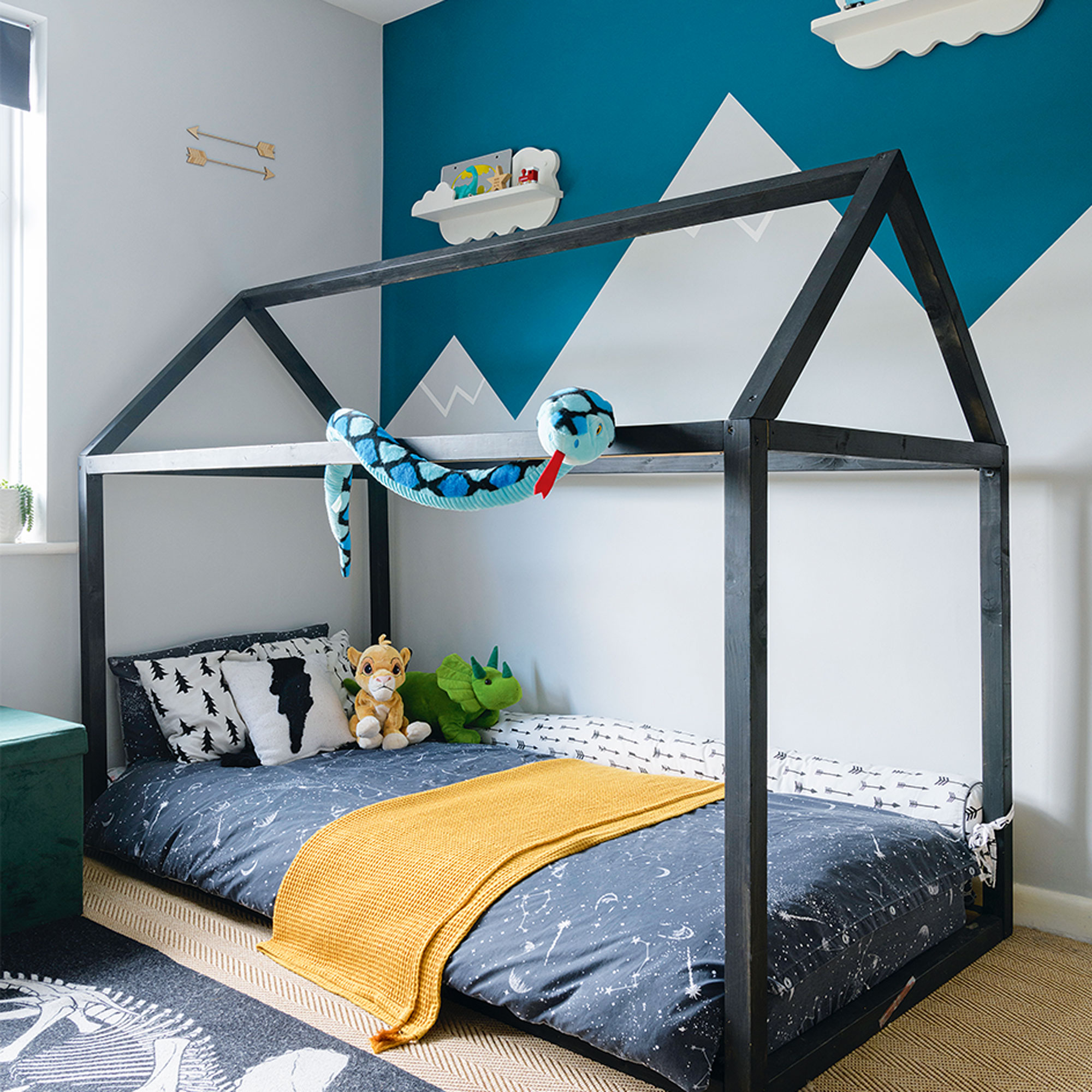
‘I hand-painted the mountains and snow mural and added the teal ‘sky’ to inject some bolder colour. The fun, cloud-shaped shelves complement the mountainscape really well.’
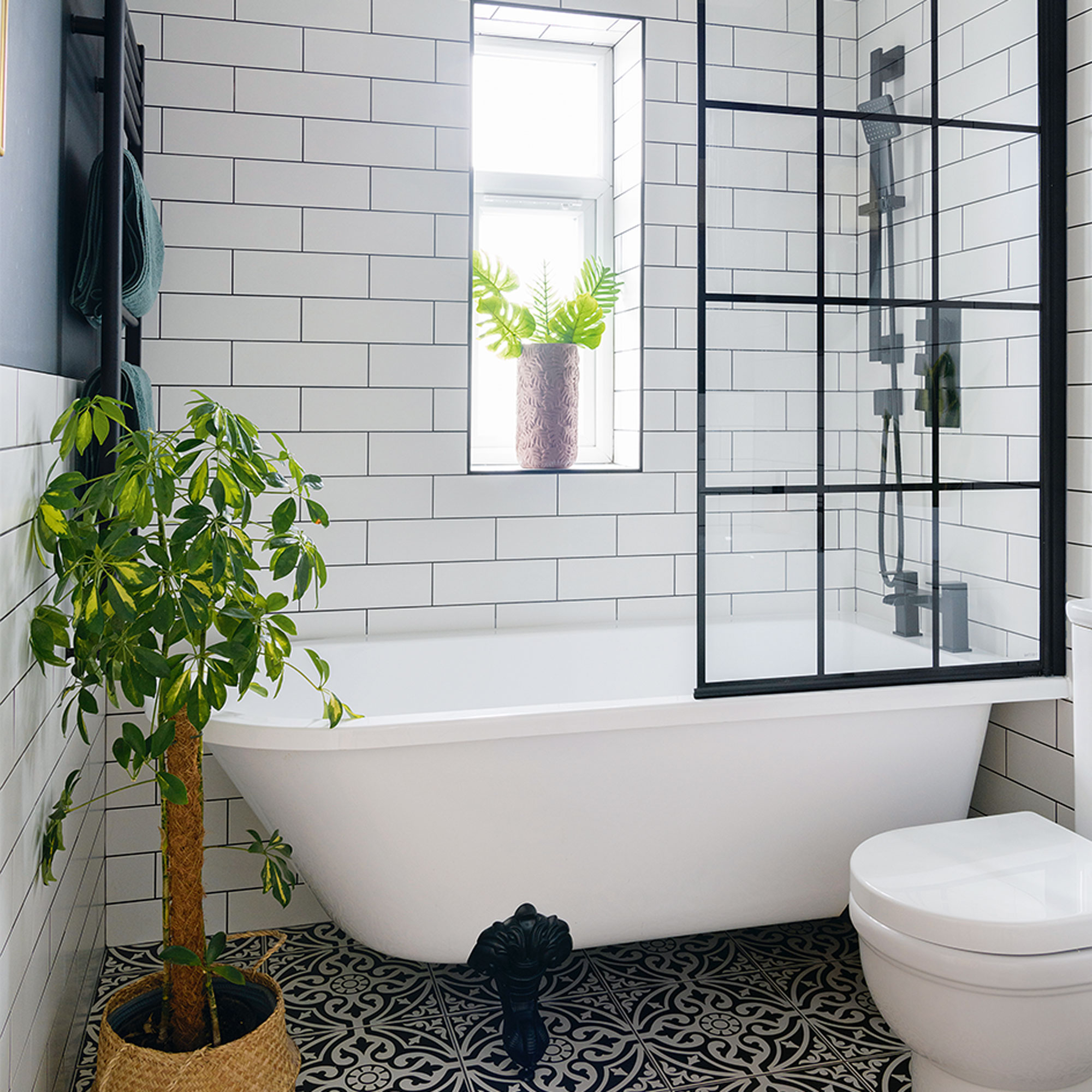
‘We initally updated the bathroom at the same time as the kitchen as a temporary fix so that it was clean and bright.’
‘When we finally did the full reno a few years later, we replaced the standby tiles with these white metro tiles which were only £10 per square metre, also changing the chrome fittings to black ones – and I sprayed the radiator and bath claw feet black to match.’
Living room gallery wall
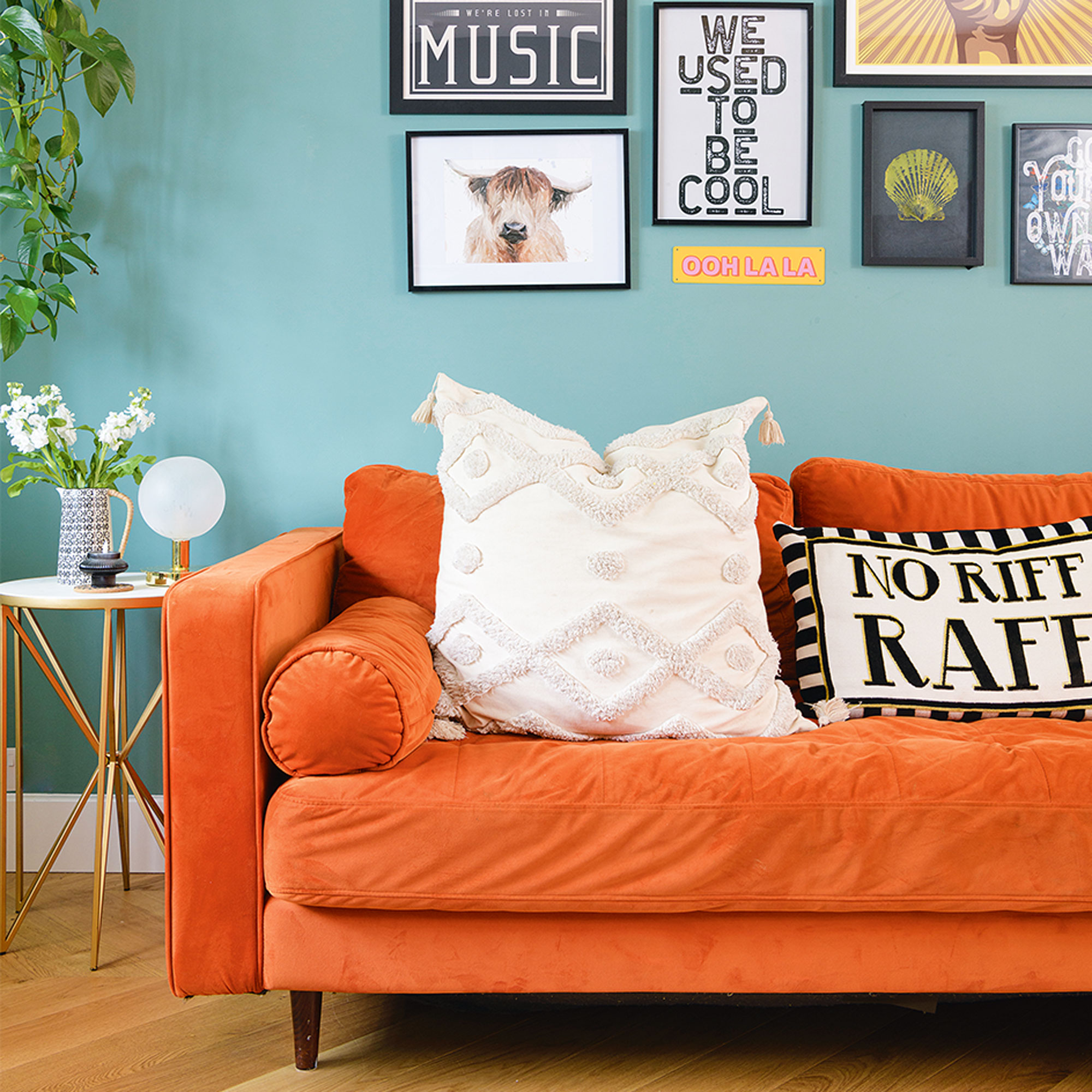
‘I’ve a passion for music and I also love a gallery wall so we used this space to showcase those two loves, finishing the layout with this cool ‘Lost in Music’ print from Rockett St George.’
‘When we bought the house we were in a very different financial position to now and we never dreamed that we could achieve this amazing home; initially the most we thought we would get was a loft conversion.’
‘But new jobs and promotions allowed us the opportunity to be brave and bold, and although it wasn’t always easy, and I think everybody will say renovations always cost more and always take more time, equally it's always worth it in the end!'


