Get all your news in one place.
100's of premium titles.
One app.
Start reading
Creative Bloq
Creative Bloq
Technology
Joe Foley

Is this burger menu design a prime cut or canner?

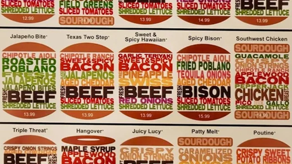
An image from a burger menu showing burger ingredients represented in text in different colours.

A clever use of colour and typography can communicate so much in graphic design. Alas, like even the finest-quality grass-fed beef from the Argentine pampas, it can be overdone and overseasoned.

This menu design from a small local burger restaurant is giving infographic and festival lineup vibes for me, but graphic designers have serious beef with its legibility. Perhaps a word cloud sandwich doesn't makes for the best user experience when it comes to ordering a burger?

Sign up to read this article
Read news from 100's of titles, curated specifically for you.
Already a member? Sign in here
Related Stories
Top stories on inkl right now
One subscription that gives you access to news from hundreds of sites
Already a member? Sign in here
Our Picks
Fourteen days free
Download the app
One app. One membership.
100+ trusted global sources.