As a child of the '90s, I grew up with the original Matrix trilogy. Back then, those films were the epitome of cool. I, however, as a twelve year old in my trench coat and sunglasses, was not.
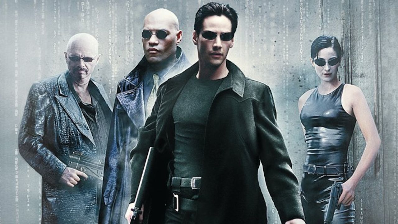
So I was a little surprised to read this week that the Wachowskis, creators and directors of the series, weren't at all enamoured with the poster for the 1999 original movie the one that ended up adorning the DVD cover for years. It's hardly one of the best movie posters ever, but is it really that bad?
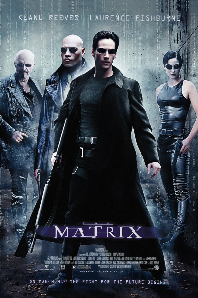
Those kinds of composites are always frustrating, because the composites never make any sense," Lilly Wachowski told Indiewire in an interview this week. They’re like early versions of AI slop, where I look at that poster, and all I see is Morpheus behind Neo; his shoulder is above Neo, but his hand is actually longer than Neo’s hand. So either Morpheus has really long arms or Neo has really short arms. [Laughs] That’s all I see."
"And the guns! They’re just not interesting. It’s not evocative of anything. That poster doesn’t mean anything. I think we’re always looking for the poster to, you know, be an ambassador for the film — to try and tick a box in terms of what it means, what the movie is about. So, eh. You know. Everybody likes the poster! What do I know?"
I have to admit, I'd never noticed the thing with Morpheus's hilariously long arm. That can never be unseen. But otherwise, it's curious how affection and nostalgia can blind us to sloppy design. Because I thought the image was cool as a kid, I've never even questioned the design. But ultimately it is just another version of the standard floating head drivel that's plagued action films for decades.
Still, it's nowhere near as bad a the DVD cover for The Matrix Reloaded. Even as a kid, I knew that was bad.