2023 saw a range of logo trends, from wide wordmarks to flowing psychedelia to clever use of negative space, with the likes of Pepsi and Nickelodeon impressing – but what about 2024?
Web design brand Wix has predicted nine different logo trends to look out for in the year ahead, and it makes for interesting reading. Some, like minimalism, you may expect based on the trends of the last few years, but you may not have considered some of the others. (Looking for design inspiration? Check out the best logos of all time.)
We’re firmly in the social media age, so it’s not surprising that many brands consider less to be more, with clean and simple logos, and this is something Wix expects to continue. And it views typographic logos as likely to remain popular, but with a focus on lowercase lettering. No matter the fonts and typefaces used, lowercase could be king. When the start of a word is in lowercase, our minds are more likely to remember the word as a whole, rather than just the beginning letter.
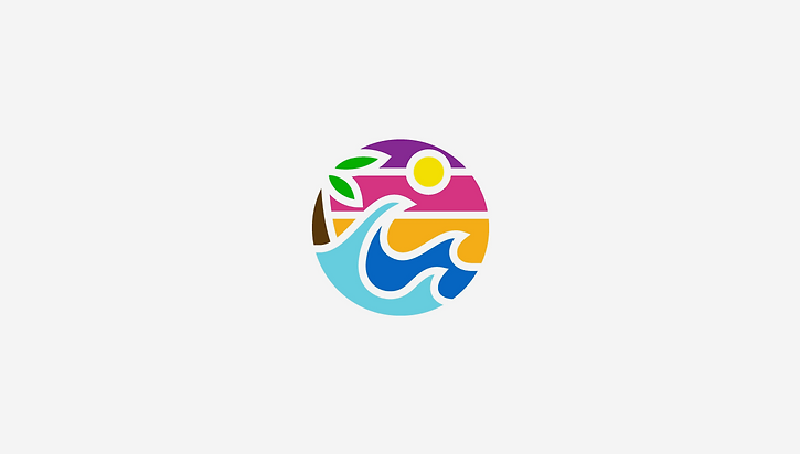
Bright, bold logos are sure to stick in the mind, too, so these are also expected to be popular in 2024. They can be modern, exciting, and full of energy, and look great against both light and dark backgrounds.
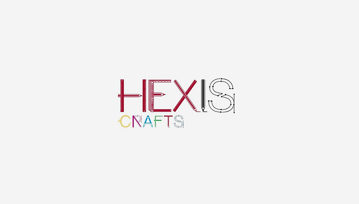
Illustrative typography is another trend Wix mentions, describing it as an art form. This can involve using letters to make more complex or detailed shapes, or creating monograms. Wix gives the examples of companies changing the letter “o” in their names to make them look like tyres and craft businesses making the letters in their names depict craft equipment.
Similarly, Wix discusses hybrid logos as one of the trends for 2024. Here, brands combine bold colours, varied fonts and complex designs to create coherent logos with plenty of depth. The aim is to make logos which look impressive in not only physical form but digitally too.
We could be looking back to the past, too. This is nothing new, of course, with the likes of Nickelodeon and Burberry turning back the clock when it comes to their new logos, but the trend isn’t thought to be going away any time soon, with brands combining old and new to great effect. Consider vintage-style logos that incorporate modern, bold colours, for example.
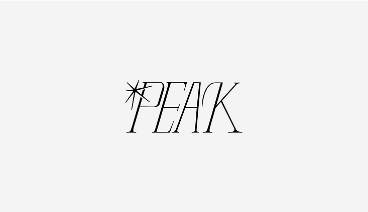
And one era that could be particularly prominent is the Art Deco era. The movement had its heyday in the 1920s, but it could be set to make a comeback a century on. Its bold use of geometry and symmetry lends itself well to contemporary logo designs, perhaps prompting the beginnings of a slight shift away from minimalism – though, again, this isn’t likely to go anywhere for a while yet.
Of course, there’s been a heavy focus on the environment of late, and this is something that Wix predicts brands to incorporate into their logos next year. With many consumers becoming more eco-conscious, it expects brands to blend nature into their designs, with earthy tones and natural movements – swaying leaves and flowing water, for example.
Wix’s final prediction is that logos will be “intentionally flawed” in 2024. This might be in the form of hand drawings and logos that have clearly been worked on by humans – perhaps a response to the emergence of AI? Broken and distorted fonts are also on the rise, as are DIY punk aesthetics, signifying an increasing focus on individuality in the face of big tech and large corporations.

