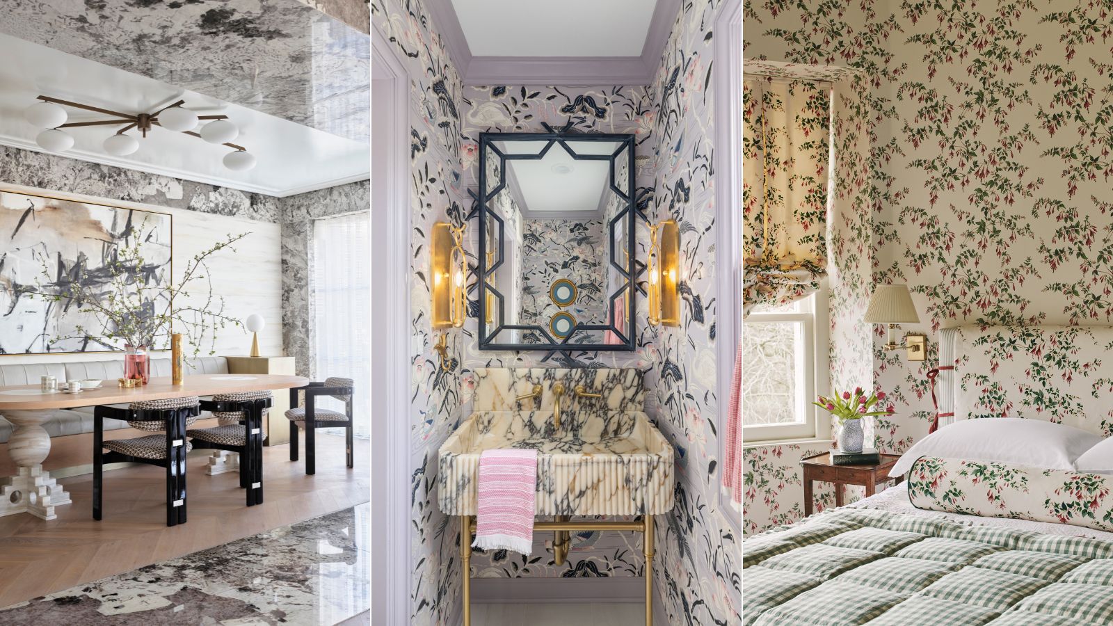
Maximalism is the interior design style centered around the principle that more is more; think contrasting colors and plentiful patterns teamed with statement surfaces and furniture all within one space.
While most people associate the style with bold colors, you don’t need to use color in order to embrace the maximalist look. Introducing neutral maximalism – the interior design style that makes a statement with subtle hues.
As with maximalism, pattern, texture, statement furnishings and trims abound but vibrant palettes are traded in for schemes of calming neutrals and the softest of pastels to create engaging spaces full of interest yet easier on the eye.
Are you a fan of maximalist style yet lean to more grounding colors? These muted maximalist schemes and expert tips might just provide the project inspiration you're after.
What is neutral maximalism?
Neutral maximalism is the interior design style that brings together layers of contrasting patterns, textures, and surfaces, as well as sculptural furnishings, all within a neutral palette. The look is a wonderful way to create layered, characterful interiors without the use of bold tones.
Decorating with neutrals and limiting a room scheme to a neutral palette of subtle, tonal variations allows the focus to shift to textures and shapes, giving a deeper appreciation for sculptural designer pieces or statement surfaces.
‘The idea of maximalism often brings to mind bold contrasts, layered textures and vivid colors and while those are certainly maximalist attributes, they are not the only route to a maximalist space,’ explains interior designer Shalini Misra.
‘Maximalism is indeed about contrast, but this can be achieved with surprisingly neutral tones. When planning a space think about the neutral spectrum, with black at one end and white at the other; between those two tones there are a number of others - brown, ivory, taupe and grey can all vary significantly from each other, so when combined with contrast in mind and layered with interesting texture they can become very impactful.’
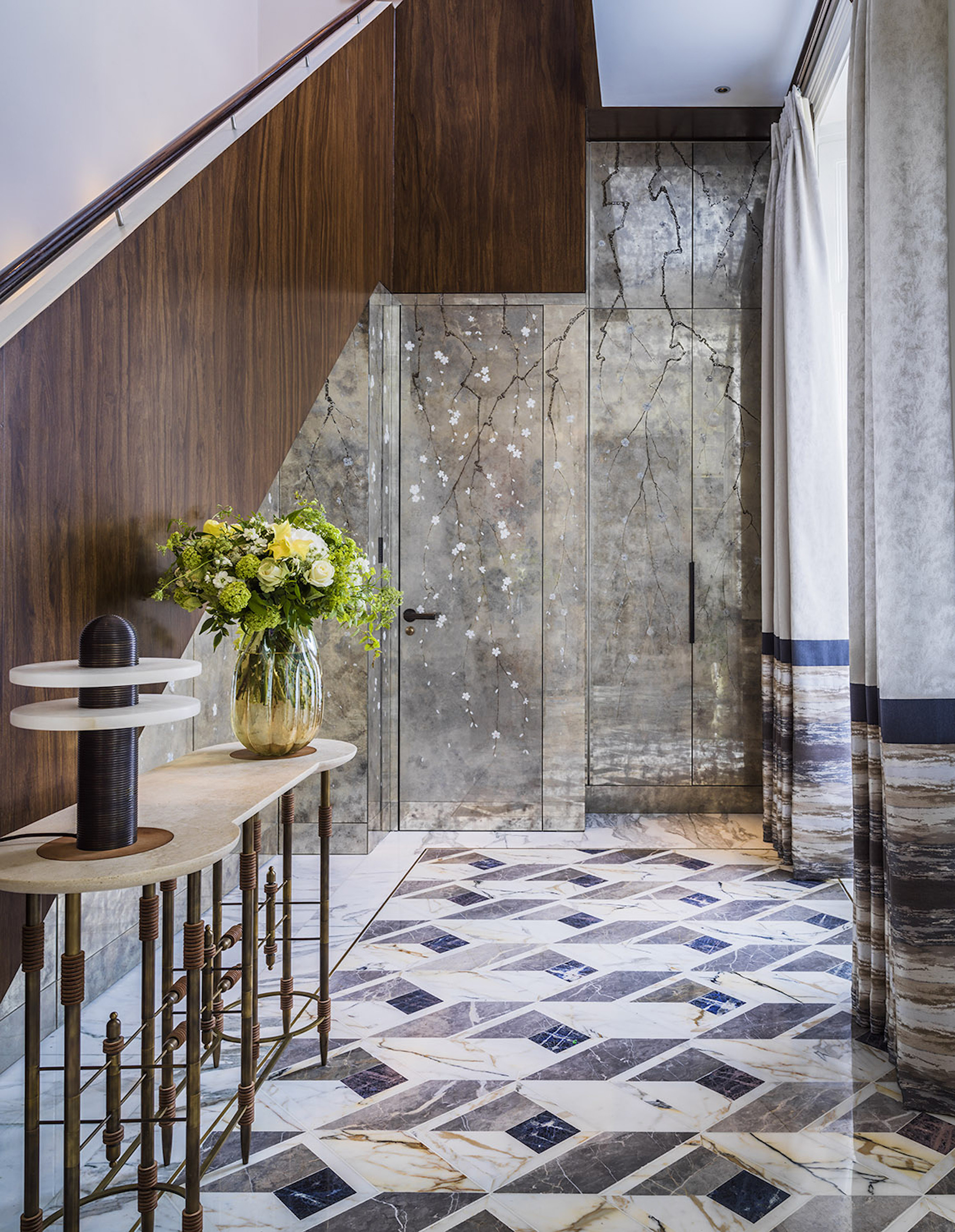
While neutral maximalism has enduring appeal, it is a look that's been growing in popularity in recent years. 'Neutral maximalism is coming to the forefront these days in fashion, and interiors usually follow suit. We seem to be stepping away from the showy ‘more is more’ and craving a simpler and more elegant aesthetic,' says interior designer Erik Munro. 'I don’t think minimalism is on its way back but instead something softer, layered, considered, and organic.'
1. Introduce texture with natural materials
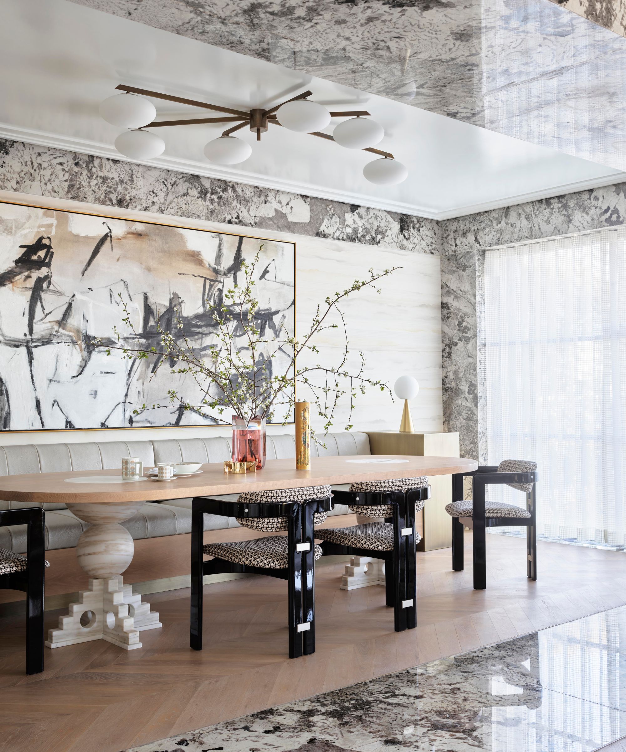
Decorating with natural stone is a wonderful way to channel the neutral maximalist look. Muted in color, yet featuring myriad tones and subtle markings natural materials such as marble, travertine or granite make stunning statement surfaces. A master of creating luxurious interiors full of interest, Greg Natale used over twenty varieties in this project.
'In Mosman House, we abided by a predominantly neutral, muted palette in most main living areas. However, the final look is still layered and maximalist because of all the materials we incorporated into the design,' says Greg Natale. 'We used twenty-eight different types of natural stone in this project, each with intricate, textured veining. One example is polished granite, which we used to create these huge portals that delineate between different rooms within an open-plan layout.'
'Already, we had so much visual excitement in the stone alone, so we therefore opted for furniture and décor in soft, neutral colors to let the materials really come into their own. If we are going clean and minimal with a neutral color palette, I always use an interesting material or textured finish on walls to prevent a room from looking flat.'
2. Go for a pattern-washed look
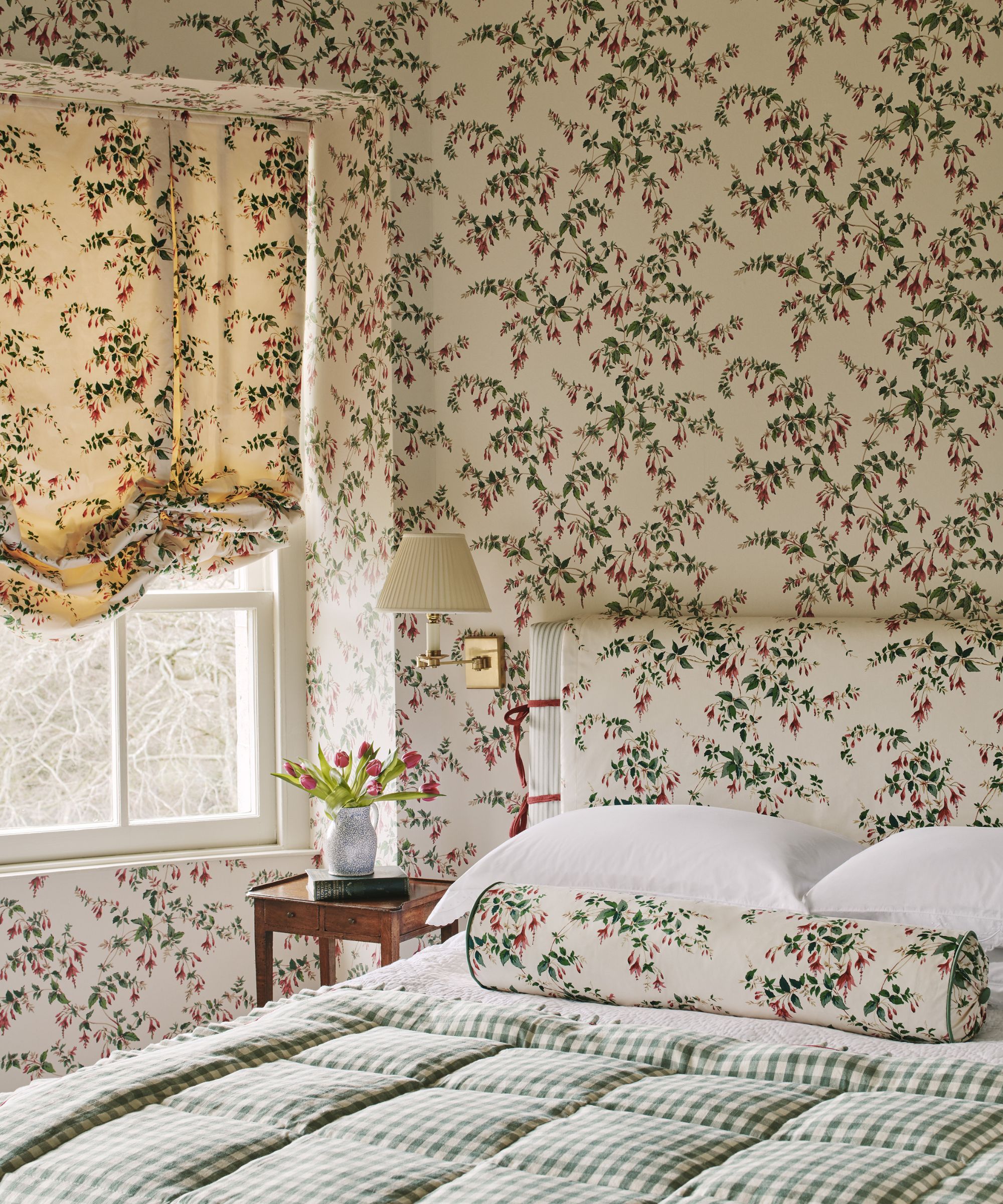
Why not create a romantic yet restful bedroom by pattern-washing all surfaces in a trailing botanical paper set on a neutral background? Encased in Colefax and Fowler's Fuschia wallpaper and fabric, this whimsical space is a perfect example of neutral maximalism.
'We were so thrilled to have the wallcovering of this classic Colefax and Fowler Fuchsia Chintz added to the range, meaning we could dress the walls, windows and bedhead of this room in a matching pattern. The coverage of the design is wonderfully distributed with the perfect ratio of neutral ground to colorful motif,' explains James Eden, head of marketing at Colefax and Fowler.
'Interestingly by pattern washing every surface, a design that would stand out as the only motif in a room seems to sit back and doesn’t dominate. Matching drapes and wallcoverings is nothing new, but there are few better designs than Fuchsia to make it work.'
3. Make a statement with veined marble
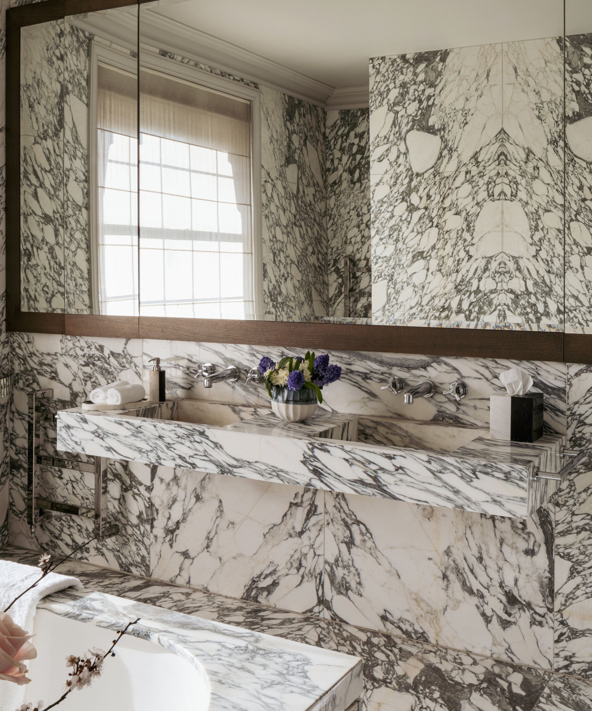
Embrace the neutral maximalism look in a bathroom with floor-to-ceiling veined marble as done in this luxury bathroom by Shalini Misra.
'This kind of neutral maximalism is great for anyone who wants their space to feel alive without it becoming overwhelming,' says Shalini Misra of this marble bathroom. 'Longevity is an added benefit here, with neutrals offering a versatile backdrop as our lives evolve.'
'Neutral maximalism works well in bathrooms and marble is the perfect material for this, because longevity is particularly important,' adds Shalini Misra. 'I always suggest marble is well considered when bought as it will last a lifetime.'
4. Showcase sculptural lighting and furniture
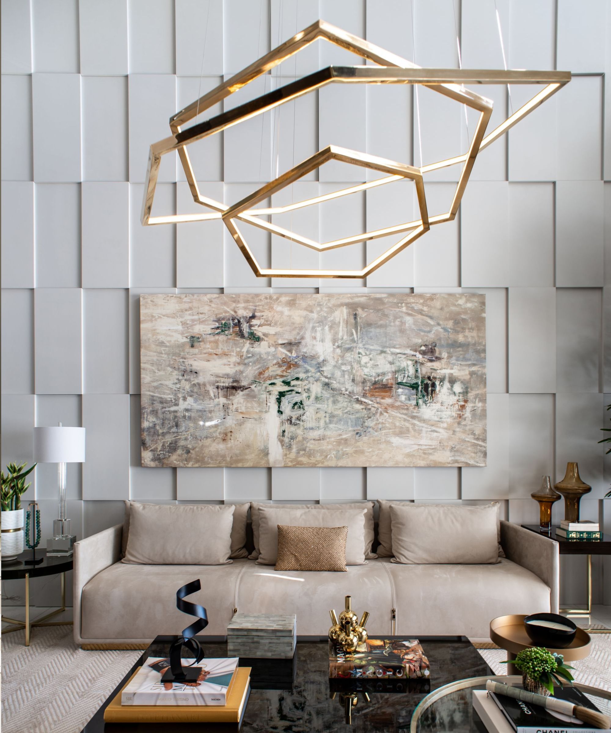
This space by Erik Munro is a wonderful example of how shape, form and texture can combine to create engaging neutral living rooms. The scheme proves that neutral rooms needn't be bland, in fact, they are wonderful rooms to introduce large sculptural pieces as they can really sing without the distraction of multiple colors. With its statement metallic finish, the Vesanto geometric chandelier from Cameron Design House is a particularly showstopping piece for a luxury scheme.
'We all know trends come and go and I think there will always be a demand for the exciting in a statement commercial project or home interior space, which can be achieved through show-stopping furniture and lighting,' says Erik Munro.
'A huge part of interior design is understanding positive and negative spaces and finding the balance between the two. Minimalistic spaces are almost all negative space, creating a lovely airy and clean feeling with very few finishes and materials. Neutral maximalism is a perfect balance between the two, using statement pieces to emphasize negative space.'
5. Embrace neutral maximalism in a powder room
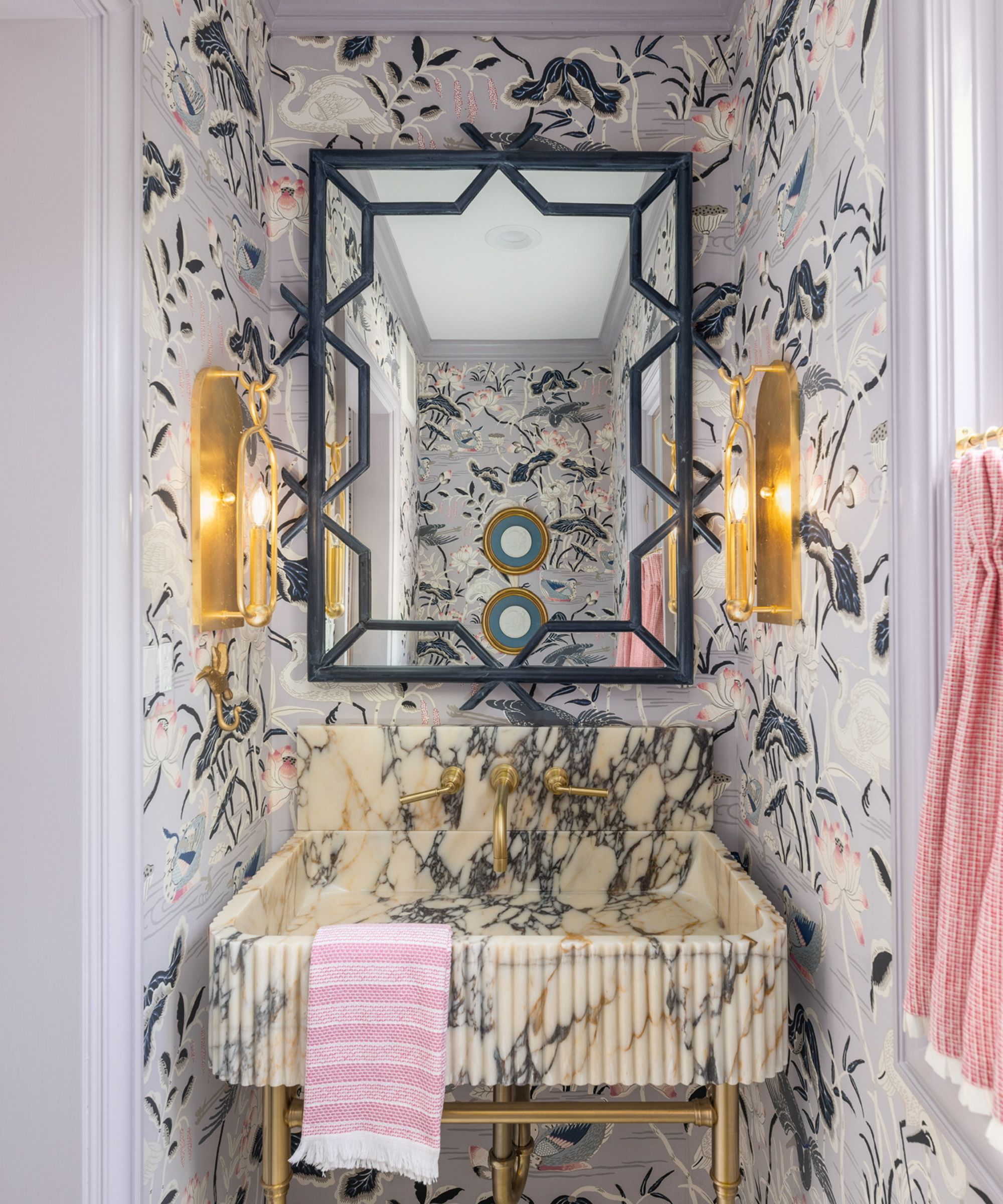
If you love maximalism but you're unsure where to start, try spaces like powder rooms or cloakrooms. As small spaces are only used for short amounts of time, they are the perfect rooms to push the boundaries. With its statement wallpaper, marble sink and sculptural fittings, this scheme by Paige Loperfido, interior designer and founder at Decor & More Design Studio, proves you don't need a large space to channel maximalism.
'The powder room in this lakefront estate provided an opportunity to create a feminine, jewelry box of a room that showcased luxe finishes and patterns. We chose the Schumacher Lotus Garden wallpaper as an ode to the grace and beauty of the natural world and the home's outdoor surroundings,' says Paige Loperfido.
‘The muted pastel and neutral tones (dusty rose, mauve, lilac, cream, gray, black) provide a foundation that ensures the maximalist wallpaper isn't overwhelming. The result is a whimsical yet grounded space.'
6. Layer constrating patterns in neutral tones
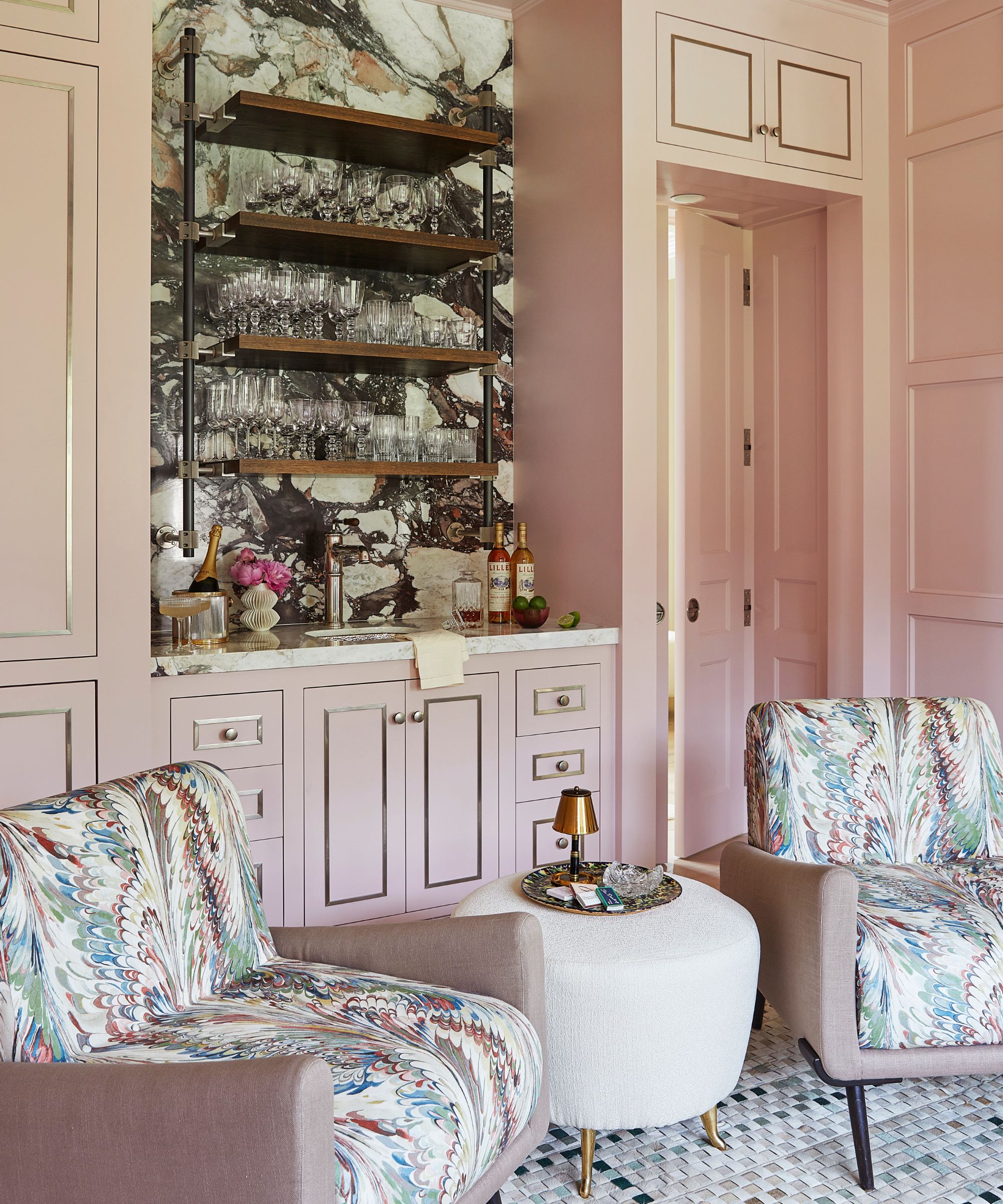
Juxtaposing different patterns over walls, floors and upholstery is an effective way to tap into the muted maximalist aesthetic as well as bringing softness and interest to large rooms.
When it comes to combining prints within a space 'it’s about the neutral backdrop and using patterns that are of varying sizes,' says NYC-based interior designer Phillip Thomas. In order to keep spaces balanced he believes there should be 'a hierarchy of patterns in a space so you don’t shut down – by looking at big patterns it becomes overwhelming and if it's too small, you lose it. It’s a delicate dance,' adds Thomas.
'The client wanted a home that was organic, natural, and pleasing to the eye. In contrast to their house in NYC we decided to go with muted pastel colors that didn’t jump out at you,' says Phillip Thomas of this space. 'This is a pink, but it certainly doesn’t overtake the room and complements the other materials and patterns in the space.'
7. Turn heads with graphic neutral wall tiles
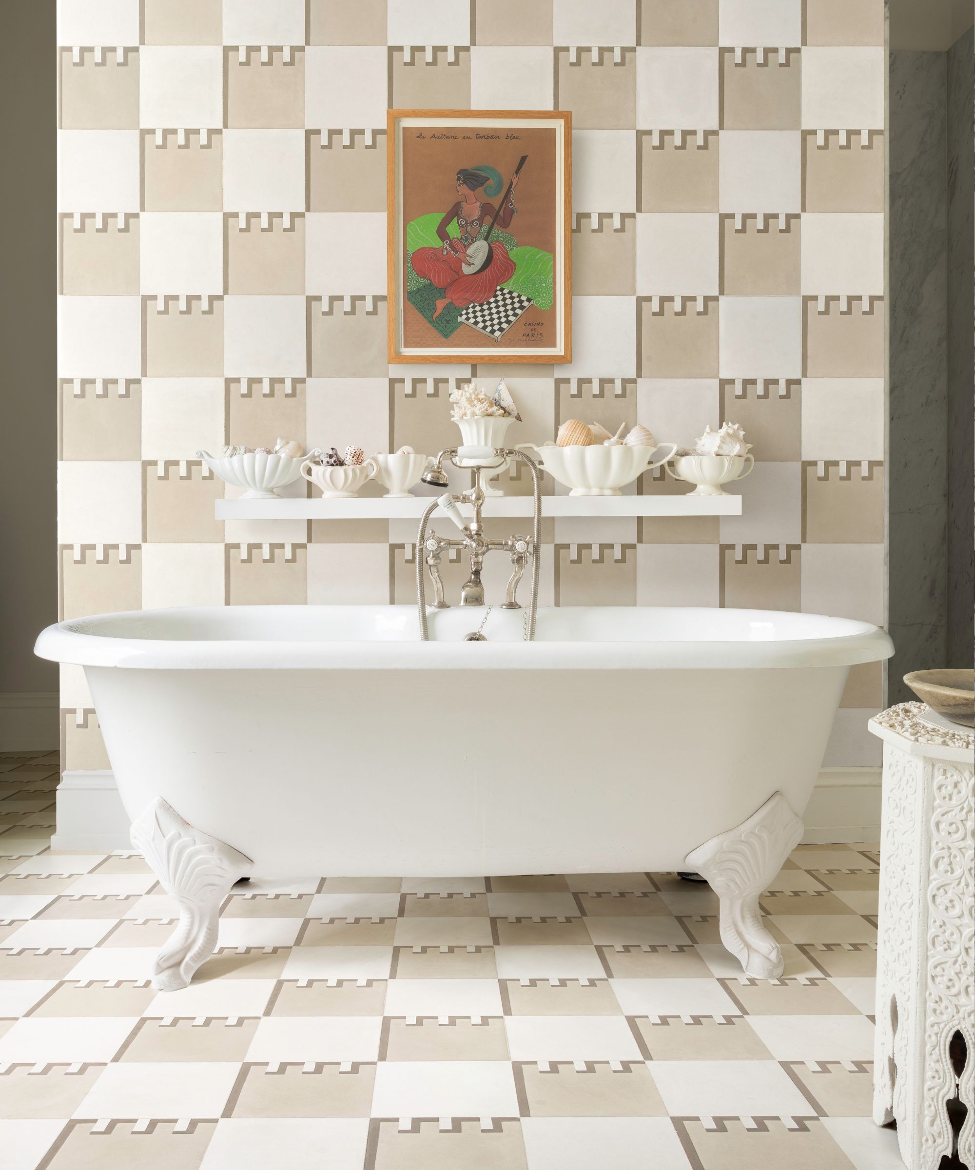
Designing a bathroom can be a careful balancing act. As private spaces, bathrooms are where you can afford to make bold statements and introduce design features you really love, yet they're also spaces of relaxation.
With this in mind, opting for a colorful maximalist scheme can be counterintuitive. On the other hand, a neutral bathroom that combines maximalist ideas may well offer the perfect solution. With so many decorative options available in neutral tones, tiles offer an easy way to recreate the look. Above cement tiles from Mosaic Factory make a bold statement in this bathroom by Susanne Sharpe.
'Neutral doesn't have to mean understated,' says Louisa Alice, creative director at Mosaic Factory. 'In fact, we have seen a surge in the popularity of our neutral tiles throughout 2024. Mixing shape, size and pattern adds personality to any space, allowing you to create character without the bold use of color. For impact and a maximalist look, match your floor tiles to your walls.'
Neutral maximalism channels the principles of maximalism but brings these together within a neutral color palette. Contrasting patterns, textural surfaces, natural materials and sculptural furnishings are used in random and abundance yet the whole look is bound with muted, pared-back tones.
‘Neutral doesn't mean boring!’ says Paige Loperfido interior designer and founder at Decor & More Design Studio. To capture neutral maximalism, ‘create visual interest through a mix of patterns, textures, and layers and add elements from nature including wood tones, natural stone, wool rugs for grounding of warmth,' says Paige Loperfido. 'And remember - muted doesn't not have to mean beige!'


