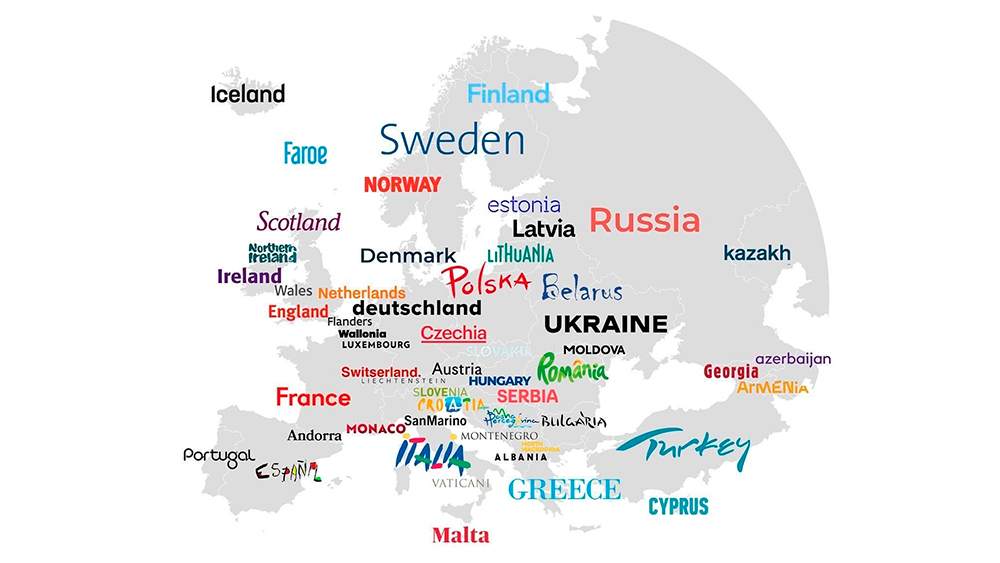
Making travel plans for 2024? One thing you might not pay much attention to is the font used in the tourism logo for the state or country you might visit. But unconsciously, the type chosen to promote a destination can have an impact on how we think of it. And it can reveal how the place sees itself, or how it wants us to see it.
While some country tourism board logos change with times, fashions or target outbound markets, some have proved to be remarkably enduring. Turespaña, the Spanish tourism board, has used the vibrant Sol de Miró logo created by the artist Joan Miró for 40 years, since 1983. Now, thanks to a trend on Reddit, we have maps that allow us to travel the world virtually and compare the typographical choices of different tourism boards.