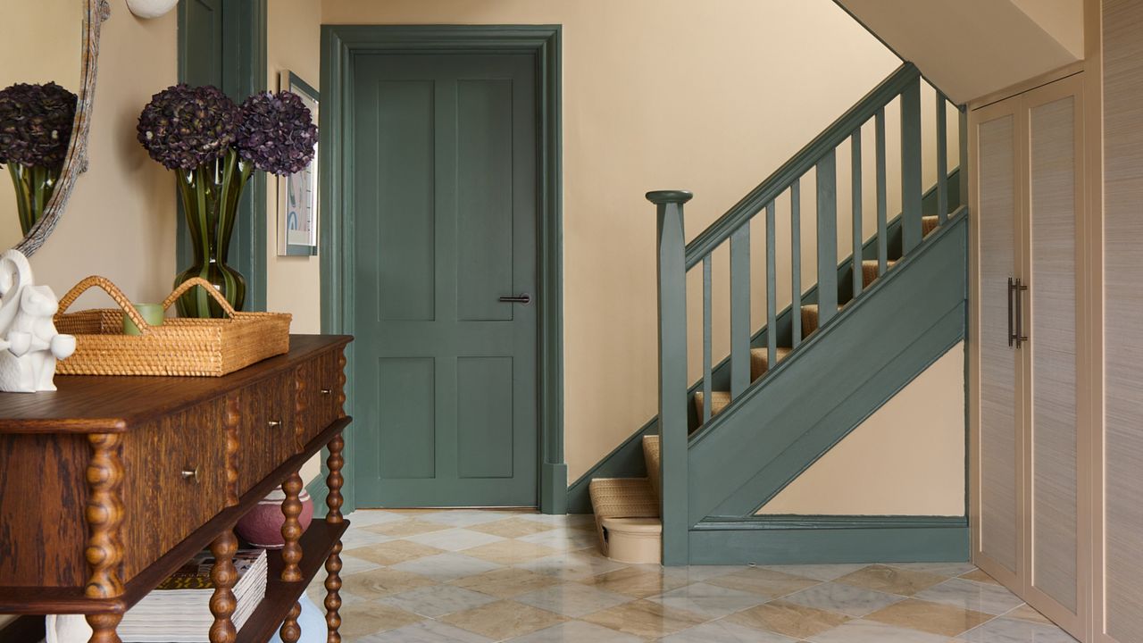
If a room has attractive architectural features — or you’re adding them yourself — why leave them white? Even the most avowed minimalist would find it hard to argue with the fact that keeping trim in such a plain shade often makes it look a little, well, ‘standard’. With even a slightly bolder treatment, everything from baseboards to architrave can become an important design element.
That said, skipping white doesn’t have to be all about creating contrast or using multiple paint colors (although, if you’re feeling playful, we've already found the most beautiful trim color combos). Swapping white trim for a similar hue to your walls, for example, creates a contemporary look that makes details appear softer without disappearing or becoming anonymous.

So, why have the experts stopped using white trim? And what should you do instead? Here's what they recommend.
1. Color Drench
Splashing the same color all over your walls, ceiling, trim, and all is a popular look in 2026. On one hand, it stops architectural oddities like sharp corners and sloped ceilings from disrupting a room’s visual flow, while on the other it makes trim feel like part of the same story rather than an afterthought.
“Painting architectural details like woodwork, paneling, and trim in the same color as the walls creates an immersive, considered feeling within a room,” agrees London-based interior designer Carina Raymond. “Rather than creating break lines, carrying a shade across the features allows the architecture to become part of the overall design.”
“It might be our instinct to leave crown moldings and paneling white, but introducing color across these elements brings a much more sophisticated result,” she explains. “It celebrates trim and makes it feel more intentional.”

“This Edward Bulmer shade is perfect for creating a warm, enveloping scheme and works wonderfully on trim,” says Carina.
2. Find a Match
If you’re not using white trim, which color do you choose? With so many possibilities, it’s best to draw from the other elements in your space. Picking out a shade prominent in patterned features like wallpaper, upholstery fabric, or even statement wall art will create a harmonious look without the danger of it appearing too ‘samey’.
“Instead of habitually painting woodwork white, a complementary neutral or bold coordinating color makes trim appear fresh and uplifting,” explains Little Greene’s Ruth Mottershead. “This subtle continuity allows even the boldest patterns to appear balanced and cohesive.”
That said, there are two ways to take this approach. “For a gentle look, take the base or background color from your pattern and use it on trim,” instructs Ruth. “For a more maximalist feel, consider taking the deepest or brightest color from within the pattern onto your painted surfaces.”
3. Spotlight Natural Wood
Not all designers have swapped white trim for polar opposite options. Removing layers of paint and stripping existing baseboards and moldings back to their original wood brings a timeless look to a space. At the same time, adding new trim in a grainy material can make contemporary builds feel more layered.
And so it is in this Krakow apartment, where interior designer Klara Ostrowska opted to let oak speak for itself. “This project is in a new building, and the natural grain of the wood makes the space feel warm without losing any of its minimal, elegant atmosphere,” she explains.
“This is an excellent way to give an extra touch to walls you’re painting white,” says Klara. “Using natural materials is an expressive choice that adds energy and character, making a room look and feel more individual.”
4. Combine Colors
If you’re painting paneling and wainscoting, there’s no need to commit to just a single shade. “Using more than one color on trim creates depth, making a room composed rather than simply decorated,” say German design duo Johanna and Friedrich Gräfling.
This is especially effective in rooms where the walls are already painted in a color, as the additional hues complement or contrast rather than simply come out of nowhere. “The relationship between walls and woodwork is often what makes a palette feel sophisticated and timeless,” the pair explain. “This frames rooms, gives rhythm to walls, and makes the overall proportions seem more deliberate.”
For a sense of order, go for two (or maximum three) colors. Deeper hues appear sophisticated when paired with softer ones, as shown here, while the brightest colors are best left for single trim accents rather than large expanses of paneling.

Looking to add trim to your own space? Skip the remodel with this peel-and-stick solution, which can be applied as part of a simple DIY project.
5. Create Harmony
“Keeping decorative details within the same color family gives a much more harmonious feeling than leaving them white,” says Laura Stephens, who combined terracotta woodwork with warm ochre walls in this study.
“Painting baseboards and window casings in a variation of the palette used on walls allows the room to feel connected and cohesive,” Laura explains. “A contrasting color would have a completely different effect, whereas this feels calm and considered.”
The interior designer recommends using the darker version of your color for trim, rather than the other way around. “Don’t be afraid to go deeper on the architectural details, as these areas carry richer shades beautifully,” she instructs.
6. Think Vertically
The trend for color capping incorporates the ceiling into the design of your space. Much like trim, the ‘fifth wall’ is often left white — but why? Using color on the ceiling, and dropping its boundaries by including crown molding and any trim positioned toward the top of a wall, instantly shifts the look of a space.
“This creates a layered look and is a wonderful way to create a richer, more engaging interior,” says Paint & Paper Library’s head of design Andy Greenall. “As ceiling and trim are often painted white, using color can radically alter the overall ambience of your room.”
To make the effect work seamlessly, work again within a tonal framework. “From graduating neutral shades to more dramatic color pairings, working with varied strengths of the same color family offers depth without disruption,” explains Andy.
7. Use Darker Detailing
Neutrals (or even plain white) aren’t always a bad idea for trim, just as long as you make them more interesting. In this London project, Rebecca Hughes opted for a ‘shadow line’ effect using gray and black architectural moulding alongside off-white walls.
“Even the subtlest contrast creates definition,” the interior designer explains. “Neutral interiors are often associated with simplicity, but enhancing trim and other architectural details ensures they never feel flat or one-dimensional.”
“Painting the outer trim in a darker shade, and the inner line of the molding in a darker tone still, allows the paneling here to read as an intentional architectural detail, without introducing any bold colors or patterns,” says Rebecca. “This extra layer of refinement elevates even the most understated palettes.”
8. Make It Pop
Door and window casings frame how you walk into and through a space, as well as how you interact with the outside of it. Leaving these elements in plain white trim can disguise them, yes, but if walls are also neutral, then it leaves your space feeling flat — another reason, then, not to paint small rooms white.
Choosing a color that really stands out is the most playful way to highlight a room’s boundaries. “Painting architectural details and trim in a bright color draws attention to them in a much more interesting way than standard white,” agrees Katerina Tchevytchalova, founder of K’Arte Design.
“It also highlights the craftsmanship of the trim itself and modernizes the look of historic features,” the designer explains.

The clue is in the name — make an impact on your architectural trim by painting it a bright, bold hue.
There’s freshness to modern ceiling trim ideas, making white seem even more basic. As interior designers swap white trim for more decorative choices, it’s well worth considering leaving the default option behind in your own project.
Sign up to the Livingetc newsletter for even more ideas straight to your inbox.