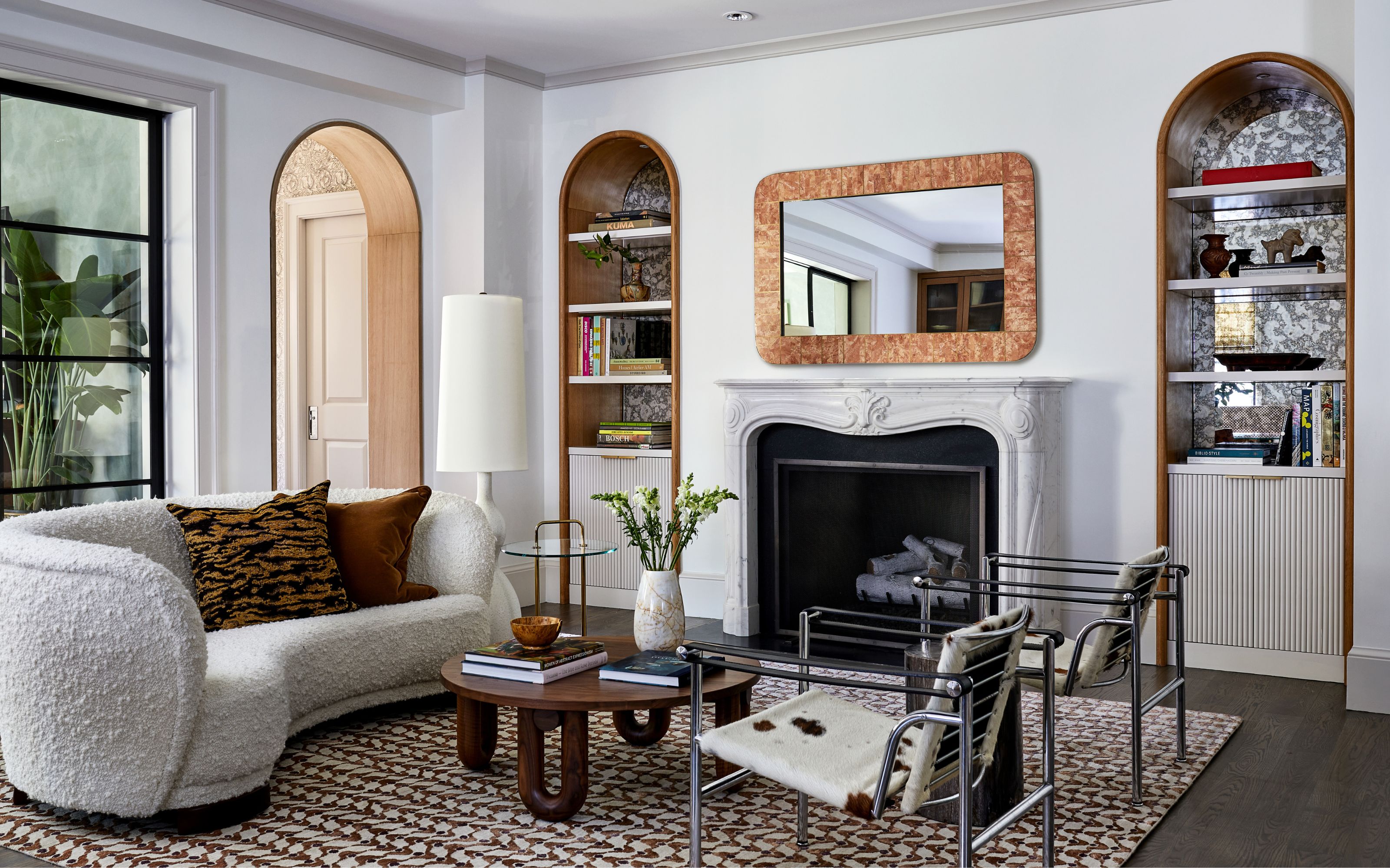
Irrespective of budget, we all want to give our homes that elevated, expensive feel. And it can definitely be achieved by choosing the right colors and materials. It’s also easy to get it wrong. One of the most important elements when creating the designer look in your home is choosing the right paint color for your walls. But with so many options that can actually make your house look cheap, it’s no wonder why some of us spend so long testing out dozens of shades before settling, still somewhat unsure, on a final choice.
While you’re trying to give your home an expensive look make-over, pick the wrong shade of white and you might actually achieve the opposite. Pick a tone that was on trend a while ago and now your home looks instantly dated. Sounds scary, but it needn’t be. I spoke to interior designers who revealed the 5 paint colors you should definitely steer clear of if you don't want your home to look cheap. They gave me their suggestions on what to get instead for an elevated, timeless look.