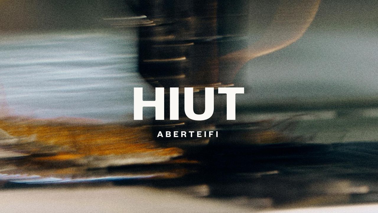
It's a little embarrassing, to be honest. I've spent more time this week than is healthy staring at a new logo for the fashion label Huit. Not the full identity, not the gorgeous landscape photography, not even the lovely barn owl mark. Just the wordmark. Four letters set in a chunky, beautifully weighted grotesque, with a small secondary line reading "ABERTEIFI" beneath it in widely-tracked caps.
That's it. That's the whole thing. And yet here I am, still thinking about it a week after first seeing it; turning it over in my mind like a loose stone in my pocket.