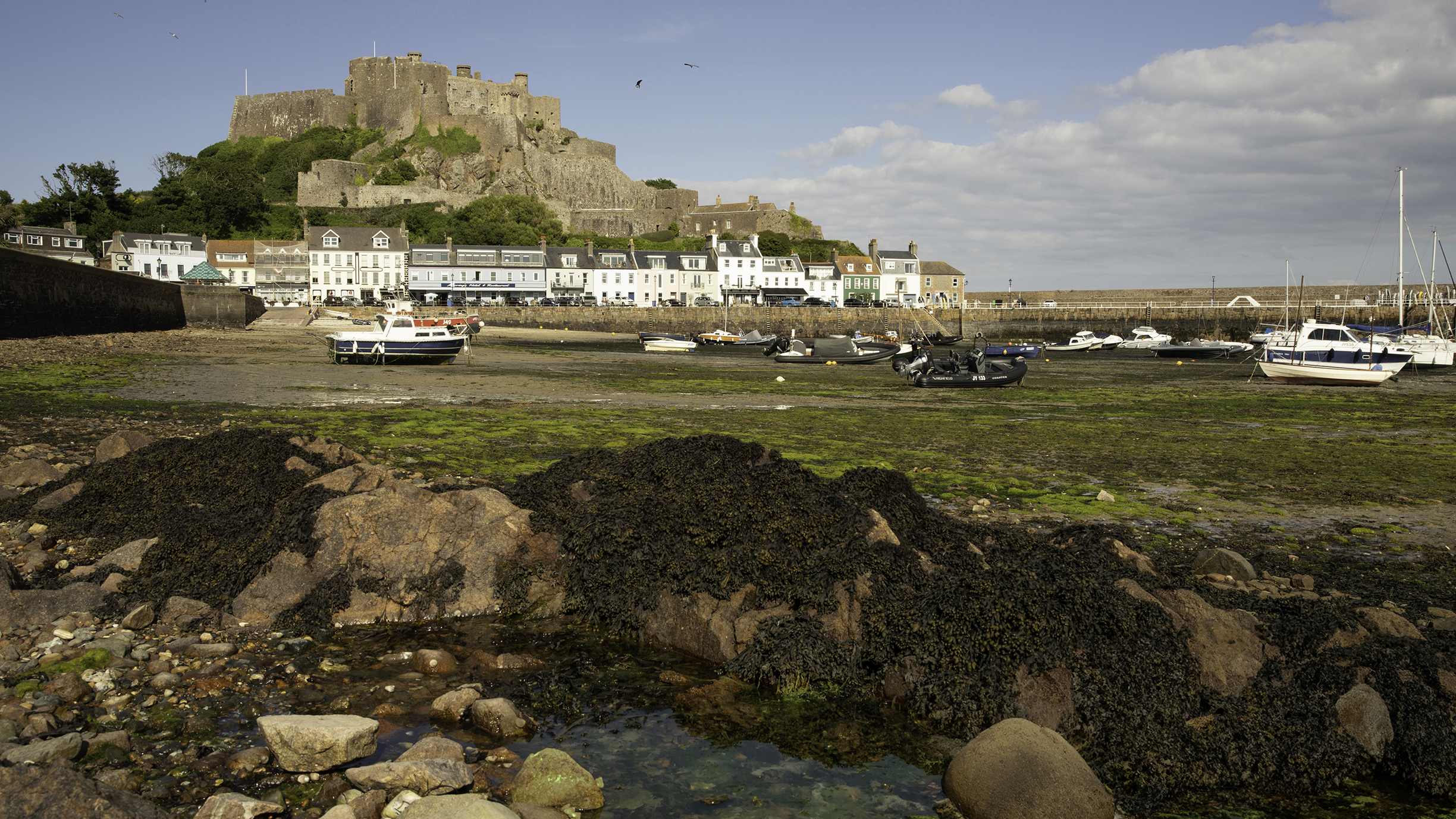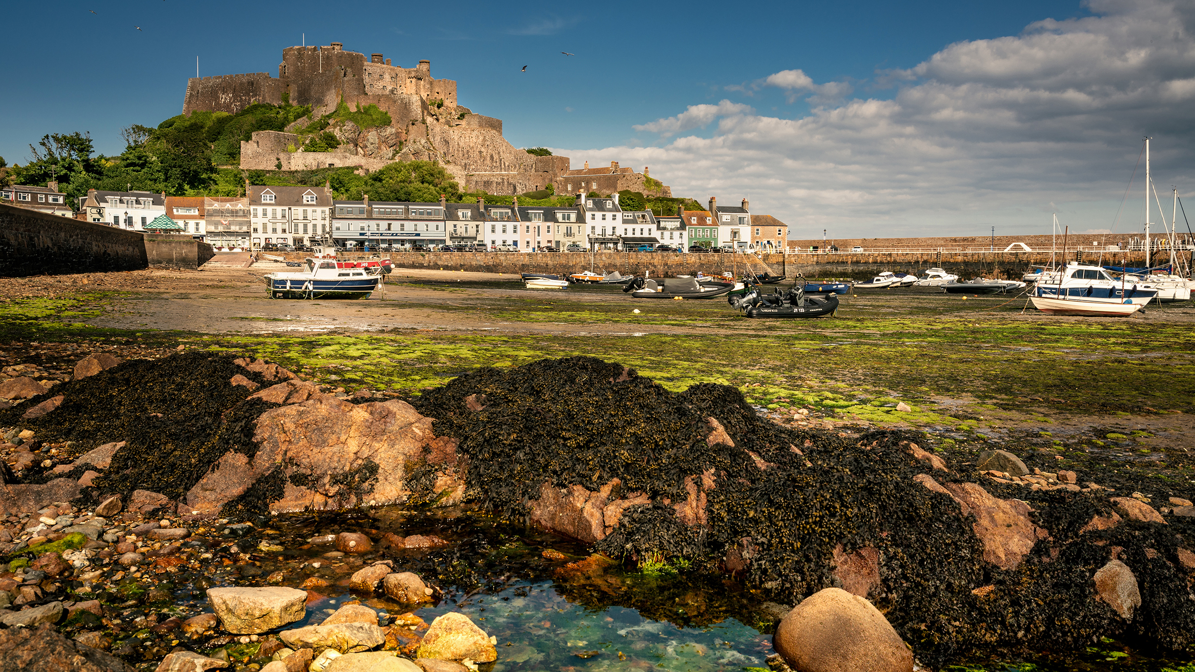
Harbors and marinas are great places to explore with a camera and offer a tremendous range of detail on which we can focus. It’s possible to find subjects for both close-up shots and wide vistas, allowing us to capture the many facets of this fascinating environment.
However, as with all coastal locations, harbors are subject to extreme tidal changes in water level and, unfortunately, it isn’t always possible to be on location at the ideal time of the tidal cycle – when water is rushing in or out of the harbor, drawing attractive lines around the boats and rocks.
- Wide-angle zoom lens
- Low-level camera support
- Polariser (optional)
During low tide, you’ll often find that the boats are resting on sand and the retreating water has revealed a jumble of rocks, seaweed, barnacles and other debris on the seabed, which doesn’t often make for the most photogenic of foregrounds.
Also, when dry, sand absorbs a lot of light rather than reflecting it, which can make colours appear dull and muted within the frame. This can all add up to produce a boring middle ground in our landscape shots, so we must work to control the relative proportions of all areas of the frame. Let’s explore the best ways to reduce unsightly parts of the scene through careful composition and creative use of exposure.
Scene analysis
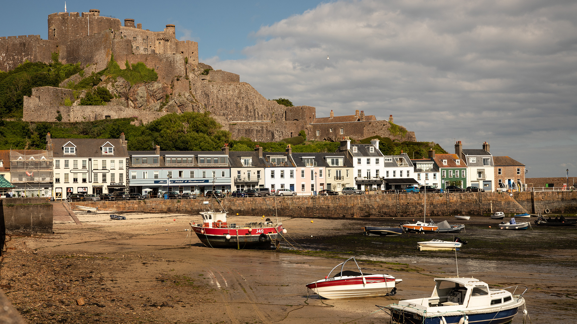
1. Imbalanced frame
From this angle, there is too much empty space on the left side of the frame
2. Busy detail
This foreground area contains lots of distracting small rocks and debris left by the tide
3. Dull material
Dry sand absorbs light, creating an uninspiring and monotonous area of bland colour
4. No structure
Here, the foreground, middle ground and background aren’t clearly defined
Shooting steps
1. Lower the camera

The key aspect to the success of this technique is to hide areas of the scene that you don’t want the viewer to see. Get the camera as low as possible to hide the dry middle ground. We used our camera bag, rather than a tripod, for the lowest position.
2. Stop down
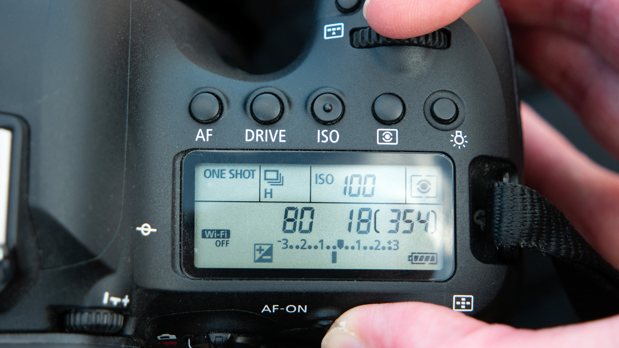
As the camera is close to foreground elements, the depth of field is greatly reduced, so choose an aperture setting of at least f/11. For this scene, f/16 was needed to get both the foreground rocks and the distant castle sharp. Magnify the preview to check this.
3. Crop the foreground
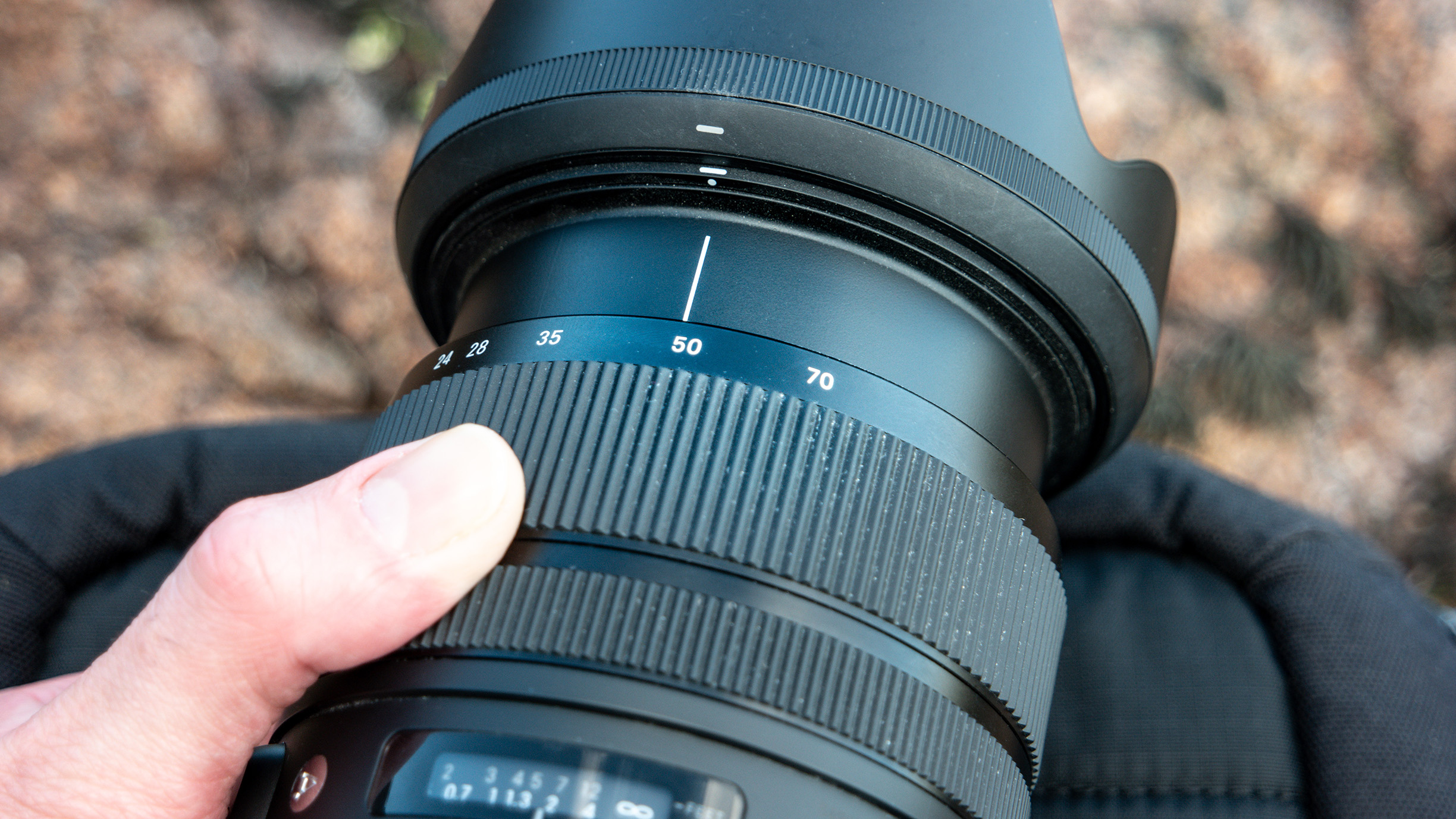
At 24mm on our full-frame camera, there is a little too much foreground. Zoom in to balance the weight of each area of the scene and reduce the middle ground further, keeping an eye on the depth of field as you change the focal length.
4. Focus the scene
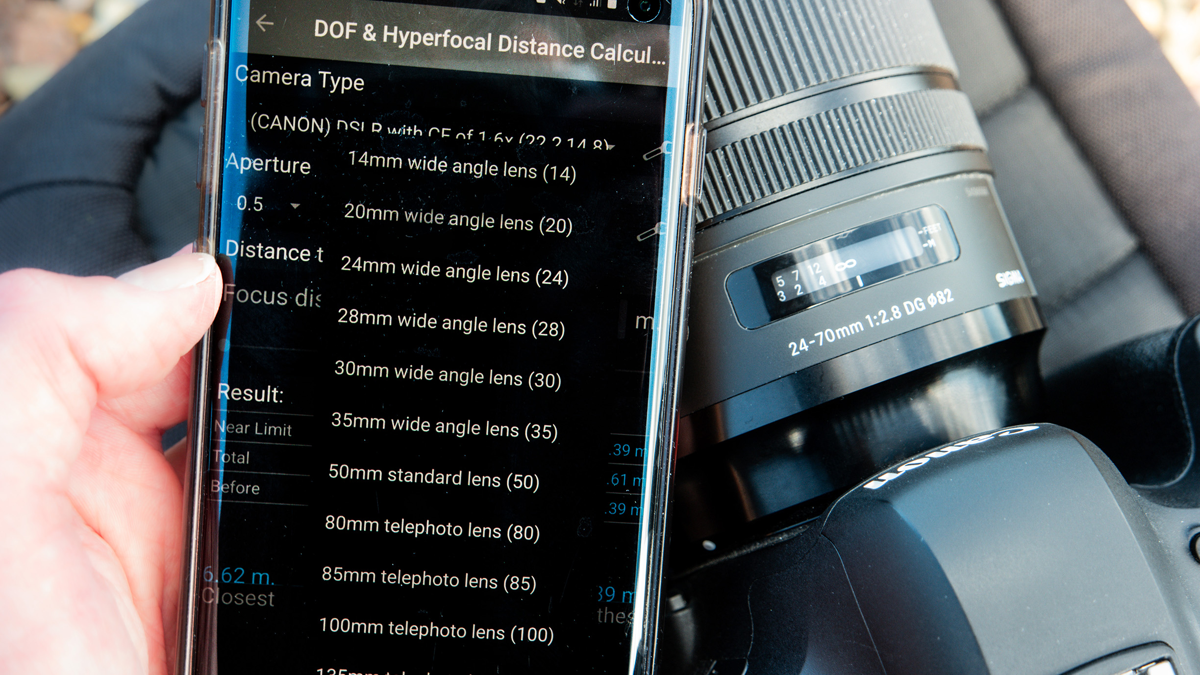
Double-distance and hyperfocal focusing aren’t always reliable when objects are located at greatly different distances. We used a hyperfocal distance app for the focus values at our focal length and f/stop, then performed visual micro-adjustments.
5. Wait for the light
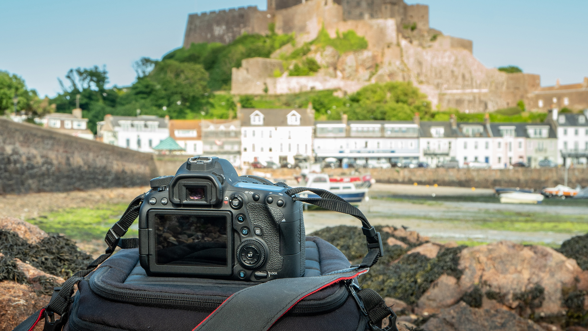
With the camera set, wait for a break in the clouds. The harsher summer evening light has some drawbacks, but one advantage is dramatic spotlighting. We took a frame as a cloud moved across the sun, breaking up the lighting structure a little.
6. Underexpose
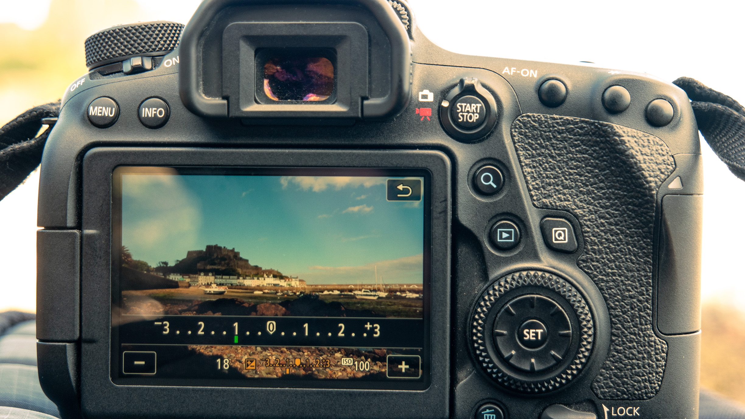
We used negative 1EV exposure compensation to darken the shadows a little. While harsh shadows are generally avoided in landscape photography, underexposing dull, non-reflective areas can draw attention away from boring middlegrounds.
Pro tip
Try shooting vertically

If the composition isn’t working, try making the foreground a major feature of your landscape scene
Your options to minimise dull middle grounds and foregrounds include pitching the camera up and exaggerating the sky or going all-in on the foreground. Where there is a good amount of detail to focus on close to the camera, try shooting in portrait orientation to capture texture in the rockpools that are often left once the tide has gone out. Use a polariser to cut through reflections and see the detail at the bottom of pools.
Editing steps
1. Balance the range
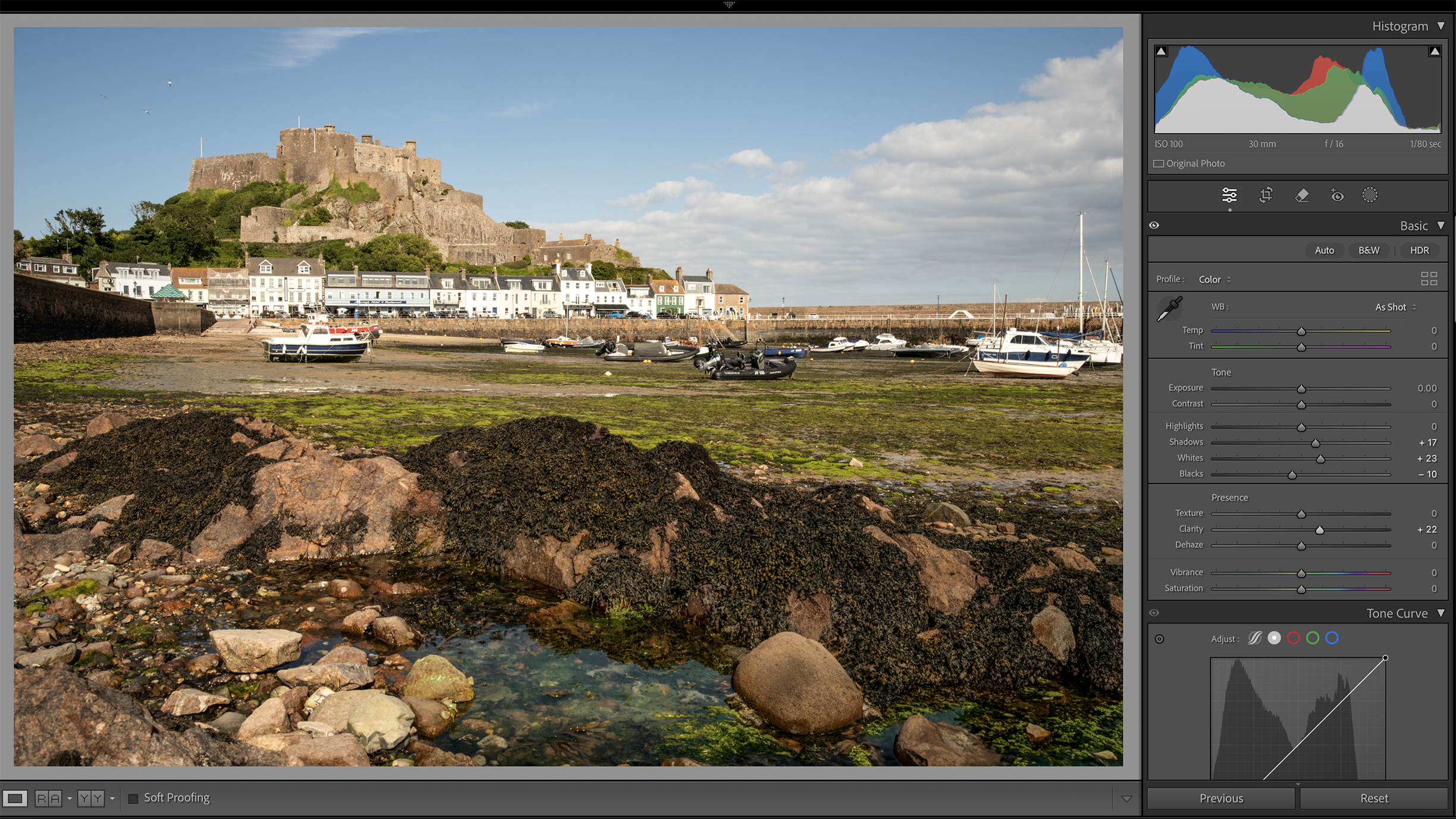
After setting the Black and White points, manage the distribution of shadows and highlights. In an image with darker rocks in the foreground, these will block up quickly. By waiting for the sunlight to hit them, only a small Shadows increase is needed.
2. Control colour luminance
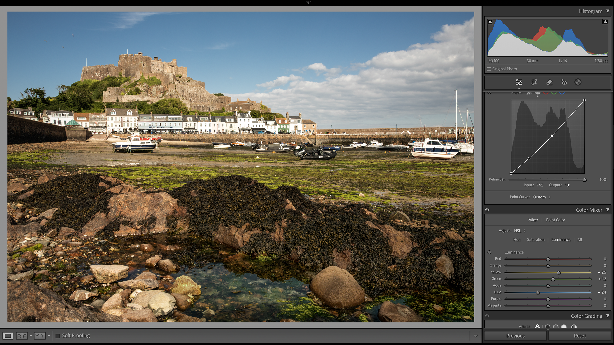
After making a Curves adjustment to darken the mid tones, we also increased the Luminance of the Greens and Yellows in HSL to prevent the green seaweed from being dulled, too. We then darkened the Blues to deepen the sky contrast.
3. Dodge and Burn
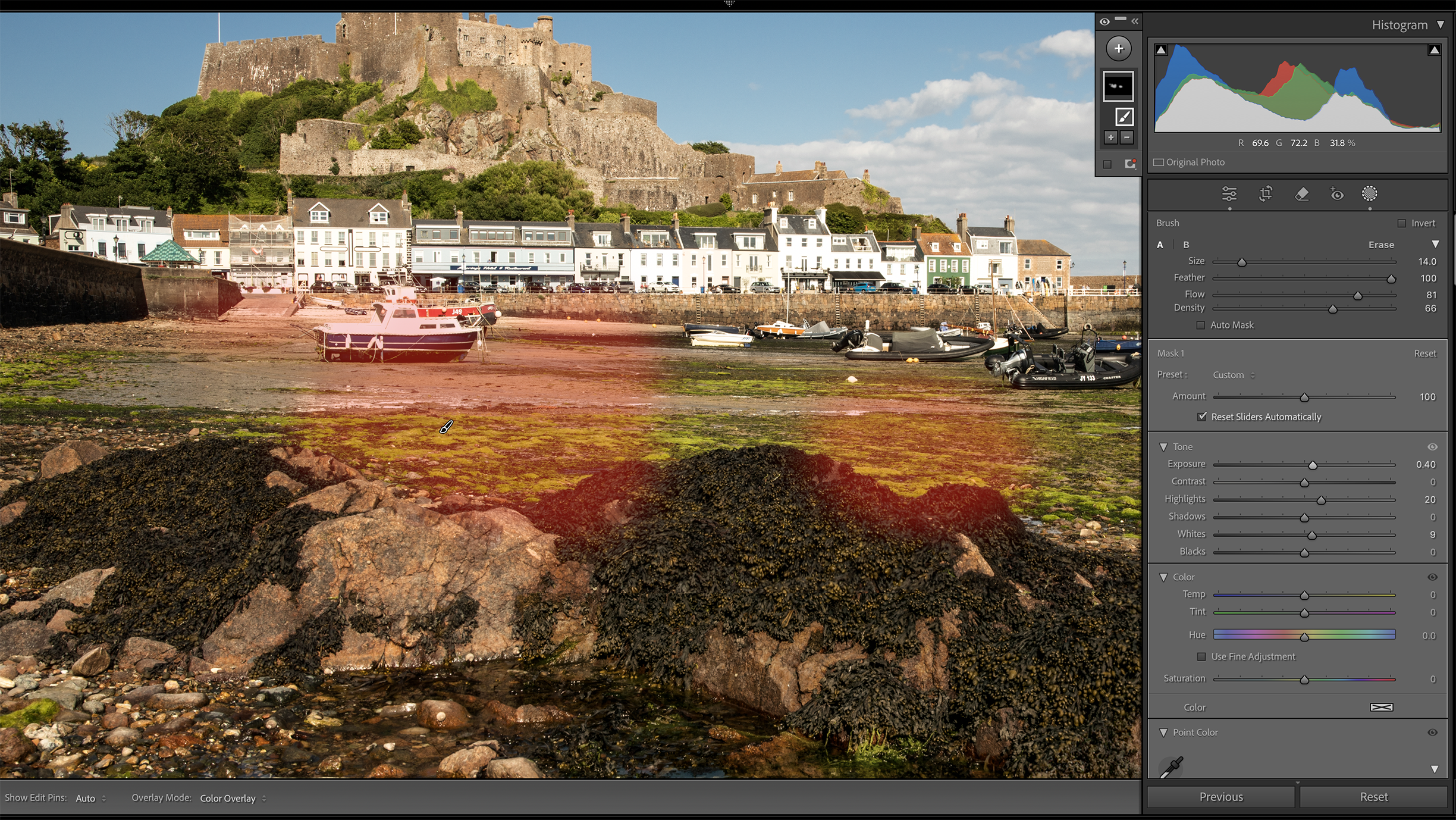
To enhance the pools of light we waited for on the shoot, we used the Adjustment Brush in Lightroom (K) with -0.50 Exposure to burn the soft shadows cast by the clouds. We then applied a Dodge to highlight areas with positive +0.40 Exposure.
4. Tone the highlights
The late afternoon sunlight is a little cool, so we applied some Color Grading by adding a Yellow tone to the Highlights and light Magenta to the Midtones for a natural colour depth. Adjust the Balance to ensure that fresh greens don’t turn yellow.
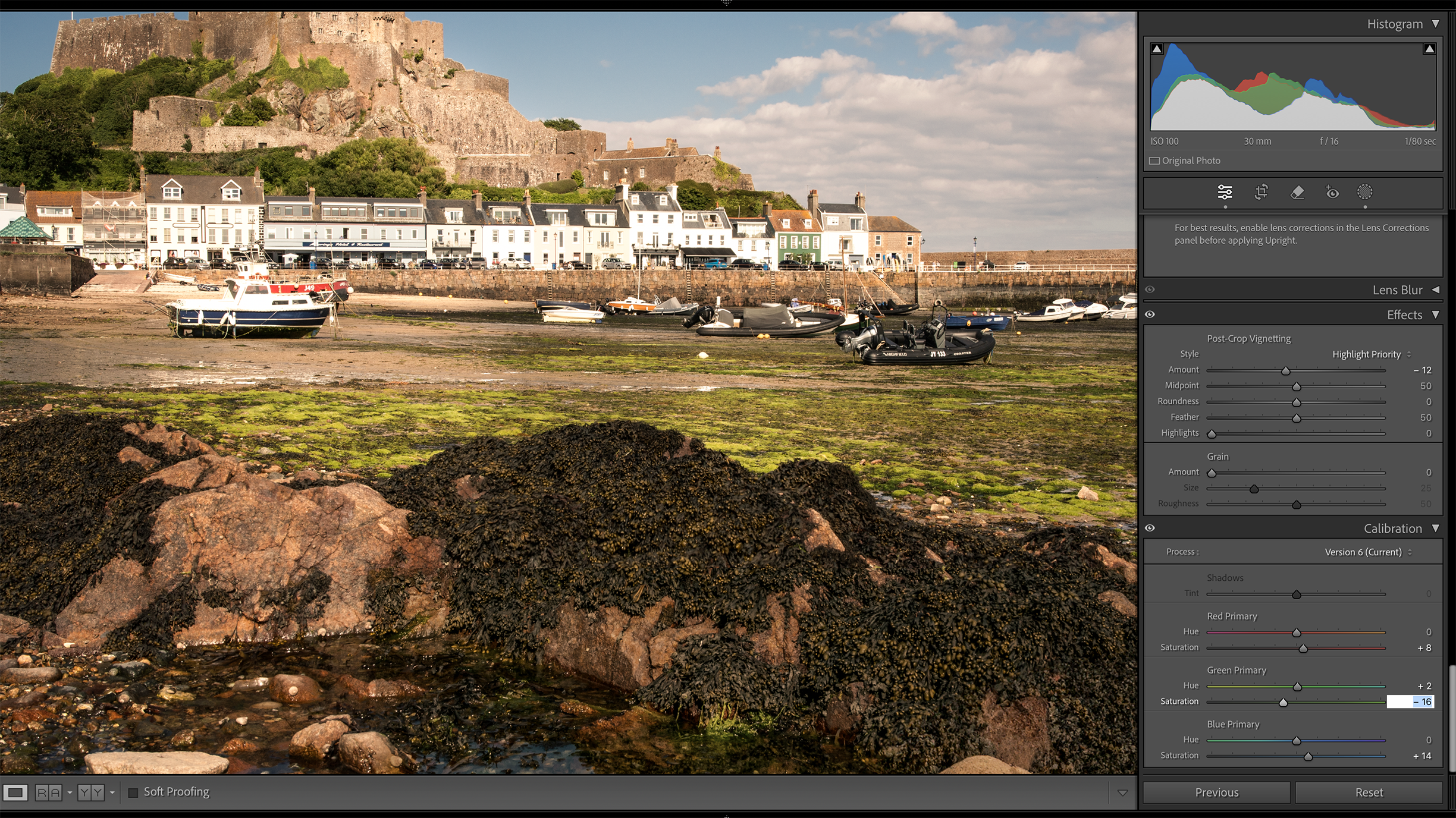
5. Adjust colour calibration
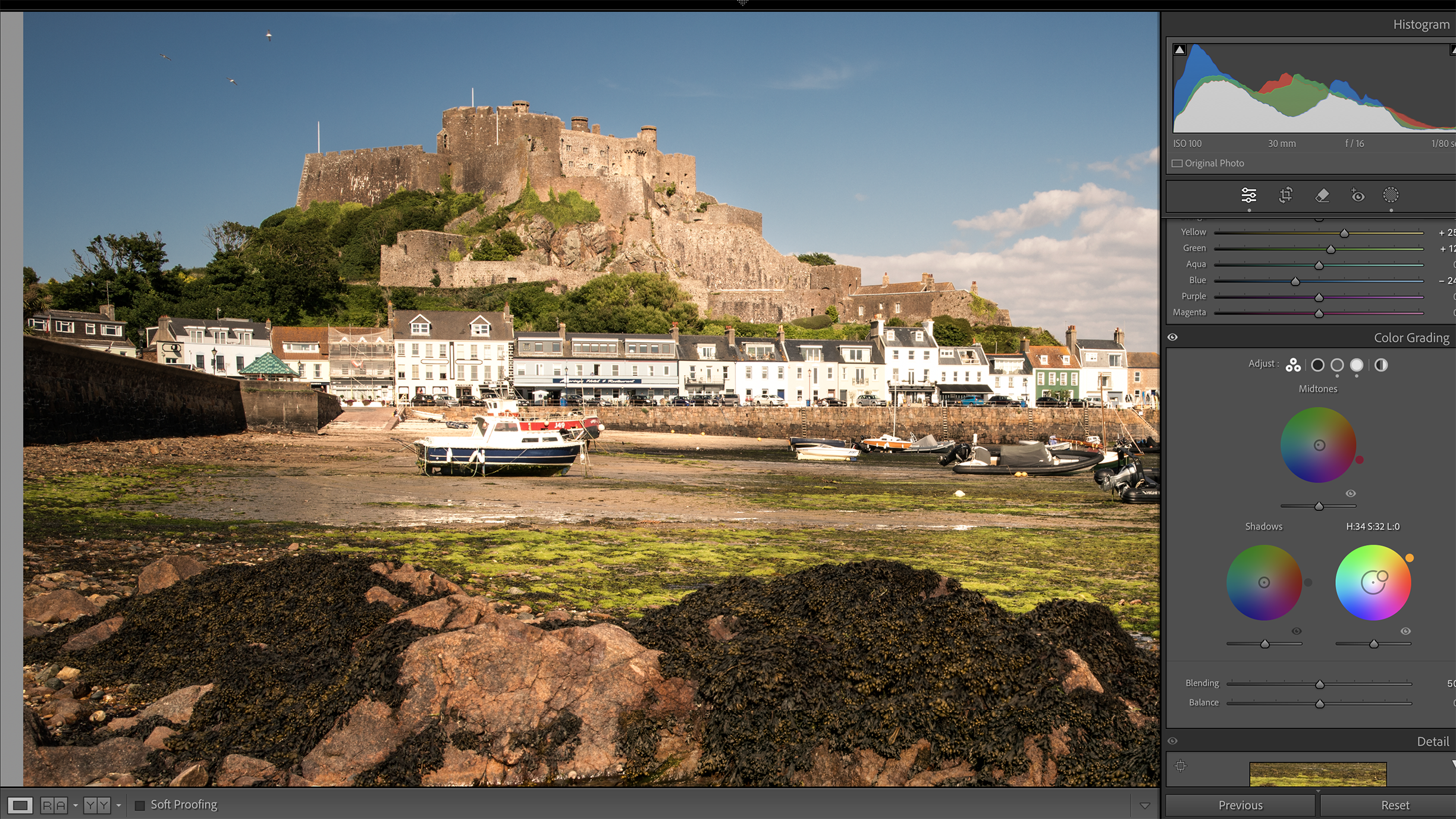
We used the Calibration Tab to adjust the Hue and Saturation of the Green Primary and also adjusted the other colour options to create a saturated but natural colour balance. The final colour step was to reduce the global Saturation by -2.
6. Selective Sharpening
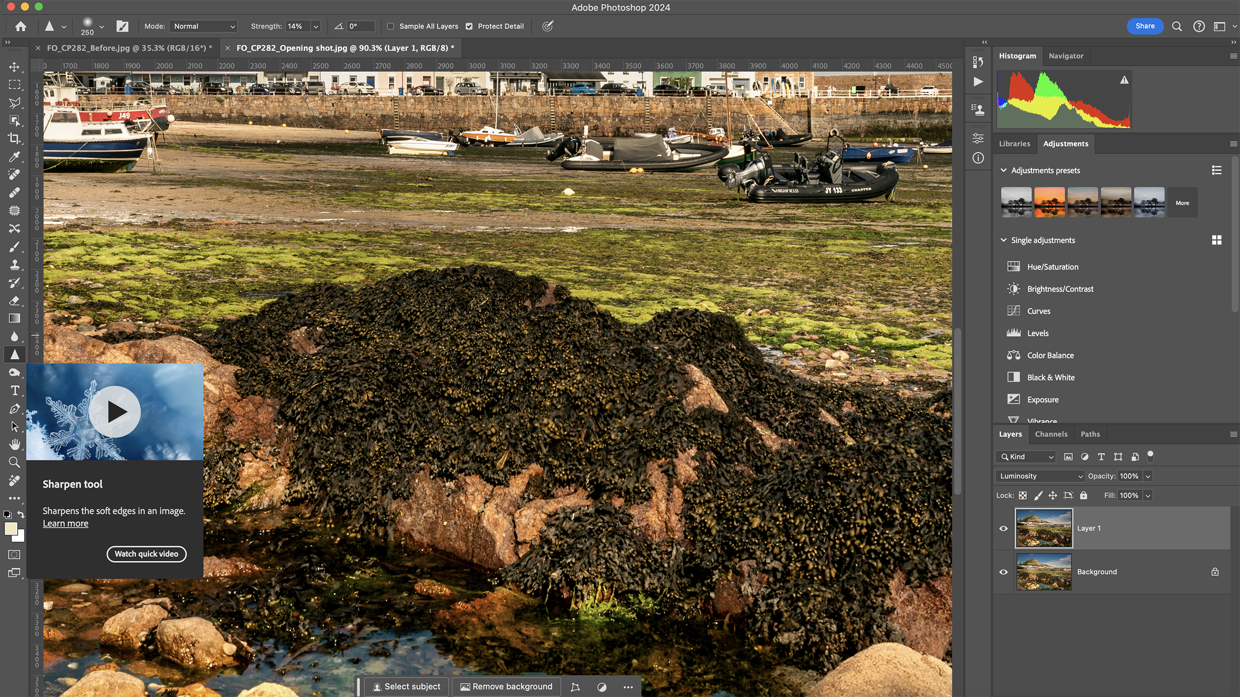
Setting the aperture to f/16 produced sufficient DOF, but diffraction has lowered critical sharpness, especially in the foreground detail. Use the Adjustment Brush or the Sharpen Brush to extract extra texture in the rocks and vegetation.
Before/After
