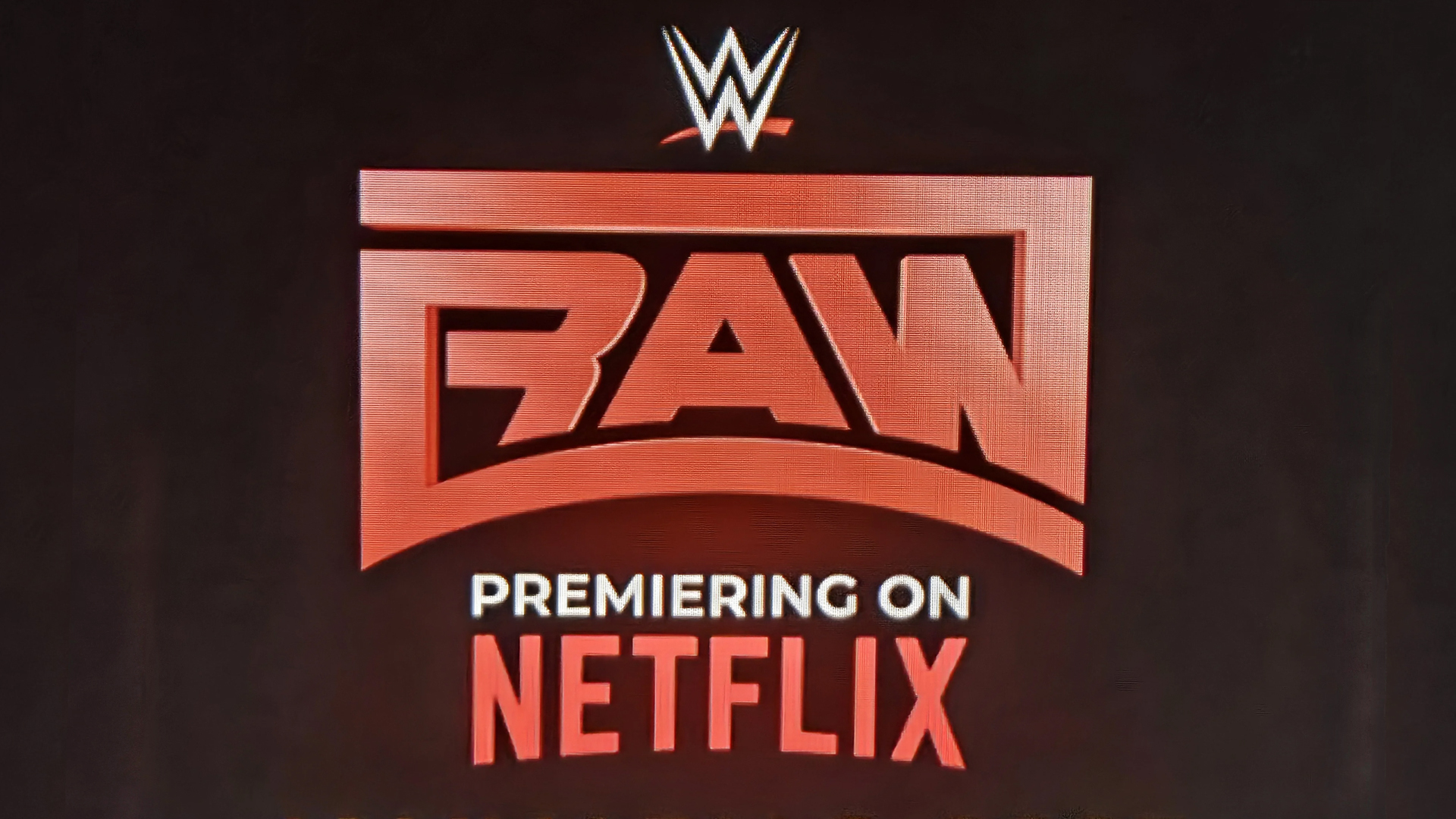
The new logo for WWE RAW made its subtle debut at last weekend's Mike Tyson vs Jake Paul fight and already fans aren't happy. Promoting the wrestling show's Netflix debut in 2025, the logo is seemingly a homage to past designs, but it's not quite the knockout that fans anticipated, leading to some rather scathing reviews.
While the best logos often have an element of heritage woven into their design, the new RAW logo demonstrates how combining too many concepts can lead to a messy, overcomplicated design. While I'm all for rejecting minimalism where appropriate, the new RAW logo is a prime example of an overambitious design that's more clunky than clever.