As a tech writer, there's always a degree of curiosity when it comes to workflows. Checking out new productivity apps and utilities can lead to fun new developments, shaving minutes or even hours off of the working week, and it pays to remain curious.
The same can be said of tech, and after working on a Mac for years, I finally decided to try and spend a day working from an iPad.
For context, I swapped my MacBook Pro for the M2 iPad Pro, and my workflows primarily revolve around writing into various online publishing systems, responding to messages through Slack and email, and doing some light editing of photos. Would I be able to work to a reasonable capacity on the tablet?
The Honeymoon

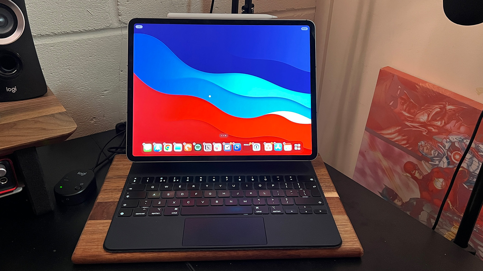
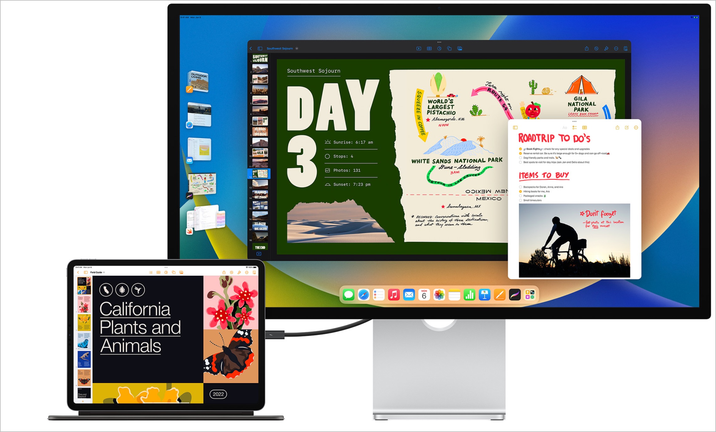
I connected the iPad Pro to a 4K monitor, positioned it onto the (still exorbitantly expensive) Magic Keyboard, and hooked up a Bluetooth mouse.
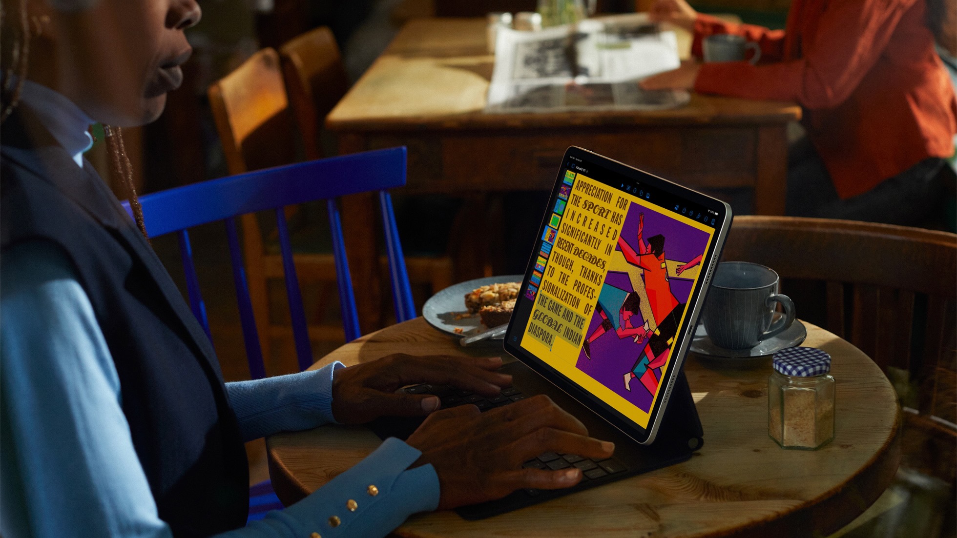
Flicking apps between the iPad's display and the external monitor was easy using the iPad multitasking button to send apps directly to either (if a little finicky at first), and I had no issues with the hardware -- the keyboard is pricey, but there's just the right amount of key travel, and the iPad hanging just above it makes it easy to reach up and use the iPad's touch screen. Your mileage will vary if you’re a big user of the function row, though, since there isn’t one here.
I even got to use the Apple Pencil to sign a few PDF files, something that made me feel like I was living in an Apple commercial.
Slack behaves just like it does on the Mac, and my combination of Polymail and Outlook for personal and professional emails was working well.
And yet, within half an hour, I found myself plugging the MacBook back in.
The Reality
It’s not that the iPad-only work was bad, per se, but it just feels about halfway to where it needs to be - a common theme with iPad over the last few years.
Take entering text into a content management system (CMS), for example – Safari is a solid enough mobile browser, but I lean on Chrome for its saved bookmarks and use 1Password for security. That combo is absolutely fine for web browsing and shopping online, but with a more fiddly page full of boxes to complete and icons to tap, things get a little dicier.
Naturally, much of that comes down to the likes of WordPress and other CMS options for optimizing for tablets, but with the market shrinking by all accounts, it doesn’t seem likely to happen soon.
In fact, in the CMS I was using most of the time, I found the iPadOS keyboard toolbar, usually found at the bottom of the screen, covering crucial UI elements, while some buttons simply didn’t display properly in Stage Manager.
That brings us to one of the bigger issues with iPadOS right now, with its multitasking paradigm all over the place.

Splitting two Google Docs windows for notes and research is easy, and using the mouse to drag apps into a split view became nice and routine after doing it a few times.
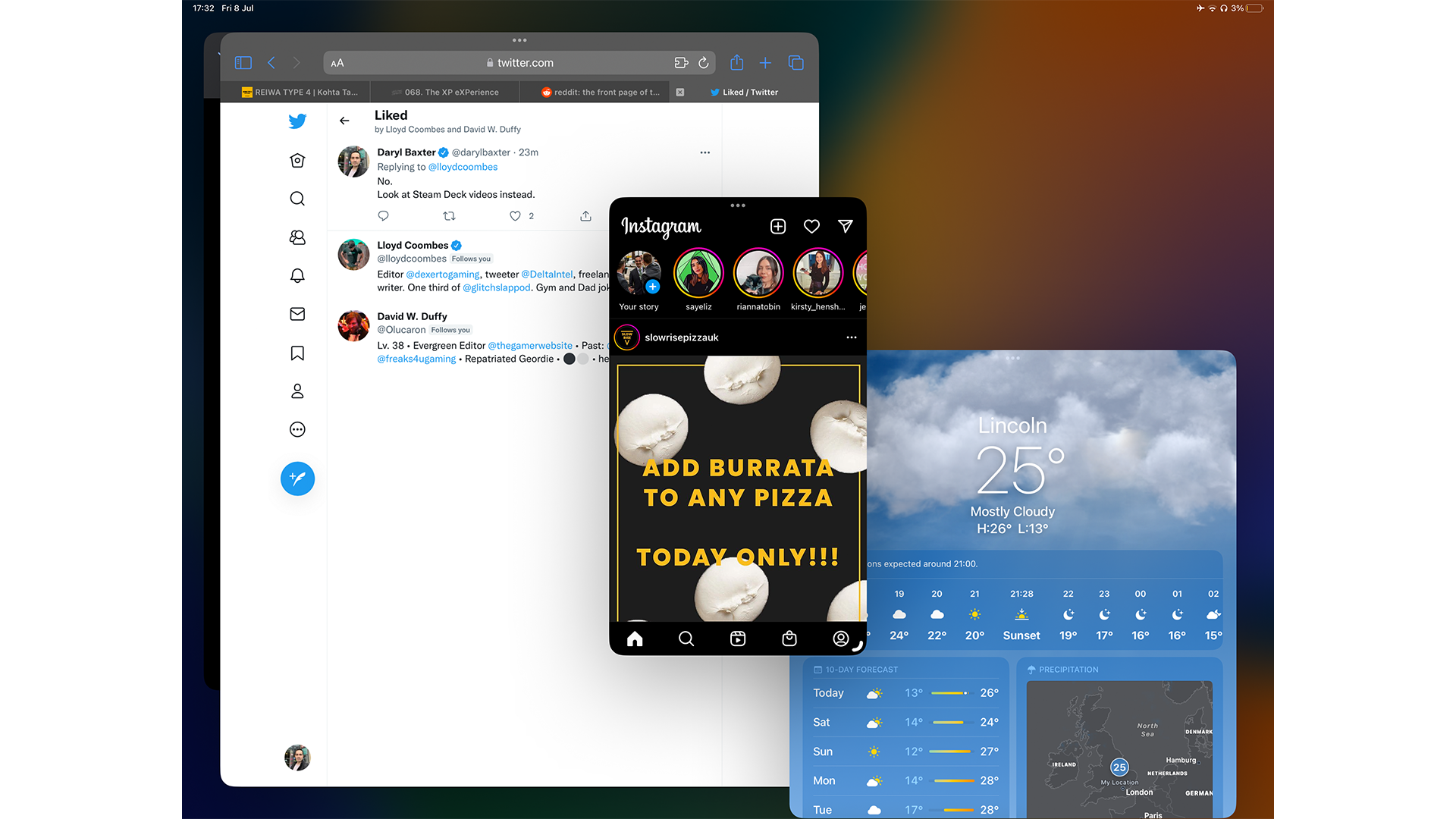
On the other hand, Stage Manager feels a little all over the place. Grabbing and resizing windows feels akin to herding digital cats, with the risk of grabbing the wrong element meaning the danger of publishing a half-written blog post was never far from my mind.
Even on the iPad Pro’s 12.9-inch display, the sidebar of Stage Manager’s open apps feels bigger than it needs to be, and much of iPadOS still requires invoking the Dock - even if just to open something from the App Library. It’s halfway between organization and chaos, and it feels like Apple needs to pick a lane.
On the one hand, I’ve grown to love the chaos of my Mac’s window layout, between Chrome windows, Spotify, Things, and much more, but there’s something to be said for having a more structured approach - I just don’t think Stage Manager is the one, or at least not in its current form.
Stage Manager is a new solution to a long-running problem, though, but sadly many of the iPadOS pain points remain. Anything that involves handling files remains very doable, but much slower than it arguably needs to be in the year 2023 - renaming, for example, is easier than it’s ever been, but opening anything in an alternative app to the default requires going via the app of your choosing.
Is the iPad Pro dream dead?
In a word, no. Despite this experiment backfiring somewhat, I did find myself enjoying the tactile feeling of the iPad (a device I often neglect for the reasons I’ve painstakingly recognized here).
iPadOS was lightning fast throughout, and none of the concerns I’ve mentioned stem from the hardware - the iPad Pro’s current design remains my favorite Apple product, potentially of all time, because of the amount of power within such a slimline chassis and the modularity of its design when factoring in the Apple Pencil and Magic Keyboard, expensive as they may be.

I also think that for many workflows that don’t involve so many moving parts, an iPad Pro could bring the joy back to computing in a very tangible way - if you spend any amount of time in spreadsheets, designing beautiful documents, or even just editing photos on the move, its power, and portability are unmatched (although the keyboard does add some heft).
Sadly, the iPad Pro, even with the M2 chip, feels like a chained beast with no sign of breaking free. iPadOS remains arguably the reason the iPad has endured while so many tablets have faltered, but also serves as an albatross around the device’s proverbial neck.
Could we get some version of macOS on the iPad? It seems unlikely, but it does feel like the iPad lineup is at an inflection point. WWDC 2023 could be huge, but for now, my iPad Pro remains a consumption device that doubles as a second display for my Mac.


