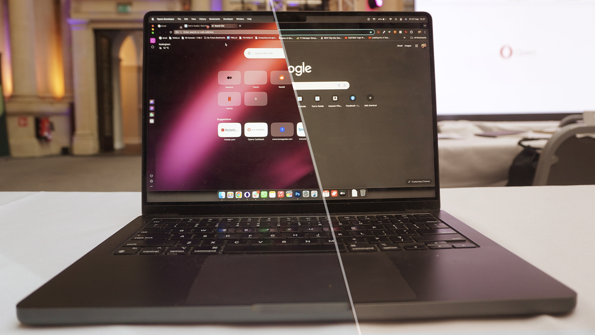
Google Chrome has long been the default choice of browser for most of the planet — no matter how many times Microsoft desperately pleads with you to use Edge on Windows 11.
But if you’re just reaching for Mountain View’s option because it’s got Google on the label, you’re missing out on some incredible browsers. One such one has just left its development beta, which is Opera’s One R2 — launching in the middle of October.
With it comes a redesign centered around a new way to consume content, a fresh take on tab management and all the latest AI capabilities rolled into one — while maintaining that same attention to performance and security.
However, I sound like I’m counting out Chrome before the battle’s even begun. There are many reasons why Google’s browser is a banger of a choice, from its simplistic design language to demystifying the many complexities of zipping around the web, to a huge ecosystem of extensions and all your Google Integrations.
Today is not a day to be coy though. No fence-sitting allowed. If we were to pick a browser between R2 and Chrome, which would it be? Let’s get into it.
Google Chrome vs Opera One R2: Design
Design is always a fascinating thing to talk about in web browsers, as I’m sure a lot of you will have looked at the same looking apps with a URL bar up top, some bookmarks and tabs and thought “what design?”
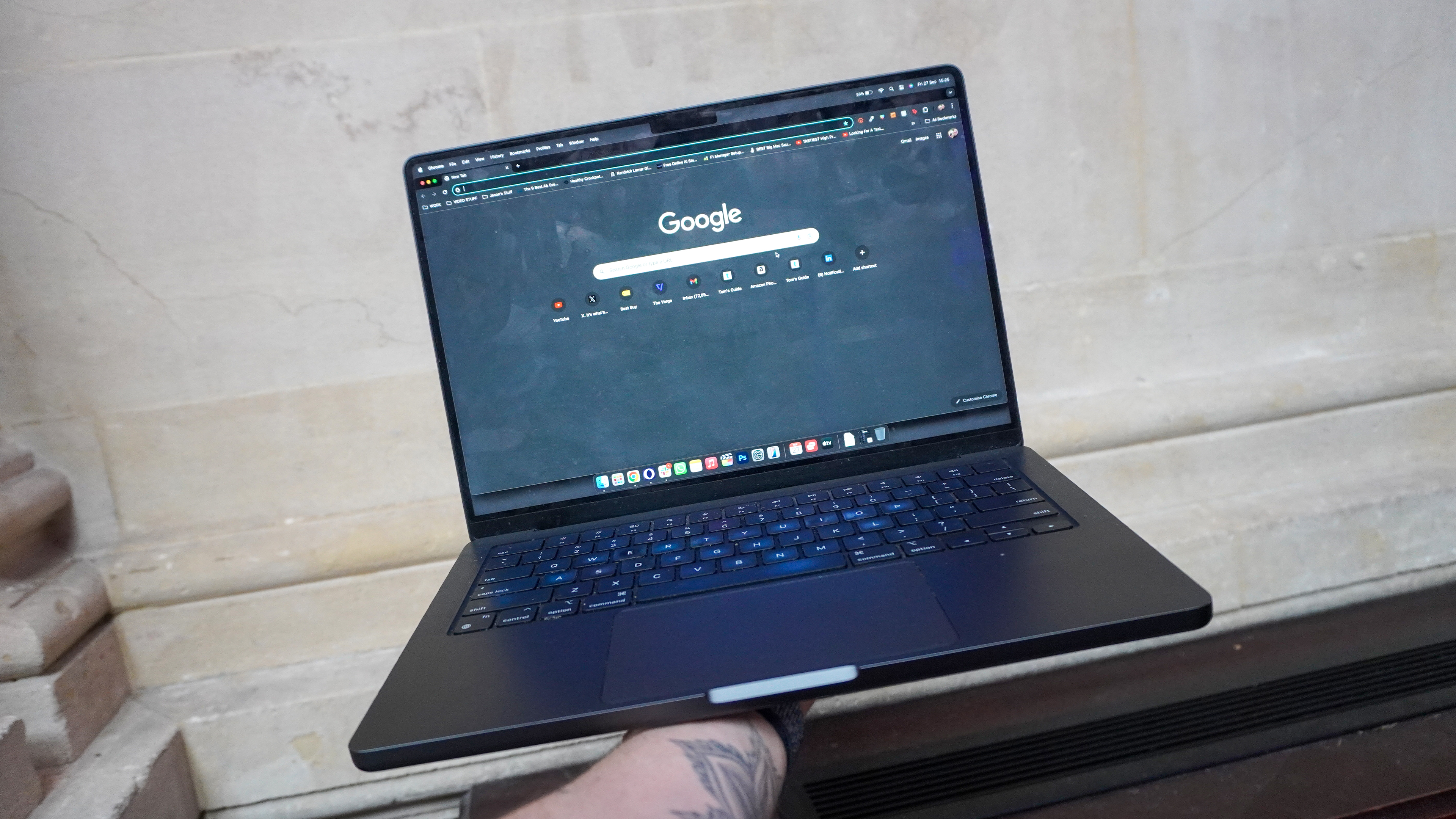
Well, that’s because when it comes to designing something as regularly used across the planet as a browser, even the tiniest of tweaks to the functional UI could be a huge risk to the global understanding of how something so universal as a browser works.
That is why Google Chrome has been the way it has always been for years, and will continue to not rock the boat. And why should it? It’s a clean interface that can be malleable around however basic or complex your browsing needs are.
Just need the simple browser bar and a login to your Google account? Sure. How about overflowing folders of bookmarks and all the extensions? Chrome can handle presenting these in a way that doesn’t feel overwhelming either. Just watch out for that ocean of tabs across the top, though, as it can be easy to get lost in it all.
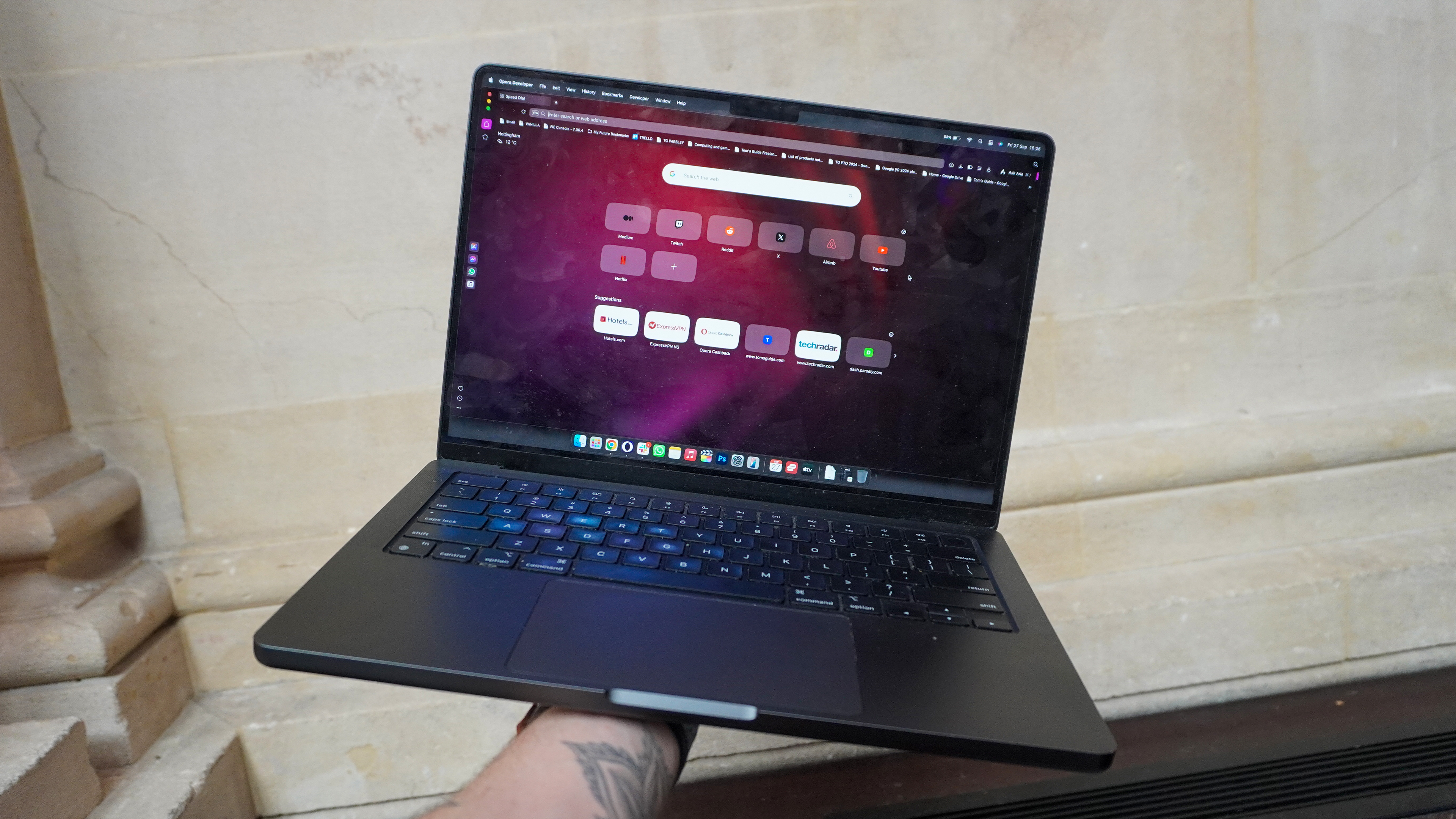
What really jumped out at me when playing with R2 is the evolved Dynamic Themes that really set an aesthetic statement with gorgeous visuals and animations. On top of that, the evolved Modular Design demonstrates how much Opera takes elements of the way a desktop OS works and blends it with a lot of well-known web browser functional design ideals.
Firstly, any media you watch or listen to will appear in floating windows atop your content, and stashed in the sidebar. These open almost as apps and even behave like apps — pausing when you receive calls for example.
And second, we’re taking a trip to Tab Islands. You know the split screen feature you’re probably using on the regular on Windows and (after finally adding it to Sequoia) Mac? Well, Opera One R2 has something similar for those moments of quick switching between two windows.
Split Screen mode was a cinch to use and immediately made a significant impact on the way I browse. Before long, I quickly grouped two sets of tabs to flit between in wedding planning mode — from checking out venues on the left side and matching them with certain theme concepts we have in mind.
Just like any browser company right now, Opera isn’t reinventing the wheel. But with these changes, they are making multi-site browsing far easier for both the casuals and power users.
Oh! And we didn’t even talk about how recently visited tabs leave a subtle visual trace for you to find your way back, and how you can distinguish each tab with an emoji. This is a clear win for the one R2!
Winner: Opera One R2
Google Chrome vs Opera One R2: Features
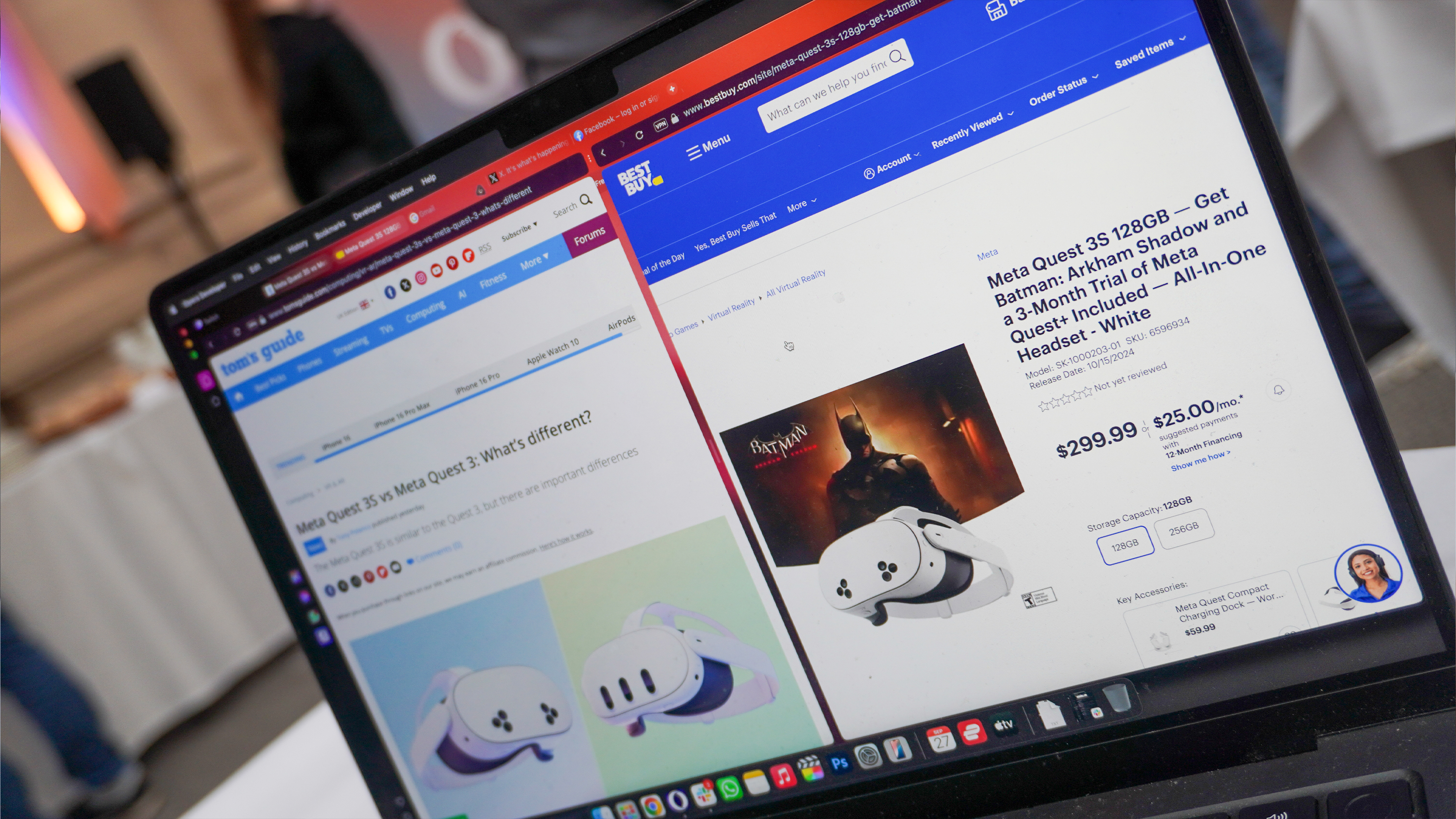
Opera One R2 does indeed bring an impressive feature set. The aforementioned Tab Islands and Modular Design are great little tweaks on the UI that make browsing simpler.
But on top of that, being able to add markers on the scroll bar to refer back to on long pages, having a screenshot tool and battery saver mode in the toolbar has saved me in clutch moments. And the built-in VPN and ad blockers assure a more secure and cleaner browsing experience than having to go out and get these tools for Chrome (more on that later).
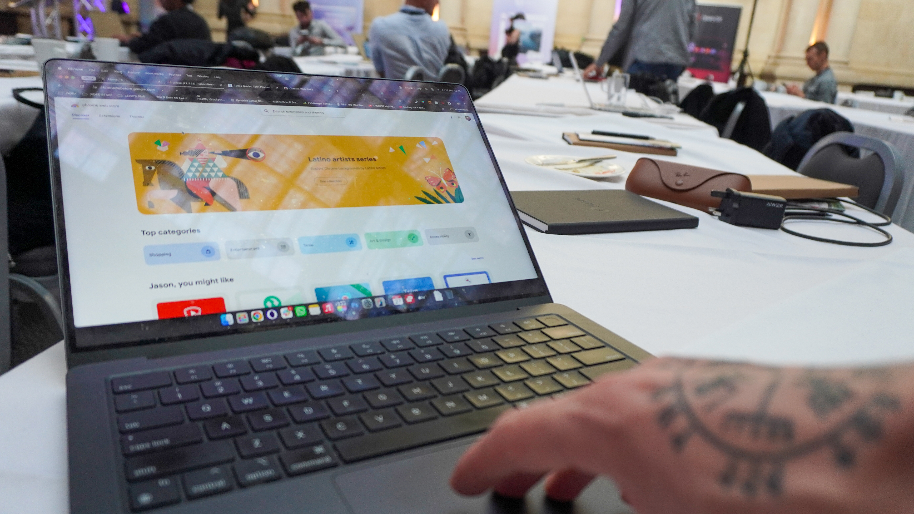
However, in terms of not just the huge, ever-growing list of features and their super simple integration into all you do, but the vast ocean of extensions to make Chrome your own, Google does take a lead here.
Particular shoutout to the multi-purpose address bar, which is context-aware of what you're asking and plugs into Google’s services to give you an answer without even having to press enter (calculating equations you type in or giving you translations right from the drop-down that appears).
And yes, I do know that in terms of extensions, Opera’s browser supports them with a Chrome extension add-on, but this is a clunky workaround at the moment on One R2.
Winner: Google Chrome
Google Chrome vs Opera One R2: Performance
First a quick disclaimer. I tested both of these browsers on my M3 Pro MacBook Pro — the base model sporting 18GB of RAM — and I’m connected to some mightily slow internet here (roughly 8 Mbps download speeds). These tests are a little rudimentary, but still an effective one.
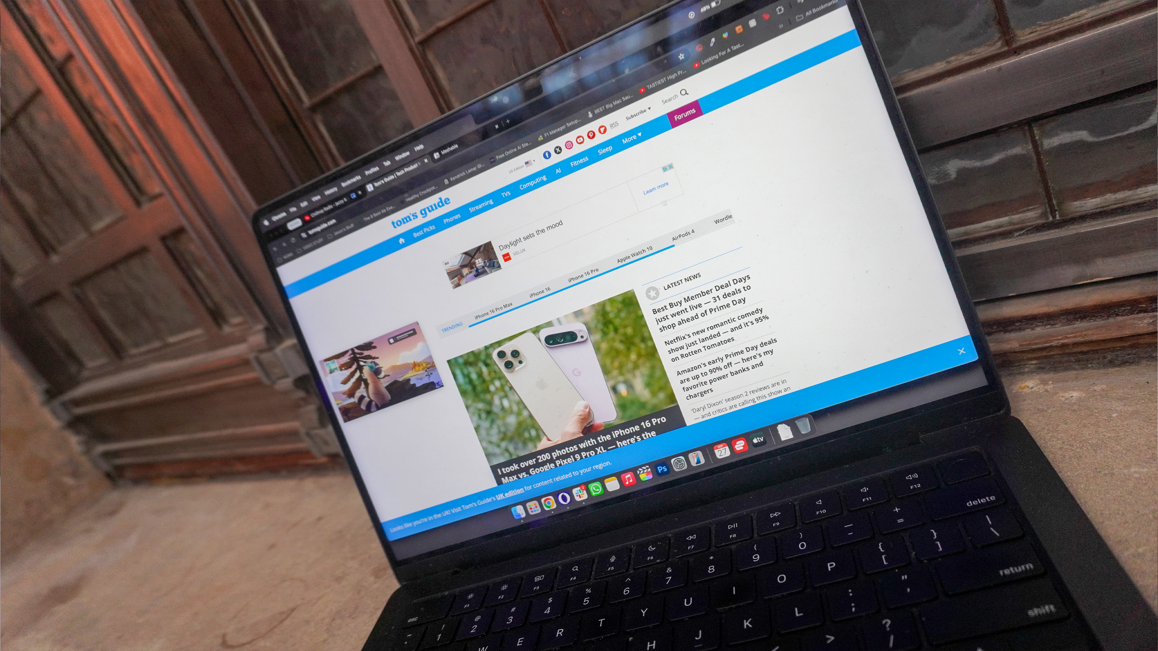
Opening the Tom’s Guide page fresh without cookies on both of these browsers saw Chrome load it in 0.9 seconds, while Opera One R2 finished the job in 1.1 seconds. You won’t notice that difference, and the similarities in loading speed come down to the fact both of these are built on the same Chromium web rendering engine.
Then to put it under load, I started adding additional tabs and loading the same website on each. Once I hit 20 tabs on Chrome, I started experiencing those classic slowdown issues, whereas on Opera One R2 I managed to reach 23 tabs. This is a surprising result, given how much more complex R2 is in what it is loading in the background compared to a basic build of Chrome — especially with animated wallpapers.
So as you can see, each has its own benefits and drawbacks when it comes to effectively managing performance. Both are rather RAM-hungry nonetheless, so make sure you’ve got a system with at least 16GB to not feel any slow-down.
Winner: Tie
Google Chrome vs Opera One R2: Security
Given all of Chrome’s privacy and security oopsies over the past couple of years, this one is an easy win for Opera. With an Ad blocker, a no-log VPN (doesn’t track any of your information), individual site data settings control toggles and a private browser (that is actually private), Opera only takes anonymous usage data for its own app analytics — no user history is shared or identified.
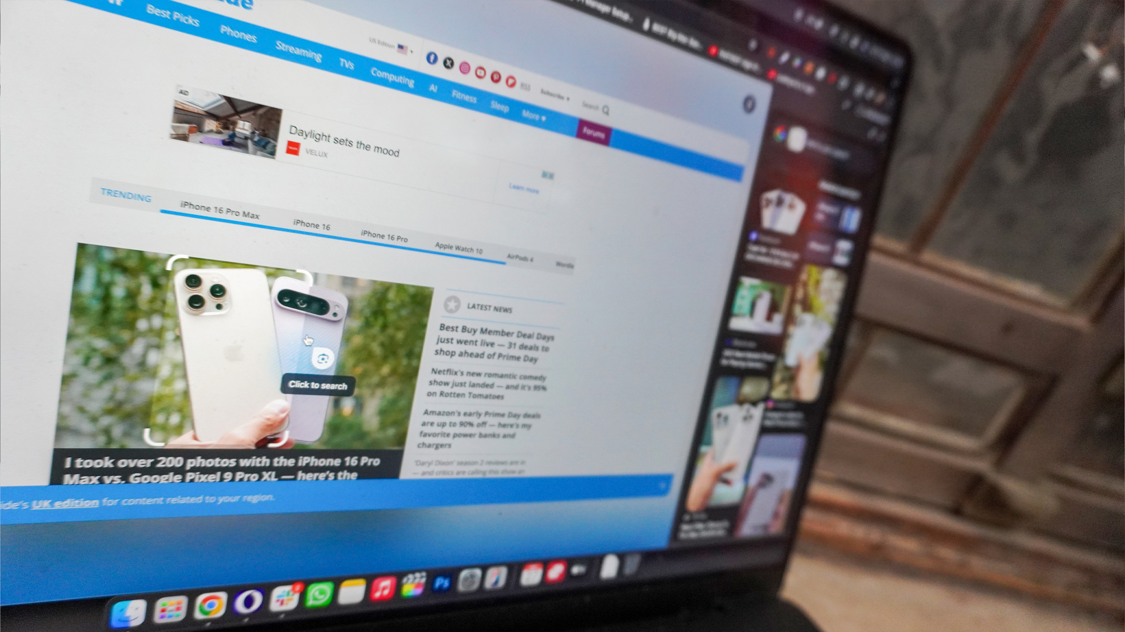
Meanwhile, Google’s browser collects a lot of information to fuel its key businesses in ads and app ecosystem. Incognito mode has (thankfully) been changed to actually be anonymous browsing, but from your browsing history, location info, activity, Gmail data, photos and videos and docs, Google has its hands on a lot of your info.
Plus it does not come with an Ad blocker and VPN included. We recommend picking up AdBlock Plus and taking a look at our list of best VPNs to help protect your data online.
Winner: Opera One R2
Google Chrome vs Opera One R2: AI
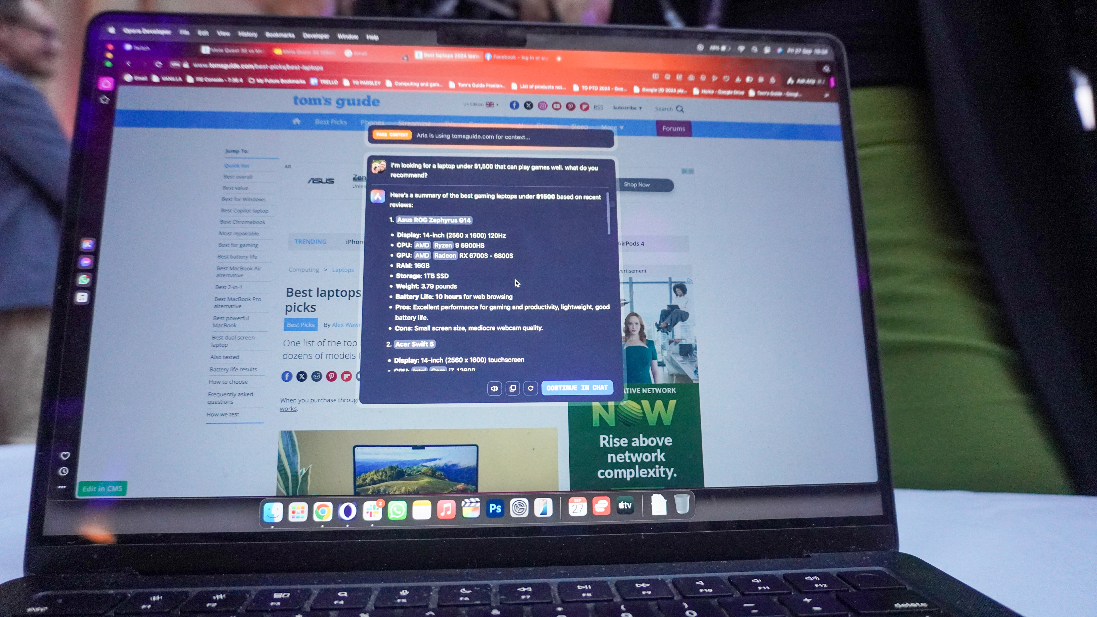
When it comes to AI-fuelled browsing, there are two very different approaches to it here — with Opera One R2 aimed more at the power user who has some knowledge of how to work their way around an LLM, and Chrome using it to enrich the features you already use most. Both have their strengths and weaknesses.
Starting with Opera, the Aria AI is a free-to-use multi-LLM engine that doesn’t require an account to use. Not only that, but you can even download and install one of the many versions of the LLaMA LLMs (3.2 is available now) for on-device usage. And accessing it is as easy as either clicking the Aria button on the left-side taskbar.

But the real superpower here is the command line — accessible by hitting Control+/ or Command+/. From here, you’ve got three modes:
- Standard mode: A prompt overlay for answering strings of questions, or even taking specific browser actions with natural language.
- Page Context mode: Aria can process everything on a web page, summarize all the details, and answer any queries you have on the information.
- Writing mode: Whether you need help drafting emails, rewriting complex sentences or formulating ideas, the writing mode is here to give options based on any website context you add to it.
It’s quite a brilliant implementation, which I’ve loved using. However, I can understand that these come with a certain level of assumed knowledge on how to effectively use AI. Put simply, some form of experience using the likes of ChatGPT is essential — ranging from being a power user when it comes to picking the right local model for you.
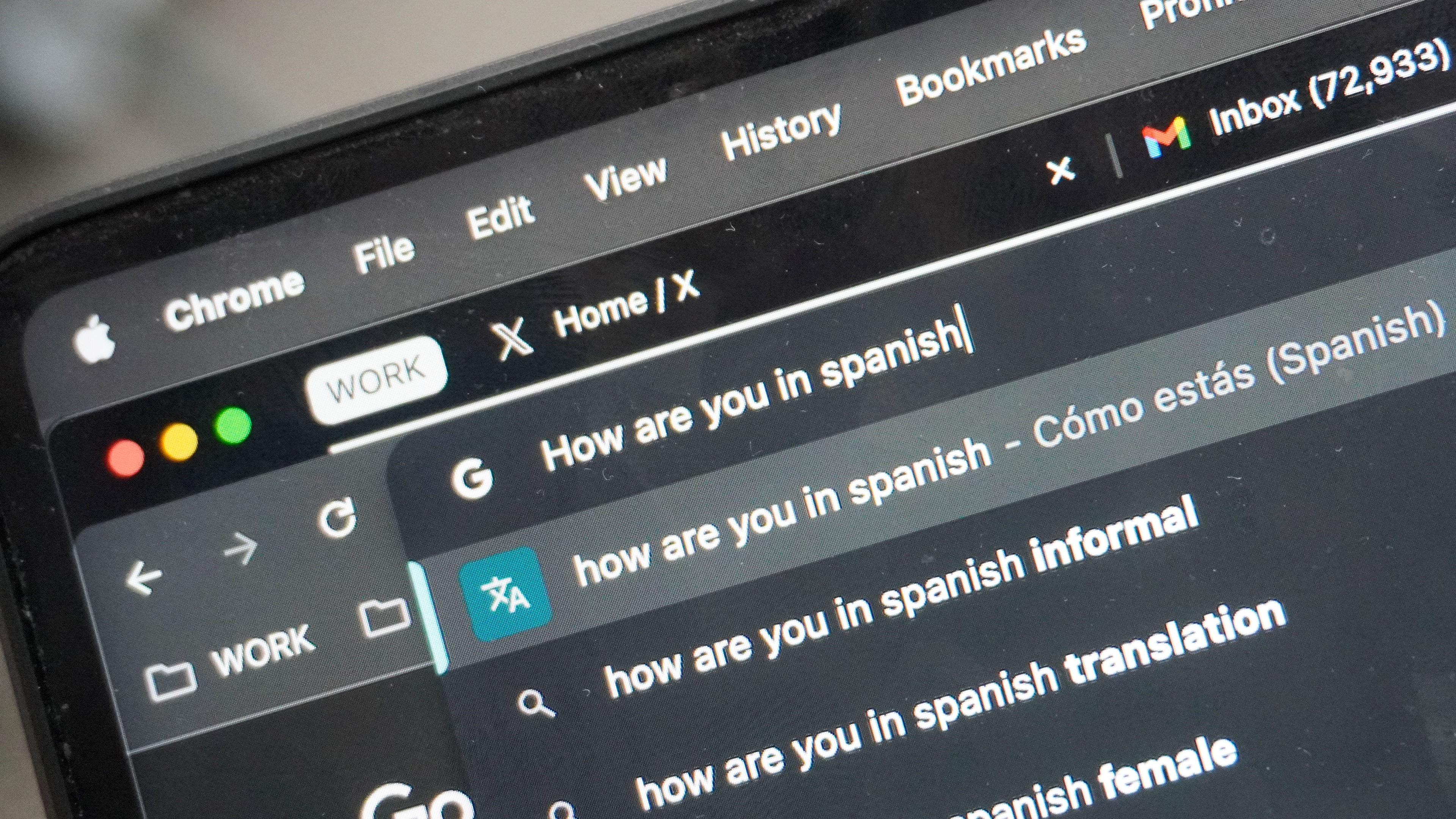
Meanwhile, with Google Chrome, artificial intelligence is peppered in here and there to enrich the things you already use. Namely, outside of the fun generative features such as creating your own Chrome themes:
- You’ve got the search labs AI overview pulling together a snapshot of all the info you need from a Google search.
- Search Browser History means you can just ask a vague question related to something you visited a while ago but only have a faint memory of getting back to that page.
- The multi-purpose address bar uses AI to interpret your request with context to deliver the result within the bar drop-down (translating text to other languages, linking to files within your drive, etc).
It’s tricky to really call a winner between the two, as they offer different strokes for different folks. If you have the AI know-how, you can really make the most of Opera’s feature set. But if you’re a new starter who wants to dip their toes in without learning any new interactions, then Chrome takes it.
Winner: Tie
Google Chrome vs Opera One R2: Bottom Line
Overall winner: Opera One R2
It’s close when it comes to functionality and ease of use, but once the dust clears, the Opera One R2 stands head and shoulders above as the better browser of the two. With privacy at its core, an engaging AI-driven feature set and a utilitarian yet sleek aesthetic that makes power-browsing a cinch, this is a mighty option if you take the time to learn its optimizations.
But the biggest lesson I learned? Not only has this past week helped me find my next new browser, but it has opened my eyes to the world outside of Google Chrome.*
*No, this doesn’t mean that I’ll give Microsoft Edge the time of day.


