Fallen in love with a cheetah print, but can't stop thinking about those chintz curtains? Surely there's no way they'd work together. Wrong — you shouldn't instantly shy away from mixing clashing prints in your interiors; it's often a sign of true style. But the goal is crafty coordination, not careless clashing, and it's a fine line that designers walk.
With maximalism making a clear (yet elevated) return to contemporary design, you can expect to see several pattern trends dominating the decorating sphere this year. Are you a newly found zebra print fan? Have you bought into the plaid revival? There's no reason why you have to choose just one singular pattern to set the tone of your space; when you carefully layer your prints based on color palette, scale, and a sense of balance, pattern clashing can become a real symbol of style, rather than a design faux pas.
So, what does it mean to practice pattern clashing in a chic way? As always, confidence and strategy are key. But if you need a little extra guidance, here's what designers recommend.
What Causes Patterns to Clash?
As 80s interior design trends and maximalist patterned sofas circle back around, it begs the question: why do some pattern clashes work together and others clash in an undesirable way? "Patterns can negatively clash when they are in the same scale, such as a geometric shape that has the same size and repetition," explains Boston-based interior designer Cecilia Casagrande. "Your eye doesn't know what to look at, it's confusing, and it gets lost in the room."
But understanding when pattern clashing can fall short also helps you understand when it does. If several busy prints crammed next to each other don't provide the visual rest you need for a comfortable setting, then, clearly, scale in the design is key.
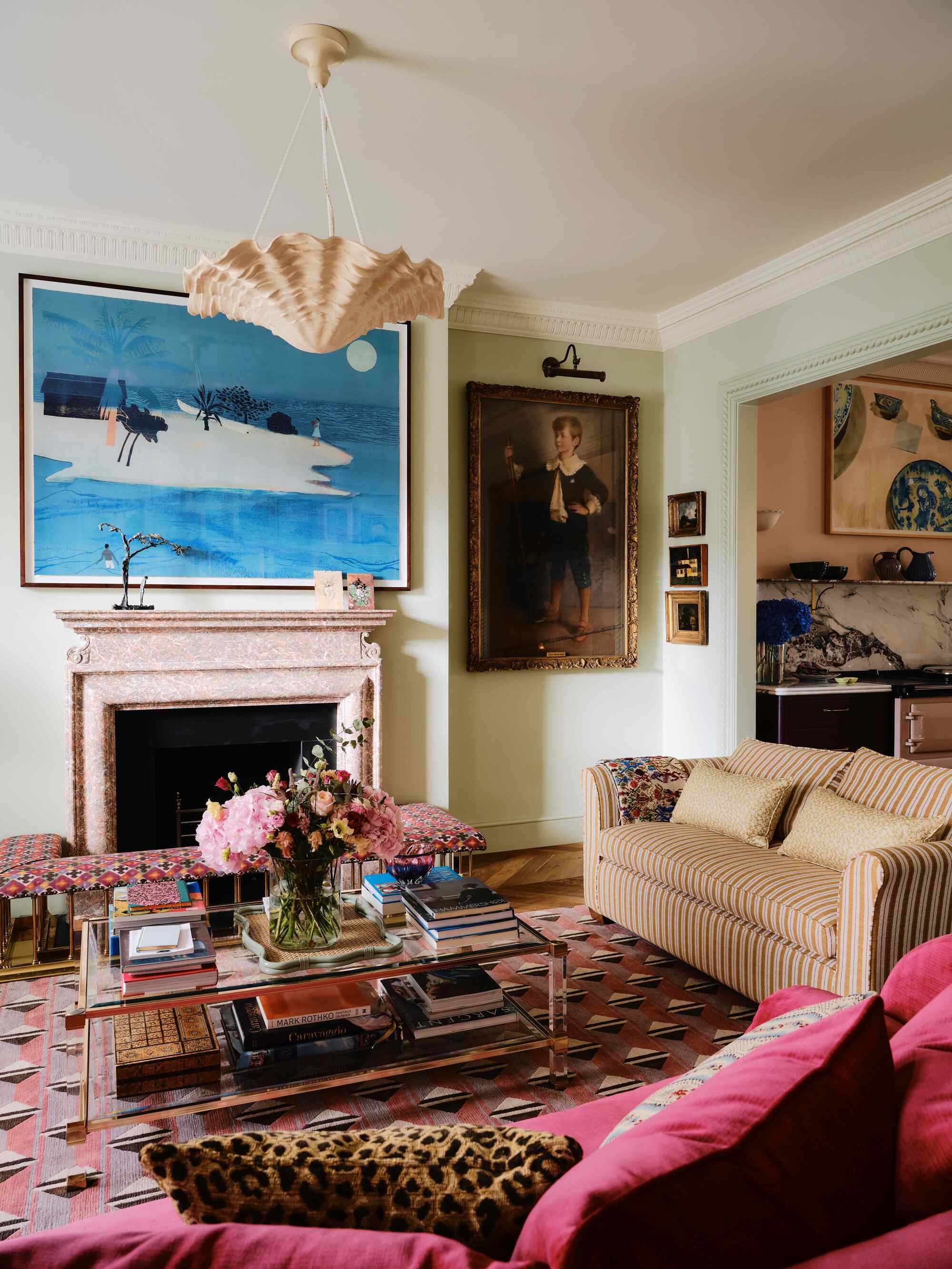
To make pattern clashing work, it's important to ensure that each pattern has room to stand out on its own, while simultaneously coexisting with the other patterns in the room, explains Cecilia. Often, it's the color palette that holds it all together.
"Design-forward pattern clashing can fall short when there is the same type or print size of pattern, such as two florals or checks with similar colors, but they don't complement the color scheme with the majority of pieces in a room," adds Cecilia.
So, How Do You Pattern Clash in an Interior?
1. Start with a Common Color Scheme
We know that patterns clash most successfully when the color palette is somewhat cohesive, and there is a mix of scale and prints. But what should come first: the pattern or the plan?
The easiest way to pick the right patterns is to start with a central color scheme. Think of this element as designing a color story with your prints. "Do all of the layers weave a shared color story?" asks Cecilia.
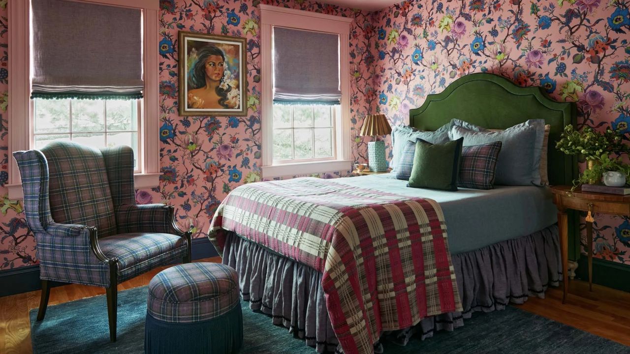
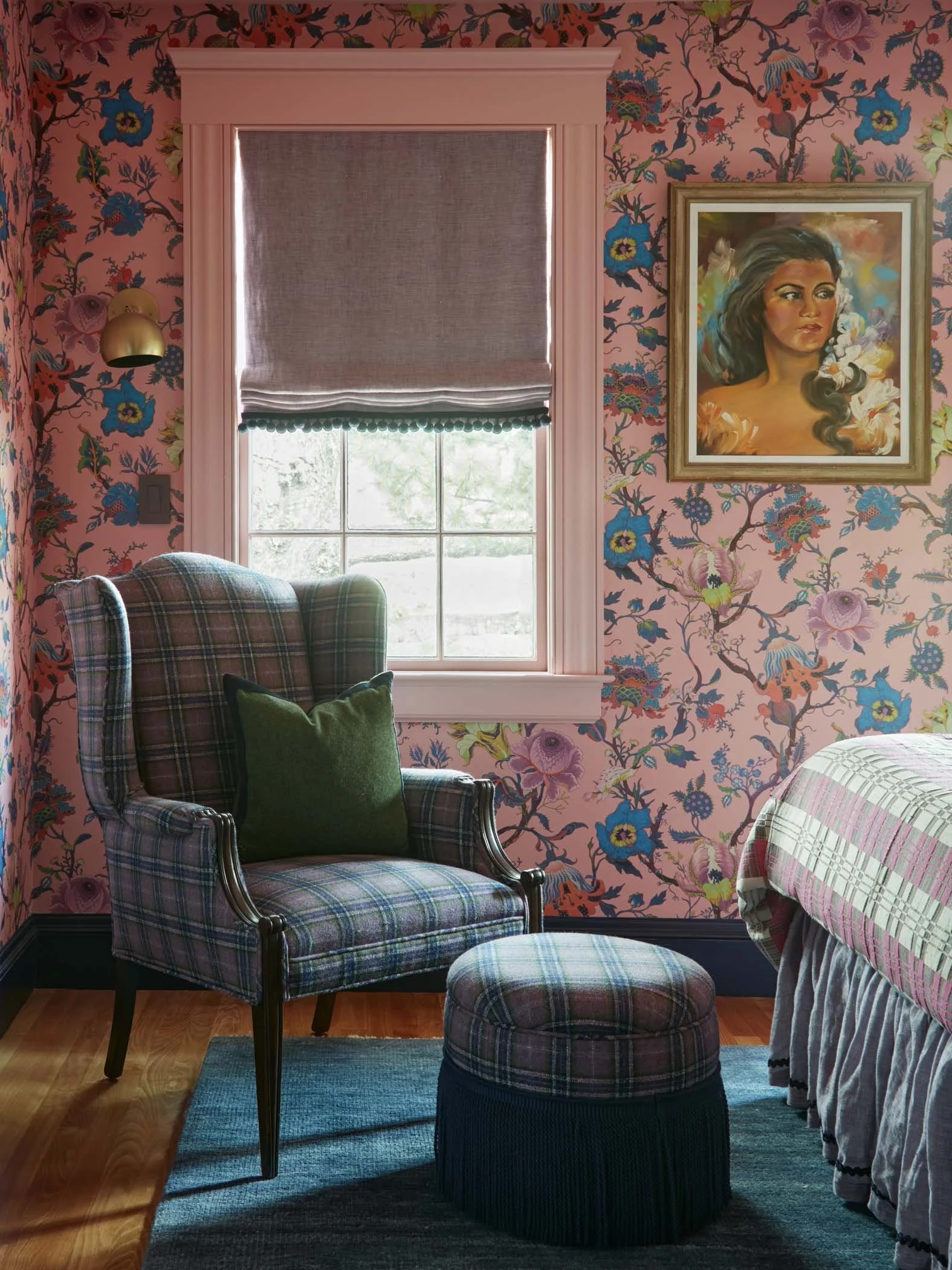
You can always opt for a color story that unifies clashing patterns. For instance, if you have a room designed with an earthy color palette, you can introduce patterns that work within this scheme. A green and blue-based verdure print clashed with a fine-print green wallpaper, and a navy stripe throw pillow to tie the blue back in. Choose your favorite print as the base color palette and pull from the colors within.
But the fun of pattern clashing comes when you stray away from 'safe' complementary colors and start weaving a mix of clashing colors into your scheme as well — go big or go home, as they say. This creates a fashionable sense of contrast in design.
"Choose something bold, colorful, with a resonance to your own personal style," says Jessica Clayworth, head of design at Morris & Co. "The trick to any mismatched scheme is to find an anchor color that links your varying patterns together. You can then go to town on the designs as much as you like!"
Yes, you should always pull a singular common color to ground everything, but "more importantly, all you need is one fabric to hold the colors together. So if your floral has four or five colors, the geometric, small floral, or stripe should have at least one or two of those five colors," explains Cecilia.
Makes sense? At the end of the day, pattern clashing should be treated just like decorating with color. Lean on a few base colors in the palette that are complementary and defined.
2. Consider the Scale of Each Print
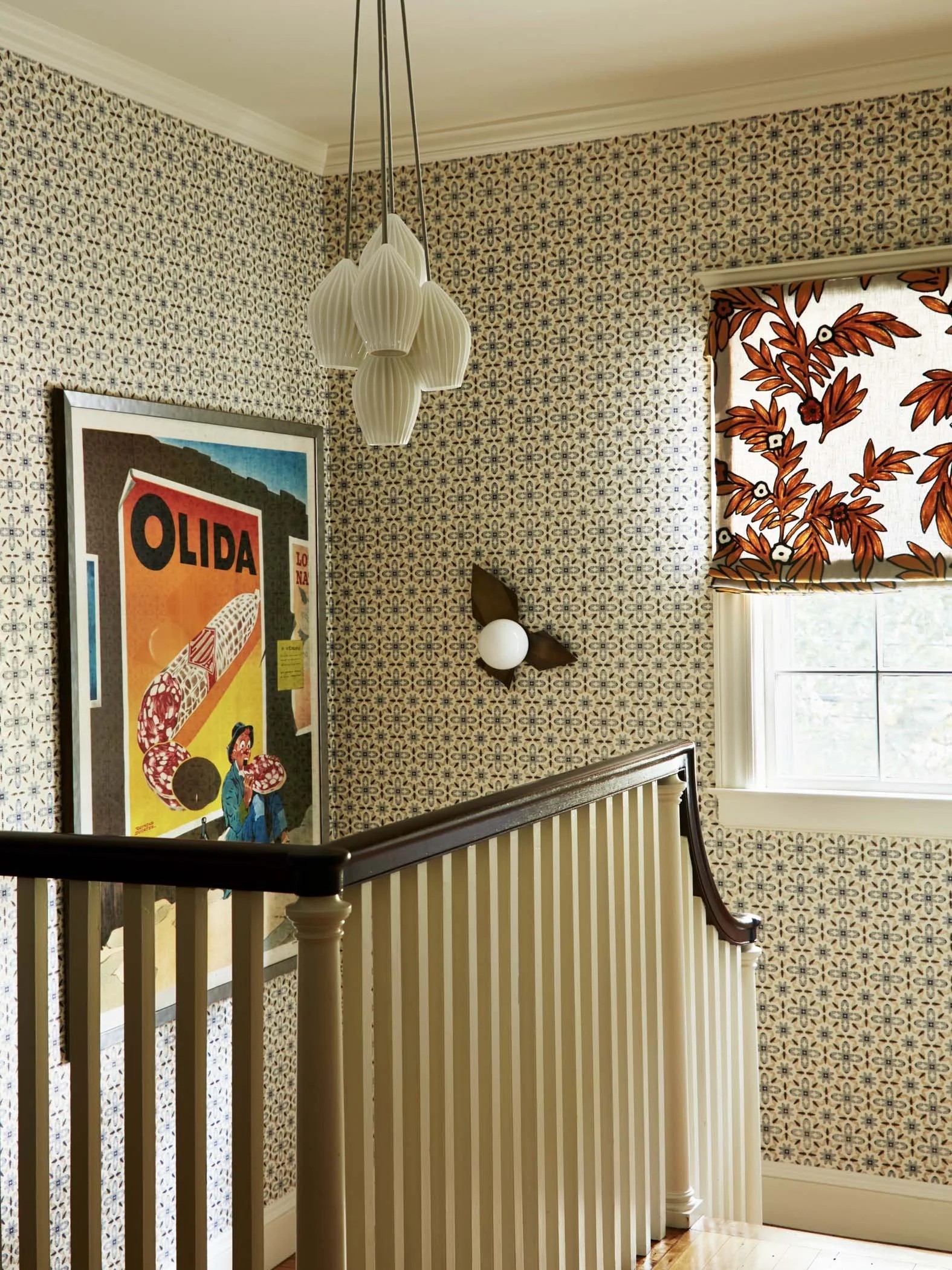
Once color is sorted, it's time to think about scale. A good example of how scale can affect patterns is by examining the resurgence of 'grandma' florals. Where small, busy florals can feel a bit dated, decorating with floral patterns with larger scales and more negative space elevates the design to feel more contemporary. Too many small, repetitive patterns in a room can feel overstimulating and cause a bad clash.
The key is to make traditional patterns feel modern."I like mixing large floral patterns with small florals, and geometric shapes, lines, or checks," says Cecilia. "Consider varying the scale of the patterns, shape of patterns — sharp angles, organic/wispy, lines, leaves, flowers, and the like — along with how large the repeats are, how open or closed the negative space is, and where solid space is for eyes to rest."
For instance, if you are beginning with a chintz wallpaper in a bedroom, then consider clashing that with a modern check or plaid throw for the bed. Or if you have a cheetah print rug in a room (which is typically a smaller, busier pattern), use larger prints on your accent pieces.
"Using softer tones and lots of negative space ensures the interior stays looking up to date," Jessica notes.
It may sound complicated, but it's really all about maintaining balance in your design. And to really bring the scheme together, try sprinkling one of the same patterns throughout the room to create greater visual symmetry.
"Sometimes pairing patterns is as simple as not thinking too hard about it, your subconscious will know what's right and what's not. Trust your personal style, what you like, and run with it," says Jessica.
Bringing bold patterns into your space is slated to be a stylish decorating tactic in 2026. Now, will you be decorating with animal prints, florals, or a gingham and check?