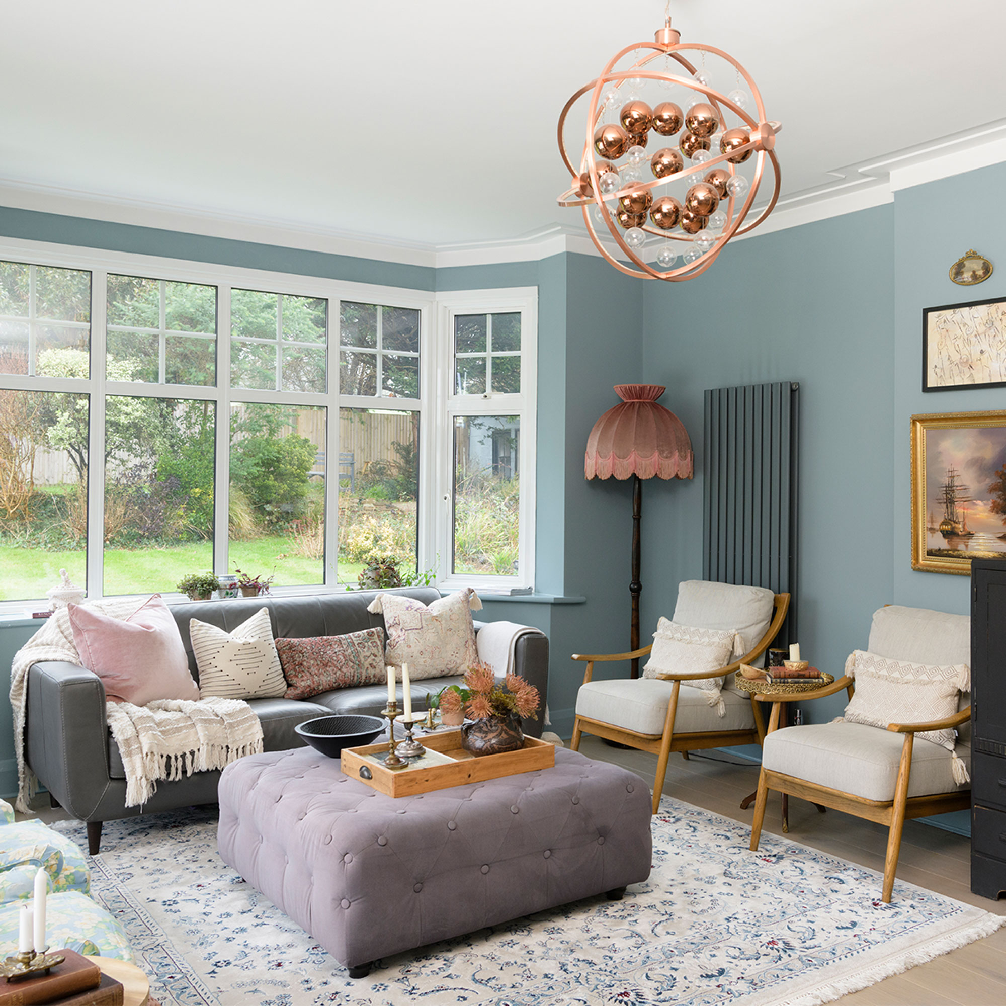
Having already completed the full renovation of their last property - and thoroughly enjoying the process - Djimbi Samb and her husband Huseyin were itching for a new project to start on.
‘We wanted somewhere a bit bigger, with a guest bedroom and some office space as I work from home as an interior designer @djimbisambinteriors and antiques dealer and because our children were getting older we really needed a bit more space too. We’ve always preferred period properties and I loved the symmetry of this house and the way the rooms flow around the circular layout of the ground floor.’
‘However, it was a huge undertaking as the house hadn’t been touched for 40 years so everything needed replacing, including the kitchen and bathroom. It also needed rewiring, re-plastering and new flooring throughout before I could even think about the décor. We didn’t want to inherit anyone else’s taste though, so we took the plunge and went for it.’
Kitchen
‘We began by ripping up all the smelly floral carpets and removing the yellow wallpaper, as well as having the artex ceilings and walls replastered. Then the reno began in earnest. The master bedroom had an en-suite that led onto a balcony overlooking the golf course, which didn’t quite make sense as it felt like we were on show, so we decided to re-jig the layout.’
‘We enclosed the balcony and converted it into a large bathroom, adding a flat roof and high windows to add much-needed privacy; then the old en-suite became a dressing room leading to the bedroom. This created a much better flow, giving us the luxury of a large, opulent space.’
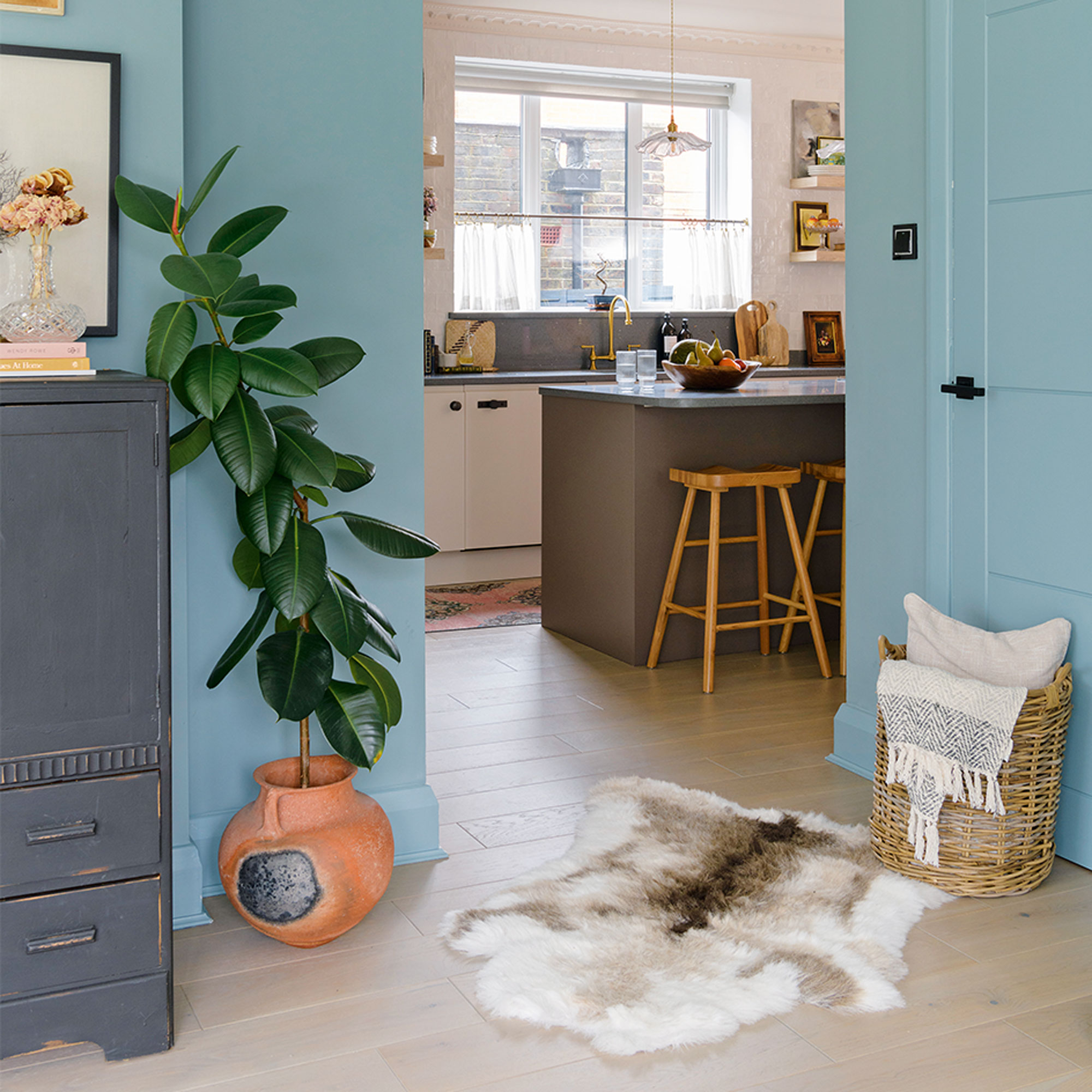
‘The kitchen was originally a lot smaller and had two arches that led through to another small room, but we wanted to create a more sociable space where the kids could sit and do homework or play whilst I cooked dinner.'
'We removed the joining wall to create one large room that allowed me to add an island and we also opened up the doorway into the family room so that the two spaces flow better.’
Kitchen
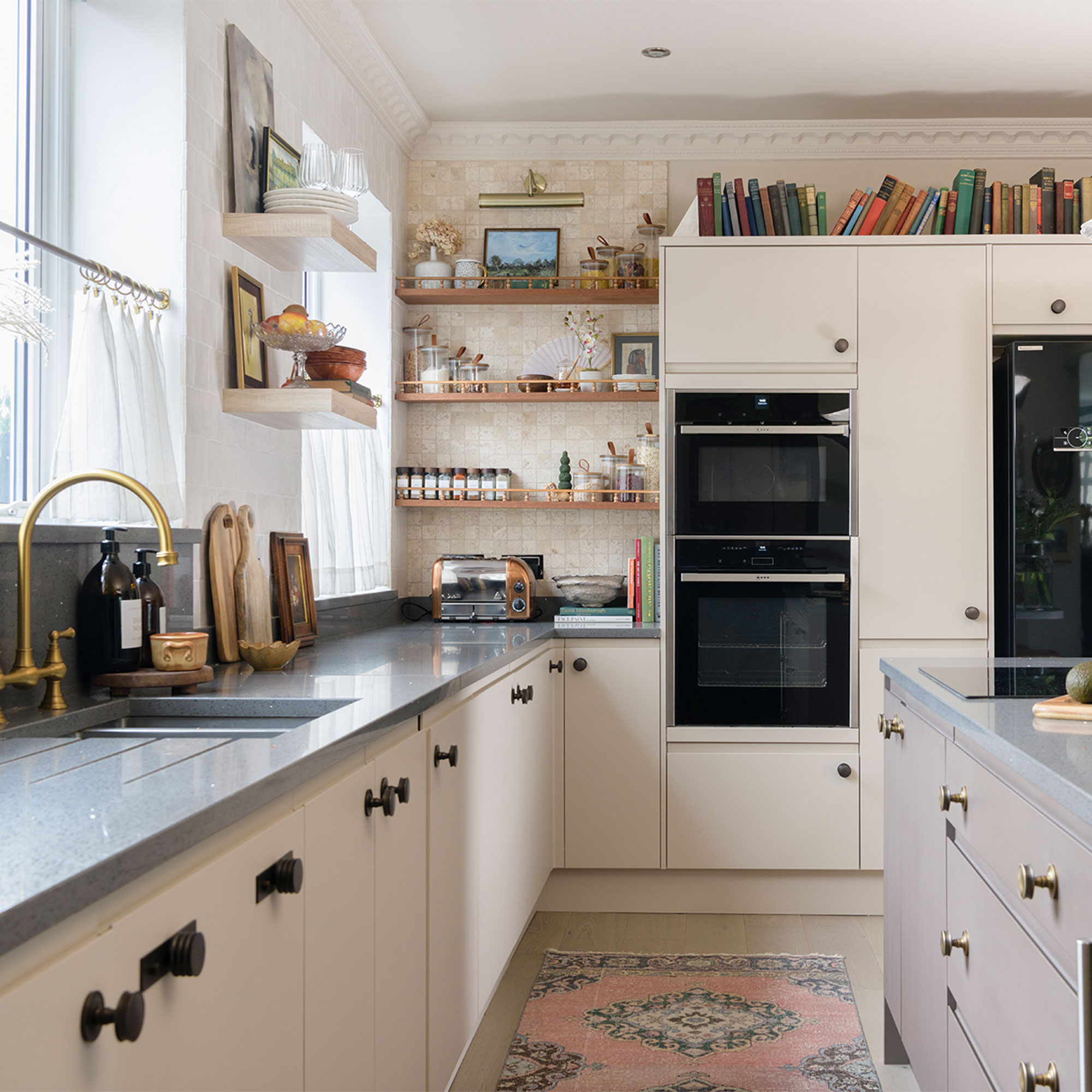
‘I chose Howdens gloss white units when we first renovated the kitchen, and we went for streamlined appliances as at the time I wanted a contemporary, modern look. But over the years my taste has changed, so recently I updated the room by painting the cabinet doors and the island two complementary colours.’
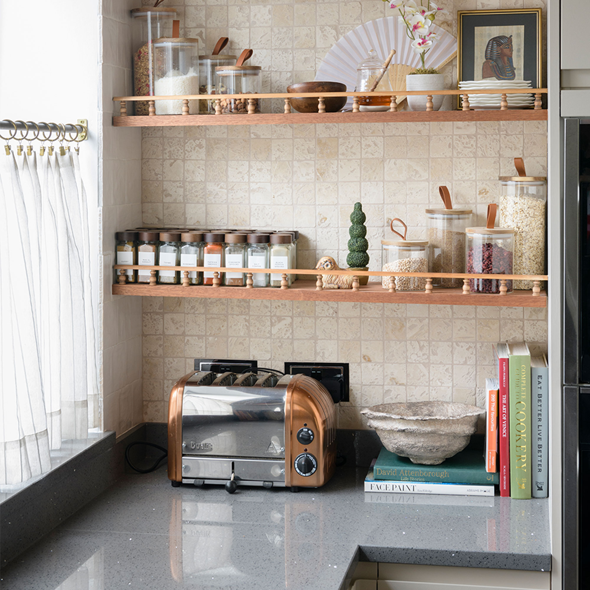
‘The original kitchen had wall cabinets, but last year I removed them and added floating shelves to give the room a more open feel.'
'I added small wooden finials to give the shelves some character and hold all my spices and kitchen odds and ends. I tiled the area with Moroccan Zellige tiles to add texture to the corner without overpowering the room.’
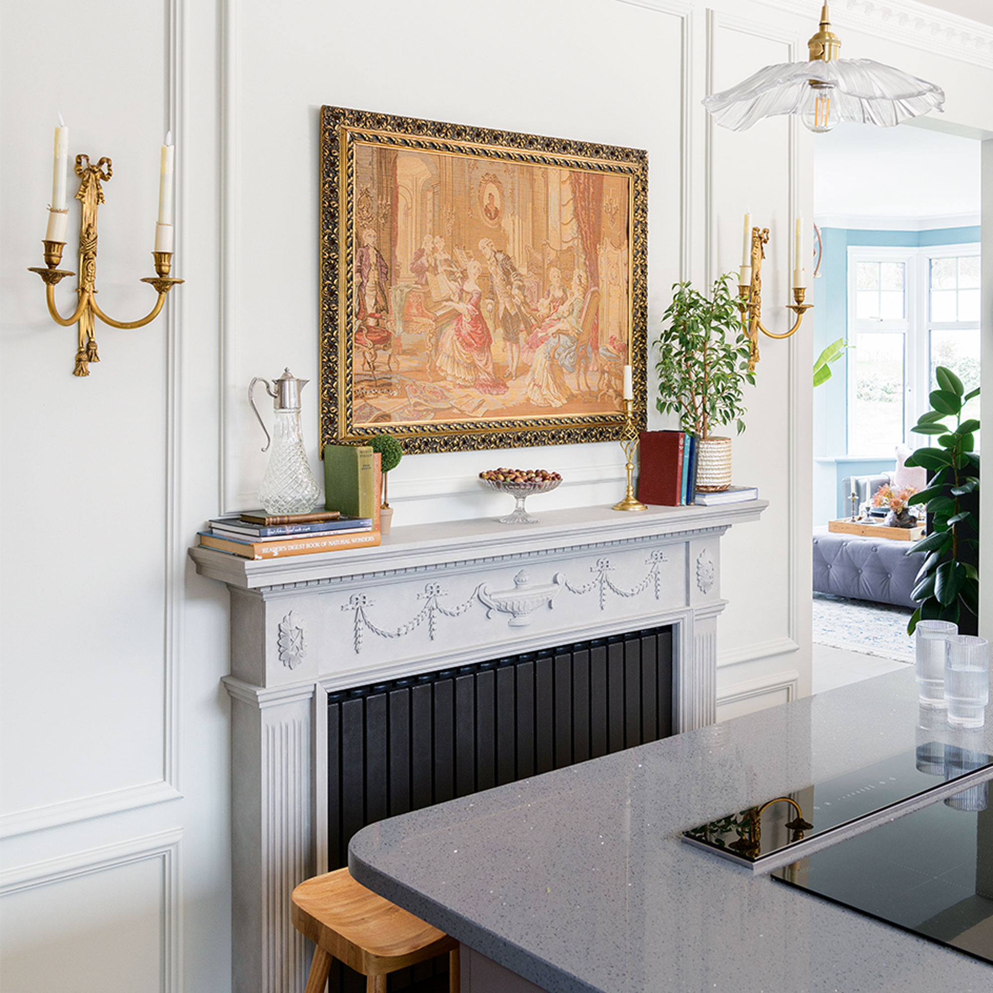
‘The fire surround was a Facebook Marketplace bargain. I painted it, had it installed and then painted the radiator black to look like a fireplace, finally adding the panelling and wall lights to add symmetry.’
Dining area
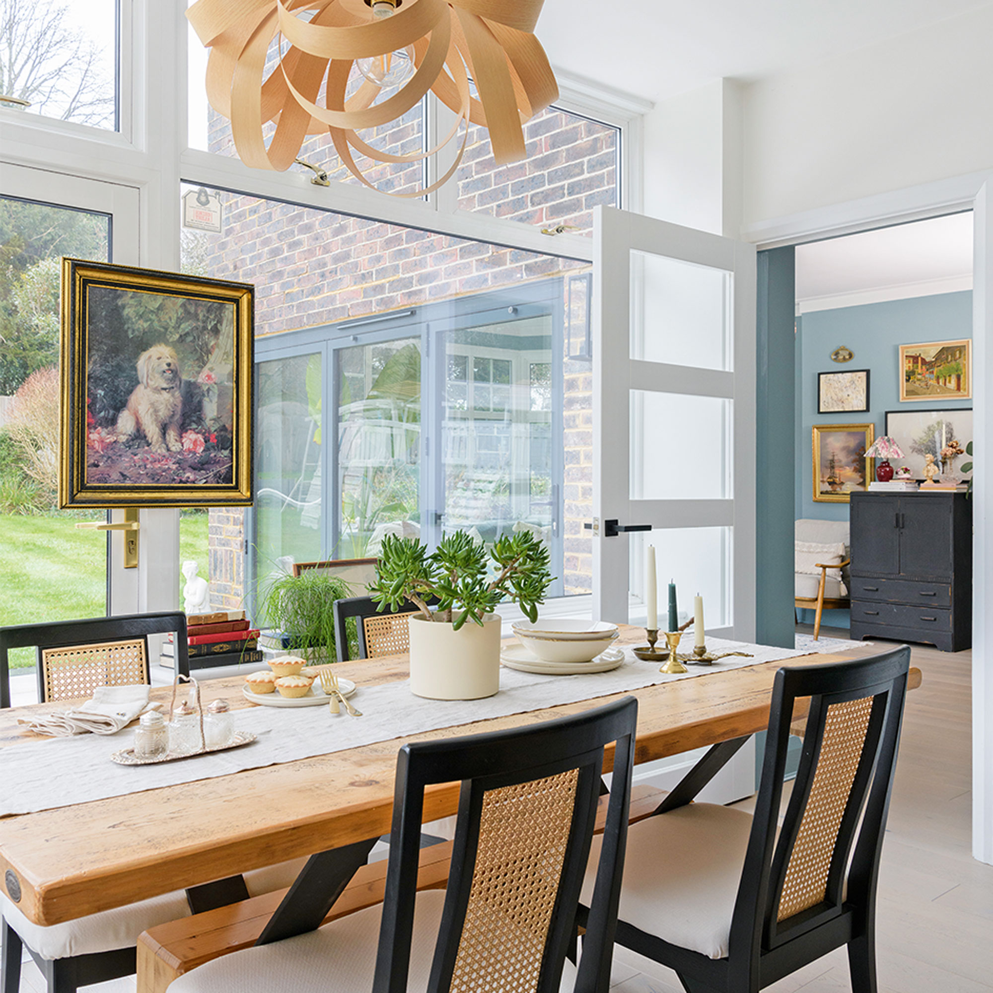
‘I wanted to zone the dining area and create a neutral space between the family and living room, so I chose a soft white shade for the walls to prevent the bold colours in the adjoining rooms from clashing.’
‘I upcycled the dining chairs by replacing the backs with new cane and reupholstering the cushions, finishing with a coat of Rustoleum black spray paint on the wood. The pendant light is from Tom Raffield.’
Bedroom
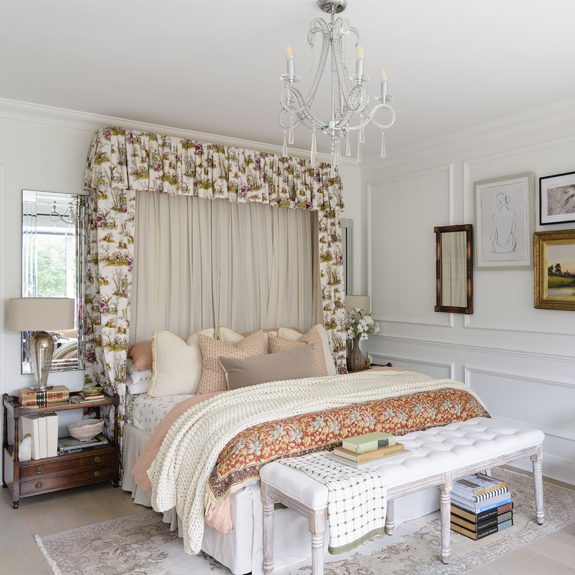
Moving onto the bedrooms, we went for neutral wood bedroom flooring, as I find boards lower maintenance than carpets, and I decided to have a go at panelling in our room as I wanted to add some architectural detailing to the space.’
‘I’d never done anything like that before but I managed to measure everything correctly, and after initially being a bit nervous of the power tools, I attached the panelling with no mistakes. The effect was a real eueraka moment for me because it made such a difference to the look of the room, transforming it from bland to beautiful, and making it feel cosier.’
‘I made the unique half-tester style bed canopy after watching a tutorial and reading lots of blogs. I fixed a wooden rectangle to the wall, then attached the voile and vintage French curtains by pleating them and stapling them to the wood.’
Bedroom
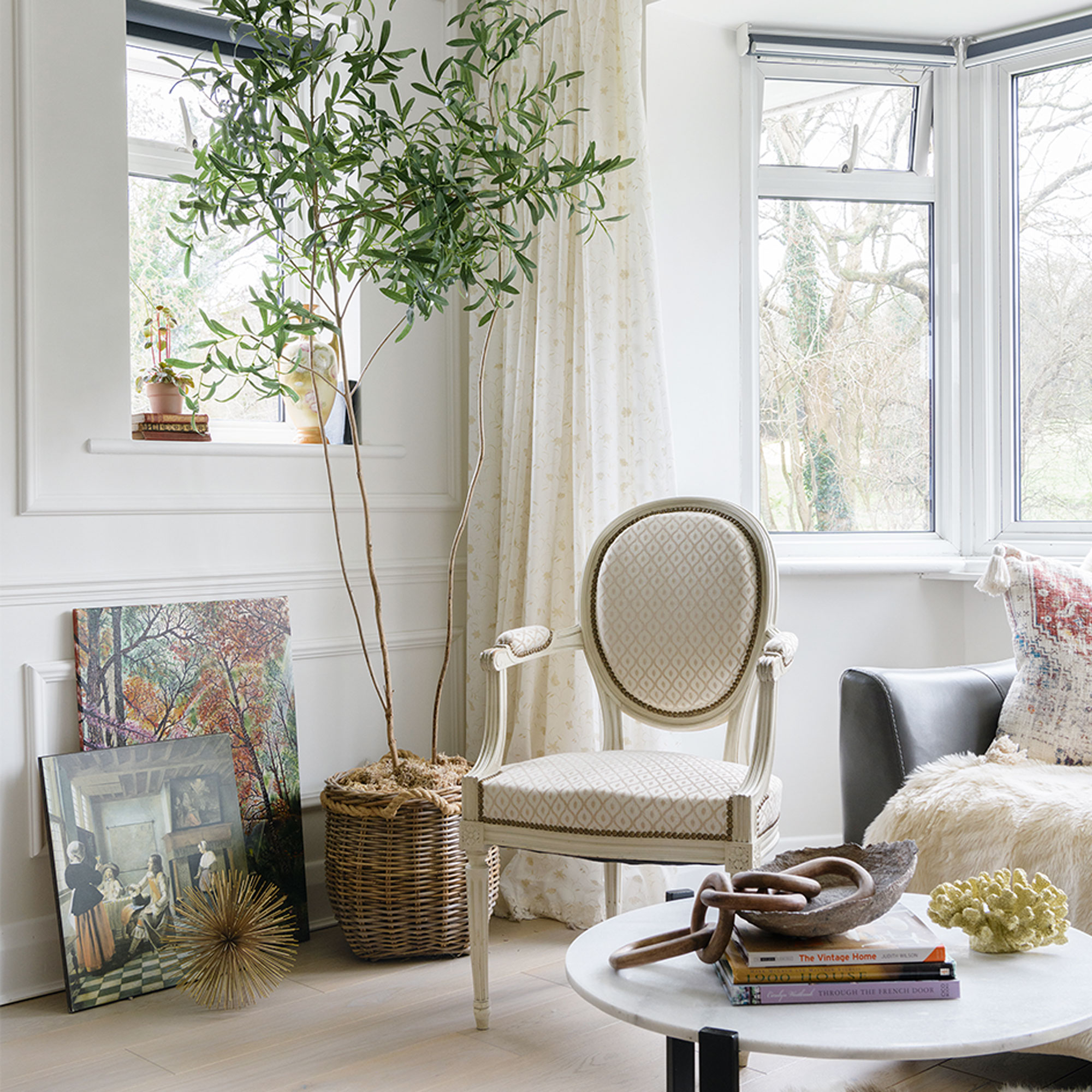
‘I made this artificial olive tree, and sometimes even I feel I should water it because it’s so realistic!’
‘I found a large foraged branch to use as the main stem of the tree and poured quick-dry ready-mixed cement into a plastic pot, to create a heavy base to stand the tree in. I then took some faux olive stems and wired them on to the branch using brown foliage tape before popping the finished tree into a woven basket.
Bathroom
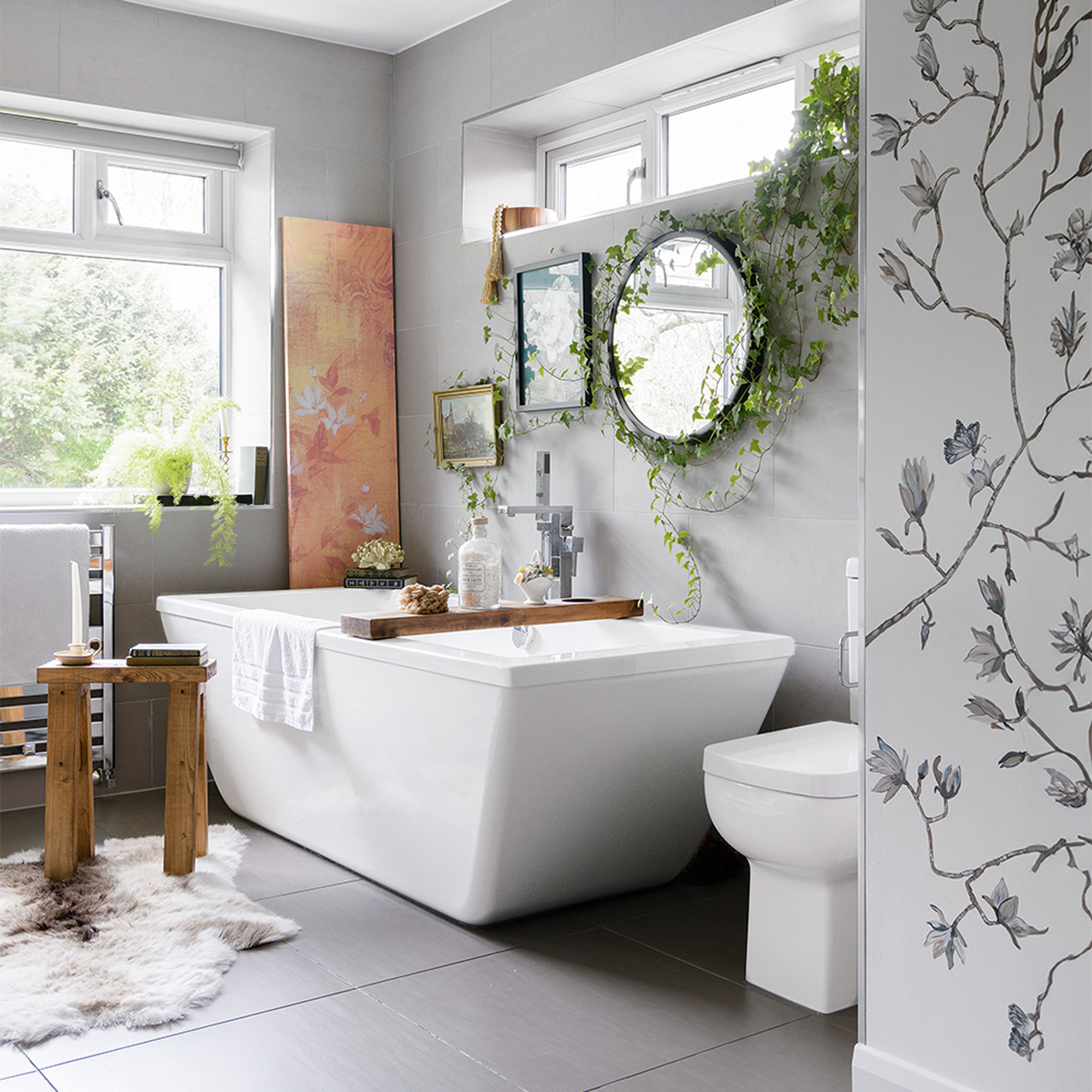
‘We injected a spa-like feel to the bathroom, choosing matt tiles for the walls and floors to add a contemporary look, and we chose a large, eco-friendly bath made out of recycled materials that helps retain the heat of the water.’
‘I like to add something unique to each room and in here the finishing touch was the hand-painted mural; I drew out the wallpaper-esque design of sweet magnolias, butterflies and birds, and then spent a few evenings painting it.’
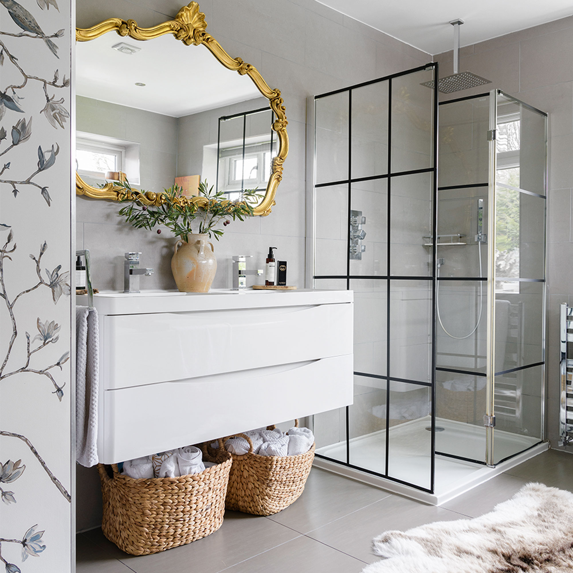
‘The crittal-style shower was a quick DIY hack – I used black Washi tape on the plain glass to get the look. The floating sink gives the impression of space and I have baskets underneath for spare towels.’
Girl's bedroom
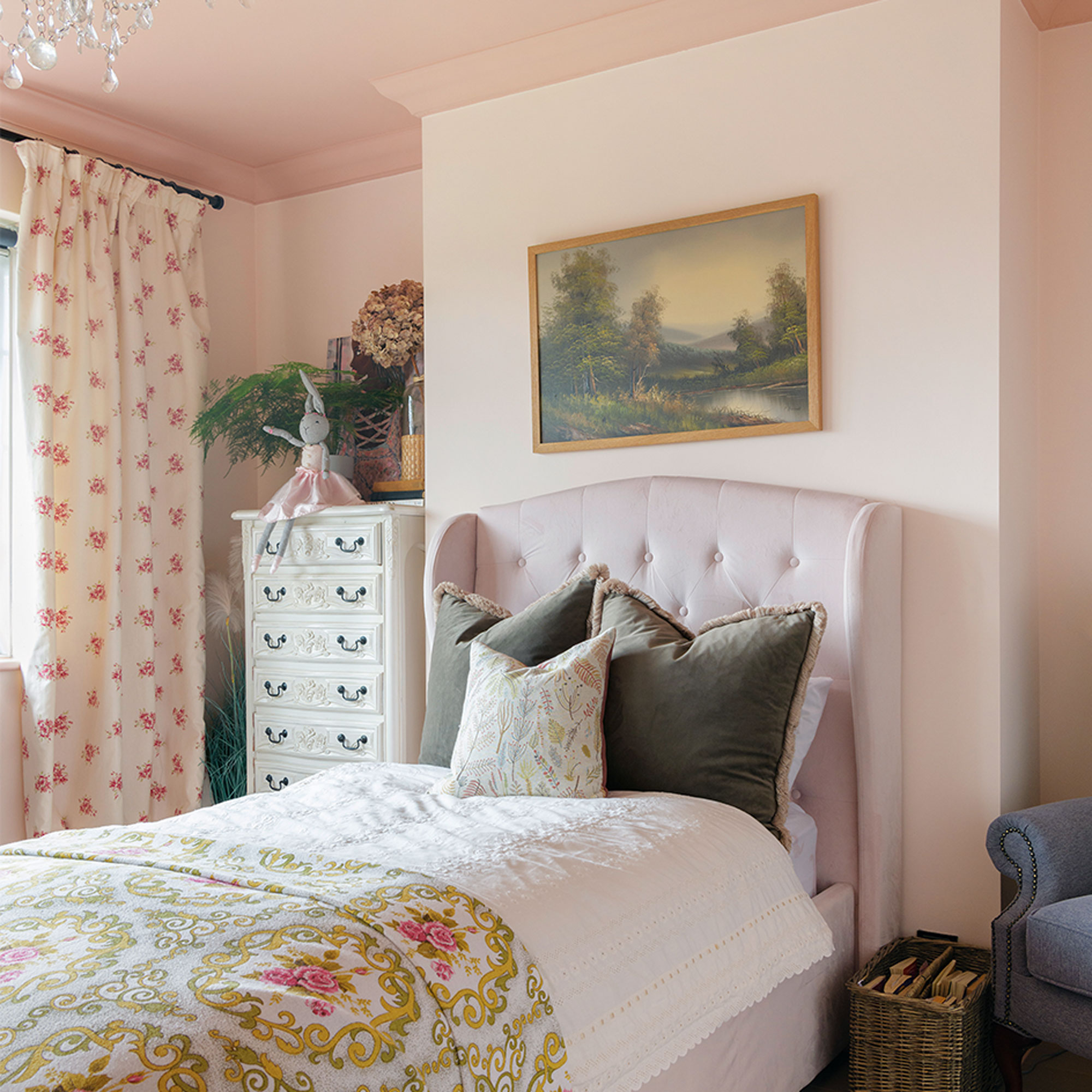
‘Our daughter’s bedroom was originally painted a soft grey, but when I gave it an update, I also painted the ceiling in Valspar’s Camisole, using You’re Blushing for the walls. It’s the first time I’ve painted a ceiling but I love the effect.’
Living room
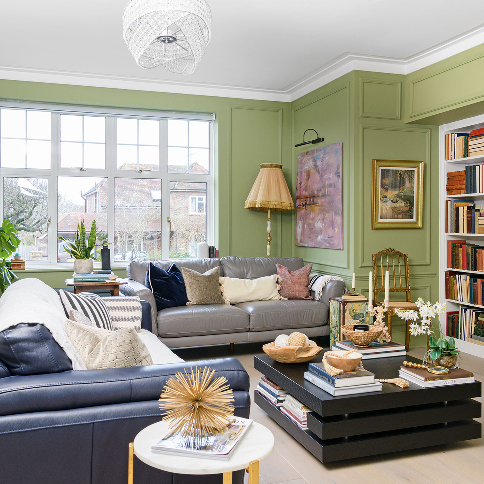
‘I loved the bedroom panelling so much that I then decided to add wall panelling downstairs, too, and it adds such elegance to the plain walls. At the time, grey was still popular for interiors so I had the whole house painted in soft shades of the colour.’
‘As time went by I fell out of love with the grey interiors I’d chosen when we first moved in and wanted to inject some playful colour into the rooms. I began by painting the family room a lovely soft blue, which has the pared-back, relaxed feel I wanted for the room, and I followed that by adding a slightly stronger olive colour to the living room.’
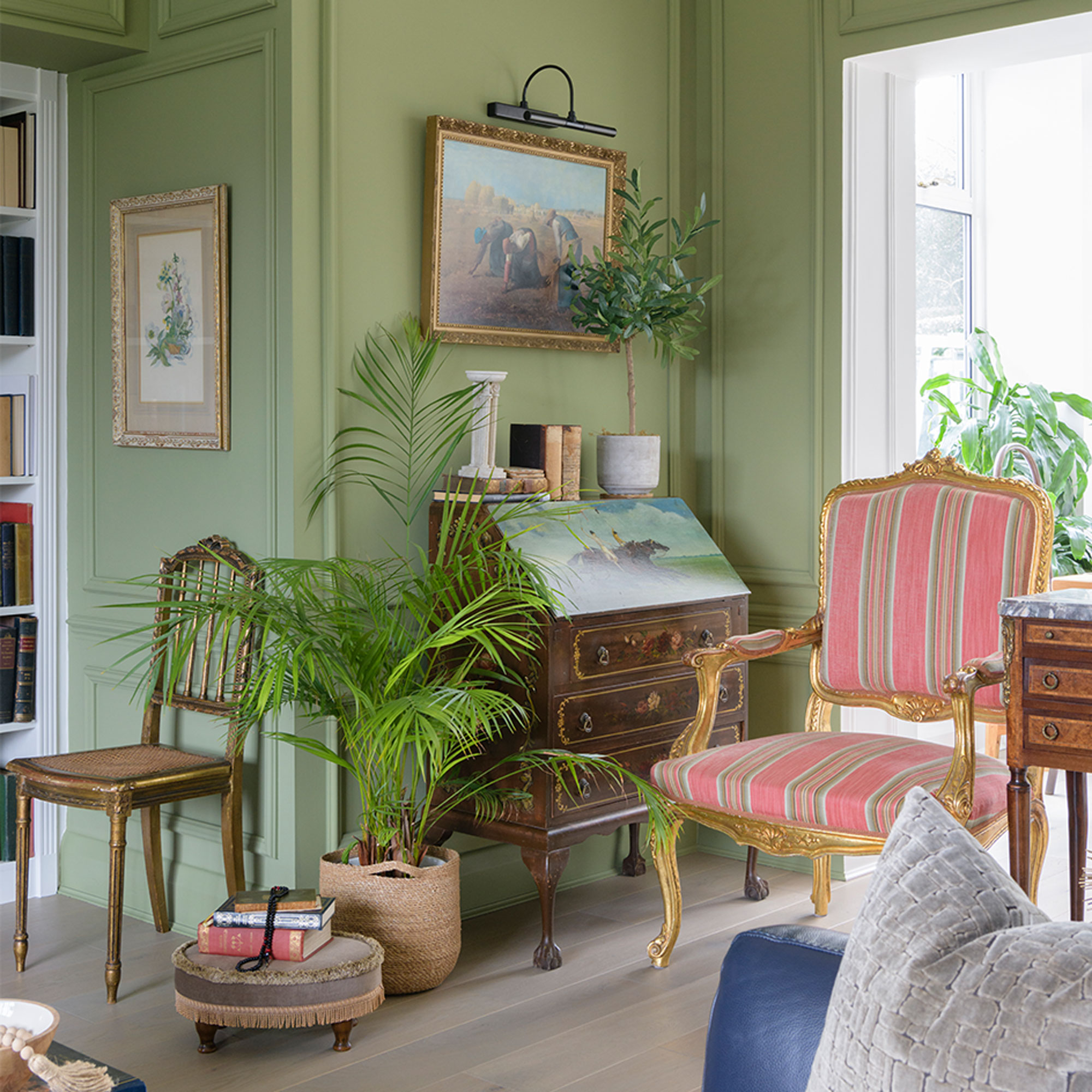
'I love the richness of this room and I’m so proud that I attached all the wall panelling myself. It was important that my vintage and antique furnishings be able to shine and not clash with the wall colour, but I also wanted the living room to feel unique – which is one of the driving forces behind my interior styling.’
‘I grew up in Senegal surrounded by lots of colour and French influences, so I have quite an eclectic style, and I love to complement old furniture with upcycled pieces. I try and avoid buying too many ‘big box’ items nowadays, preferring to fill my home with quirky finds, sourced from all over the country.’
‘Looking back I don’t think I would do a renovation all in one go again, I’d take time to do each room so that they start with an individual feel and have more personality, and I would take my time choosing colours. Tastes change and we live in our homes for a long time so they are bound to look different over the years, but I’m really proud of how our home looks and feels now.’
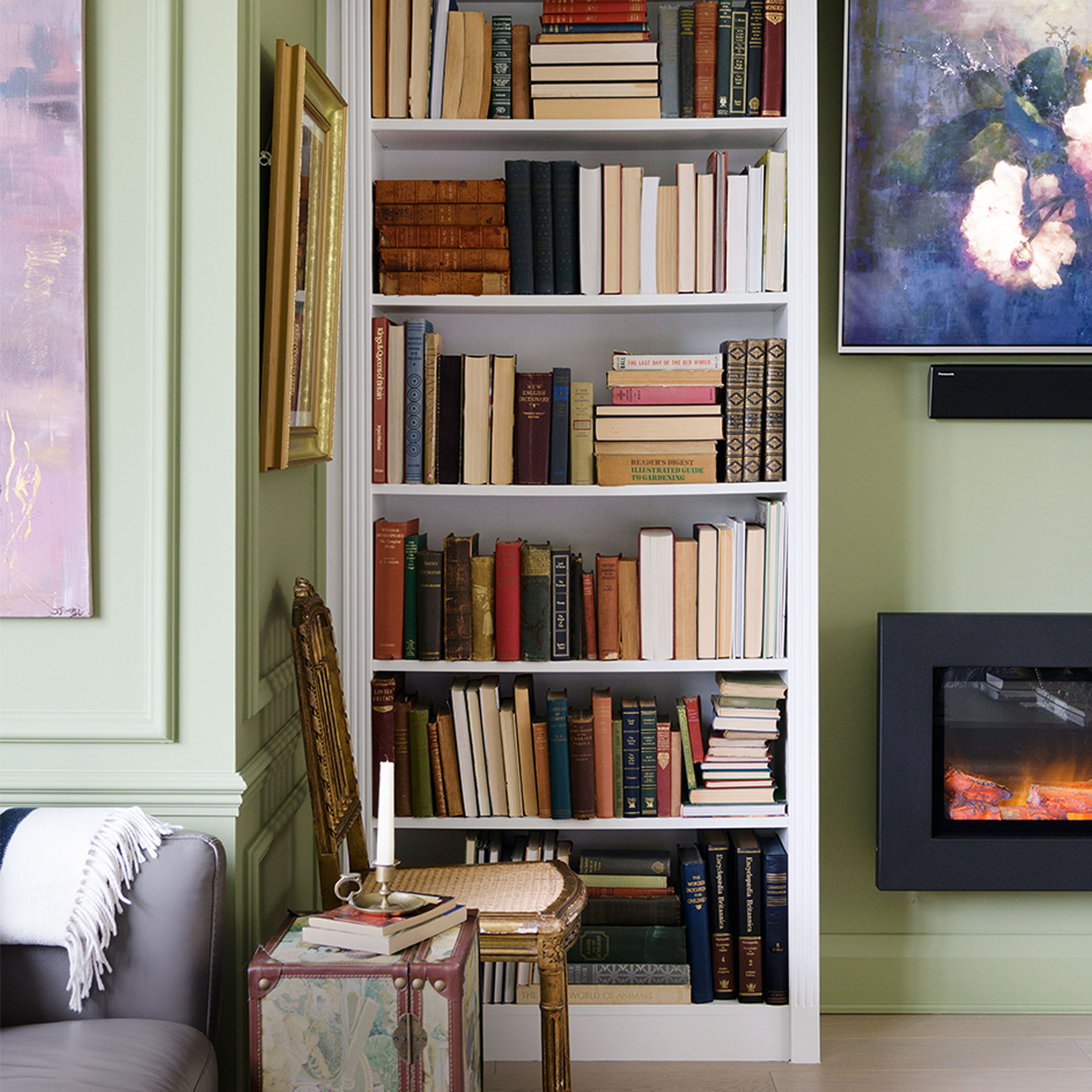
‘The bookcase is an Ikea hack; we put the shelves together and the carpenter boxed them in and routed the architrave to make them look bespoke and fitted.’
‘I love the quote by American interior designer Elsie De Wolfe: “I am going to make everything around me beautiful – that will be my life,” and I use that as my own mantra. I want my home to be unique, but not at the expense of beauty, so I spend a lot of time curating the rooms.’
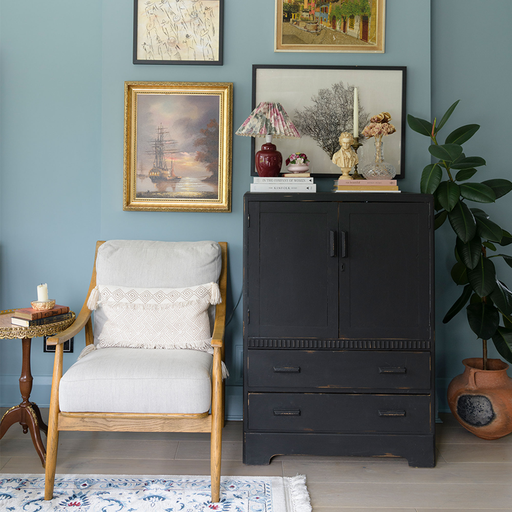
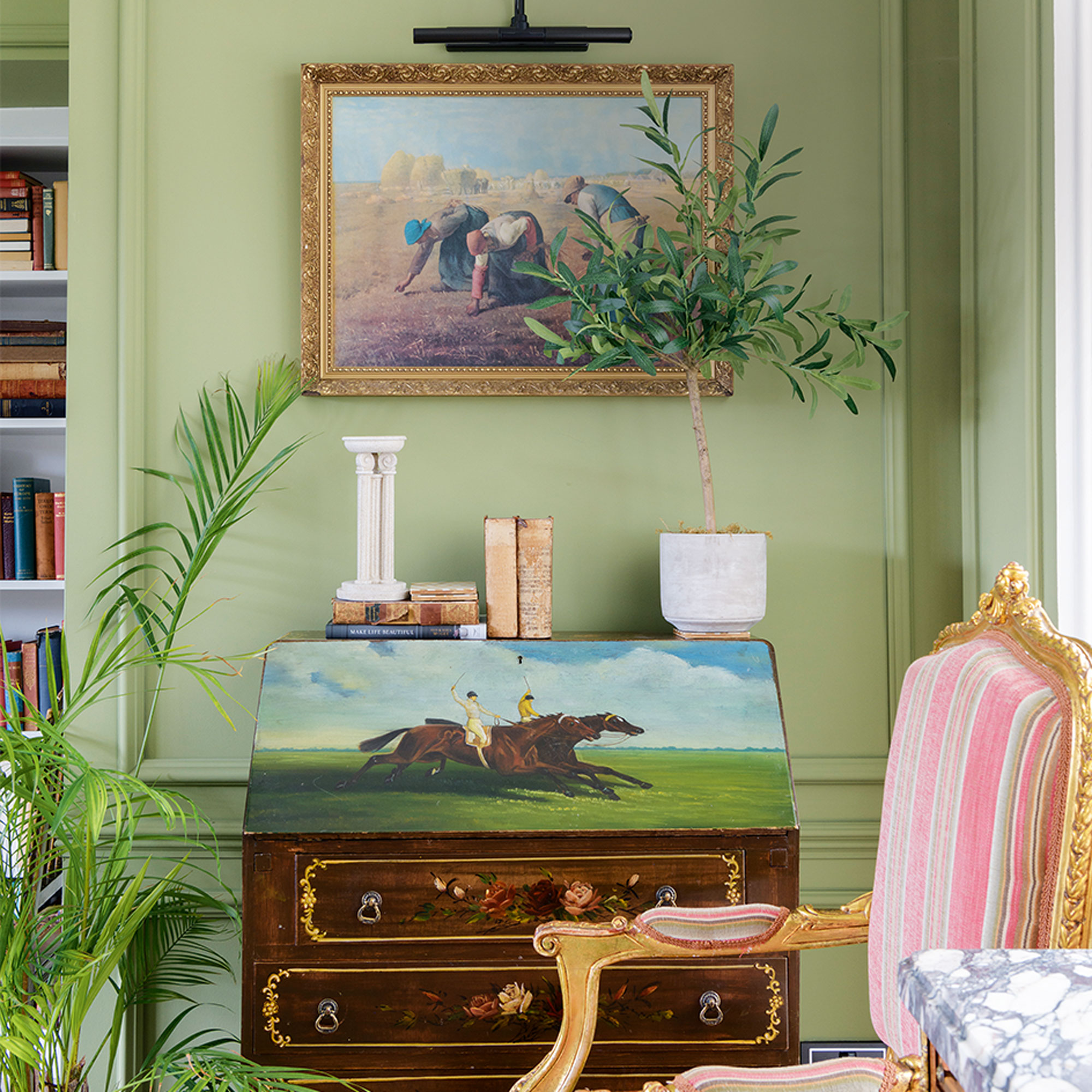
‘This vintage cabinet, from Facebook Marketplace, is one of my favourite pieces as I love the painting of the horses, and the green grass and sky blue complements this room so well. The gallery-style lights are battery operated and remote controlled so needed no wiring.’
‘Friends always compliment me on how thought-out and comfortable our house feels, and it’s nice to know that my family enjoy the spaces and love the welcoming, relaxed home I’ve created.’
Check out Djimbi's interior design business at djimbisambinteriors.com


