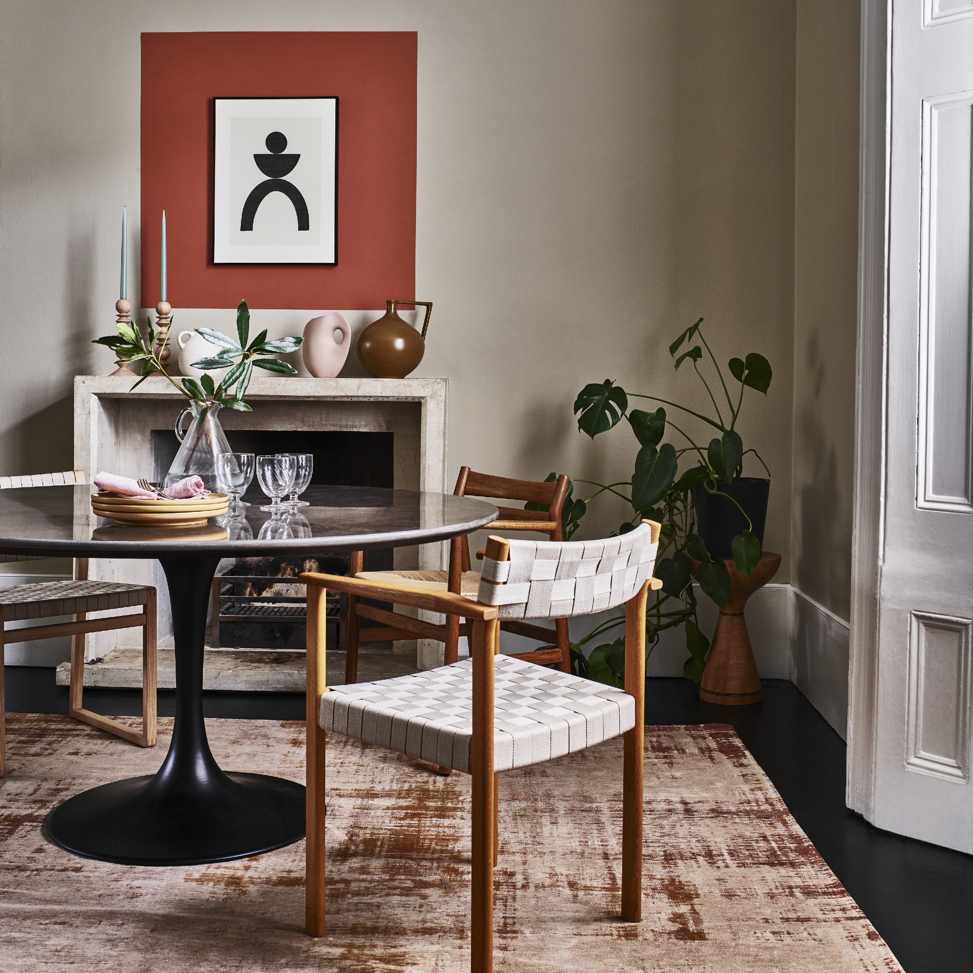
Almost everyone knows the principles of minimalism, as well as maximalism at the other end of the spectrum - after all it’s in their names. But this has never really sat right with me as I’ve always liked the clean lines and uncluttered look and feel of minimalism but also have enjoyed doses of colour, pattern and other playful elements. Well, guess what – I just recently found out that I’m a ‘midimalist’.
That’s right, there’s a new interior design term and home decor trend on the block called midimalism. And just like there is a midi dress in the middle of a mini and a maxi, there is midimalism somewhere between the two extremes that are minimalism and maximalism.
Midimalism allows you to take elements from both without any constrictions, which creates the perfect balance within interiors, in my opinion – and the interior experts seem to agree. This is something that I’ve been doing since forever without having a name for it. And now there is one! Hi, I’m Sara and I’m a midimalist.
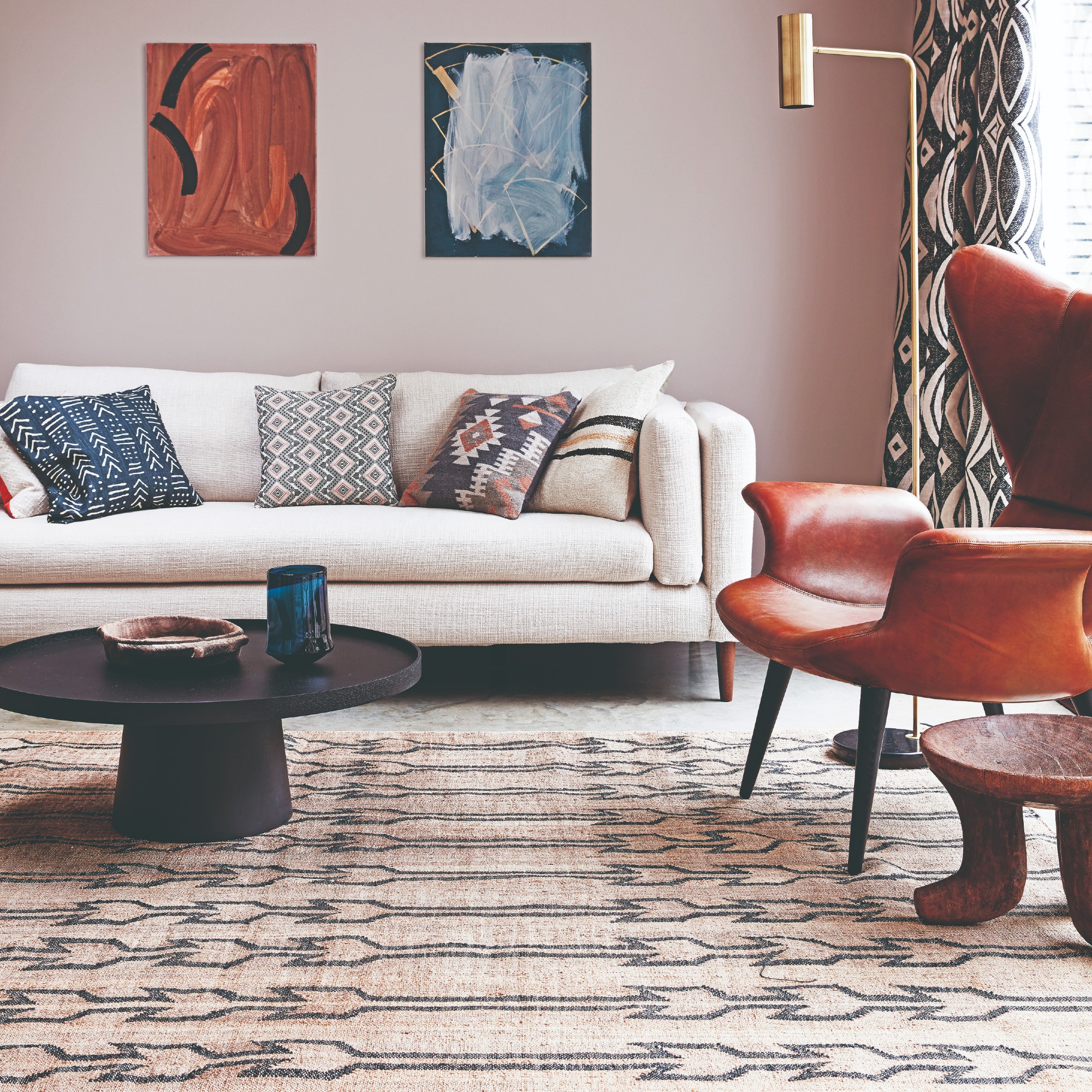
Midimalism home decor philosophy
In truth, once I started talking to the editors in the Ideal Home office, they agreed that this is pretty much what they’ve also been practising in their homes – as maximalism often feels too much and minimalism can go too far into sparseness. So it seems that true minimalists and maximalists are the minority and most people just fall somewhere in the middle. And yet, we’ve gone for years unnamed.
But perhaps we should first clear up exactly what is midimalism as a design principle.
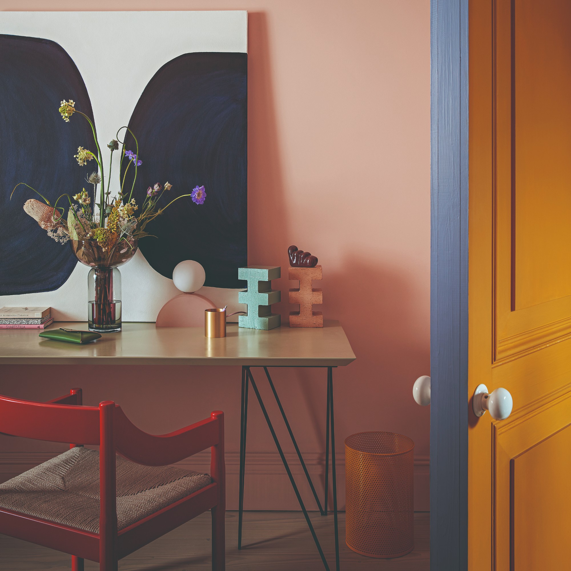
‘The concept of midimalism in interior design is a style that has traits of both minimalism and maximalism but doesn’t have the extremes,’ says Lucy Mather, design expert from Arighi Bianchi. ‘It takes elements from a minimalist approach – for sleek lines, order and an uncluttered environment with a select few pieces – but also uses cues from maximalism that features bold colour and pattern.’
Lucy continues to explain why the term is emerging right now, ‘The term midimalism has emerged in the mainstream on the back of the rising popularity of the maximilism trend in interiors over the past few years. For many decades, we’ve talked frequently about Minimalism in home décor design, and more recently Maximalism at the other end of the scale – but what about aesthetics that fall in between? That’s midimalism.’
What do the experts think about midimalism?
Being a midimalist myself, getting the experts’ opinion on this home decor style in part felt like I was asking them to scrutinise me and my taste. So you can imagine I was pleased when they gave me and midimalism their stamp of approval.
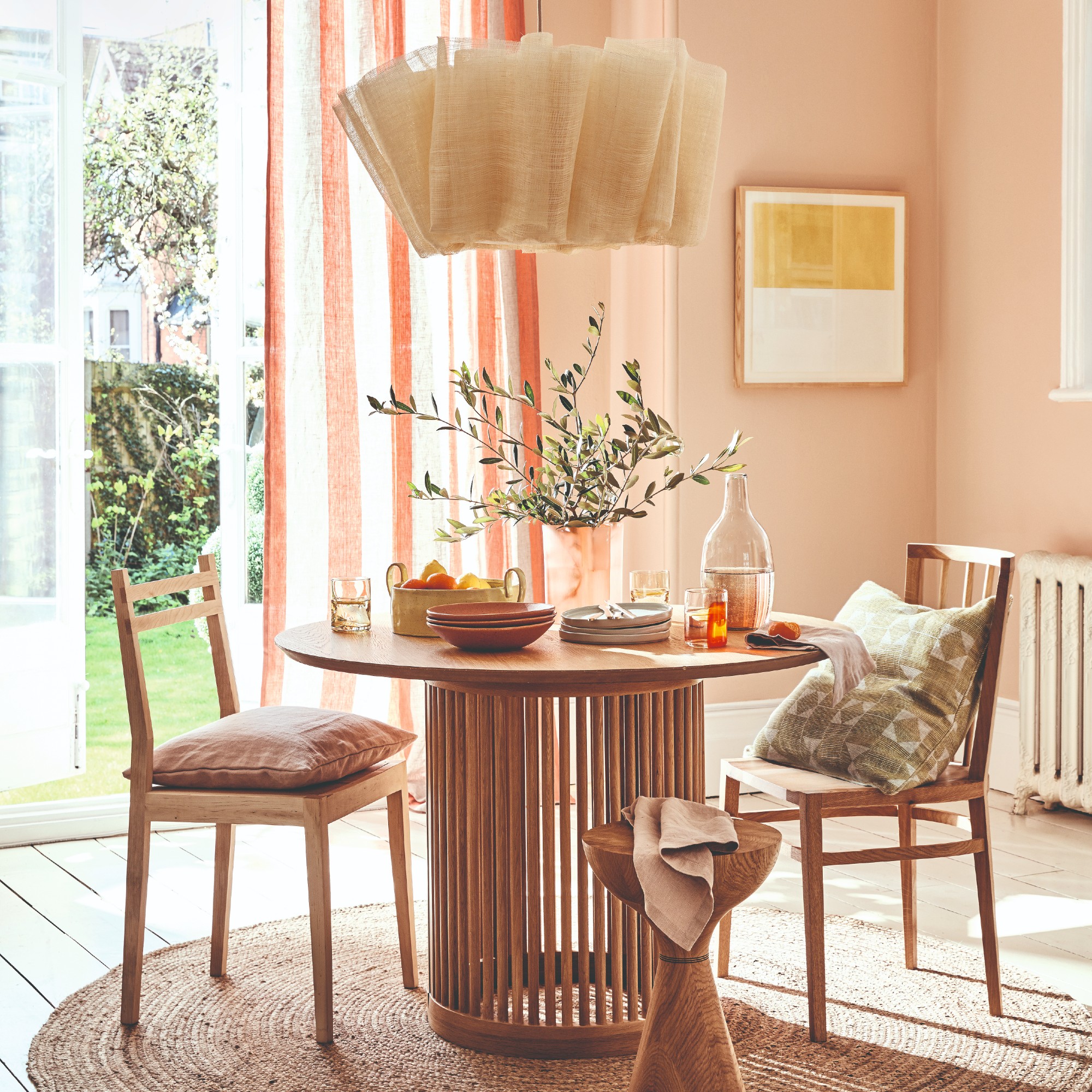
‘I am always a big fan of balance and that’s what I love about midimalism, which offers an approach to design that merges the best of both worlds,’ says Alex Stubbs, Flitch interior stylist. ‘It creates dynamic, functional spaces that are both visually appealing and highly practical.’
Lucy agrees, ‘Midimalism works because it offers lots of flexibility and still keeps a decor scheme looking designed. I love the use of colour but when it’s applied in a way that doesn’t overpower a room or scheme – and taking a midimalist approach achieves this. It still has a “look” but is less strict than a pure minimalist or maximalist concept.’

How to achieve the midimalist ‘look’
If the idea of midimalism still sounds way too abstract, our experts did share some tips and formulas for a well-balanced, midimalist home.
‘It’s a trend that needs balance to keep it looking ‘curated’ not random – and clearly has key features of minimalism or maximalism,’ Lucy starts. ‘Choose neutral-coloured walls as a base to layer with brighter accent colours and patterns.’ Just take the unexpected red theory making a space look nicer with a bold pop of colour.
Starting off with a more neutral, minimalist and timeless canvas in the form of walls and large furniture is best. And then you can inject colour and pattern with curated decor.
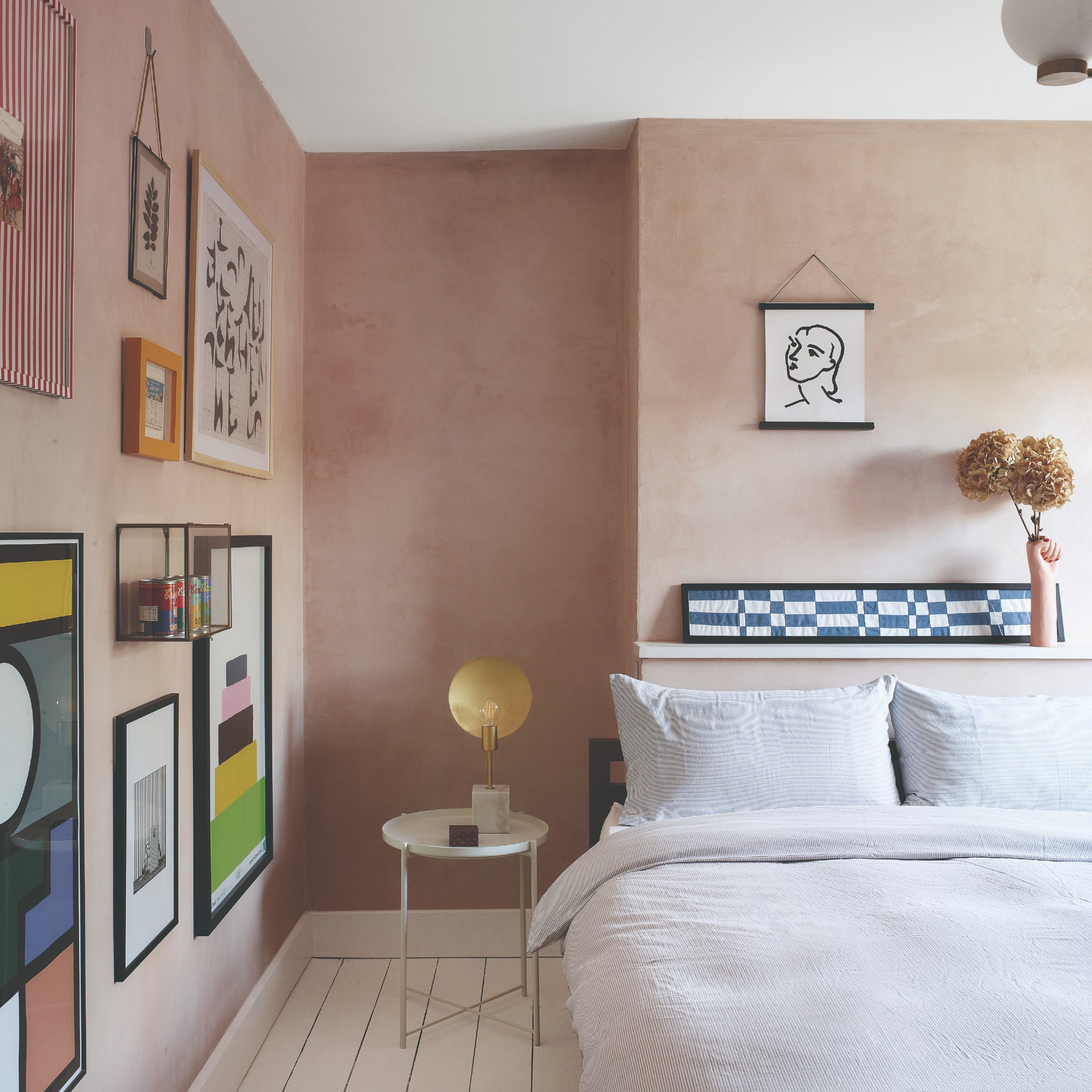
‘Incorporate bold, curated decor items that add personality and interest without overwhelming the space, such as statement art, unique lighting fixtures, or textured textiles. I’d suggest sticking to a cohesive colour palette, often featuring neutral tones with strategic pops of colour. Importantly, pay attention to the balance between negative space and decor, ensuring the room feels spacious yet inviting,’ Alex advises.
Lucy concludes, ‘Unlike with minimalism, you can add an eclectic mix of accessories – ones that are personal to you and are non-uniform in how they’re displayed. Introduce statement pieces that reflect the maximalist in you, but juxtaposition it with more calming and simple elements with clean lines. While a maximalist decor scheme can perhaps come across as cluttered, ensure the environment still feels spacious and practical. This can be achieved with clever storage – which can be bright or patterned but that keeps a room free from chaos.’
A midimalist’s wish list
All of these pieces either currently are or at one point have been on my wish list (and now live in my home).
M&S Home has been killing it with their pretty lighting over the last year or so. So much so that it's hard to pick just one but this year's newcomer, the Ollie table lamp, has charmed me with its striped pattern (I love stripes) and the similarity to the cult favourite, the Kirsten table lamp.
As Lucy said, keep the lines clean and storage is key for maintaining a clutter-free space. But the storage in question can feature colour. Which is what Mustard Made's storage lockers do best.
I love the colourful and often floral-focused art prints by illustrator Carla Llanos. I still haven't taken the plunge of buying one despite following her for years - I guess I can't decide what print to go for but this one is currently on top of my list.
To be honest, I own the football-centric version of this cushion. But considering the current tennis-core trend started by The Challengers movie, this one is probably more on trend.
I recently bought a new sofa (at last). And while in the end , this one wasn't the one , I was seriously considering it. It's a shame that I only got to sit on it at the DUSK press day after I'd already ordered another one. But I can attest that it's super comfortable and cushiony.
Totem side tables might be a current trend but I know that the clean and yet playful silhouettes of the likes of this H&M Home variation will not go out of style. And it would look great stationed next to my sofa.
The classic, clean design of a wishbone dining chair like this one from Dunelm is what my dreams are made of. Hopefully, one day (soon) I will own a set of these design icons.
Spattered ceramics are my weakness. I think they just effortlessly inject a bit of colour and pattern to a tablescape without overwhelming it. I own this exact bowl but in the cranberry colour but this one would have been my first choice. For a pasta bowl, it's pretty sizeable so I use it more as a serving bowl.
I love the eclectic and abstract pattern of this Ruggable rug and its earthy colours. It currently covers the majority of my living room floor - don't forget the 18-inch rug rule though - and I couldn't be happier with it.
So what has midimalism taught me? Firstly, there’s no need to conform because a term for what you’re doing will come around sooner or later anyway. And secondly, if ever in doubt, choosing what brings a sense of balance into your home and life is often the best way forward.


