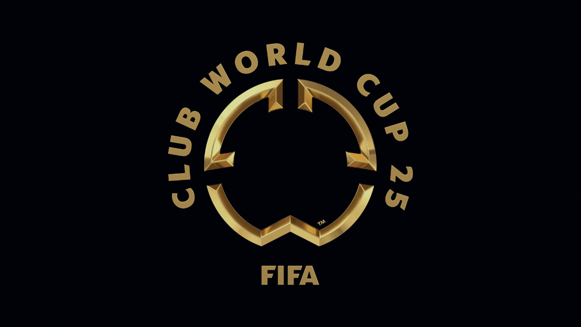
Fifa has unveiled its new logo for the upcoming Club World Cup – a unique competition that brings the world's greatest football clubs together in the ultimate sporting showdown. As football's newest tournament, the Club World Cup faces the challenge of standing out in a sea of sporting competitions but judging by fan reactions, it seems the unique logo has failed to score with supporters.
The best sports logos are often packed with powerful symbolism, something that the Club World Cup logo seems to lack. With on-the-nose nuance and a painfully minimalist design, it's a tepid logo that feels like style over substance.