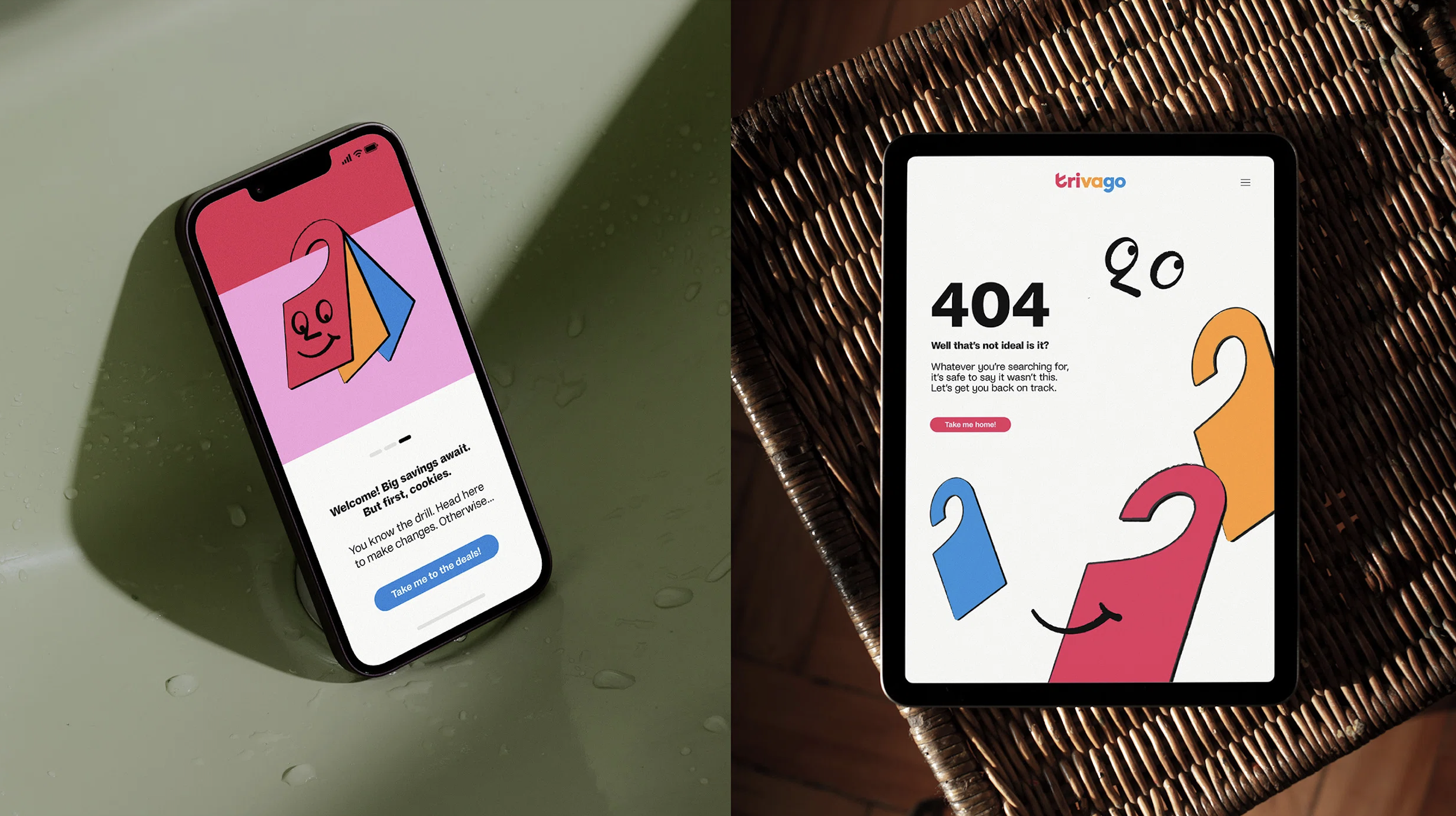
Hotel booking service Trivago has unveiled a brand new visual identity, complete with a new wordmark, a cute illustrated mascot and a bold new illustrative style. Also at the centre of the refresh is what Trivago calls a "first of its kind" AI-driven ad campaign.
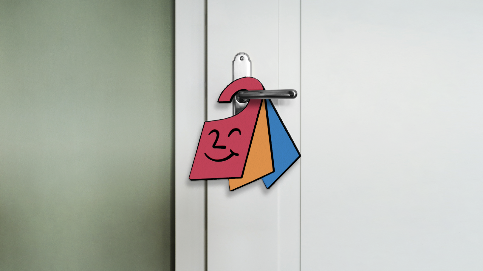
The new look is delightfully friendly, right down to the smiley door hanger mascot and the new wordmark's clever incorporation of a checkmark ("representing how easy it is to find a hotel that suits your needs"). The graphic design work here is top notch, so it's a little bizarre that Trivago has chosen to dedicate so much precious press release space to the aforementioned AI ads – arguably the least visually striking aspect of the campaign.
Designed by DesignStudio, the new visual identity is centred around the new tagline, "Search savvy. Feel super." According to the studio, "the witty and characterful nature of the brand is brought to life through playful hand-drawn illustrations, created in partnership with Niceshit. The illustrative scenes are inspired by the trivago persona, Hank – a simple yet lovable door-hanger character."
"Our goal was to create a simple design system that heroes our warm & witty tone of voice," shares Diane Dear, senior designer at DesignStudio. "Hank can play a key role in this by welcoming and guiding users through the customer journey."
In an age of flat, monochromatic, sans-serif wordmarks, it's refreshing to see such a fun and playful visual identity. But this is also the age of AI, which explains why the brand has also decided to make a song and dance of its new "first-of-its-kind" ads. Anyone worried about AI taking jobs, look away now: the ads use AI to translate a single actor's dialogue into various languages, removing the need for various actors. “The spot is an evolution of the Mr. Trivago or Mr. and Mrs. Trivago spots that in the past had 20 spokespeople and 35 productions,” Trivago CEO Johannes Thomas told Skift. “The beauty now in leveraging AI is to have one actor in one production, and being able to cut production times in half." You can view two different versions of the ad below.
But AI-powered translations aren't anything particular new, and the ads themselves are missing most of the fun of the new visual identity itself. Instead of this slightly dead-behind-the-eyes actor (perhaps showing little emotion to make the AI translation job easier) couldn't we have had lovely old Hank? Instead we have a somewhat generic-looking ad that, unless the viewer chooses to watch in its various translations, does little to belie the supposedly revolutionary artificial intelligence at play.
Still, that doesn't detract from DesignStudio's brilliant rebrand. Like Burger King's sizzling new look in 2021, this is a personality-filled delight. With mascot logos seemingly on the decline, we'll be hang(er)ing our hopes on Hank for a comeback.
