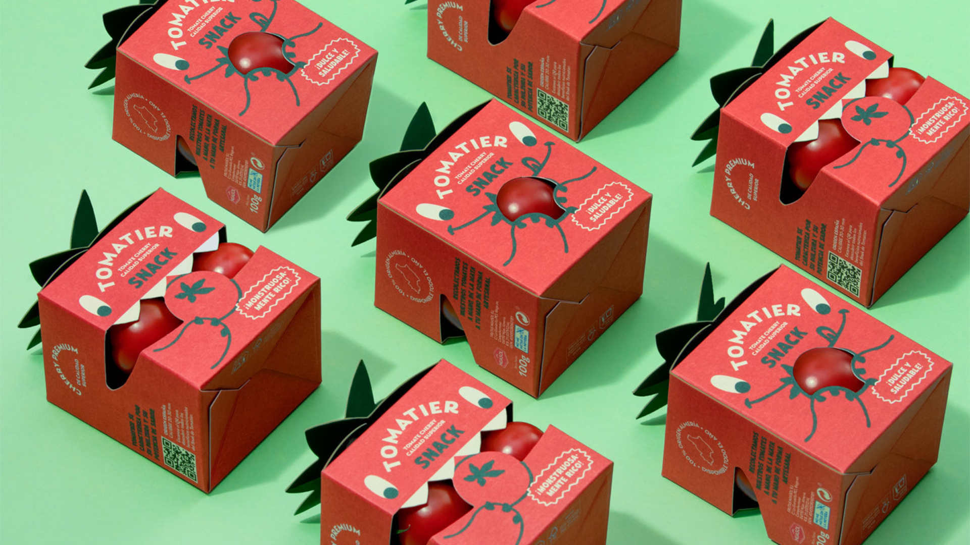
In this era of modern minimalism, sometimes we can forget that design can still be playful. Fronting the return of fun and creative packaging is none other than tomato brand Tomatier Snacks, bursting onto the scene with a delightfully fresh packaging design that embraces the sillier side of branding.
In a crowded market of sleek, monochromatic packaging design, it can be hard to stand out from the crowd – especially when your product is the humble tomato. With a refreshing taste of playful personality, Tomatier stands out as a unique identity that's unafraid to buck trends in the name of joyful design.
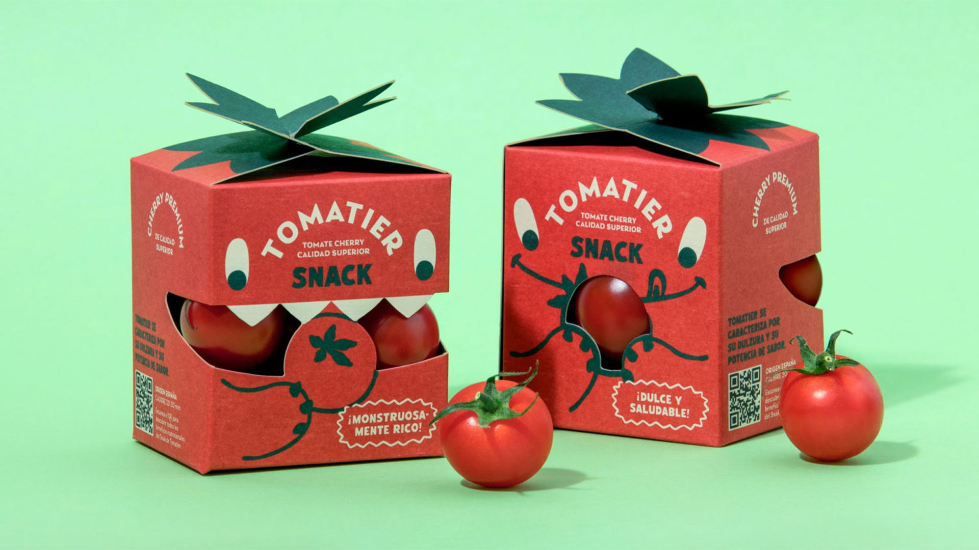
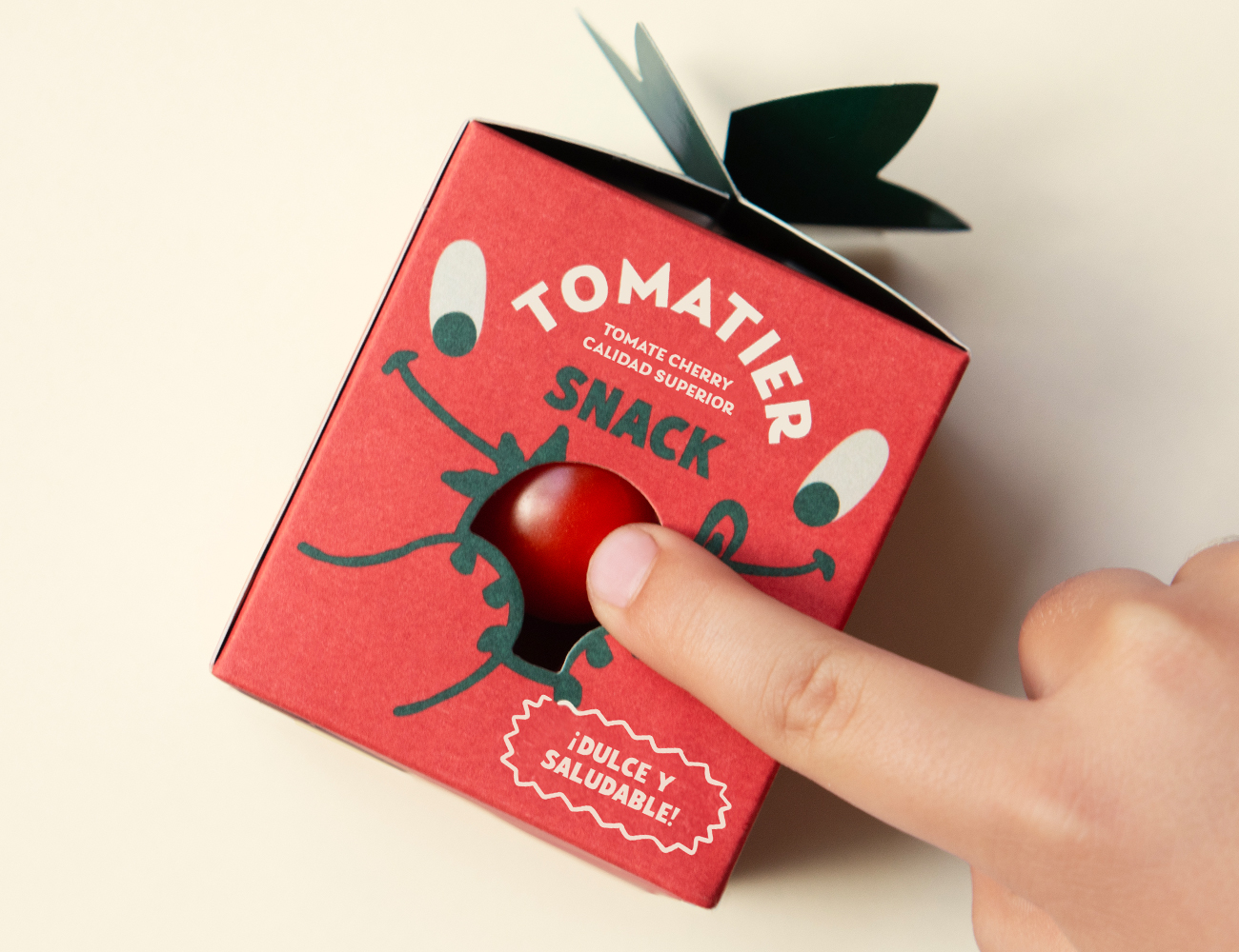
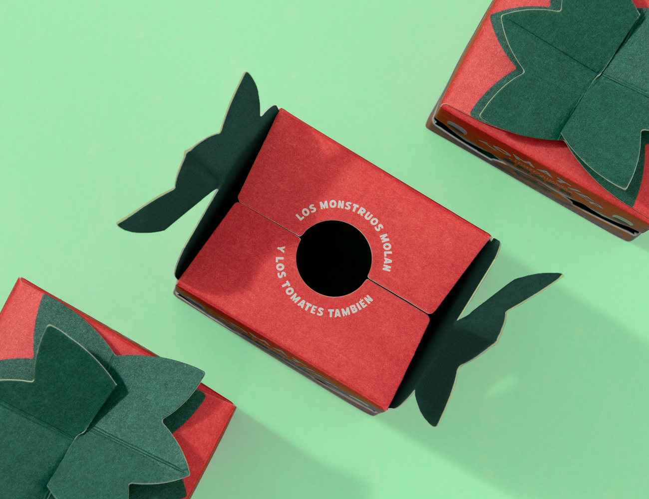
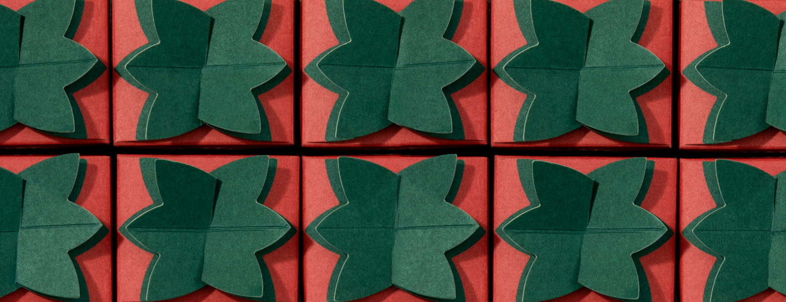
Created by Valencia-based design studio Meteorito, the stylish design aims to capture the imagination of kids and parents alike. The dinky square boxes are bursting with personality, featuring a series of monster characters with adorably illustrated expressions. From the visuals alone, there's a distinct connection between product and packaging, taking design motifs from the cherry tomatoes such as the bright red colour palette and leafy box closure detail.
It's a well-considered design that's both playful and practical, utilising the monster's mouth as a window to the product within. Presented under the simple slogan “Monsters are cool and so are tomatoes”, the design is a lighthearted and creative example of thematic branding that's both unpretentious and endearing.
For more packaging inspiration, check out these adorable milk carton packaging designs that are a refreshing take on dairy branding. For more design news, check out Messi's drinks brand packaging that caught the eye of competitors.

Have you created some standout branding? Enter the Brand Impact Awards today.


