The home screen on your iPhone is going to look a lot different once iOS 18 gets done with it. Multiple reports now claim that this year's iPhone software update will offer a greater degree of customization, giving you free rein to move app icons where you will.
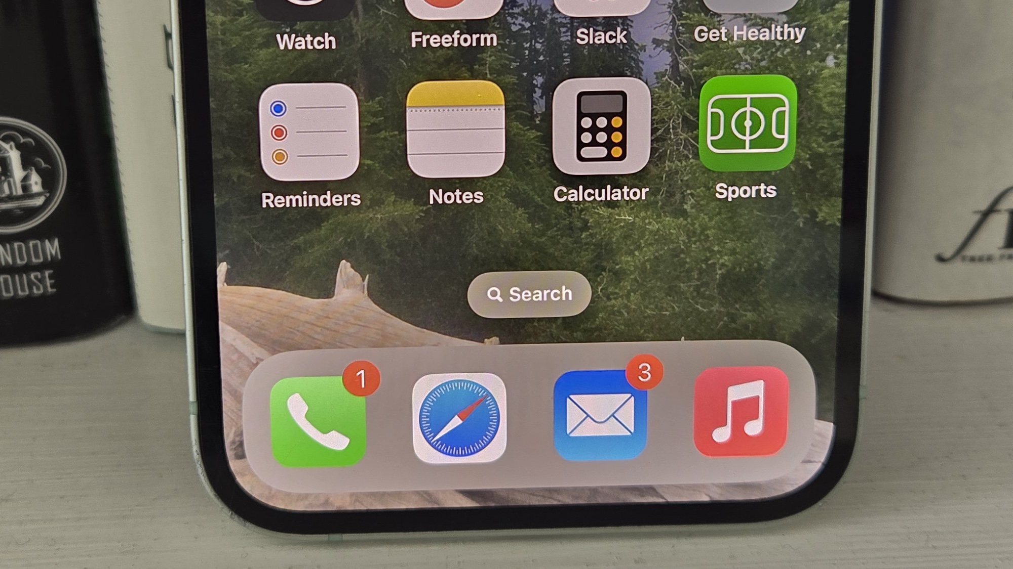
According to reports from both Bloomberg and MacRumors, you'll still have to contend with the now familiar grid of apps when you update to iOS 18. But you won't be locked into stacking app icons one after the other; instead, you'll be able to leave blank spaces, even having entirely empty rows and columns to better space out those apps.
It's a look you could have currently with the help of either shortcuts or third-party tools, but iOS 18 will reportedly bake home screen customization tools right into the iPhone software. The end result should be an iPhone screen that's more reflective of your wishes.
Giving the iPhone a more personalized look has been a focus of recent iOS updates. For example, iOS 16 introduced the ability to customize the lock screen of your iPhone, adding different widgets and changing around the fonts of the clock and other on-screen features. The rumored iOS 18 customization changes sound like a natural extension of that.
I'll reserve judgment on this change until I get a good look at iOS 18, which will likely happen once Apple previews the software update at WWDC 2024 in a few months. But from the reports about the new capabilities, I wonder if the customization features are going far enough.
Add some AI to the home screen
In regards to the iOS 18 changes, Bloomberg's Mark Gurman posted something on whatever we're calling Twitter these days that got me thinking. "Prepare to see a slew of AI tools that help manage your daily life," Gurman says of the changes coming to iOS 18. "There also will be a new home screen that's more customizable."
Here’s what I wrote about iOS 18, visionOS 2.0 and watchOS 11 in Power On today https://t.co/yHepnBRSE7 pic.twitter.com/K7qY2iVw7IMarch 24, 2024
If I may paraphrase a meme in responde: why not both?
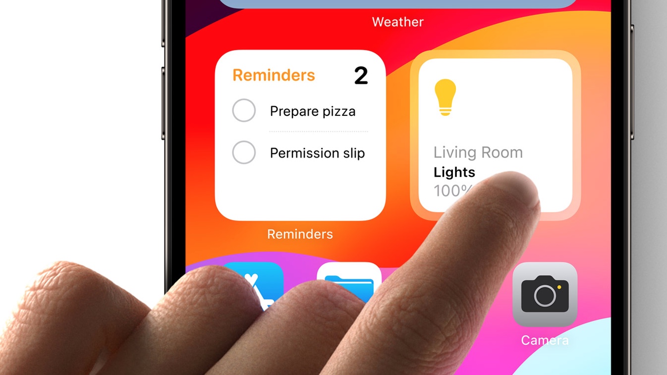
By that I mean, why not combine Apple's rumored push to add more AI-powered features to its iPhone software with the increased customization coming to the home screen? What I'd love to see on my home screen is a widget panel, not unlike the stacked widgets that currently exist. In this case, though, I'd get a control panel showing me glanceable information of my choosing — the current temperature, my Move ring status, upcoming calendar events — all visible at once.
It'd be even better if Apple could tap into AI and serve up quick links to apps it knows I use at certain times and in certain locations. For instance, if I'm at the grocery store, the smart control panel on my iPhone home screen would be able to detect my location and serve up a quick link to the Reminders app where I have my grocery list.
Expanding the dock

I like the current setup in iOS where you can store four apps in a dock that will appear at the bottom of whatever home screen you happen to be on. I wouldn't mind it if Apple made that dock scrollable so you could include even more apps in that area. Or Apple could let you designate a space on the home screen where the icons of recently used apps could appear.
Currently, if you want to access apps you just used, you have to swipe up from the bottom of the screen to reach a scrollable array of app windows. It's not a bad system, but I'm just as likely to inadvertently jump to the search screen or swipe over to a different home screen. I think being able to designate a section of the home screen where icons of the last two or three apps I've used would be a great customization feature — and it would boost the iPhone's multitasking capabilities, too.
So long as we're proposing home screen reorganization features, I'm going to repeat a request I make every time someone asks me for my iOS wish list. I want a way to organize apps on a home screen that doesn't require me to drag and drop icons, which can be particularly fussy when you're dragging an app from one screen to another.
In the good ol' days, Apple included a section in the desktop version of iTunes where you could arrange apps to your liking with the luxury of a trackpad and a larger screen. iTunes may be dead as disco on the Mac, but surely Apple could launch some sort of companion app where I can have a larger workspace to rearrange my iPhone home screens.
iOS 18 outlook
Even if none of these suggestions are part of Apple's iOS 18 plans, it's clear there's plenty of room for rethinking just how an iPhone home screen should look and what it can display. I'm more eager than ever to see that iOS 18 preview at WWDC, and to get my hands on the iOS 18 beta that's certain to arrive this summer.


