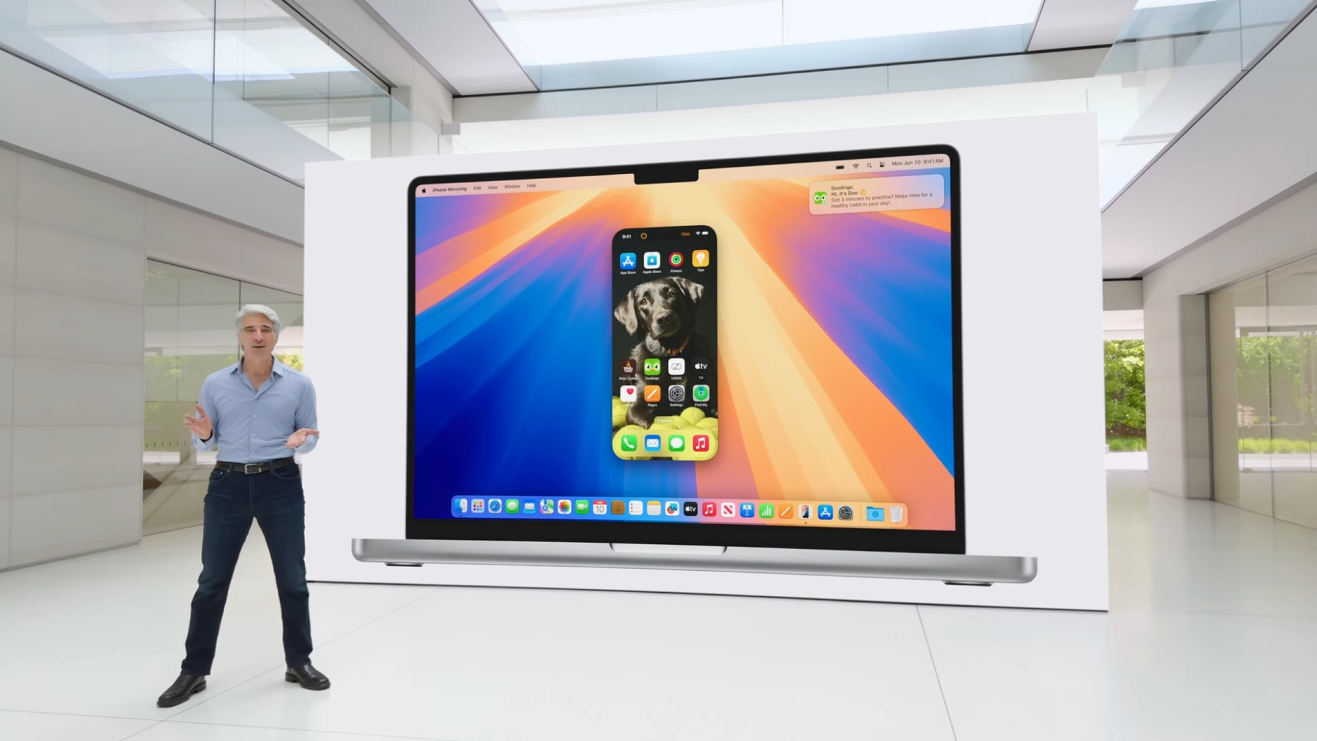
Apple has finally launched the macOS Sequoia public beta, which means you can install macOS 15 now and mess around with all the cool new changes to come later in the year. Unfortunately, Apple Intelligence has yet to make an appearance in the beta, and will likely be withheld until the proper release in the fall. I don’t mind the wait, though, because my favorite feature is already here: iPhone Mirroring.
If you missed the presentation at WWDC 2024, iPhone Mirroring was one of the key features announced when discussing macOS Sequoia. The feature allows you to pull up your iPhone screen on your desktop and type, swipe, and scroll on your phone apps right on your Mac – as long as your iPhone is nearby and not in use (you can’t use the feature if you’re also using your phone).
In the short time the public beta has been out I’ve become so reliant on iPhone Mirroring that I’m starting to question how I lived without it. You’d be right to wonder what difference it could make to have your phone mirrored on your desktop screen, but, honestly, answering messages, double-checking important info, and having a cheeky social media scroll during work without needing to grab my phone is just so useful.
“Windows got there first!” I hear some of you say through the screen, and you’re right, Windows Phone Link is exactly the same, but I would argue that iPhone Mirroring is better. Don’t get me wrong, I’m not saying iPhone Mirroring is doing something new and completely out of the box (at least in the public beta anyway) but it feels so much more intuitive.
You may have done it first, but...
On Windows, when you open the Phone Link App you’re greeted with a menu of all the apps on your phone, and when you select one a small screen pops up allowing you to interact with the app. There’s a separate section of the app dedicated to controlling your music too. The Apple iPhone Mirroring differs dramatically from this. When you open the app it immediately brings up an interactive version of your phone on your display.
While Microsoft emphasizes functionality over aesthetics, Apple’s choice to have the floating phone screen makes it feel more like you’re using your phone.
I think that’s much more intuitive than having to open up a menu and then get the phone menu up. It’s a lot more fun and scratches that scrolling itch by allowing you to scroll through your apps or homepage the same way you would on your phone – extra points if you use a trackpad.
The iPhone Mirroring feature is sure to be a hit with Apple fans once it’s officially released to the general public. You can answer a text or two without breaking focus (well…) or take a quick break and catch up on your socials. Plus, the demonstration at WWDC 2024 showed off the ability to drag and drop files to and from your phone and your desktop, which adds another reason to love it! I highly recommend downloading the macOS 15 public beta and getting a taste of what's to come. Besides, there’s nothing wrong with a cheeky little doomscroll between meetings. Note to my editor: I have never done this of course...


