Most of the time, I try to steer away from using absolutes, but in this case, I'll make an exception: I hate white kitchens.
Now, let's be clear, when I say I hate white kitchens, I'm talking about those high-shine, bright-white monstrosities of the 2010s. You may be going for bright and airy, but in reality, your kitchen will look harsh, sterile, and, more often than not, downright ugly. I'm sorry if that offends you, but if we're being honest, this kitchen aesthetic offends me, so let's call it even.
This may all seem a little harsh, but no one said the truth would be easy to swallow. Luckily, what is easy is finding an elegant alternative. There are countless shades out there that offer you that same crisp, clean look, without making your kitchen look like a doctor's office. These three hues are key to a "light and timeless" kitchen, according to interior designers.
1. Warm Neutrals
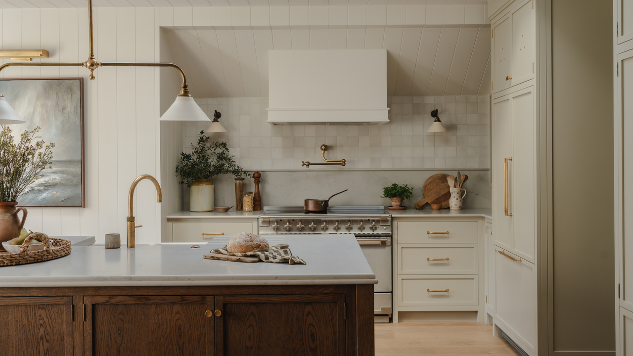
Just because we're moving away from white kitchens doesn't mean we're abandoning neutrals entirely. To the contrary, neutral kitchens are as popular as ever, so long as you stick to the 'new neutrals'.
In 2026, we're swapping out harsh, sterile whites and cool-toned grays for softer, warmer shades. Think taupes, stones, mushrooms, and other similarly warm, earthy color palettes.
And while these on-trend shades work beautifully across your whole home, they really come into their own in the kitchen. As Katerina Tchevytchalova, director of K'Arte, explains, "These shades keep the kitchen feeling light and timeless, but they introduce a softness that pure white often lacks."
Borrowing tones you'll find in the natural world is one of the easiest ways to create a color scheme that feels comforting and calming. These shades, although darker than a true white, still feel bright and uplifting.
Unlike a true white, these deeper, warmer tones tend to be more forgiving, too. "A straight white can feel quite clinical, particularly under artificial lighting, and in a hardworking space like a kitchen, it tends to show every mark and scuff," says Katerina. These warm, neutral alternatives, on the other hand, lend your kitchen a diffused softness, making it feel far more welcoming.
Much like white, these shades capture the same bright, airy quality that appeals to so many, while avoiding any chance of harsh sterility. "They create the same clean, airy backdrop people love about white kitchens, but with far more warmth and character," explains Katerina.
This subtle taupe shade has undertones of red and is inspired by the colors of coastal retreats.
This aptly named shade is the perfect brown-gray, with plenty of warmth from the soft, red undertones. It feels cocooning and comforting, like a warm hug.
The OG warm neutral, Elephants Breath, set the standard for greys that don't feel clinical. The soft, pink undertones make this a super welcoming shade.
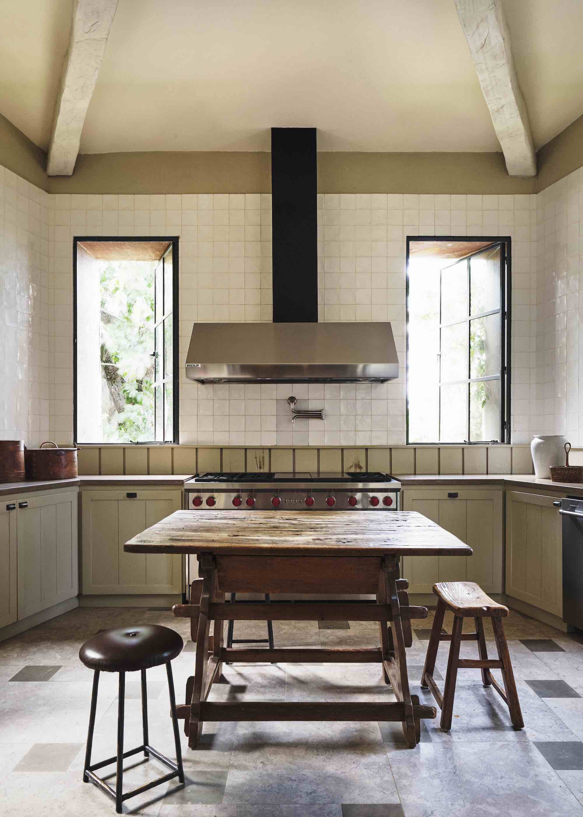
2. Off-White
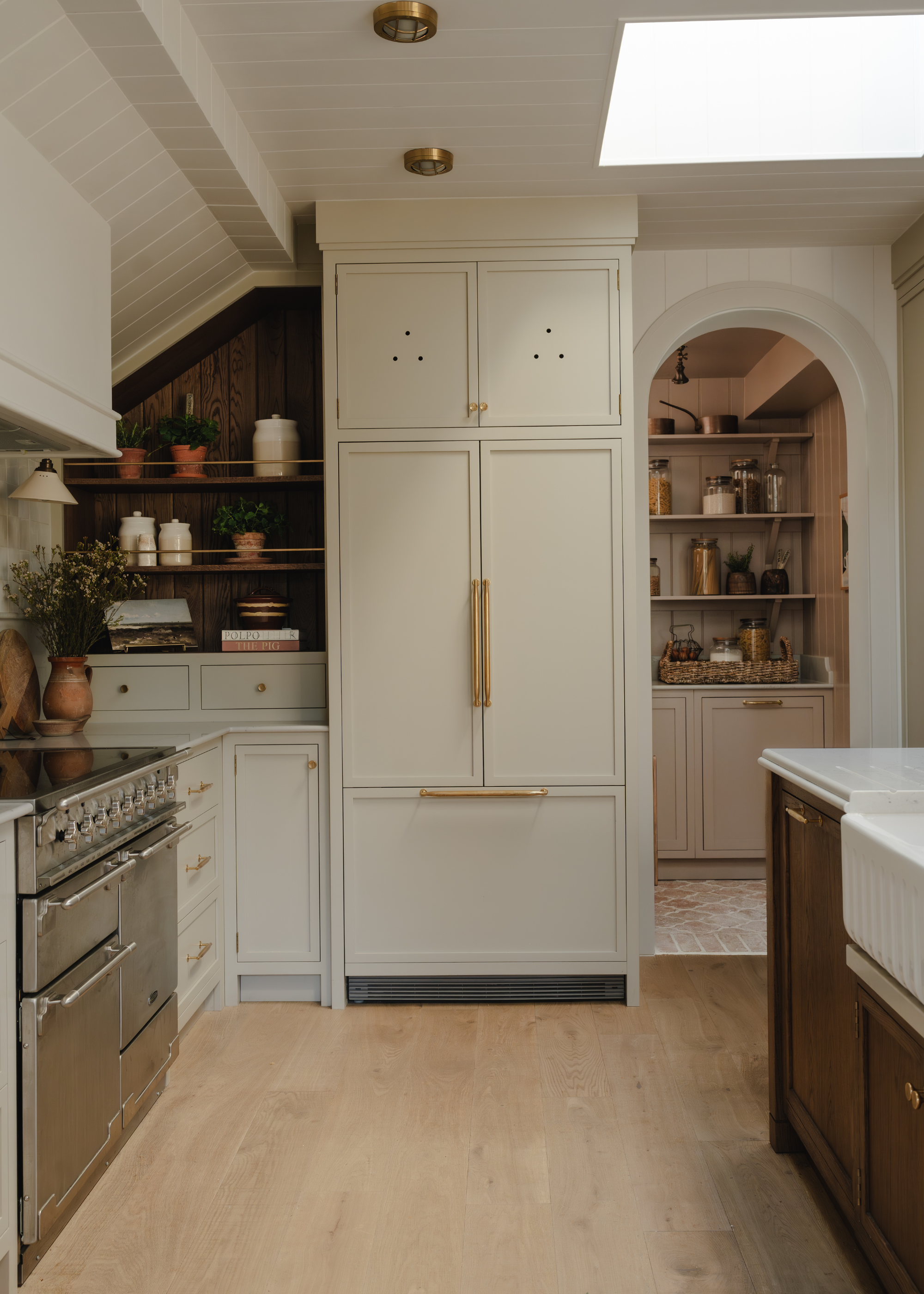
White kitchens are not all created equal, and while a harsh, bright white kitchen sits firmly in the no-go camp, there is a strong case to be made for the more subdued, off-white shades as your kitchen base.
Take one look at the variation in the best white paints edit, and you'll instantly know what we mean. "The paint companies have a wide range of colors that aren’t quite ‘white’ and have warmer undertones, some cool undertones, and some are seen as mushroom or cream," explains Allison Lynch, senior designer at Roundhouse. Picking one of these softer, warm whites instead of a true, bright white is the easiest way to create the same light, crisp vibe you'd find in a true white kitchen, but with an added softness.
As Allison mentions, there's no shortage of options in this category, either. In fact, it can be slightly intimidating choosing the right off-white for you. But, Alison suggests, "The best way to select the right shade is to put it against the other chosen materials, like work surfaces and flooring, and then pick a complementary shade."
Think about how the undertones of the paint will interact with surrounding materials, and how the color may shift and change in certain lighting. These tones work far better under natural lighting than a true white would, making it a great color family for south-facing kitchens.
When it comes to styling, these shades offer a huge amount of creative freedom, working beautifully alongside a range of materials and finishes, though it makes a particularly good backdrop for natural, highly-textured materials.
"The textures from other materials will stand out more, and soft furnishings too will bring the ‘vibe’ into the space, which the off-white kitchen will allow and won’t date either," says Katerina, adding, "Artwork and sculptural pieces will also be a great way to work the space with a light kitchen run."
Created as an alternative to white paint, Joanna is technically a light taupe shade, but in practice it reads as more of an off-white.
A warm-toned, light gray, this paint is a softer, more elegant alternative to pure white paint.
Perhaps one of the most iconic shades in Farrow & Ball's whole range, School House White is the perfect off-white paint.
3. Soft Green
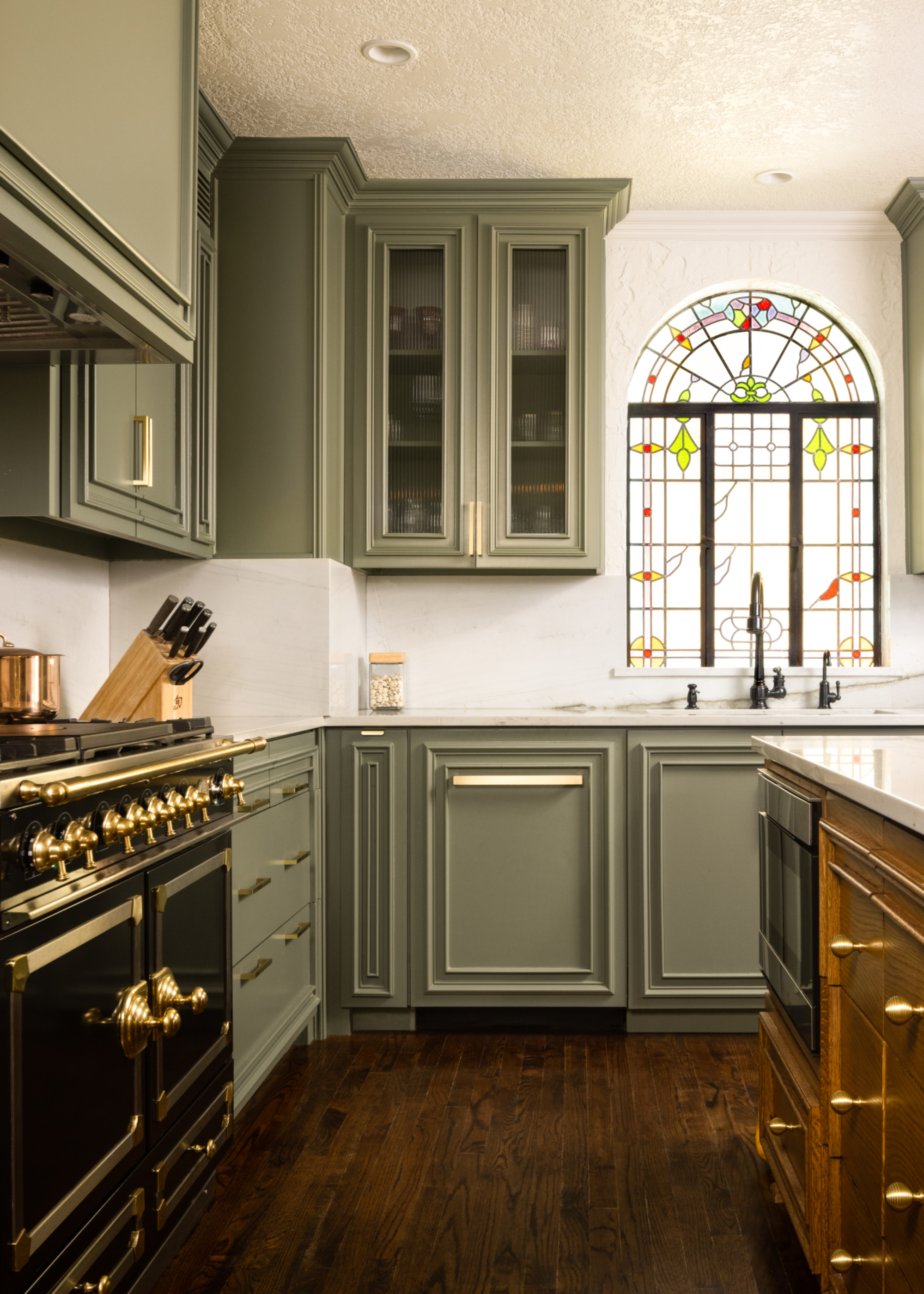
Over recent years, a green kitchen has become as commonplace as a white one was back in 2010. This, however, is not to say that green kitchens will be a passing fad; in fact, they could be better described as a new classic, instead.
As Tamsin Holland, from Paula Rosa Kitchens, says, "Lighter greens like sage and pistachio, when paired with oak or clay tones, offer a timeless combination that feels intentional rather than trend-led."
These light, soft shades of green naturally create a welcoming, calming atmosphere, especially when paired with other natural materials.
If, however, this feels like too far of a stretch from your initial desire for a pure white space, Tamsin recommends pairing this shade with an accompanying, light paint, too. "We often recommend using green where you want visual weight," she says, "such as on a kitchen island or lower cabinets, while keeping upper units lighter. This helps the space feel open while still letting the color do the work."
Creating a distinction between the upper and lower cabinets is a particularly helpful tool when designing a small kitchen, too.
Somewhere between a grass and a pistachio, this green shade is calm yet inspiring, perfect for kitchens.
A truly unique shade, this muted green is described as having a silvery appearance in certain lights, making it a particularly magical finish.
True to its name, Kitchen Green is the perfect shade for your kitchen cabinets. It's a muted apple green, juicy and fresh, yet still understated and calm.
While these colors are all great if you prefer a more subdued, neutral look, there's also a strong argument for a bolder look, too, and the latest kitchen color trends have given us plenty of inspiration for both ends of the spectrum. For more ideas, sign up to Livingetc's newsletter so all the latest news is delivered straight to your inbox.