Four years ago, I had a heart attack at the age of 33. Understandably, I wanted to know more about my body, so since then, I've used fitness trackers and smartwatches to monitor my health.
Usually, I have the Apple Watch Ultra 2 on my wrist and the Oura Ring, generally rated as one of the best smart rings, on my finger. But I've always felt more drawn to Samsung devices as the Samsung Health app is so good at producing detailed sleep reports.
So while the Oura Ring Gen-3 has been a comfortable way to track my sleep over the past few years, when my fingers swell up, the ring gets too tight, and unlike a smartwatch, you can't just adjust the strap to get some relief.
This applies to all smart rings to varying degrees, but as I discovered, the Samsung Galaxy Ring has a slightly different design that makes it far more comfortable. But that's not the only reason I ditched the Oura Ring for Samsung's smart ring.
The design eases the pressure on my finger

Samsung’s first foray into smart rings is exciting for numerous reasons. There is great battery life with a refreshing approach to charging, an array of health features that rivals many smart rings, and a unique design that is fantastic for those with swollen fingers.
When I held an early version of the Galaxy Ring in February, I noticed that it was extremely light and thin. Then once I placed it on my swollen index finger, I quickly noticed that the concave design was more comfortable than the Oura Ring.
Fast-forward to its official launch in July, and the company made a few design tweaks that meant it was just as comfortable. But this is a very individual thing — the design helps ease the pressure when my health conditions cause my fingers to swell.
I initially thought the concave design was the reason it helped with my swollen fingers, but when I mentioned this to the company, they said it shouldn't actually make a difference, as the concave design is primarily an aesthetic choice and to make it easier to prevent scratches.
So that got me thinking about what else could be making it more comfortable than the Oura Ring for my fingers.
Slimmer design, smaller sensors

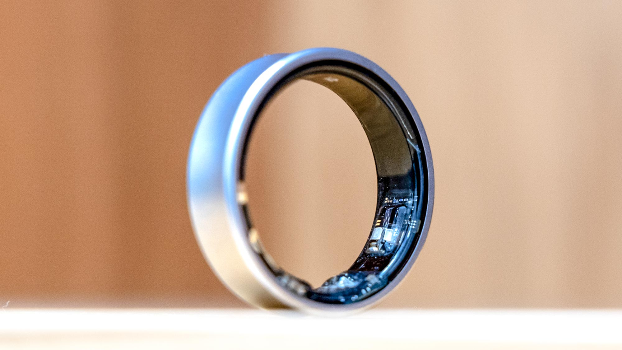
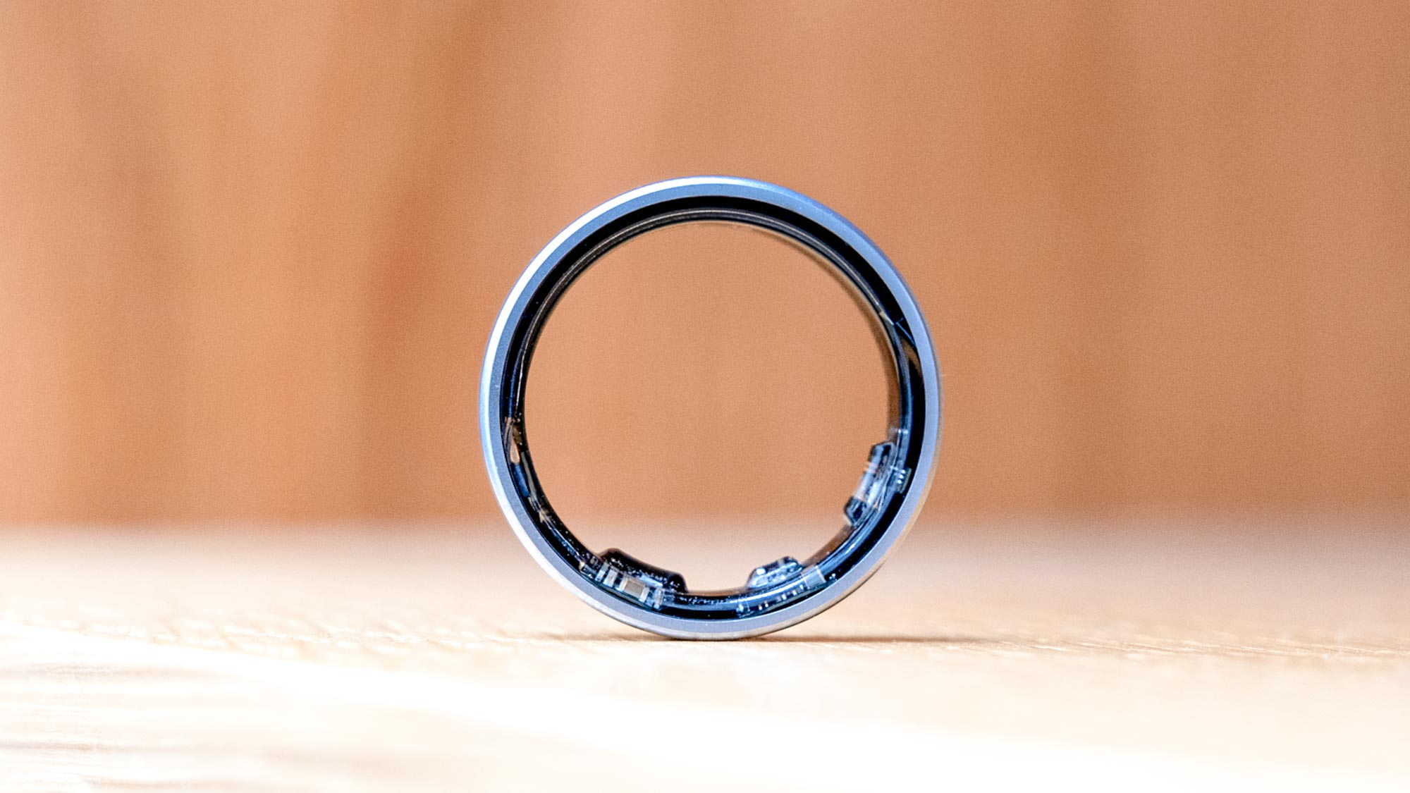
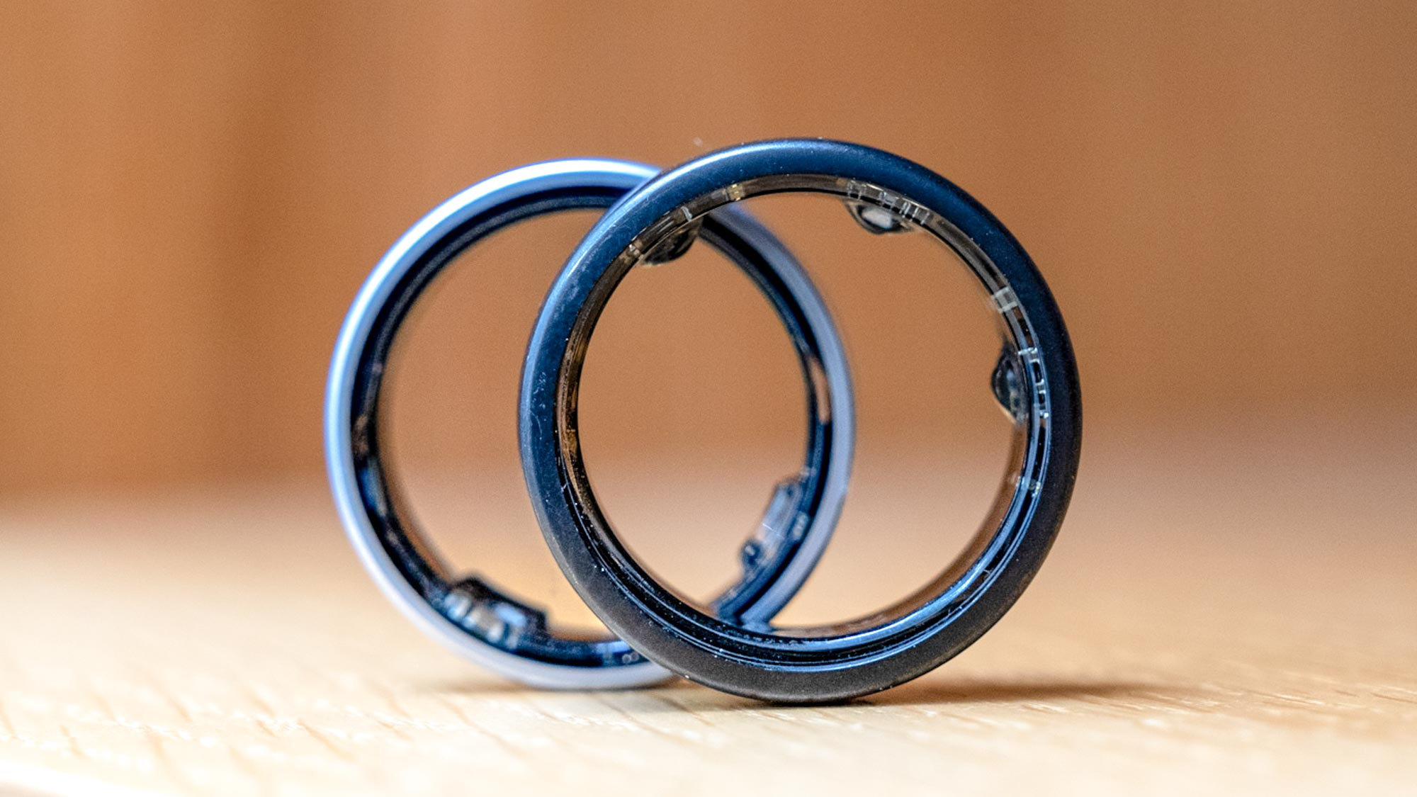
When you compare the Samsung Galaxy Ring and Oura Ring, you notice the Galaxy Ring is slimmer and the sensors are more flush with the ring, unlike Oura's which creates a noticeable bump along the ring's interior.
And Oura's sensors are narrower and taller than Samsung's wider, flatter sensors. When your fingers swell, any pressure on the swelling can be incredibly uncomfortable, and the design of the Galaxy Ring inherently means there’s less pressure on your finger.
The Oura Ring measures 0.31 inches wide and 0.10 inches thick, while the Galaxy Ring measures 0.28 inches wide and the same thickness. This slight reduction in width also helps ensure less contact with swollen fingers and a more subtle feel on your finger overall.
Plus, the Galaxy Ring weighs between 2.3-3g (depending on size), while the Oura Ring weighs 4-6g. And after wearing both rings, I felt that the Galaxy Ring, feels more akin to a traditional ring, whereas the Oura Ring is heavier and more pronounced on your finger.
I came for the design, stayed for the features

The Samsung Health app is the hub for all the ring's data. It's actually been around for a while, but this year, Samsung gave it an AI-powered upgrade, so you get more actionable and individualized insights, alongside the usual graphs and charts.
And it's particularly useful when it comes to sleep analysis. Samsung has prioritized sleep as an area to focus its efforts on, and the result of its partnership with the National Sleep Foundation is a well-designed, extremely user-friendly, and detailed overview of your sleep.
The reports aren't that different from those you'd find from Oura or Apple, but in each section, there's information on what a metric means, why it matters, and how to improve that reading to improve your overall sleep score. It’s a fantastic approach to sleep, I feel it's better for most people than any other wearable.
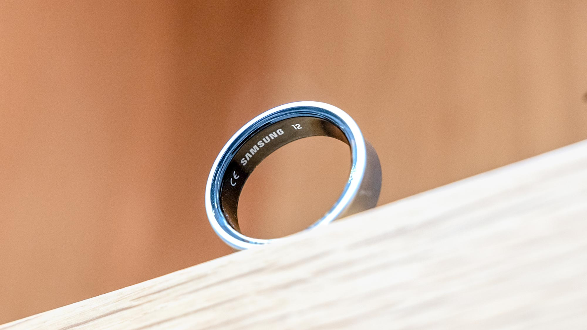
The battery lasts pretty well too, although varies by size. The size 12 I tested only dropped 50% in five days, so could last more than the seven days Samsung suggested. But the smaller size 10 fell slightly short of the six-day battery life.
However, the included charging case tops it up one and a half times, so the battery could last up to 21 days before it needs a full mains-powered charge. As for accuracy, I found that the Galaxy Ring equaled Oura's measurements, although did seem to record heart rate spikes that didn't appear on the Oura Ring or Apple Watch Ultra 2.
Why I won't be going back to the Oura Ring
Like for most people, the Oura Ring showed me what a smart ring can do, and I loved wearing it. But the Galaxy Ring feels like a refinement of the concept; similar data but in a streamlined, more comfortable package.
And for me personally, the fact I could barely notice my swollen fingers was a huge plus. I sometimes need to change the Oura Ring to a different finger when it gets too tight, but the Galaxy Ring felt more manageable (even if slightly uncomfortable at times).
I would maybe caution against the matte black version of the Galaxy Ring, though — after testing, it had already managed to attract a few scratches. If I was choosing again, I'd probably stick with the silver version instead.
But with these minor caveats aside, the Galaxy Ring is easily shaping up to be my favorite smart ring. I find it most comfortable throughout my day-to-day use, and that’s the primary goal, as you need to be able to wear the ring all day to get the benefit.
But if you think the flatter design on the Oura Ring might be better, you can order Oura and Samsung sizing kits online and try both out before committing to either of the two popular smart rings.


