I'll admit it: pastels aren't usually my thing. They feel a little too sugary-sweet for my liking, and can sometimes date quickly; I'm much more about the deeper hues. However, lately I've come across a few new pastel kitchen projects that have made me genuinely reconsider. When paired with the right materials, I'm finding these soft, pale shades can feel unexpectedly sophisticated and even quite luxurious as a kitchen color idea.
Designers are increasingly leaning into nuanced pastel color palettes that read as grown-up rather than safe and, dare I say it, feeble. Used well, they can soften the harder architectural edges of a kitchen, allowing the materials to take center stage and be fully appreciated. "Pastels, when handled with restraint and intent, can be transformative in a kitchen," says Tom Howley, design director at Tom Howley Kitchens. "Soft tones such as pale blues and gentle sage green create a calm, light-filled backdrop that allows beautiful shaker cabinetry, veined stone, and architectural detailing to truly shine."
Part of their appeal is their ability to layer so well. Rather than dominating the scheme, a pastel palette can act as the glue that holds it all together, within a richer material palette. "Pastels bring fresh perspective to kitchen design and, when used with intent, can feel remarkably sophisticated," says Lizzie Spinks, head of sales and design at Makers. The key, as these pastel kitchen ideas show, is a balance of grounding, delicate hues, raw tactile finishes, and deeper tones, so the palette feels layered and uplifting, all without compromising on character.
1. Traditional Yellow
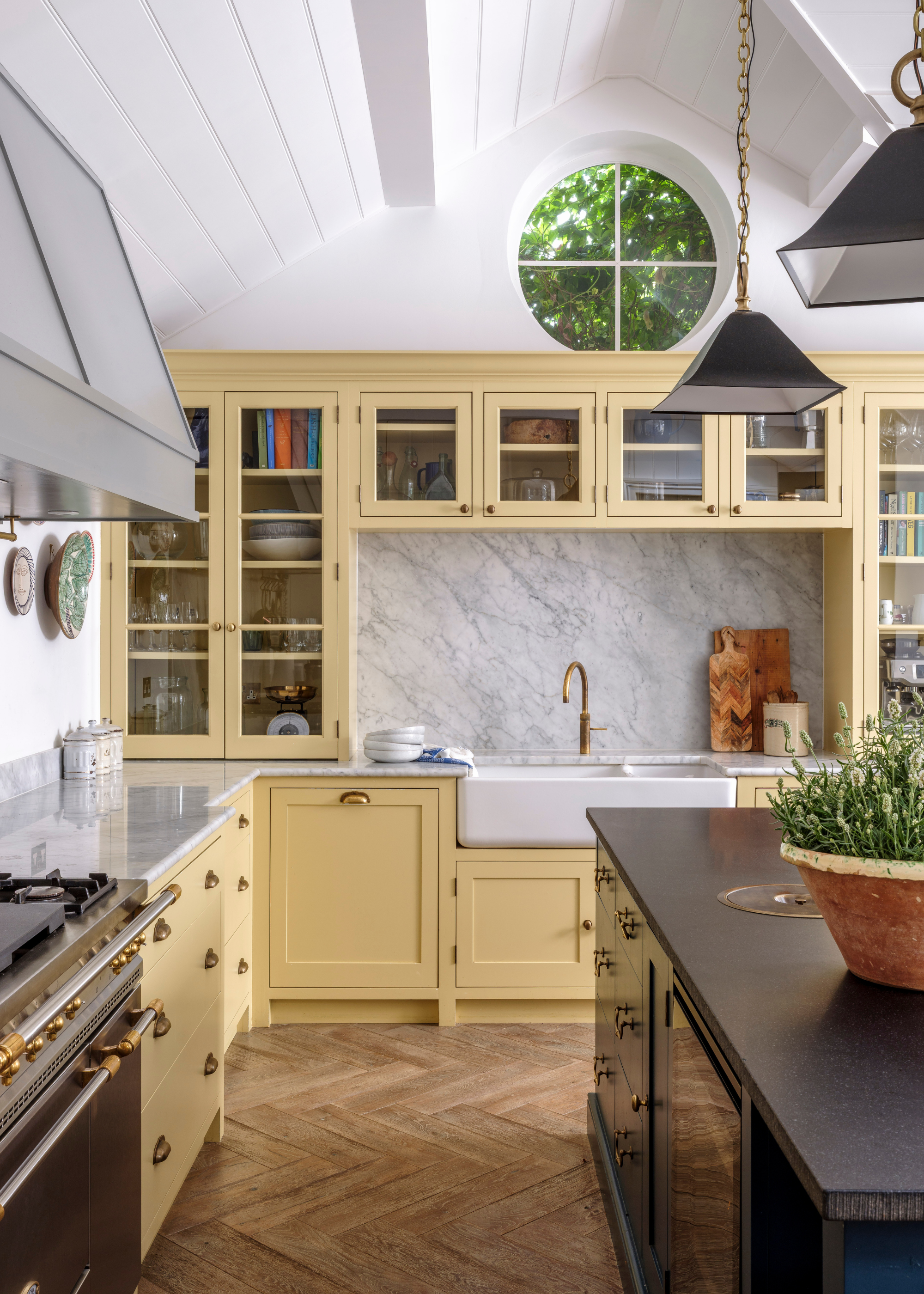
I'm seeing more and more yellow at the moment, and let me tell you, I am surprised by how much I'm enjoying it — and how timeless it feels. In fact, pastels in general can be surprisingly grounding.
"In this kitchen, we chose Hay by Farrow & Ball for the cabinetry because it feels warm and welcoming — not overpowering, and not too pretty or delicate," says Kate Cox, creative director at HÁM. She tells us, "It’s an easy color to live with, and it sits beautifully against the deeper blues elsewhere in the house. The palette feels considered and connected, so the whole place stays relaxed."
It's not a color that's usually on my radar, but they do say it's the ultimate positive color, and this HÁM yellow kitchen would certainly make me happy!
2. Pale Blue and Wood
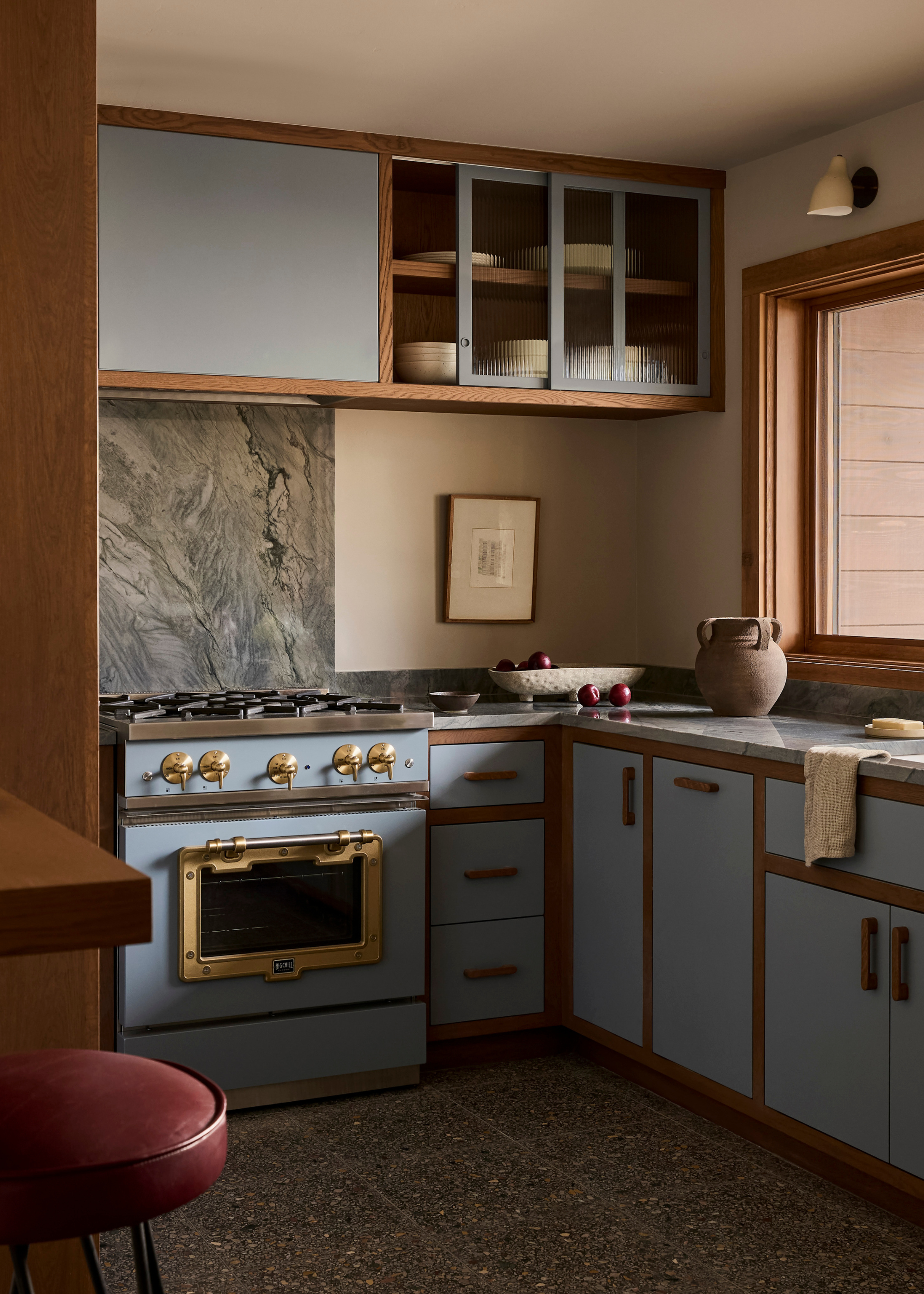
A pale blue kitchen may feel like a risky choice, but when handled well, it can feel incredibly calming and refined. In this space by Yond Interiors, the soft pastel cabinetry brings a lightness to the space, while the strong materials layered around it stop the scheme from feeling plain and dating too quickly.
That balance is exactly what the designers say is key to making a pastel kitchen feel sophisticated rather than sickly sweet. "The secret to ensuring they never feel juvenile lies in balance and depth — selecting shades with gray or earthy undertones rather than anything overly sweet, and pairing them with tactile, grown-up materials like aged brass and richly grained timber," says Tom.
"Pale blues and greens have become especially popular with our clients because they bring a sense of tranquillity and refinement while remaining wonderfully versatile in changing light," he adds. They feel fresh and breezy without being stark, and provide gentle character.
Choose quality over quantity with a couple of these bar stool beauties perched at your breakfast bar.
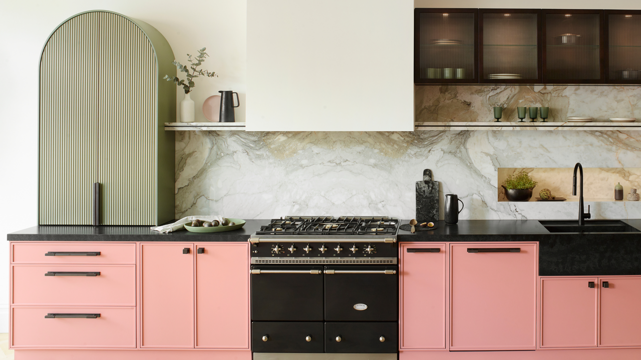
3. Pink and Green
Even though pastels aren't usually my go-to, I have always had a soft spot for a pink and green combo, and this Munro kitchen is honestly one of the best examples I’ve seen — a space I could happily live with day-to-day without ever getting bored.
From the brass extractor hood to the mesmerizing green stone backsplash, the luxury subtly reveals itself in the details, elevating the space while deepening the character and overall strength of the scheme.
Interior designer Erik Munro explains exactly why they went for this palette: “Pastel kitchens work best when the color is rooted in nature. In this kitchen, we chose a soft, earthy green for the joinery because it reflects the surrounding countryside and brings the landscape indoors. Pairing pastel tones with natural materials like timber or stone helps ground the color so the space still feels warm and timeless."
Sometimes less is more, and this dome pendant certainly abides by that rule.
4. Light Apple Green
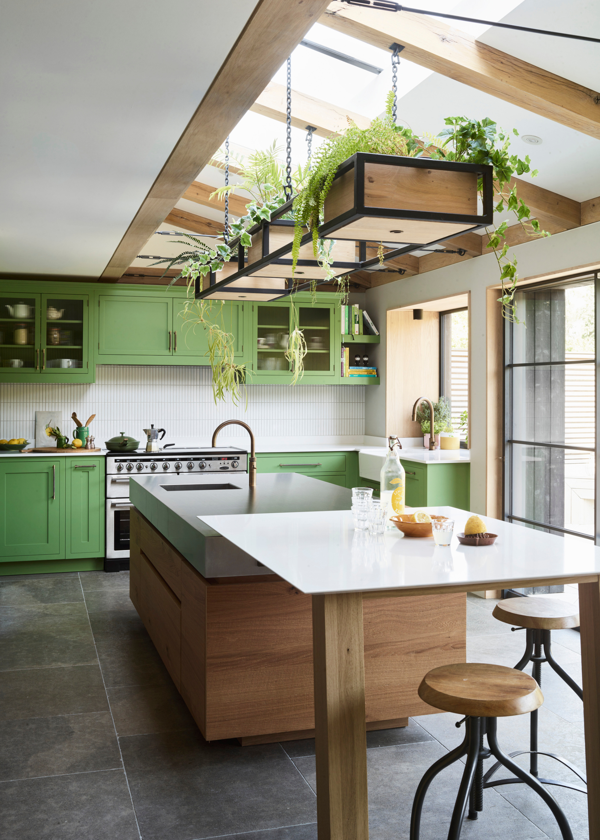
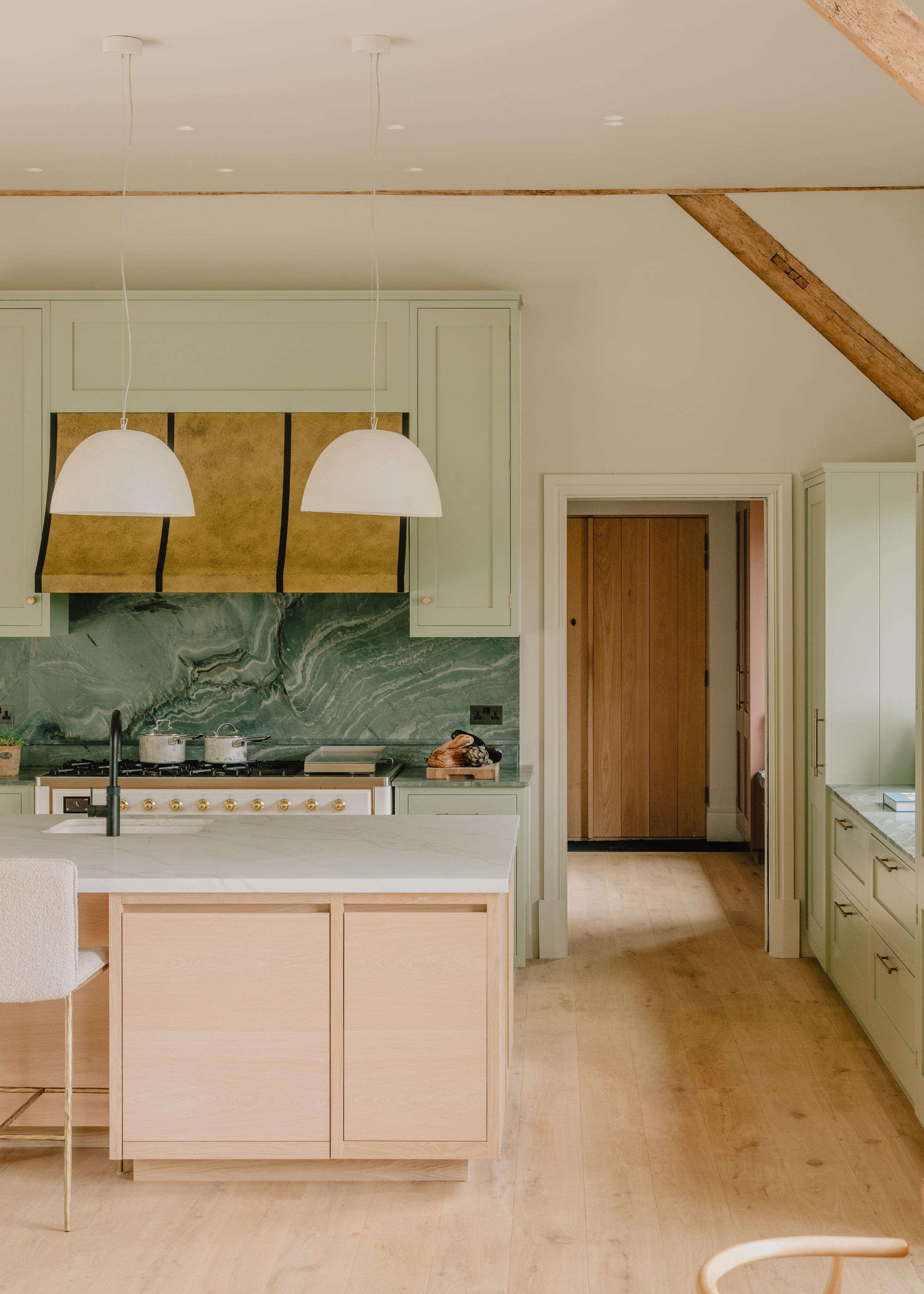
A green kitchen is always a good choice — forever connecting our interiors to nature — but this is a little more punchy than our last example.
Kitchens often lead directly into the garden, as seen in this Roundhouse example above, and the lively light green cabinetry and built-in planter, bursting with freshness, only help strengthen that seamless flow between indoors and out.
Ben Hawkswell, senior designer at Roundhouse, explains, "The architectural features of the room gave us the opportunity to be playful with color, finishes, and texture, and the clients wanted a strong contrast.
"The fresh botanical green brings energy and character to the cabinetry, while the stainless-steel worktop and rough-sawn oak island introduce warmth and texture that echo the oak doors and beams within the home." The result is a vibrant pastel kitchen idea that feels balanced and closely tied to its surroundings.
5. A Playful Pastel Palette
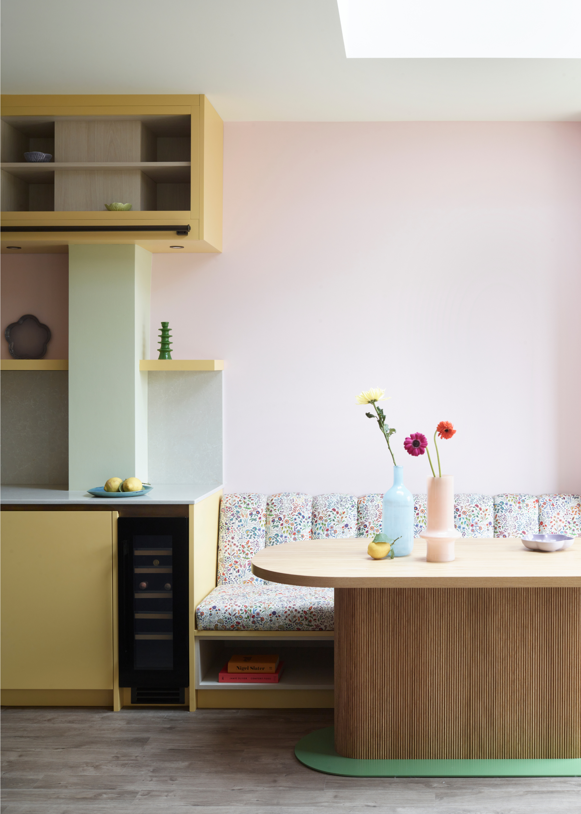
Now, if there's one way to make a pastel kitchen feel design-forward, it's by embracing several all at once. This kitchen by Makers leans into a multi-pastel palette, layering the different soft shades throughout — walls, cabinetry, banquette seating — right down to the finishing touches of styling the table. It's playful AND polished.
Rather than feeling overwhelming, the space feels cohesive and nicely balanced, and the natural wood tones ground the entire look.
As Lizzie explains, "They allow a multi-tonal palette to sit effortlessly together, creating depth and warmth, particularly in natural light. Paired with considered materials such as timber and glass, they nod to craftsmanship, resulting in a modern, elegant interior filled with confidence and personality.
Style with pastel vases and single-stem flowers for a simple but striking table centerpiece.
So, while pastels might not be the obvious choice for a kitchen, and not top of the list on our Pinterest boards, these projects prove that when handled with care, they can most definitely hold their own.
The trick lies in the balance and pairing of more grounding materials along with the smooth, sweet colors. You’ll need layers, natural materials, and tactility — plus, interesting architectural detail will no doubt add so much more character.
From pale blues that bring a sense of calm, to playful multi-tonal pastel palettes that feel full of fun and personality, it’s safe to say I may be reconsidering my stance on pastel kitchens. In the right hands, they are surprisingly fresh and sophisticated.
There are actually quite a few kitchen color combinations you wouldn't expect to work together, but really do, as these projects go to show. And for more design and style advice for your kitchen and wider home, why not sign up for the Livingetc newsletter, and they'll be delivered straight to your inbox.