
Get all your news in one place.
100's of premium titles.
One app.
Start reading
Tom’s Guide
Tom’s Guide
Technology
Jason England

I built a touchscreen MacBook Pro using this snap-on accessory, and I'm baffled why Apple hasn't made its own for years

Intricuit Magic Screen.

The MacBook Ultra is making a lot of headlines — namely for being the first system that will reportedly bring touchscreen to the MacBook. But what if you wanted that without having to pay the (probably) massive price that’ll come with a top-of-the-line Apple computer?

That’s where Intricuit’s Magic Screen comes in. Unveiled at CES, I’ve been testing one for a while now, and not only is it a fantastic piece of kit for converting to a 2-in-1 and extracting more value from your laptop, it proves that Cupertino may be more ready for a touchscreen Mac than you may think.

So, consider this both a review of my three weeks using Magic Screen and a look into Apple’s quiet work preparing for when the worlds of iPad and Mac collide ahead of WWDC 2026.

How it works

(Image credit: Future)

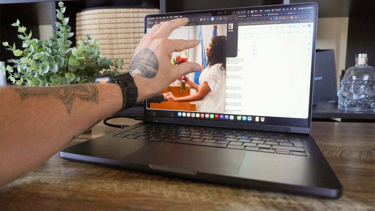
It’s a lot simpler than you think! Magic Screen is a magnetic glass layer that snaps directly on top of your current MacBook Pro’s display. Make sure the original display glass is clean, pop it on top, connect via USB-C and you’re off to the races.

In terms of availability, you’ll be able to pick one up in all display sizes — from the 13-inch MacBook Neo all the way up to the 16-inch MacBook Pro. Offical pricing is unconfirmed (it’s going through Kickstarter first), but we do know early bird pricing will start at $139. That's giving me hope that the final retail cost will be reasonable!

You can see it impacts viewing angle at the most extreme of degrees (i.e. directly off to the left or right — places where you won’t be using it), but brightness remains untouched by the additional layer.

Plus, with the lip, you will not be able to close the laptop with this attached. Consider this a PSA because I don’t want eager users destroying their pricey MacBook Pros!

MacBooks suit touch input well(ish)

(Image credit: Future)

The first thing that surprised me about using the Magic Screen is just how intuitive it is from the word “go.” The plug-and-play nature of it shows just how macOS already has some nice touch optimization going on here — something we already found when building a touchscreen iMac.

Navigating around is a cinch with simple taps on apps, press and holds for the right-click menu, multi-touch gestures that are mapped identically to the ones you do on the touchpad, and dragging windows and objects around. And the iOSification of the aesthetics of macOS really lends itself to being more touch-friendly than Windows 11 for sure.

Is it perfect? No, and it comes down to two key issues that I’ll be watching WWDC like a hawk for to see if there are any hints of making macOS even more touch-friendly.

(Image credit: Future)

First, the general user interaction dynamic changes with different icons — double-tapping a folder on the desktop vs single tapping an app is a great example of this. It’s a small thing on paper, but everything needs to work the same in a uniform kind of way.

And second is the macOS apps themselves. They’re clearly built for mouse and keyboard, and this can prove tricky with some tiny touch targets in things like a Final Cut Pro timeline. Buttons will need to be simplified and made larger for these moments.

This is going to be more of a mammoth task, not just for Apple’s own apps but for third-party developers, and I’m not entirely sure how it’ll be done. Beyond ground-up redesigns, will it be reactive windows that change as you start to touch? I don’t know.

Magic Screen is pretty magical for getting creative

(Image credit: Future)

As for the Magic Screen itself, it’s a well-made piece of hardware with the intuitive setup of just magnetically snapping it onto the chassis. You’ve also got that folio case for the panel itself that doubles as a brace that stops any display hinge wobble while you touch too!

But things get really interesting when you turn it into a drawing tablet with the stylus. We’ve loved illustration surfaces from the likes of Wacom for a while now, and this additional use case makes for a really nice ergonomic dimension for getting creative.

(Image credit: Future)

Palm rejection is hard at work here, and the stylus has a nice feel in the hand with immediate response times and pressure sensitivity. And given it’s a giant touch surface that matches the dimensions of your laptop’s panel, it’s really easy to guess where your pen will land (even without looking at the hovering icon).

Bridging the gap between iPad and Mac

(Image credit: Future)

For years now, it’s seemed a little crazy to me that there hasn’t been a touchscreen Mac. I understood Apple’s reasons, and the touchpad navigation can feel almost iPad-esque with the multi-touch gestures and speed of getting around.

But the wealth of Windows 2-in-1s has shown the world is keen for touchscreen laptops, and this additional paradigm of interaction with a Mac feels very intuitive. Apple’s already done the heavy lifting with macOS taking some visual cues from iOS, and outside of a few app tweaks and gestures, it’s pretty much ready for primetime.

That’s what we’ll hopefully see more of come WWDC 2026 — these small visual tweaks and UI elements that make it more finger-friendly!

More from Tom's Guide

Sign up to read this article
Read news from 100's of titles, curated specifically for you.
Already a member? Sign in here
Related Stories
Top stories on inkl right now
One subscription that gives you access to news from hundreds of sites
Already a member? Sign in here
Our Picks
Fourteen days free
Download the app
One app. One membership.
100+ trusted global sources.