Type is, in most cases, the predominant way a brand speaks to its audience. Whether through signage, packaging, advertising, graphics or websites, a brand will do most of its messaging via text, and the choice of typeface, like it or not, will form a significant part of how the audience receives and interprets that message.
“Typography is a fundamental pillar of branding because it serves as the visual voice of a brand,” says William Richardson, co-founder and creative director of typography-focused branding agency Studio DRAMA. “It communicates personality, tone, and values, often before a single word is read. A well-crafted typeface not only builds recognition but also establishes trust, making the brand instantly identifiable.”
It's currently Typography Week here at Creative Bloq, in association with Monotype. Check out our dedicated page to find out more.
Lukas Paltram, creative director at typeface design studio Dalton Maag, describes type as “one of the most relevant and valuable assets that a brand can have.”
“The written word is inescapable, regardless of the medium,” he says. “A brand can choose to embrace this as an opportunity and to make the most of it by creating an individual and recognizable voice through type.”
Typographer and art historian Erik Spiekermann, of agency Edenspiekermann, is a font (pun semi-intended) of knowledge on modern-day type, having designed letters for global brands like Audi, Bosch, VW and more. His advice for brands trying to nail down their type is succinct: “Analyse the use case, do research, look at good and bad precedents and then do your job properly,” Also: get a real type designer, not an illustrator or graphic designer who thinks they can also ‘do type’.”
William, Lukas and Erik could talk all day about the benefits of type — so we decided to let them do just that. Read on to learn more about all the ways that typography can make and break a brand...
What makes for “good” type?
“For me, the most impactful are those where the typeface feels seamless and essential — where visual information is reduced and condensed to the most essential parts, communicating successfully with words alone,” says Dalton Maag’s Lukas Paltram.
“Think of brands like Mercedes-Benz, TfL, IBM, or Lush. Whether you’re a design expert or not, you can connect a brand's messaging and aesthetic with the text you’re seeing, even if you don’t consciously know why. Type often works on a subliminal level; you may not know how it conveys a certain message, but you certainly receive it.”
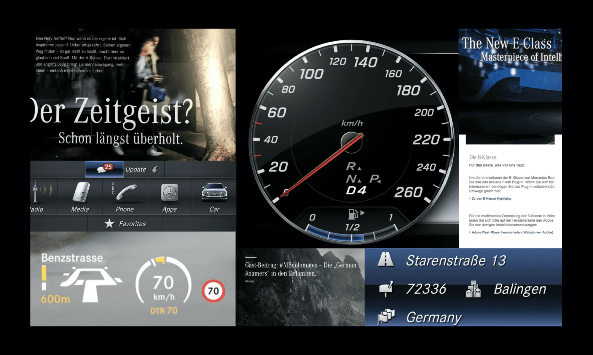
Edenspiekermann was responsible for redesigning type for Mercedes Benz a few years ago — required for new media and in-car technologies — and Erik Spiekermann points out that MB is “still the only car brand who relies on the mix of a serif and a sans typeface. Even the instruments inside the car play with that, gaining instant recognition.”
More recently, Studio DRAMA’s William Richardson worked on the much-publicised RSPCA rebrand, which involved the development of a whole new typeface, named Wilberforce Sans.
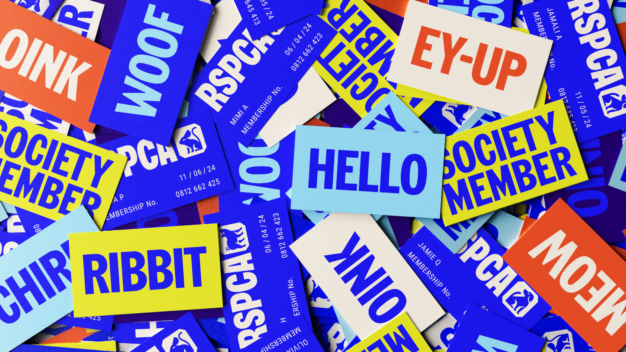
“The challenge was to create a typeface that could embody the organisation’s compassionate, approachable nature while also reflecting the seriousness and credibility of its mission,” he says. “The RSPCA needed something unique that resonated with its diverse audience—ranging from donors and volunteers to the public and policymakers.”
“Together [with fellow branding agency Jones Knowles Ritchie] we crafted a typeface that integrated seamlessly into the RSPCA’s new brand identity, addressing their specific needs: warmth without being informal, authority without being harsh.”
When coming up with a typeface, it can be helpful for designers to take cues from the cultural context in which the letters will exist. A career highlight for Lukas Paltram has been helping design a custom font project for the City of Vienna.
“The shapes and forms of the letters were influenced by cultural references and designed for the needs of modern applications,” he says. “The typographic expression aligns with the messaging and emotions that the city wanted to convey to its citizens. The curves of the letters formed the basis for the development of the iconography.”
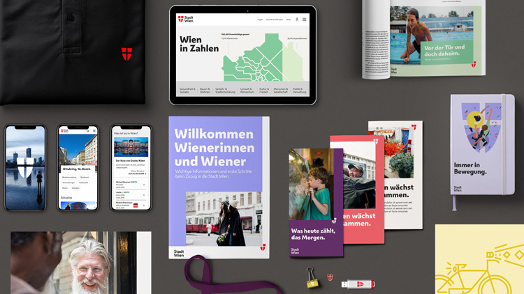
“For several years now, the new brand has been in place, with images, colours, symbols, and text used consistently across digital, physical, and printed matters throughout the city. From my children’s public kindergarten brochures to general election announcements, I can see the typeface in action, bringing everything together. Most people will never think about it, but for me, it’s this seamlessness and acceptance that define its success.”
Common typography mistakes
Of course, not everyone gets it right.
“Sometimes, it can feel like typography is treated as an afterthought,” says Lukas Paltram. “While there’s nothing wrong with following a certain typographic trend, brands often commit to typefaces without considering their requirements. This can lead to a mishmash of fonts being used to compensate for the shortcomings of a single typeface, missing a significant opportunity.”
A big and all-too-common error for brands is trying to cut corners by grabbing a typeface off the shelf. “Using something widely available like Helvetica or Arial is the death sentence,” says Erik Spiekermann. “Even good type suffers from over-use. Frutiger is the best all-round typeface but it certainly doesn’t stand out.” He also points out that it’s not even a particularly good cost-saving measure — getting a custom typeface designed can often work out cheaper than licensing a popular one.
William Richardson agrees: “Relying on generic, overused fonts (Inter, *cough cough*)... makes a brand feel indistinguishable and lacking in authenticity. When many brands within the same industry use similar typefaces, it becomes harder to stand out. Even if a custom typeface isn’t feasible, choosing one that aligns with the brand’s identity is crucial.”
Another common issue arises when brands don’t anticipate how type will work in different languages — a fatal mistake in our increasingly connected world. “Some typographic ideas simply don’t work on a global scale, and a lack of support for specific characters, or even entire writing systems, often leads to patchwork solutions,” says Lukas Paltram
Erik Spiekermann, who has designed type for public transit systems in Berlin, knows how important it is . “We read badly under stress — when in a foreign or unknown environment, for example,” he says. “Different cultures have different typographic histories and thus sensibilities… Italians can read long lines in caps only; German words are very long and often start with a capital letter; Slavic languages have many accents and diacritical marks; some languages (e.g. Finnish) have lots of double vowels and/or double consonants.”
Ultimately, blunders happen when brands don’t take enough care over their type — and the longer and greater a brand’s legacy, the more care it must take. “As brands build and evolve over time, it’s important to remember that type develops at the same pace,” says Lukas Paltram. “Brands must handle established and trusted elements carefully, as change can provoke strong reactions.”
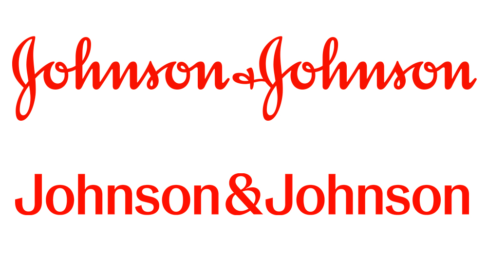
“For instance, the controversy surrounding the new Johnson & Johnson logo demonstrates how losing the impression of established tradition can unsettle people,” Paltram adds. “Not everyone will welcome design progress if it feels like part of shared history is being lost, and in the worst case, this can erode trust.”
Type, like anything, can be used and misused. Brands that are careless about their approach to typography can end up getting into problems. However, those that take the time, find the expertise and do it right can have it all: clarity, legibility, distinctiveness, and an identity that lasts.

