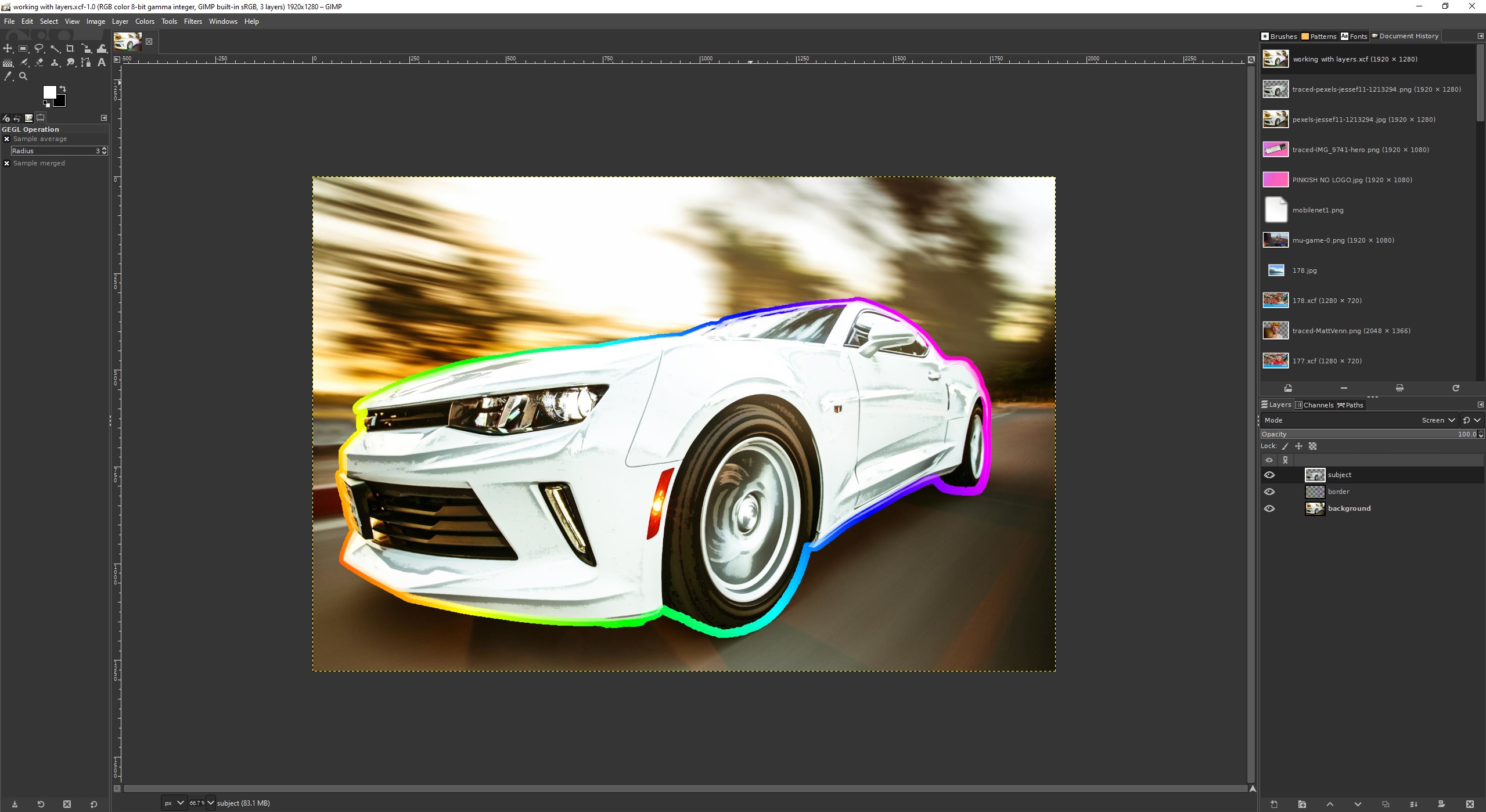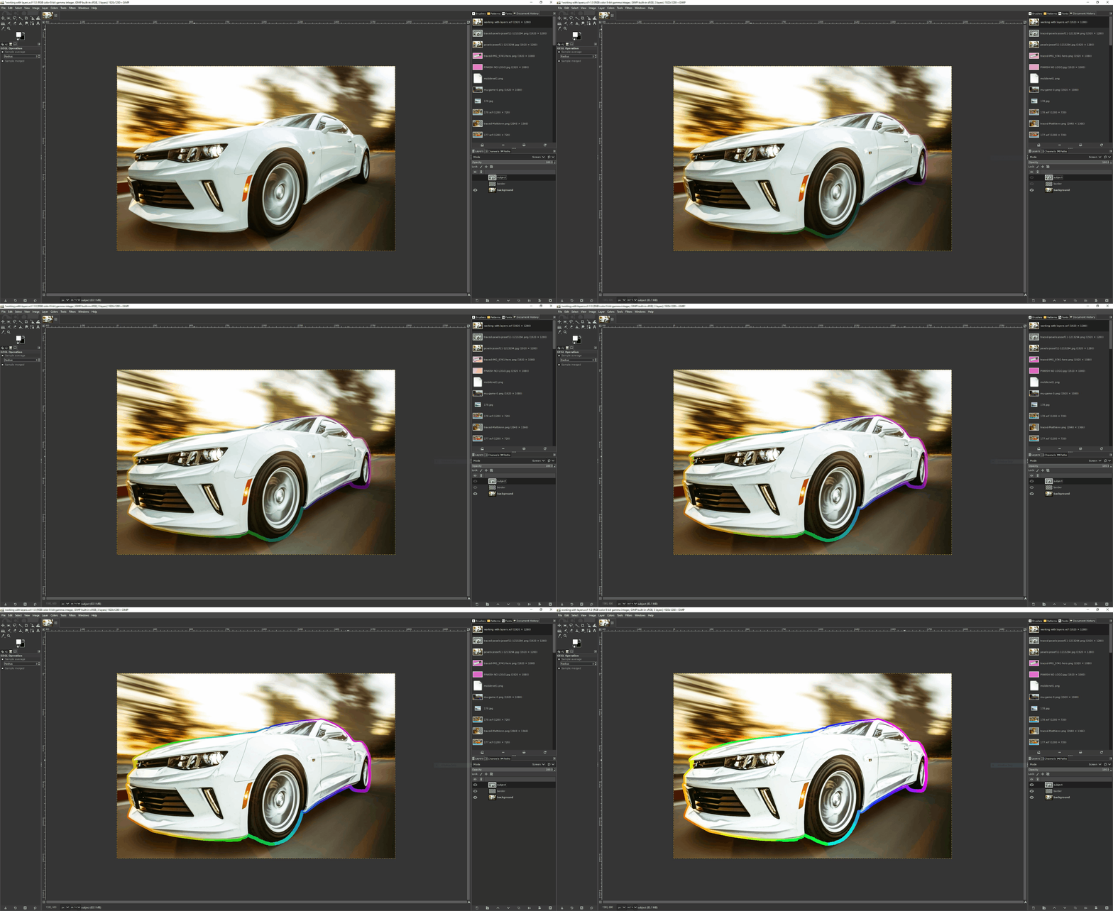
Layers are a clever and easy-to-use way to introduce elements to an image without destroying the source or main image. It works similarly to placing sheets of paper on top of each other. Each piece is a separate element of the composition, but when put together, they become the image you want the world to see.
In this how-to we will use GIMP’s layers to take a stock image, remove the subject from the image, and apply effects just to the subject, leaving the background untouched. We’ll learn how to create new layers, manage layers, and apply effects to certain parts of an image using alpha selection.
All you’ll need for this how-to is a copy of the free GIMP image editor, and this stock image of a car. Use this as a basis for experimenting with the image and the tools on hand.
Working with layers
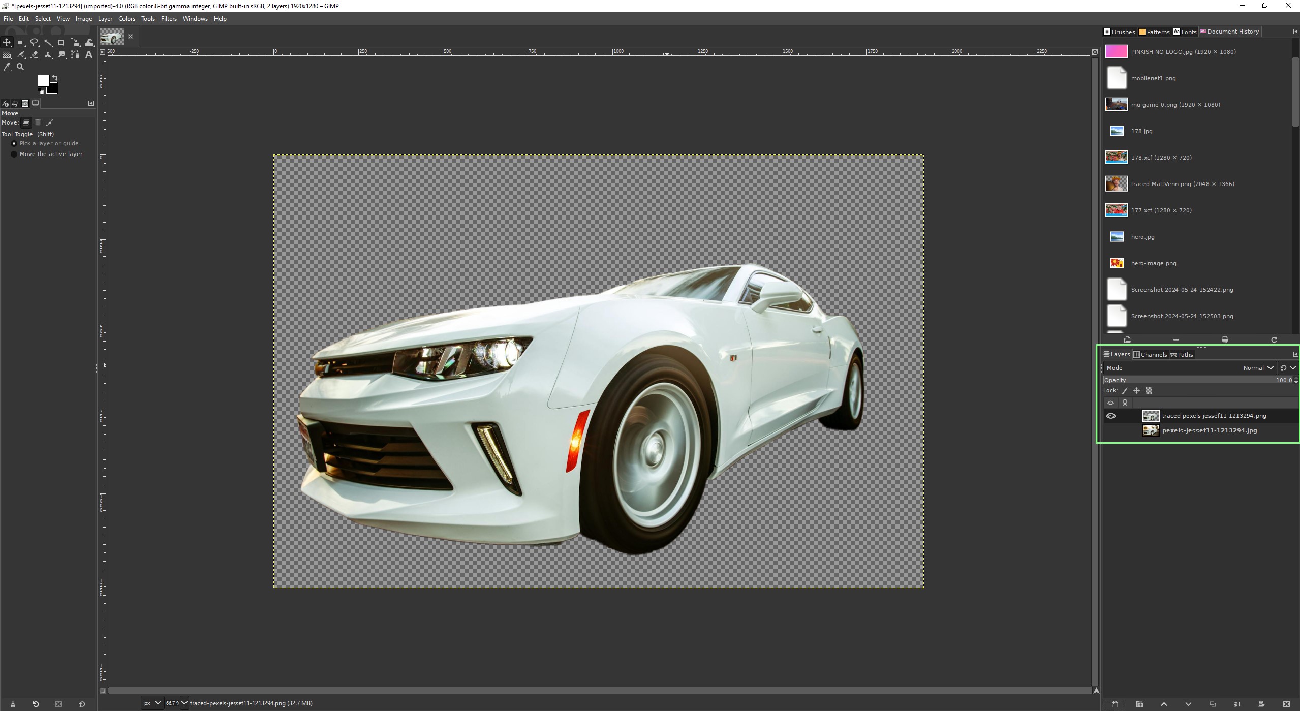
At the bottom right of the GIMP interface, we find the layers tab. By default there is just one layer, our background. Many users will just paint / work directly to this layer, but if we need additional layers we need to do the following.
Creating a new layer
1. Click on the + icon at the bottom of the interface.

2. Give the layer a name, fill the layer with transparency, and click OK to create. Give your layers meaningful names, once you are using multiple layers it can quickly become confusing.
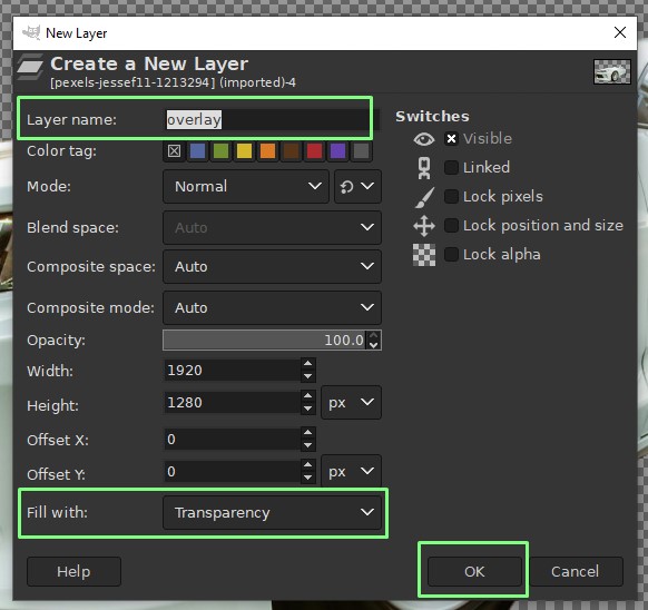
3. Ensure that the new layer is active. By default, GIMP will select the new layer as the active layer and any work will be done on that layer. Clicking on a layer will switch to that layer.
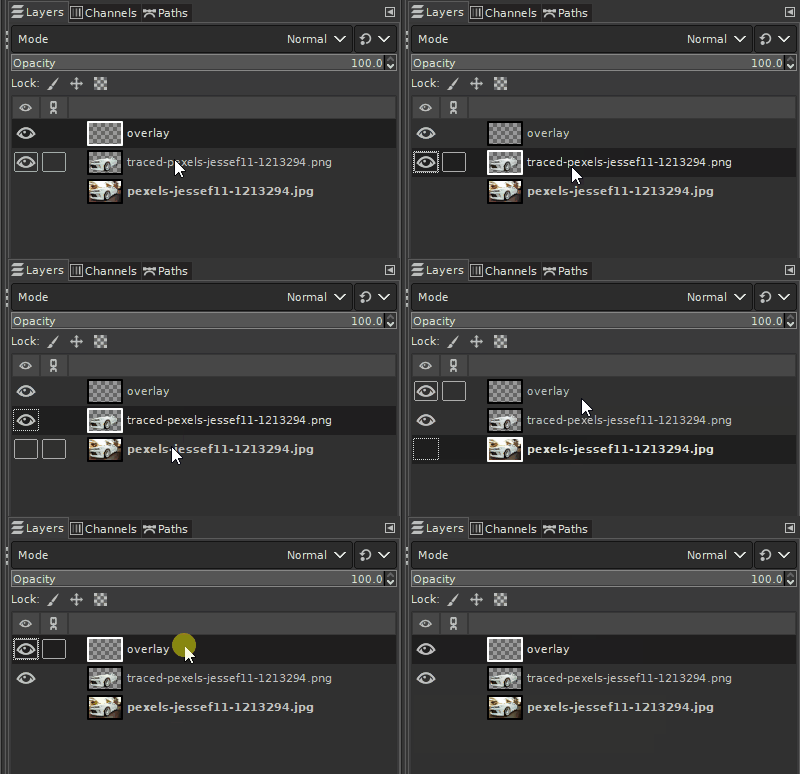
Another way to create a new layer is to import an image as a new layer.
1. Click on File >> Open as Layers.
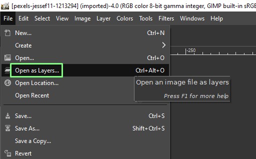
2. Select your file and click open. This will open the image a new layer, on top of the currently selected layer. The image can be manipulated on the layer, so we can resize / edit the image to match the other layers.
Using layers in a composition
Our goal here is to take a stock image from pexels.com, remove the subject from the background and then create a new layer to superimpose the subject over itself. There we will create a border effect to make the subject stand out.
Removing the subject from the image can be done via a number of online services such as remove.bg, or you can use Python to remove the background.
We’ve chosen a stock car image and run the image through remove.bg to cut the car from the background. Now we have two images. The original image, and just the car.
1. Open GIMP and click on File >> Open as Layers.
2. Open the original image and it will be set as the active layer.

3. Repeat the File >> Open as Layers process and open the cut-out image of the car. The cut-out image will be loaded on top of the original image, and because they are the same subject, we cannot see a big difference.

4. Click on the eye icon next to each layer to set its visibility. Click on the bottom layer to remove the background, leaving just the subject on the top layer. Set both layers as visible before moving on to the next step.
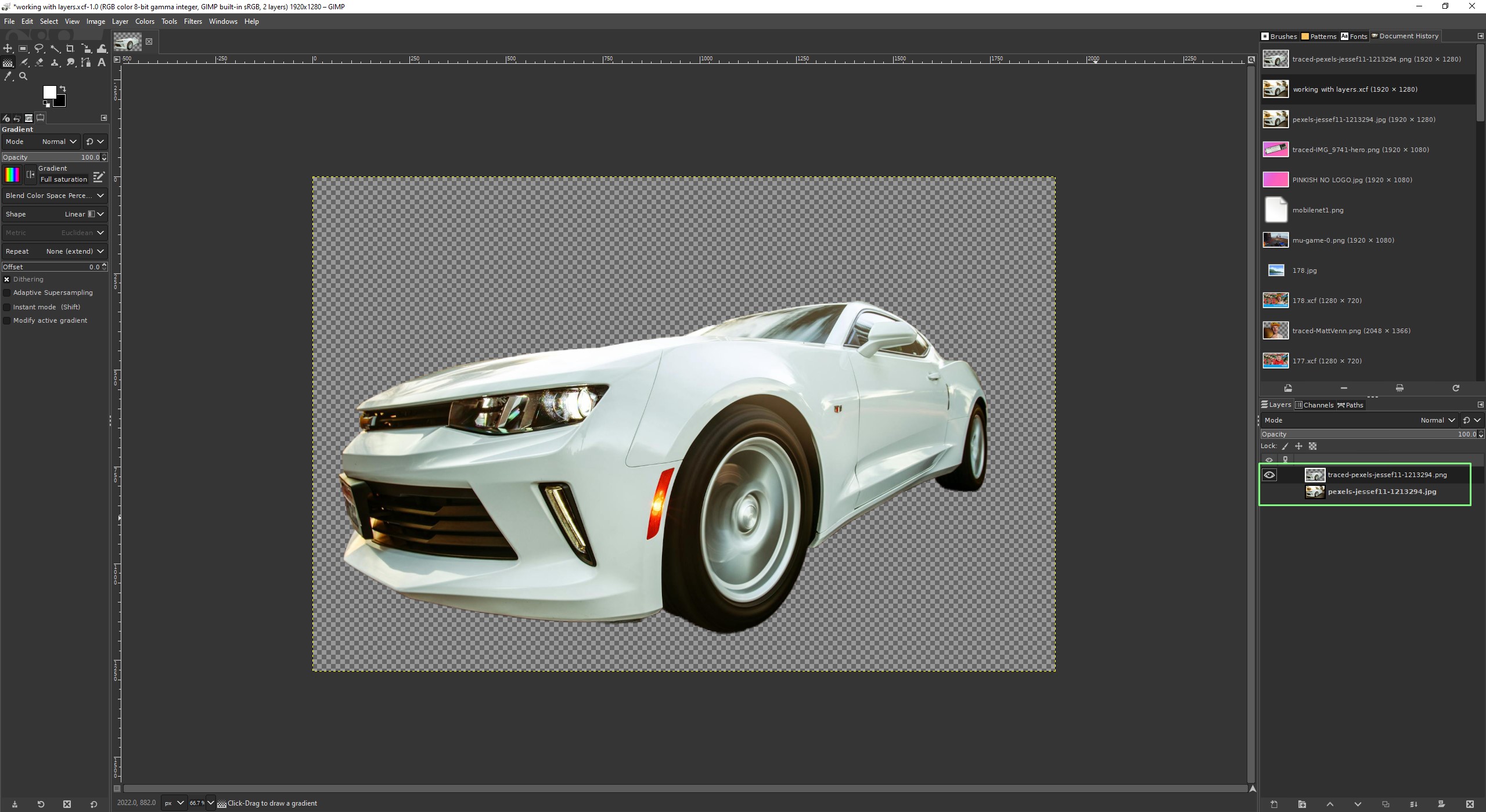
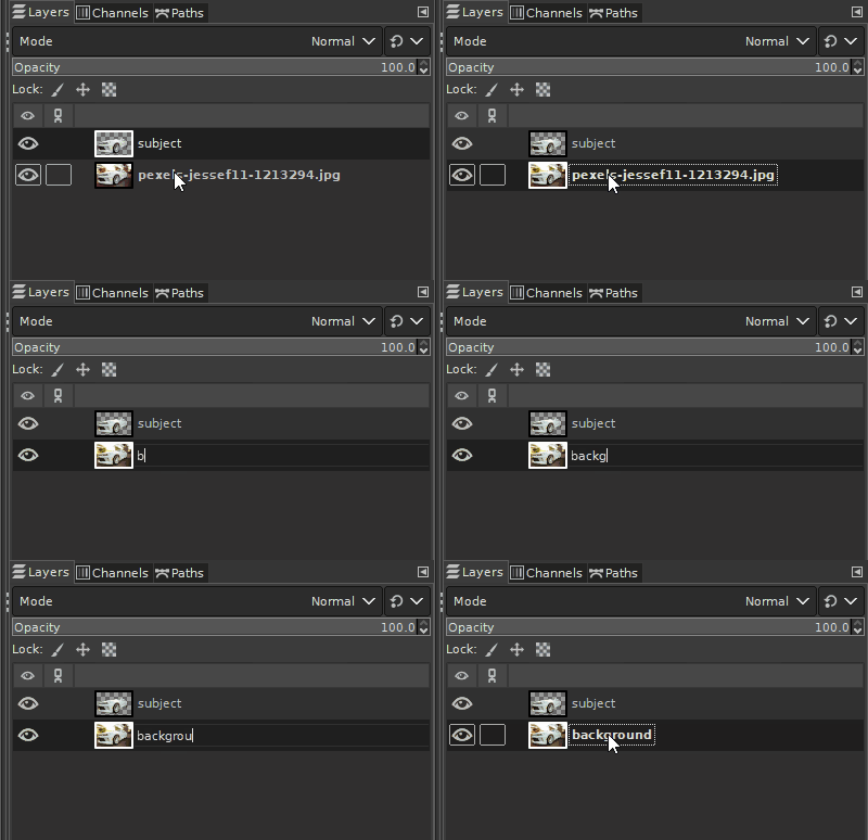
5. Double click on the layer name and edit to reflect what that layer refers to. It is important to name layers so that we can quickly understand the many layers that make the composition.
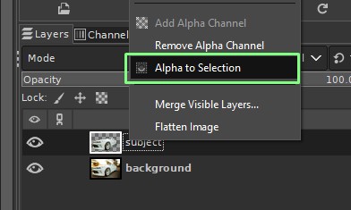
6. Select the subject layer, and right click on the subject layer (the top layer in this example) and select Alpha to Selection. This will automatically select the subject as it is the only thing on that layer.
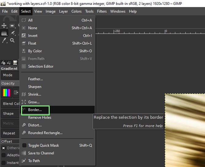
7. From the main menu click Select >> Border.
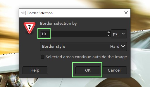
8. Set the border to 10 pixels around the subject, and click OK. The subject now has a 10px border around its perimeter.
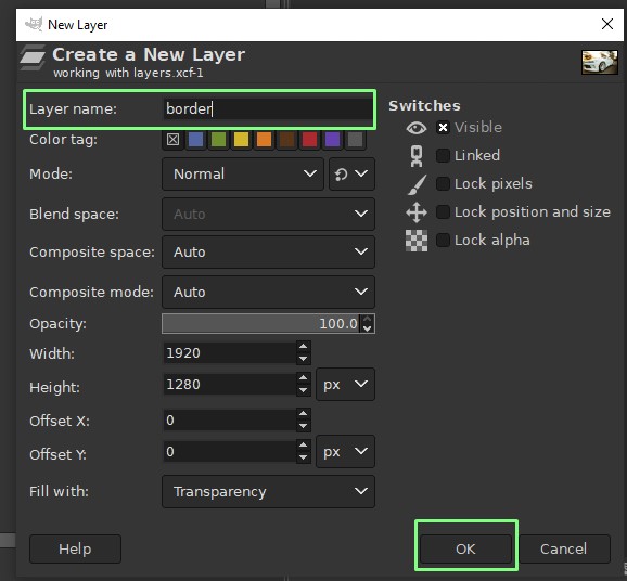
9. Create a new layer and call it “border”. Click OK to activate. The active layer will now shift to “border”, and it is on top of all other layers.
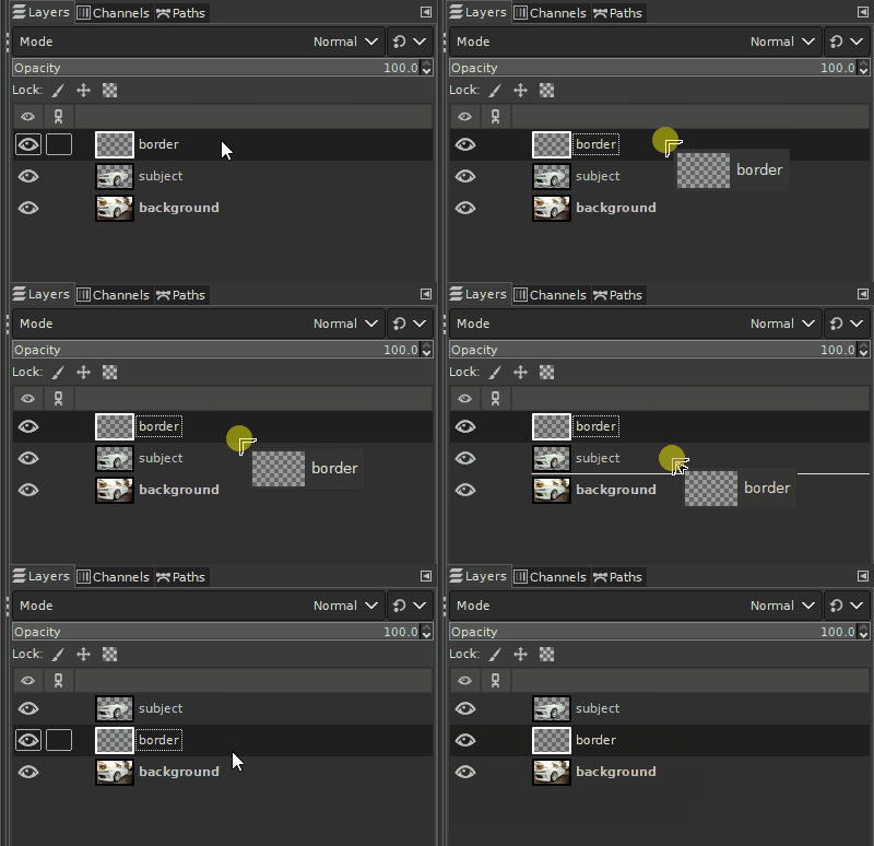
10. Move the “border” layer so that it is between the subject and the background.
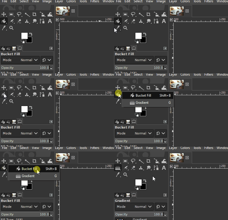
11. Click on the Bucket icon, and hold the button down. Select the Gradient tool from the drop down.
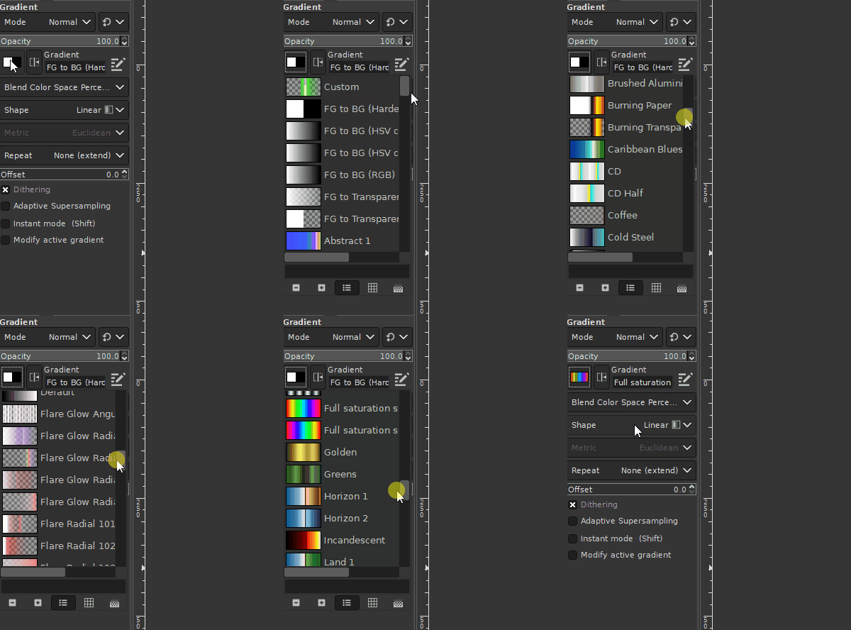
12. Select the saturation fill from the menu.
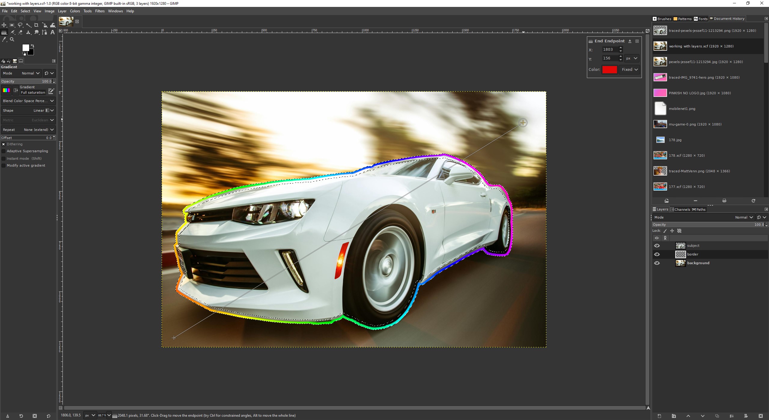
13. Ensuring that the border layer is selected, click and drag across the image to create a colorful gradient border around the subject. Press Enter to set the gradient. The start and end points can be tweaked to change the color effect.
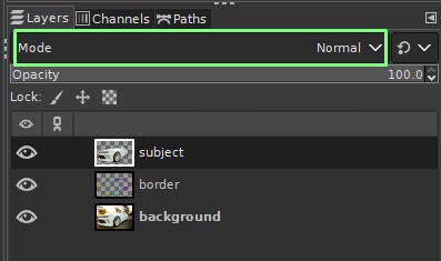
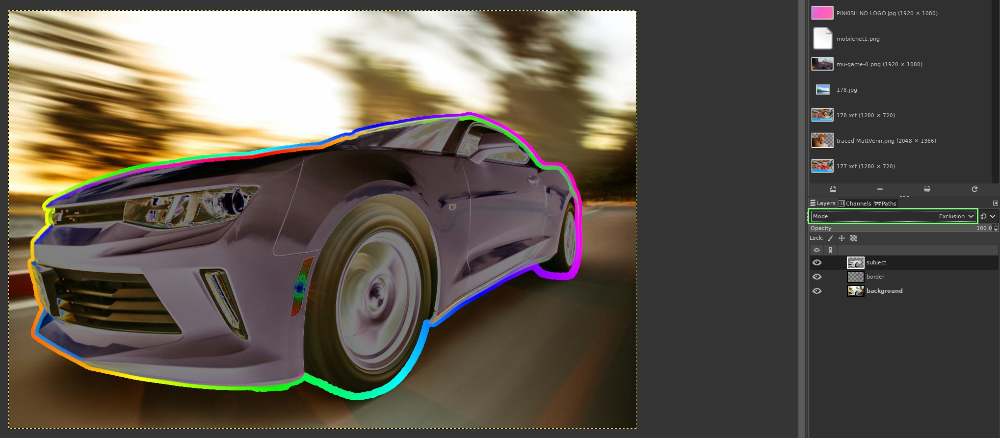
14, Select the subject layer and click on the Mode drop down just above the layers. Here we can alter the properties of a layer so that the contents of the layer can be used for artistic effects.
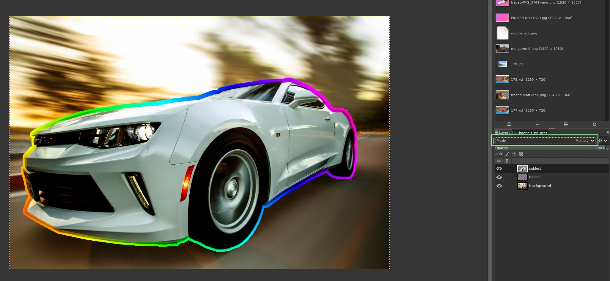
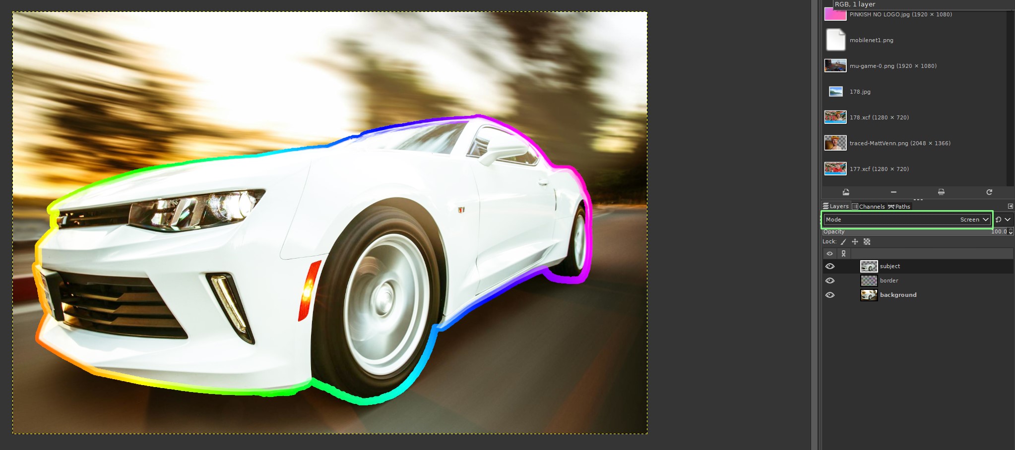
15. Try out a few different modes to see what suits your vision of the composition. For this step there is no right or wrong, it is an artistic choice. Multiply makes the image darker, Screen bright, and exclusion produces a negative image.
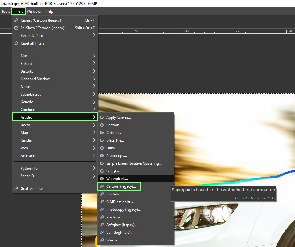
16. With the subject layer still selected, click on Filters >> Artistic >> Cartoon (Legacy). Each layer can have its own filters / effects.
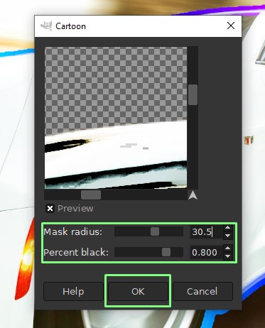
17. Set the mask radius to 30.5 and the percent black to 0.8 and click on Ok to apply. This will transform just the subject (car) into a cartoon image against a real background.
<
For now we are done. We’ve taken a stock image, added some layers, effects and played with how the composition works. To take it further, explore how the different layer modes and effects work with each other to create different styles. As Bob Ross would say, ““There are no mistakes, just happy accidents.”
