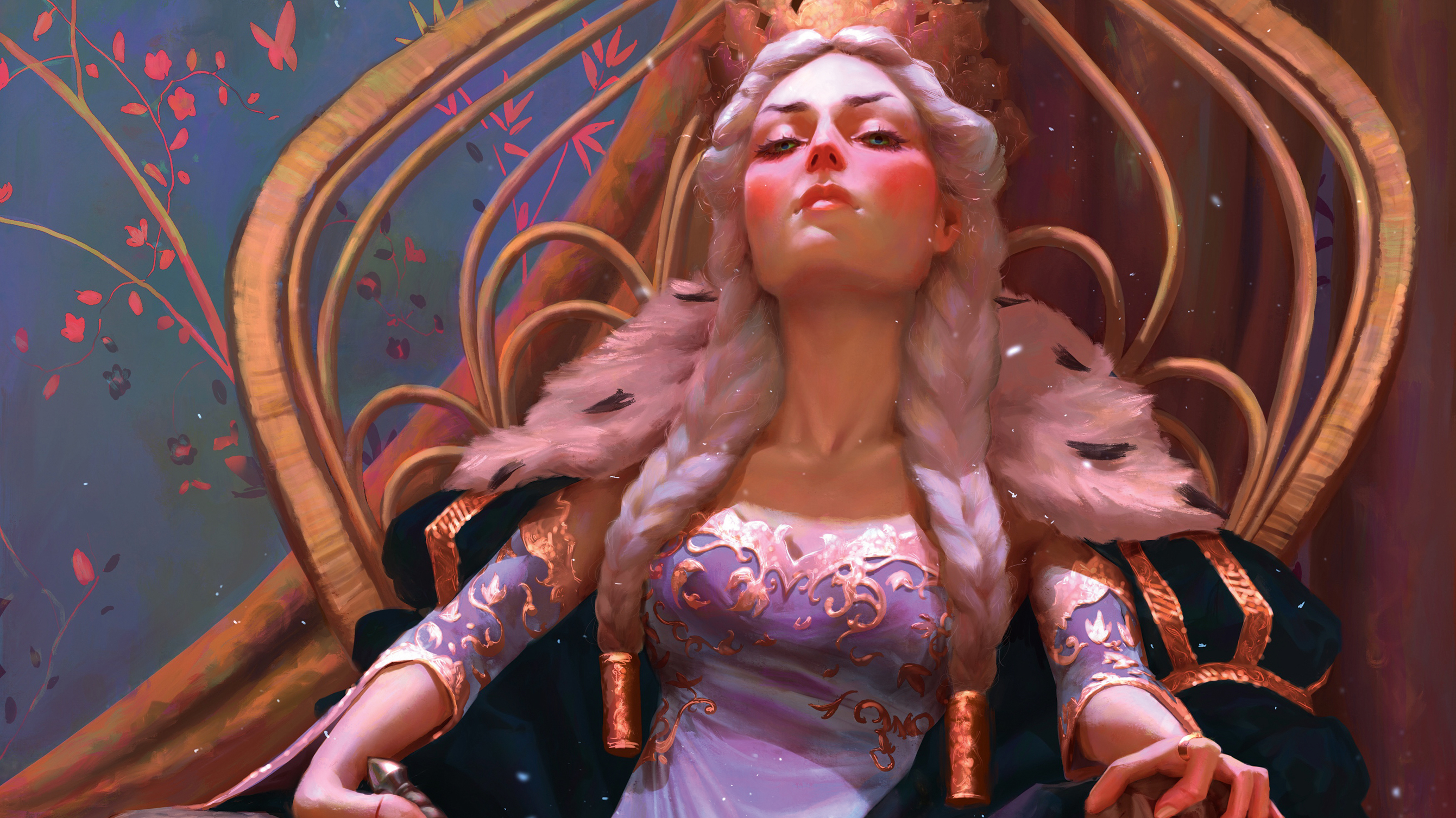
For this Procreate tutorial, I'm going to show you how to use VR models in Procreate to form the basis of a fantasy character illustration. I created this image as an entry for the Gwent art contest run by CD Projekt Red. The task was to illustrate a character from The Witcher that hadn’t appeared in the Gwent card game. I had played the game and read the books, and couldn’t wait to get stuck in.
I feel that I’m painting at my best when there are no uncertainties in my planned composition. Doubts over a character’s anatomy or a vague lighting setup slow me down significantly. That’s why I need to have solid references to hand. For this scene I built a 3D base in virtual reality, using Gravity Sketch and Tilt Brush. This meant I had a custom reference for the composition with consistent, accurate lighting. I use personal projects like these to experiment with new media. VR is like entering a whole new world where creation is simply magical!
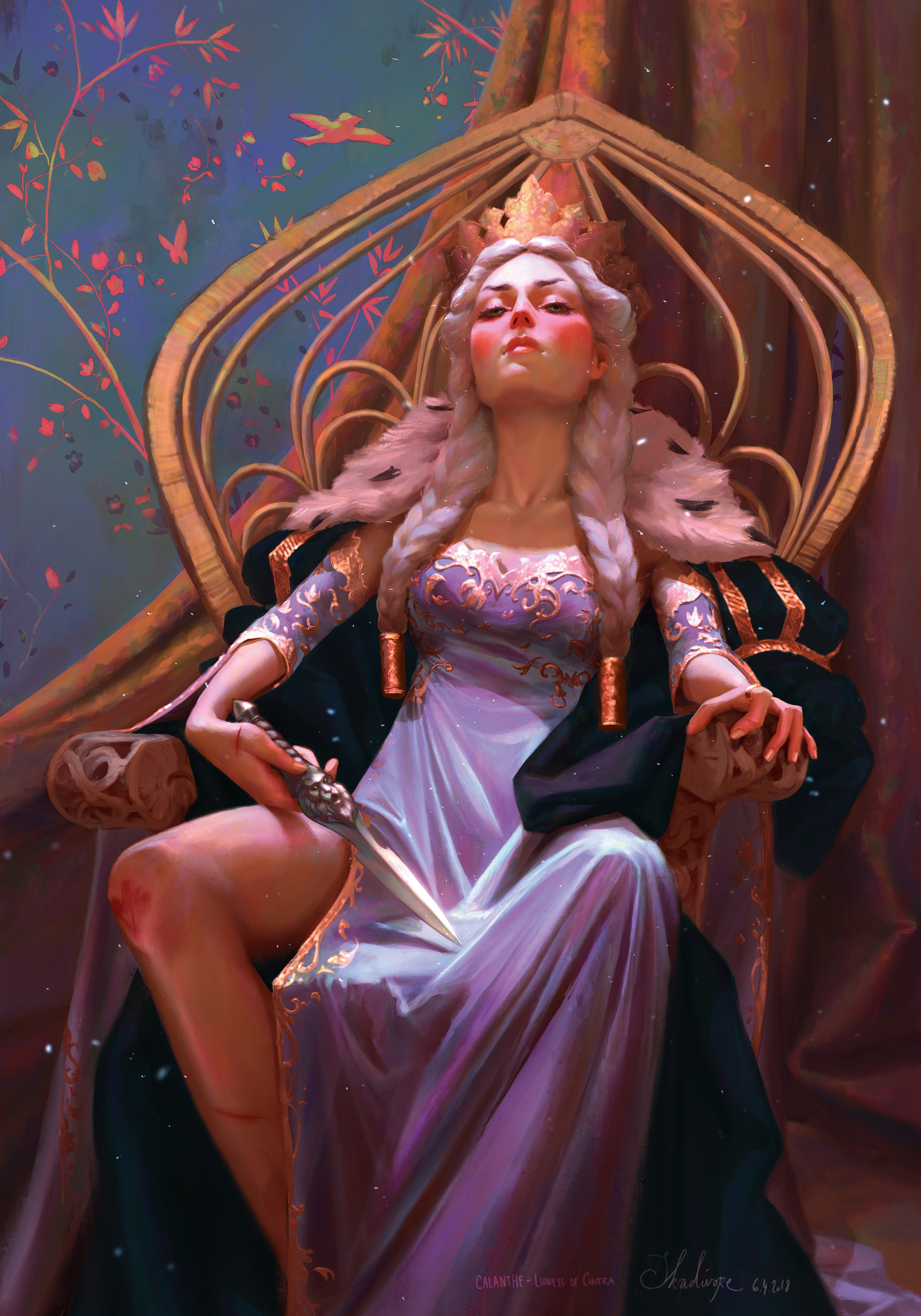
So now with a decent reference in place, and with the clock ticking, I had to paint my ice queen in Procreate as quickly as possible! You can see my full finished piece at the bottom of the page, but read on for a blow-by-blow of how I made it.
Procreate tutorial: my brushes
Here is the key Procreate brush I used for this particular project.
Default Brushes: Damp Brush
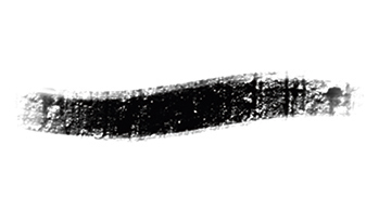
The base of my paintings is usually created with the default simple hard edge Round brush, called Airbrush in Procreate. But one key element in my Procreate art is how I smudge my strokes. For this I use the Damp brush, which is also part of the app’s default brush set.
How to use VR models in Procreate
01. Posing the figure and composition
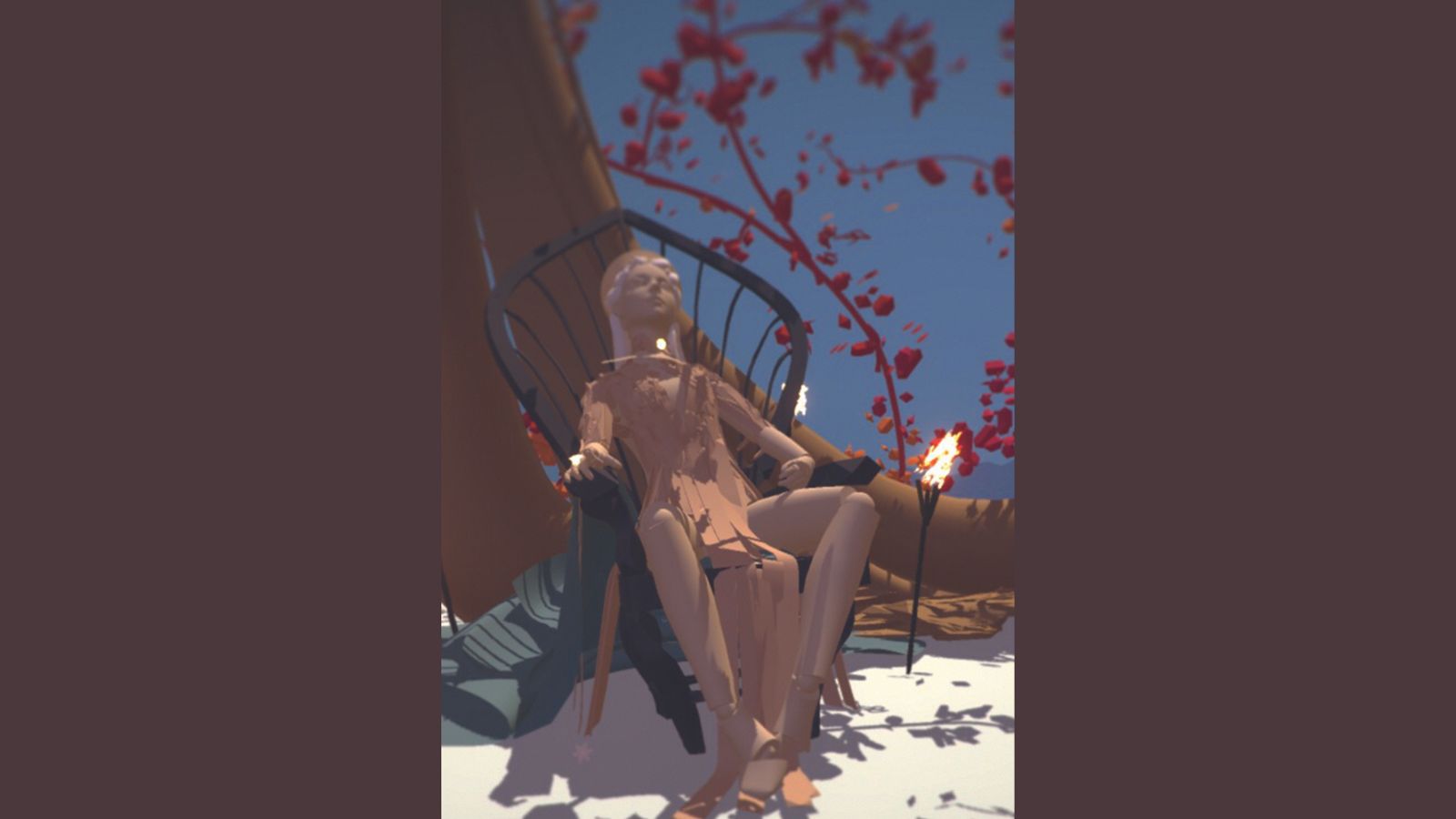
I build a rough 3D model in VR and light it. I use the default posing model of Gravity Sketch and then import it into Tilt Brush for detailing and custom lighting. When I’m happy with the composition I save an image that I keep open for reference.
02. Being organised
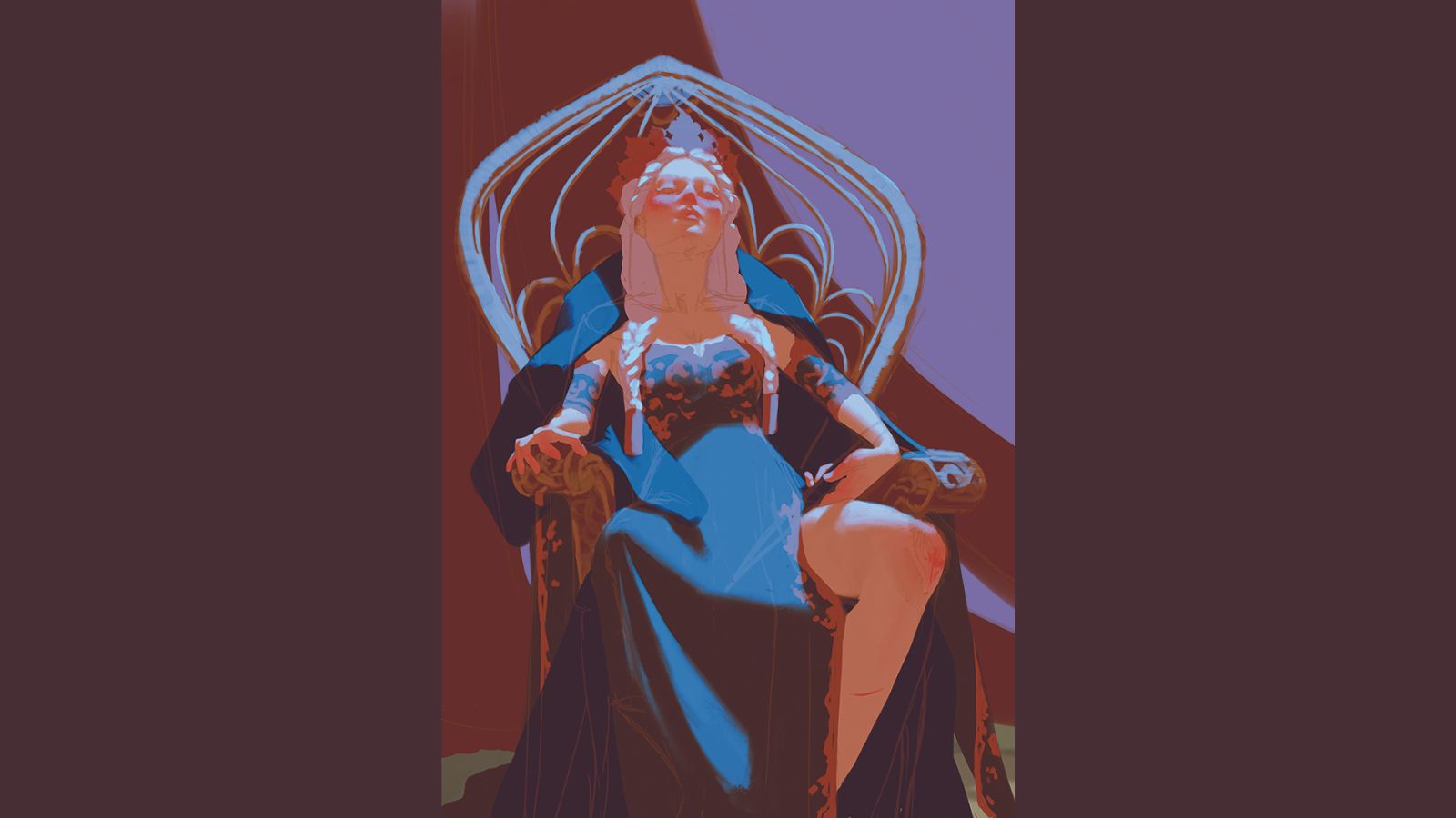
I start with outlines and add flat local colours to areas that are on different layers. I don’t always take this approach, but it’s useful for simplifying iterations when doing client work. I also use mirroring to ensure my figure’s proportions are correct.
03. Adding vibrance
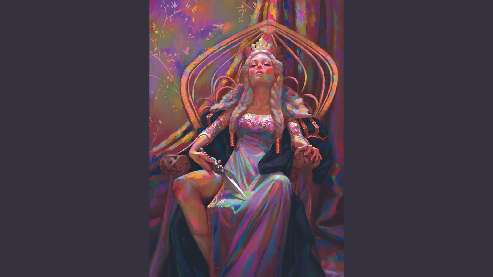
Once I’ve finished all the rendering I add random colours on a separate layer to achieve a neon mother of pearl look. Then I blend them in on a lower saturation. So, for example, the hair isn’t just white but appears white while being very vibrant.
04. Going from dark to light
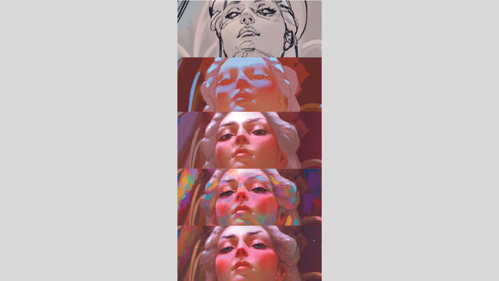
I establish my local, low-contrast colours, and ensure that they all sit roughly within the same palette. Then I paint on the main light source layer and play around with the colours, while adding secondary light sources or bounce lighting.
05. Adding storytelling elements
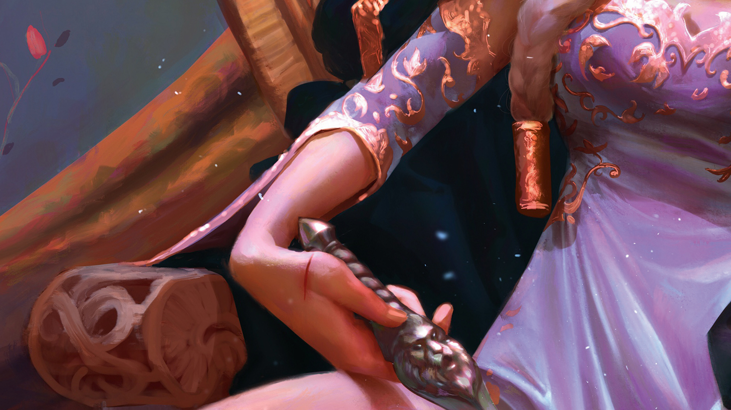
Calanthe is a queen, but she’s also a fighter. The bloody scratches imply she was in an altercation before she put on her dress. Her injuries are minor because she’s a skilled warrior – or perhaps it was a training session! The dagger has a lion on its shaft because she’s also called The Lioness of Cintra.
06. Creating atmosphere
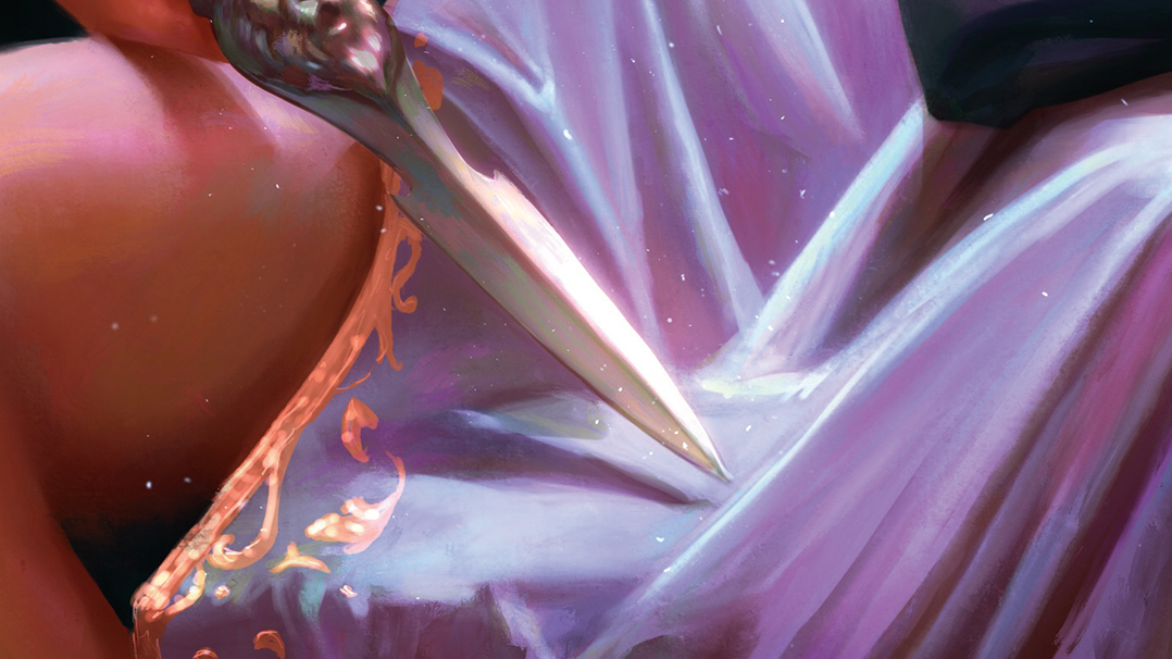
A strong sun beam coming through a window in summer will highlight tiny dust particles dancing in the air like magic. I enjoy adding this feeling to my paintings. When this kind of light hits metal or other shiny surfaces, the bounce light is so strong that it creates a halo around the object.
07. Leading the eye
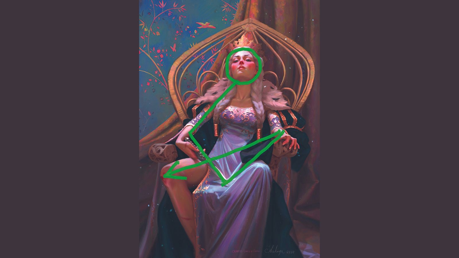
When looking at a picture, the eye is naturally attracted to areas of high contrast first, and then wanders around the image. An image is often pleasing if the eye is guided through the image intentionally. Value contrasts, depth blur (doesn’t have to be Gaussian – loose strokes work very well, too) and strong lines are good tools to lead the eye through the painting.
08. Final touches
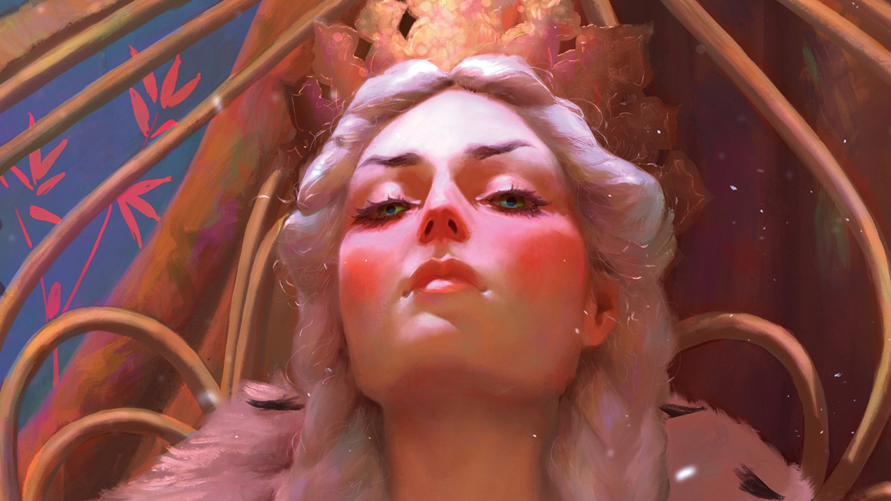
I touch up the face, make sure the proportions are correct, add details such as light hitting single hairs around her head, create tiny reflections in the eyes, paint individual lashes sticking out, fix her makeup and so on. I want to really bring this young queen to life.
More Procreate tutorials
You can find more great Procreate tutorials on CreativeBloq, for example we have advice for how to experiment with Procreate brushes, our expert Abi Le Guilcher shares her top five Procreate tips and Ken Coleman reveals how you can make use of the latest Adobe AI to create custom Procreate brushes.
If you've still yet to use Procreate, it's only available for iPad and Apple devices. Read our guide to the best iPad for drawing, as well as our iPad Pro M2 review for the latest high-end Apple tablet.
Get more Procreate tutorials in ImagineFX
This content originally appeared in ImagineFX magazine, the world's leading digital art and fantasy art magazine. ImagineFX is on sale in the UK, Europe, United States, Canada, Australia and more. Limited numbers of ImagineFX print editions are available for delivery from our online store (the shipping costs are included in all prices)
Alternatively, you can access us instantly through our digital options:
• Apple app (for iPad or iPhone)
• Pocket mags (multi-platform app, great for Android users)
• Zinio (multi-platform app for desktop or smartphone)


