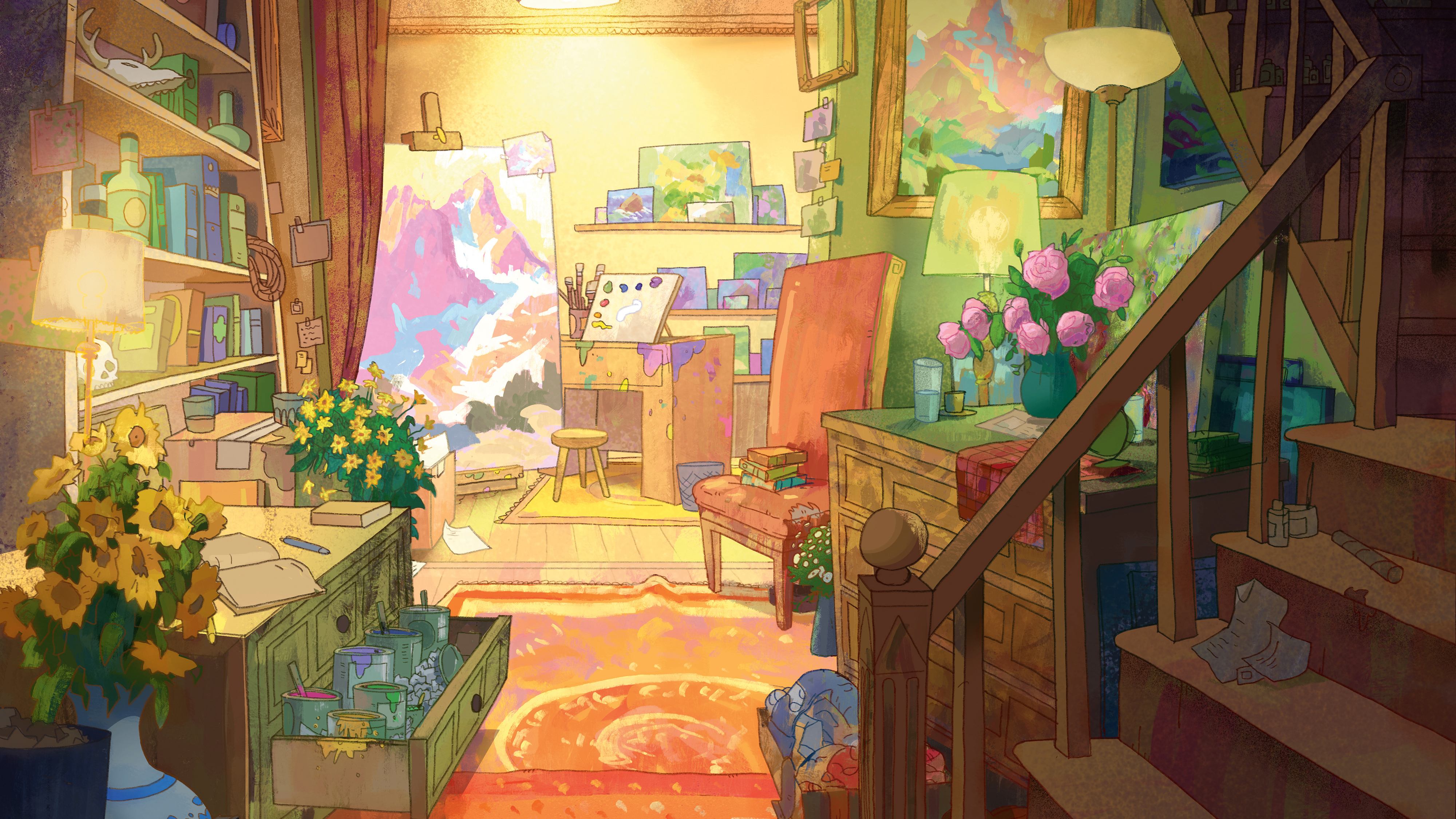
This Photoshop and Procreate tutorial is all about having fun creating a dynamic and interesting background featuring line art and a textured paint style. One of the key aspects of painting is making sure that I enjoy the process. I do this by leaning into what excites me and working in a variety of different methods and styles.
I want to set myself up for success by doing lots of planning in the early stages of the painting process. I start by seeking out plenty of reference and inspiration. Once I have a simple idea of the story I’ll do a drawing of the environment, featuring as many props and details as I can bring to mind.
The goal during this stage is to be able to imagine what kind of person lives in this room. I then create several black and white compositions that explore different ways of lighting the image. At the same time I’ll create various colour keys of the image.
Below I focus on combining Procreate and Photoshop to paint vibrant scene, but we also have more tutorials to get up to speed with these apps. Read our roundup of the best Photoshop tutorials, for example. I'd also recommend reading Jana Schirmer's tutorial for mastering colour and light in Procreate.
Photoshop and Procreate tutorial: my brushes
Here are the key brushes we'll be using for the tutorial on drawing in Procreate and Photoshop.
Custom brushes: Techno Texture
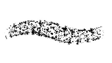
This is a great brush for laying in large areas of abstract colour.
Nemo
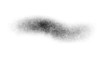
Ideal for laying down subtle texture. I once used it to paint a fish!
Photoshop and Procreate tutorial: vivid scenes
01. Starting from nothing
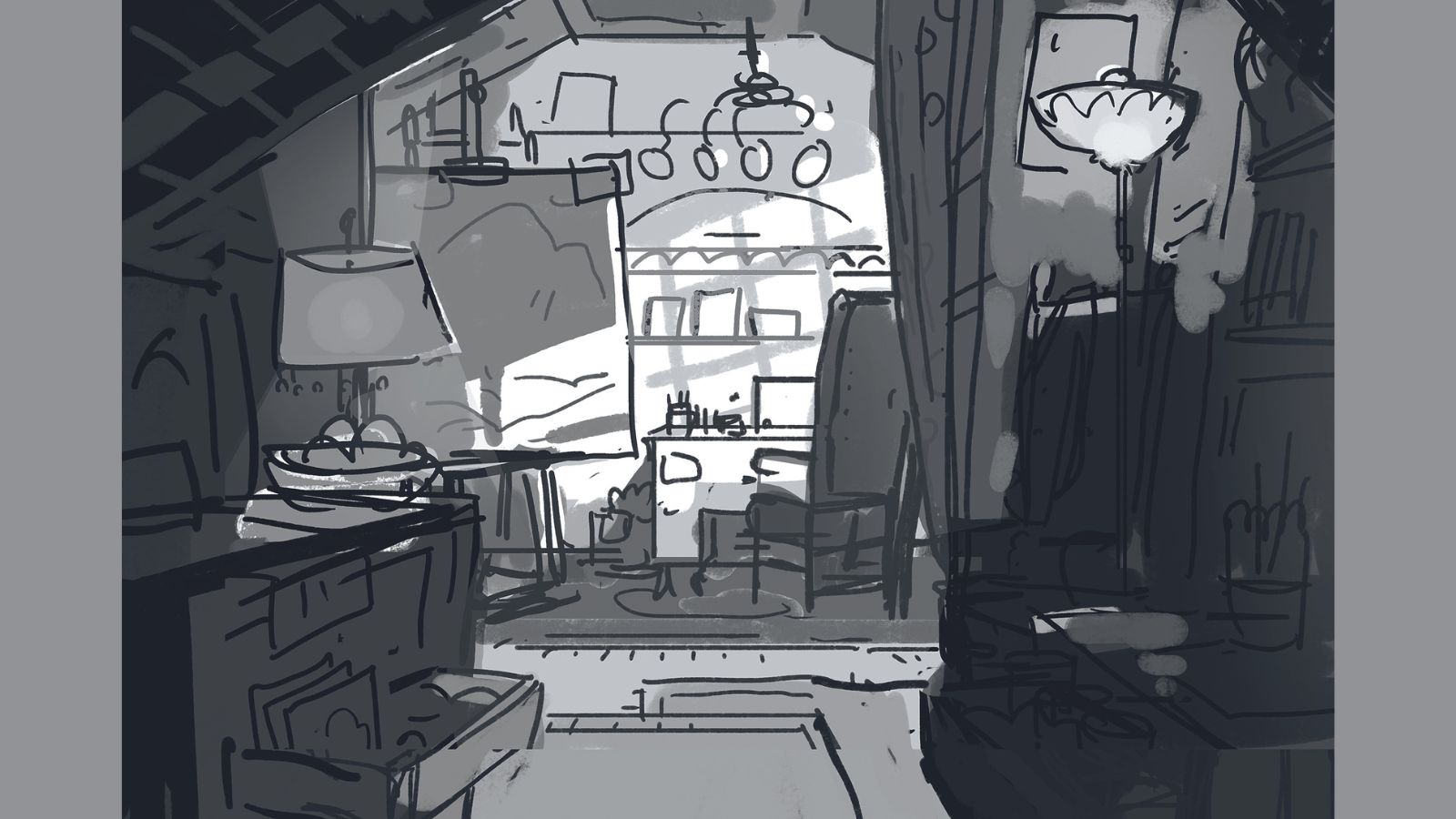
When I start a painting I try and pick one simple idea. This takes the pressure off me to think of something amazing right from the start. I want to paint an interior shot of an office with lots of props. At this point I’ll spend lots of time researching and quickly sketching ideas in Photoshop to spark my imagination.
02. Establishing a story
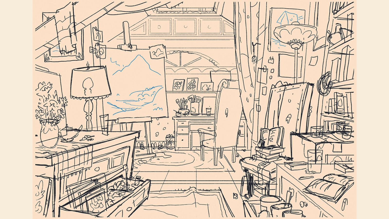
I start to hone in on what makes the subject matter interesting to me. I decide to turn the office into an artist’s studio because – perhaps unsurprisingly – I can relate more to that subject matter. At this stage I’m focusing on large shapes and the overall feel of the drawing, rather than getting bogged down in the details.
03. Experiment with lighting
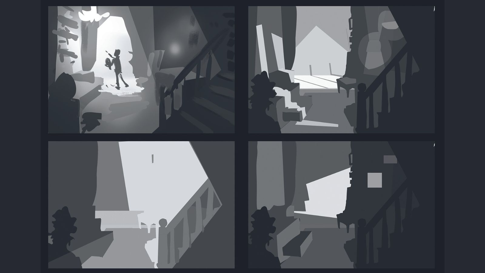
I tend to do lots of prep work for a painting. These lighting options provide a safety net so that I won’t get stuck later on in the process. Composition, lighting and colour are so intertwined that I like to make these decisions early, knowing that I’ll change things up as I go.
04. Refine the composition
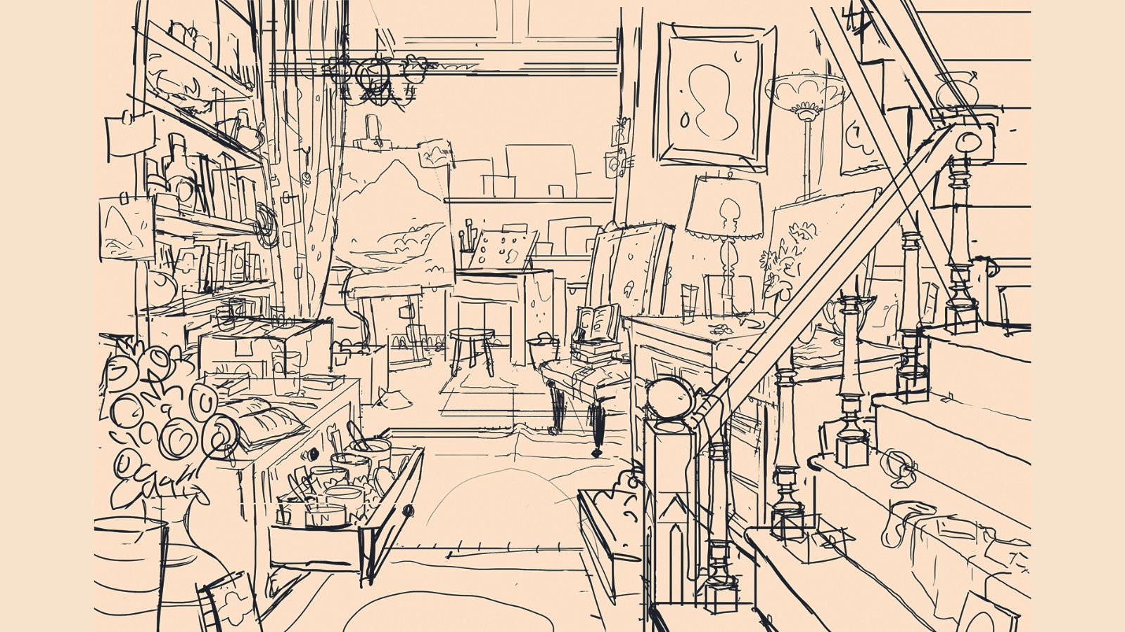
At this point the image feels as though it lacks depth, so I expand the frame to show more of the room. I try adding a large window before ruling that out and eventually settling on a staircase as a framing device. There’s lots of experimentation in the early stages of a painting – but that’s all part of the fun.
05. Consider the perspective of the scene
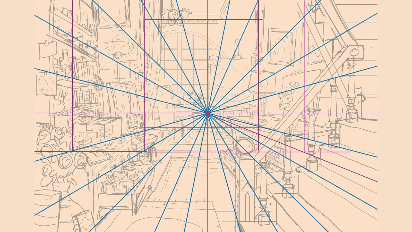
Perspective can be a daunting task, but with practice it can become second nature. For this image the perspective is relatively simple: it’s one-point perspective with a horizon line in the middle of the image. To avoid becoming overwhelmed by the complexity of this image I lay in main shapes as cubes and then build around them.
06. Create lighting and colour keys
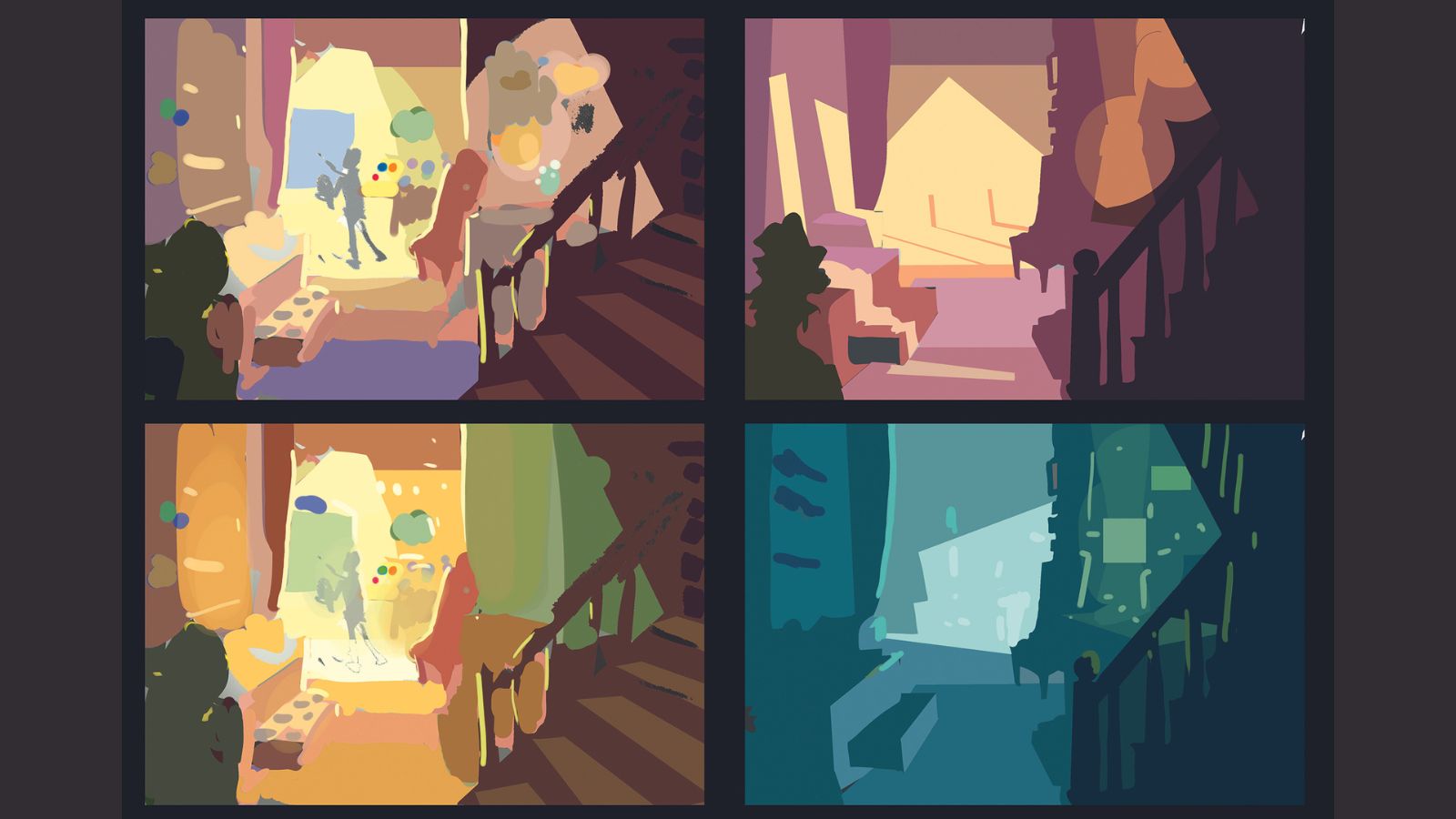
When creating my colour comps I like to infuse them with energy, making as many as I need in five minutes. I avoid using transparency when painting colour comps, opting instead for a hard Round 100 per cent Opacity brush, so I’m not tempted to start painting details.
07. Produce a clean line drawing
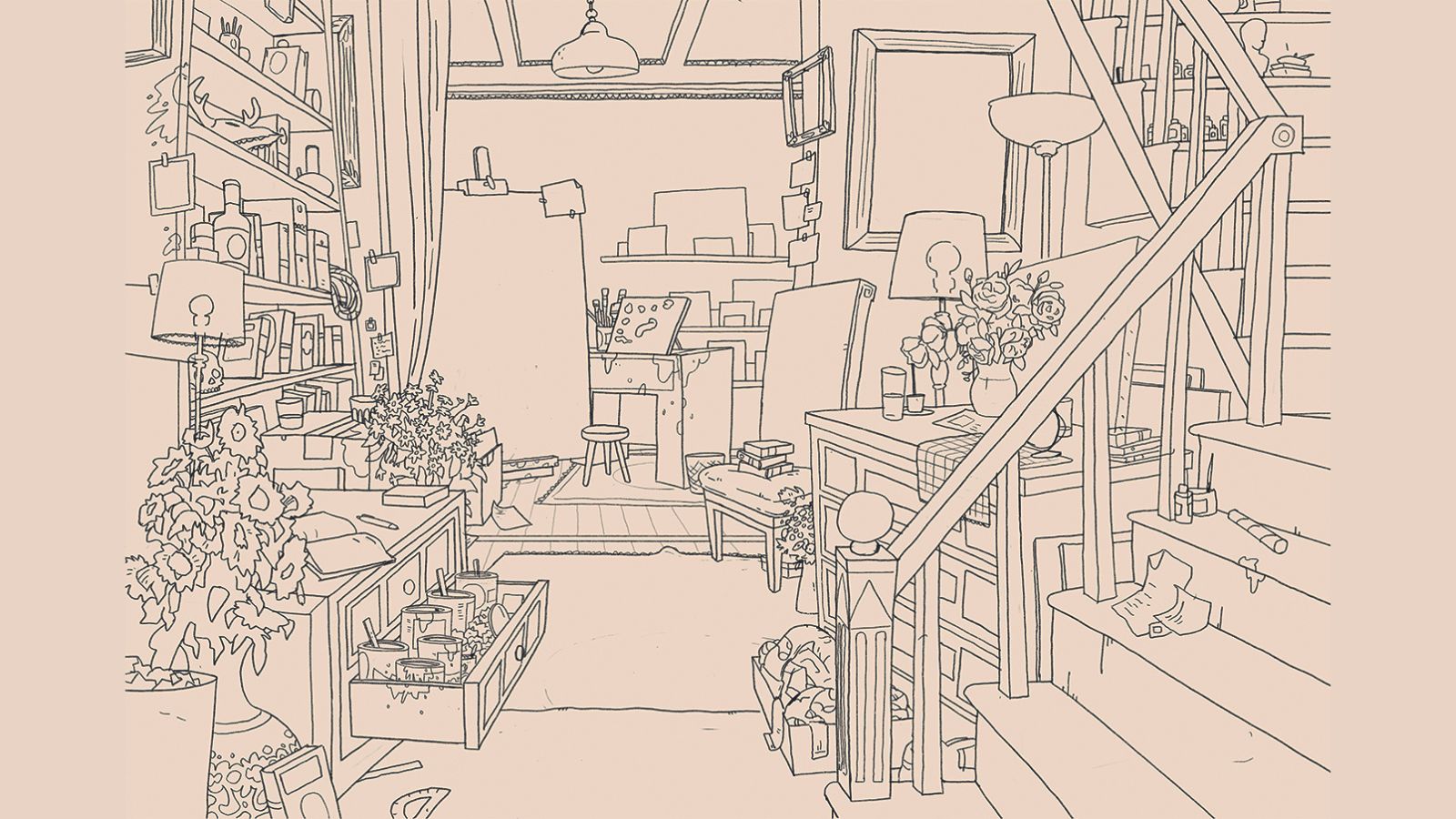
I transfer my Photoshop file to my iPad and open it in Procreate. At this stage I like to take a step back and have fun. Time to really let loose and allow my personality to shine through the drawing! I make sure not to trace the sketch, but to improve on it, fix perspective errors, and add more personality and detail.
08. Laying down a base
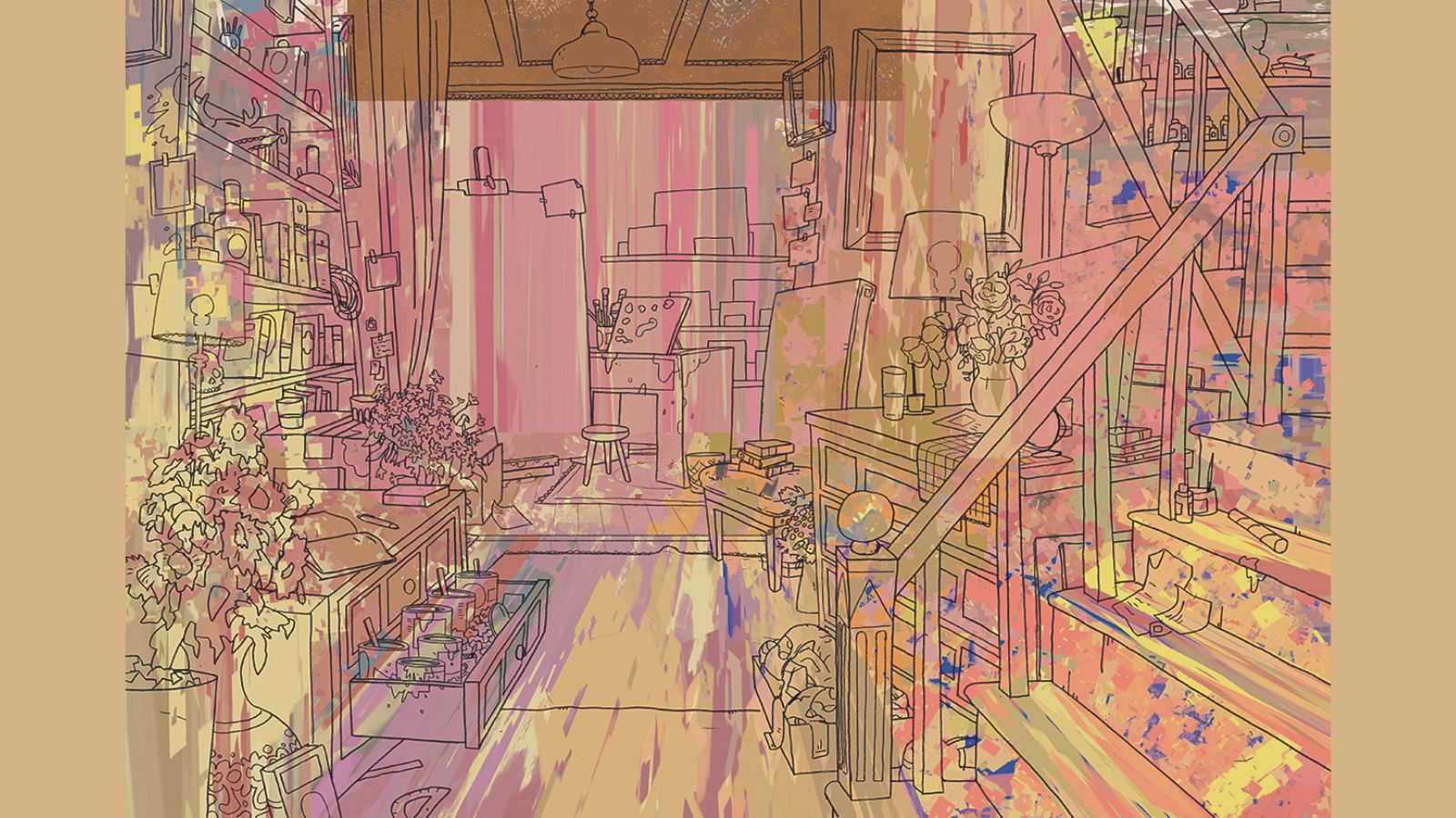
I want to create a base to paint on so I don’t have to stare at a white canvas. It doesn’t matter what kind of brush or texture at this point, I’m just trying to start the final painting process with lots of energy, to make sure I don’t end up with a stale-looking image.
09. Blocking in major shapes
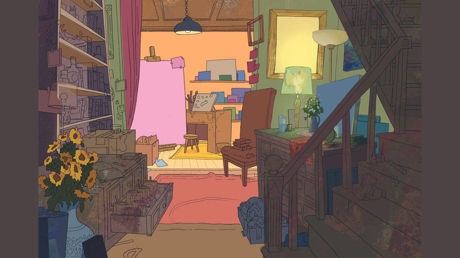
I block in my shapes with what I consider would be their local colour and value without any lighting effects added. I can paint those in later. What I need now is for the main shapes to be there so I can paint into them later. This little bit of prep work will enable me to jump around different parts of the image with ease.
10. Take advantage of Color Dynamics
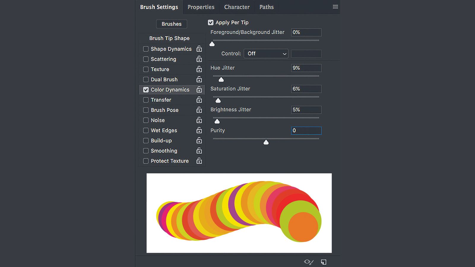
One great tool in Photoshop is Color Dynamics. I like to have this turned on with most of my brushes, although I rarely turn any of the sliders past 10 per cent because it can get garish. It generates a subtle colour variation that would take too long to paint by hand.
11. Painting with light and colour
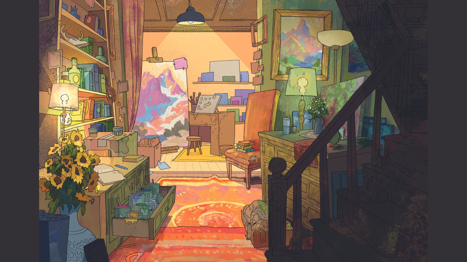
Once the main shapes are laid in I can start to light the image. Using my colour key as a guide I make my way around the painting, adding a light and shadow side to all objects, I consider the local colour of the object, as well as the temperature and colour of the light that’s affecting it.
12. Keep your value groups consistent
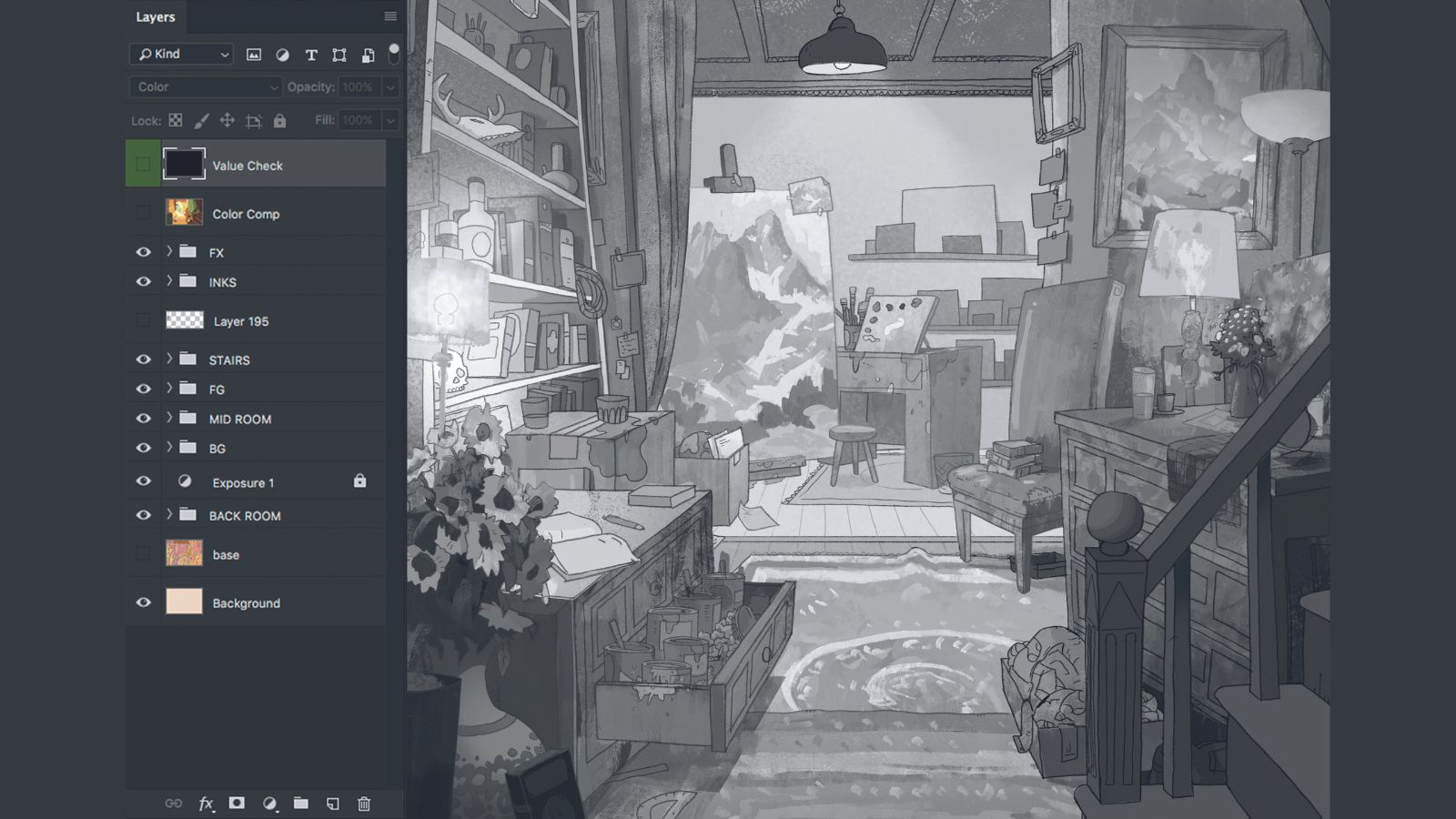
I create a layer filled with black and set the blend mode to Color. This enables me to check that I’m not straying from my initial value comp as I add colours. It can be easy for an image with this much complexity to lose focus if I allow the colours to take precedence over the value.
13. Taking plenty of breaks

One thing that demos can’t convey is time. Generally, when I’m painting I’ll work in small chunks – 20 minutes to an hour, say. I find that when I stare at the image for too long I can become blind to the mistakes I may have made. Overall, I spend about 13 hours on this interior scene.
14. Colouring the lines
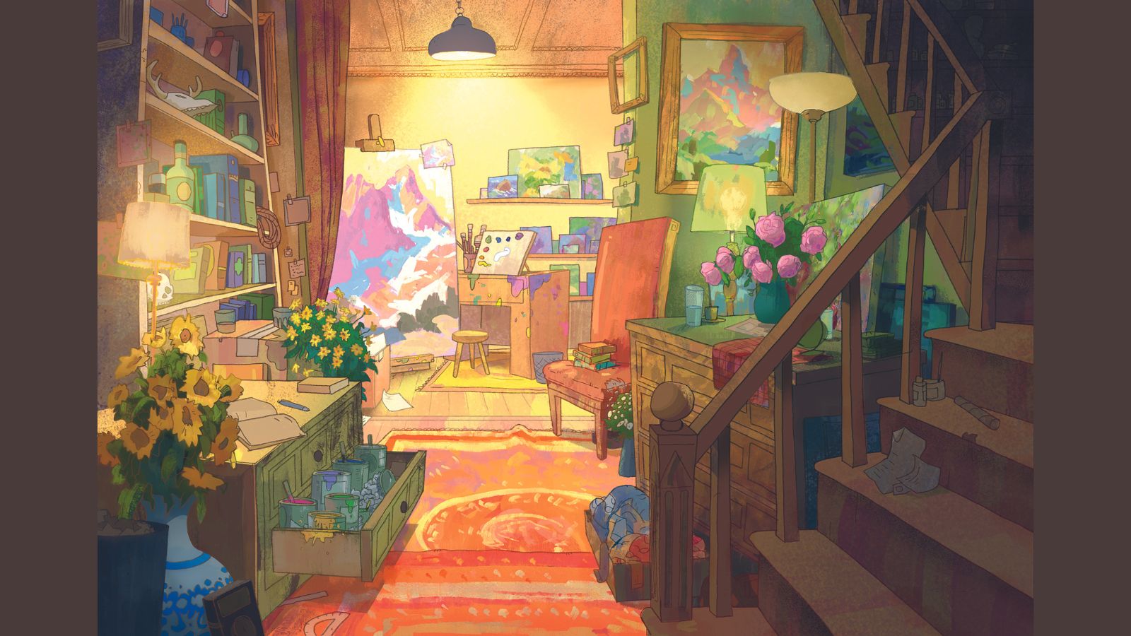
To give my image an extra bit of depth at the end I go through and colour the lines, My goal is to integrate the lines into the image so that it feels like they belong. In my experience, having an all-black line drawing on top of a colourful painting will flatten it out.
Get more Procreate tutorials in ImagineFX
This content originally appeared in ImagineFX magazine, the world's leading digital art and fantasy art magazine. ImagineFX is on sale in the UK, Europe, United States, Canada, Australia and more. Limited numbers of ImagineFX print editions are available for delivery from our online store (the shipping costs are included in all prices)
Alternatively, you can access us instantly through our digital options:
• Apple app (for iPad or iPhone)
• Pocket mags (multi-platform app, great for Android users)
• Zinio (multi-platform app for desktop or smartphone)
