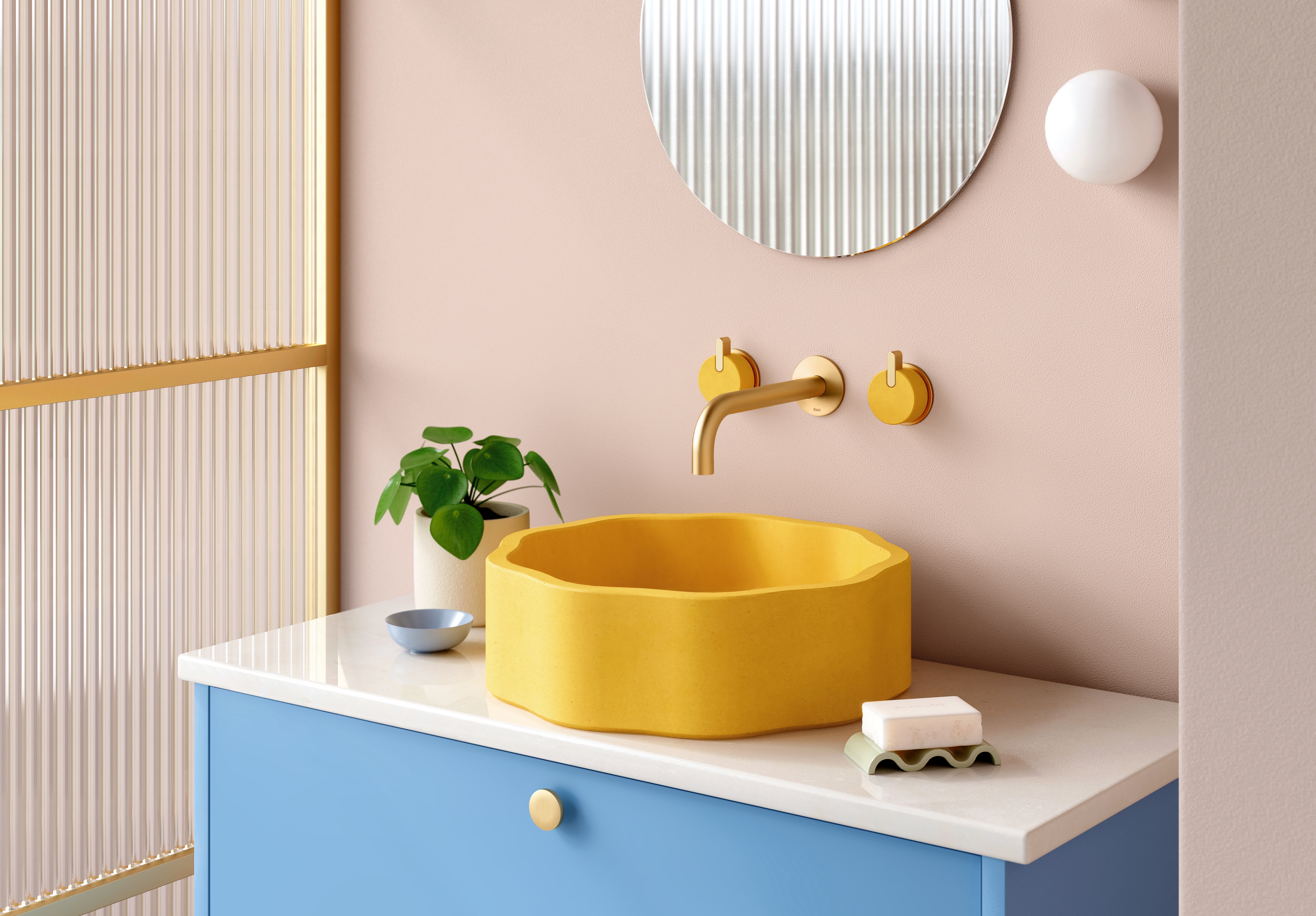
If your powder room feels like it's slightly letting the side down on the design front, you're probably not alone. This oft-neglected space doesn't tend to feature particularly high up on the priority list for most of us, particularly when working with a tight budget, or tackling larger renovation projects.
While it might not be a crowd-pleaser like the kitchen or living room, a beautifully designed powder room is akin to the cherry on the cake, or the 'gem' of the home, as described by Shelby Griffiths of Alexander & Co. It's also an easy win, given its compact proportions: you can make a big difference with limited resources.
The powder room is also the place where you can go a little off-piste when it comes to design; there's no pressure to make it conform to the style you've set for the rest of the house if you'd prefer not to. Why not wrap the room in wallpaper with an oversized pattern; experiment with mismatched tiles; or elevate with luxurious brassware? You could swap the obligatory wall of family photos for a piece of art that you love, or invest in some atmospheric lighting. For more expert advice on designing a powder room that aspires to be so much more than an afterthought, read on.
1. TRY A STATEMENT WALLPAPER

When Georgina Jeffries embarked on the redesign of this Edwardian Residence in Melbourne, she was keen to introduce 'a touch of whimsy'. The home features an understated yet sophisticated palette, enlivened by playful elements, such as the Cole & Son Nuvolette wallpaper in the powder room: 'a reflection of the family’s light-hearted disposition'.
'The wallpaper design is calm yet powerful, and feels so immersive when wrapped around all four walls of the room,' says Georgina. 'We wanted to create an experience that made an impression, but also a space that can be enjoyed for many years without looking tired.'
2. UPGRADE YOUR BASIN
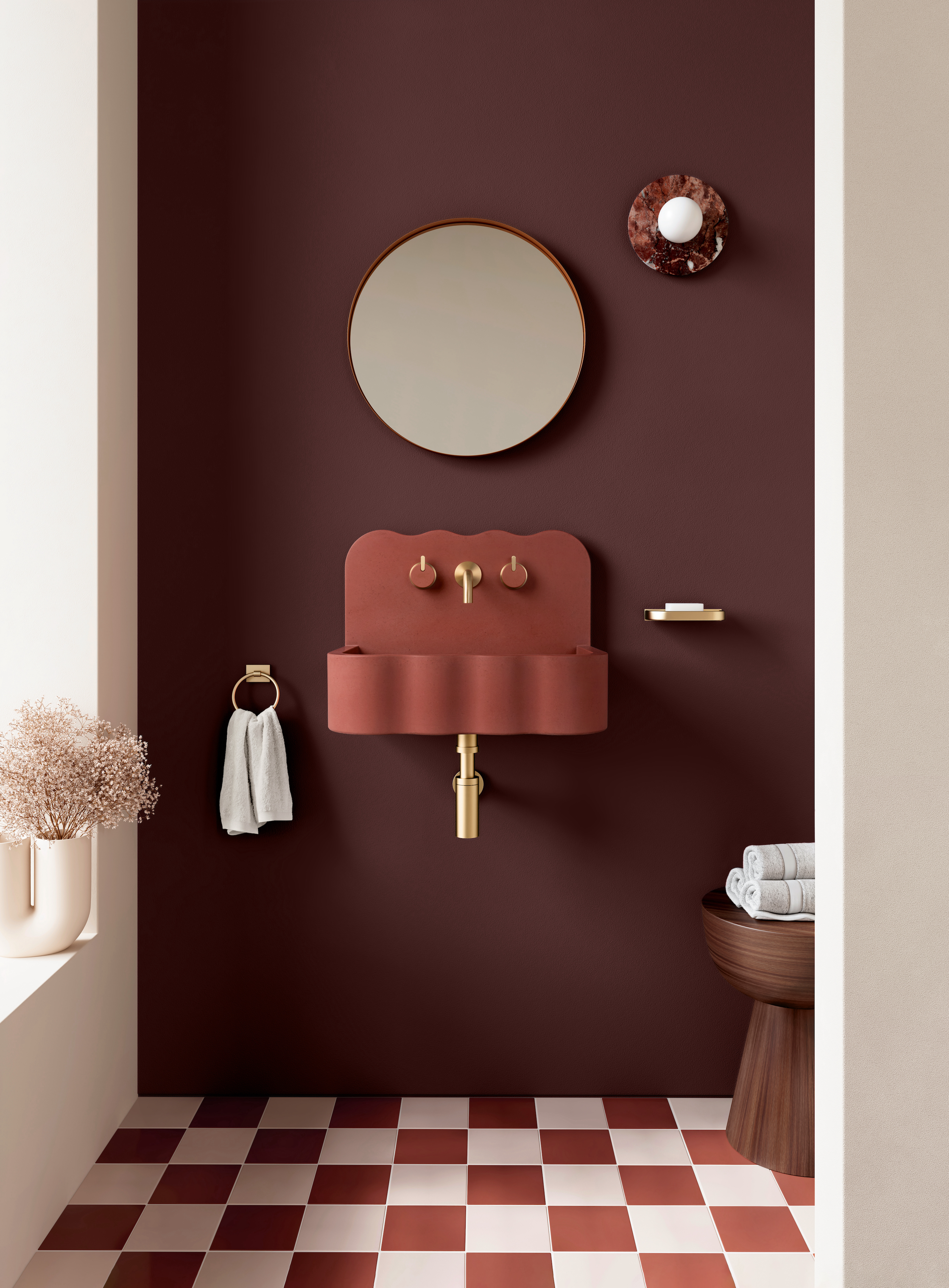
We love this perfectly proportioned, scalloped Tilde basin from Kast's Wave collection; it's a sculptural, wall-hung design that's great for small spaces. 'Tilde's unique form emanates creative energy, making it an ideal choice for compact spaces like powder rooms, where it effortlessly evolves into a functional work of art,' says Amy Bartlett, head of creative at Kast.
'Opting for a wall-hung basin provides an excellent space-saving solution, streamlining the interior of powder rooms and cloakrooms. This particular model establishes a captivating contrast with the angular lines that so often feature throughout our homes.'
3. INVEST IN A BESPOKE VANITY UNIT

A beautifully crafted bespoke vanity unit – complete with integrated sink – stretches from wall to wall in this sophisticated powder room designed by Sydney-based architecture and design firm Alexander & Co.
'Powder rooms are often conceived as the place where you can be a little more daring or decorative,' explains Alexander & Co associate Shelby Griffiths. 'The concept was no different in this home. We originally a suggested pink marble, but our clients fell in love with the warm veining and vibrant emerald green of the Smeraldo polished quartzite.'
4. GET CREATIVE WITH TILES
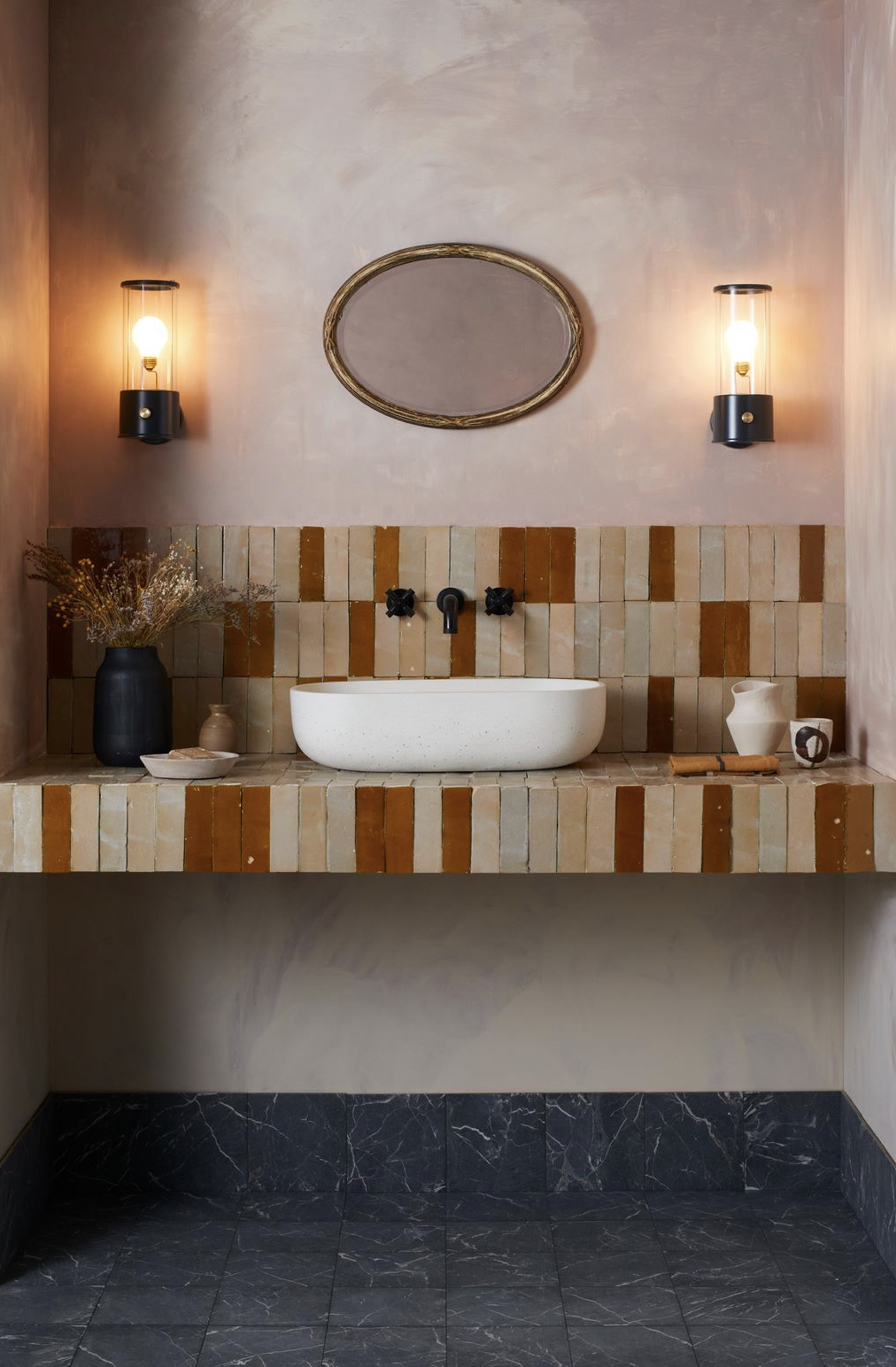
If your budget doesn't stretch to a bespoke stone vanity unit, don't despair. There are other ways to put a unique stamp on your powder room, one of which is tiling. A tiled vanity shelf is a really effective way to create a custom design without the high price tag, as this impactful space proves.
‘This vanity design features our Cherry Red and Clear Glazed Bejmat tiles, all of which are handmade in Morocco,' says Bert & May founder Lee Thornley. 'Characterized by their distinct, raw aesthetic, the individuality of the tiles brings a feeling of personality and warmth to the space. The effect highlights how subtle tile colors can add so much character to a smaller room.'
5. ELEVATE WITH LUXE BRASSWARE
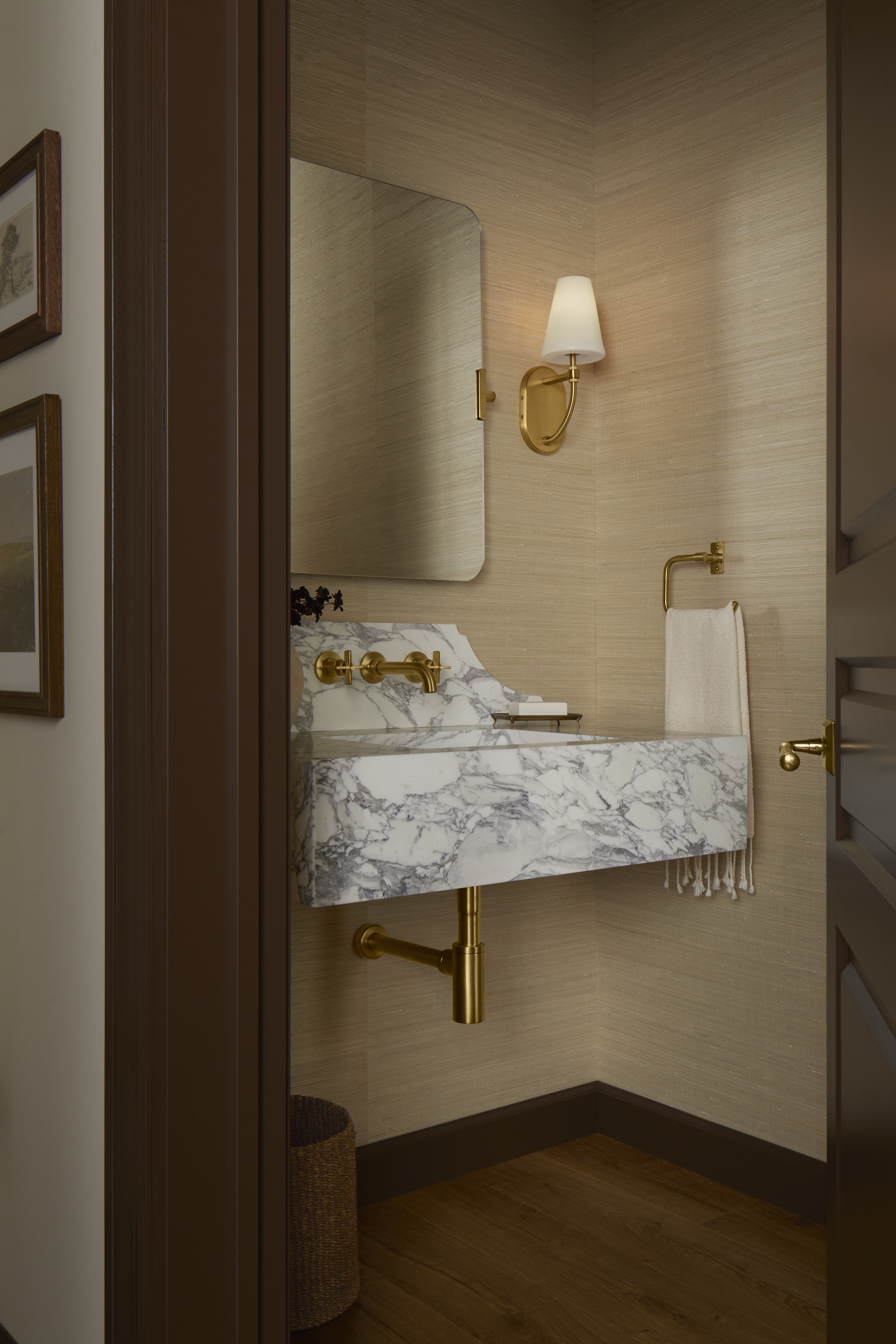
An easy switch that can make all the difference the look of your powder room is to swap out your old tapware for more contemporary or better quality designs. There's a wealth of styles and colors choose from when it comes to taps, bottle traps or basin wastes, from brightly hued to matt-black to classic brass.
We're big fans of Studio McGee's collection for Kohler, which blends modern and classic influences, making it both enduring and versatile. 'I went deep into the Kohler archives to find some of the historical details and styling that make a fixture timeless,' shares designer and co-founder Shea McGee. 'From there, I gave them modern updates for a mix that’s uniquely Studio McGee.'
6. INTRODUCE ORNATE TOUCHES
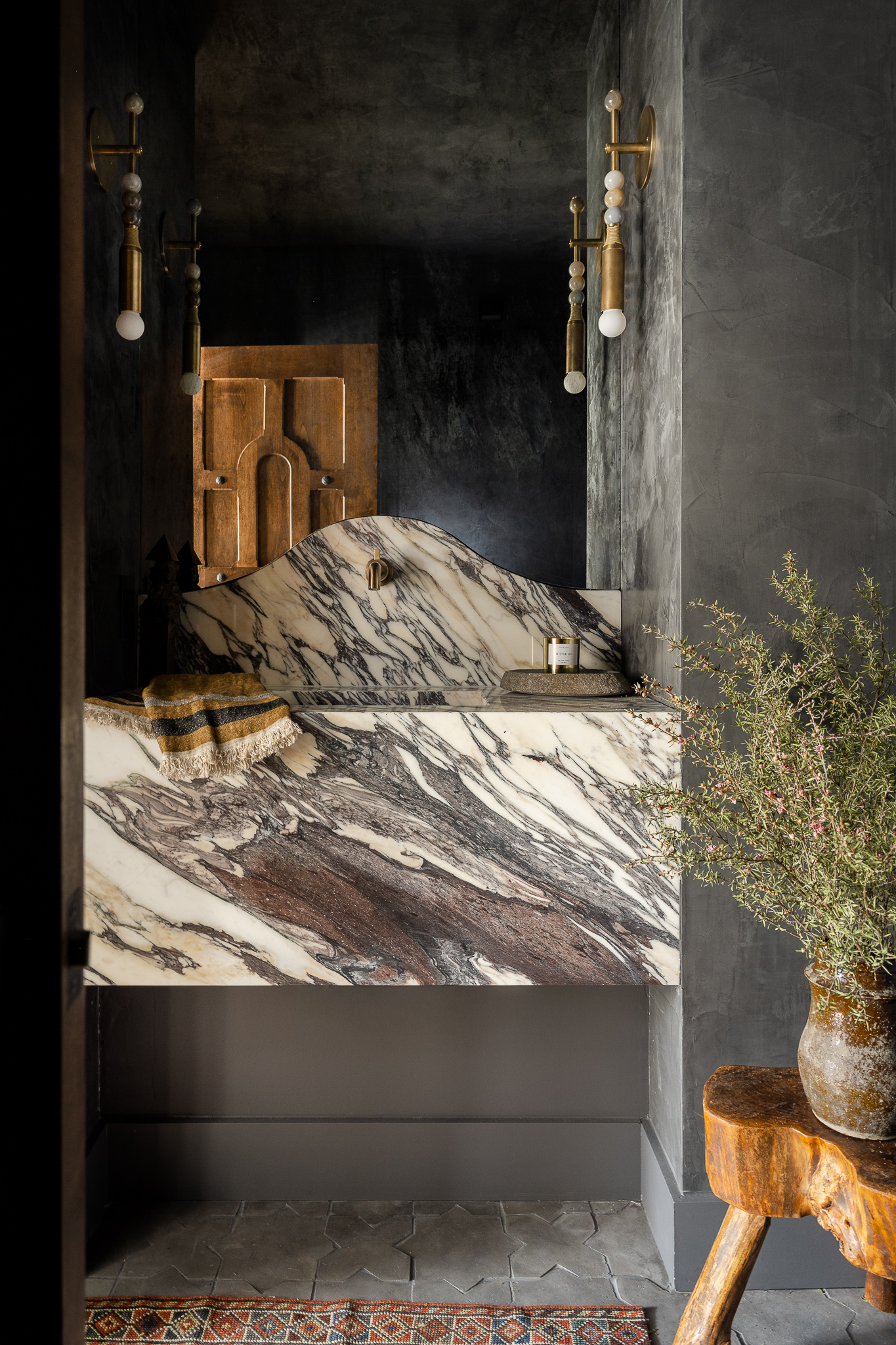
When Indianapolis-based interior designer Heidi Woodman overhauled this powder room as part of a larger Mediterranean-modern-style redesign, she embraced the space's lack of natural light with a dark interior. Charcoal walls echo the grey veining in the monolithic marble basin unit, above which hang two ornate brass wall lights that immediately catch the eye.
'We wanted this space to feel formal yet approachable. We brought in a beautiful slab of marble with very distinct veining that would move with the profile of the vanity,' says Heidi. 'We thought of the lights, which are from Apparatus, as the jewelry of the space. My client even said that if they came as earrings, she would wear them!'


