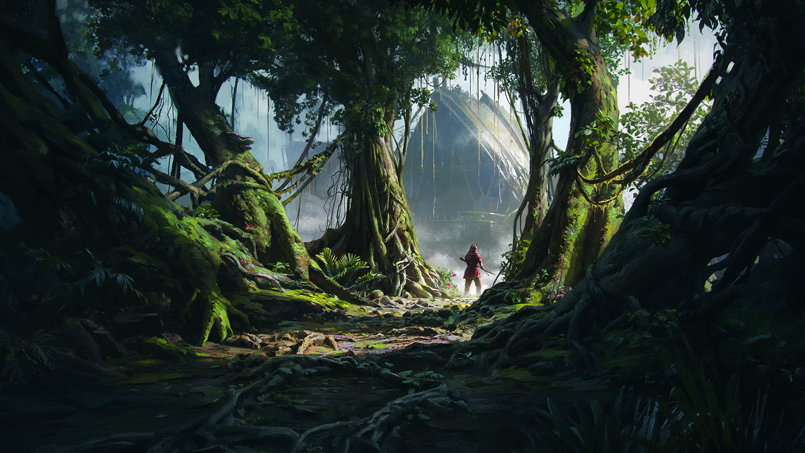
Starting out as an artist, creating a professional-level image can feel like an unattainable feat. This is exacerbated when you see thousands of highly skilled artists on social media, creating incredible images that leave you wondering how on earth they arrived at such a detailed and complex final result.
When you don’t know the strategies artists use to get such outcomes, the ArtStation home page can be quite an intimidating place. Hopefully, in this workshop I can help remedy this by breaking down the gargantuan task of creating a professional-level image into nice, bite-sized, achievable tasks.
In this Photoshop tutorial I will be giving you a glimpse behind the curtain and showing you some of the many strategies we concept artists utilise to get a professional outcome in a short amount of time.
I’ll start by describing how I come up with ideas and create black-and-white sketches. After that, I’ll cover a variety of techniques for building a 3D base for your image in Blender (for more, see our Blender tutorials roundup). Finally, I’ll utilise a combination of photo-bashing and painting techniques to bring us to the final image in Photoshop. I can’t cover everything in this article, so if you want a more in-depth look, check out the video tutorial above!
01. Get your ideas down
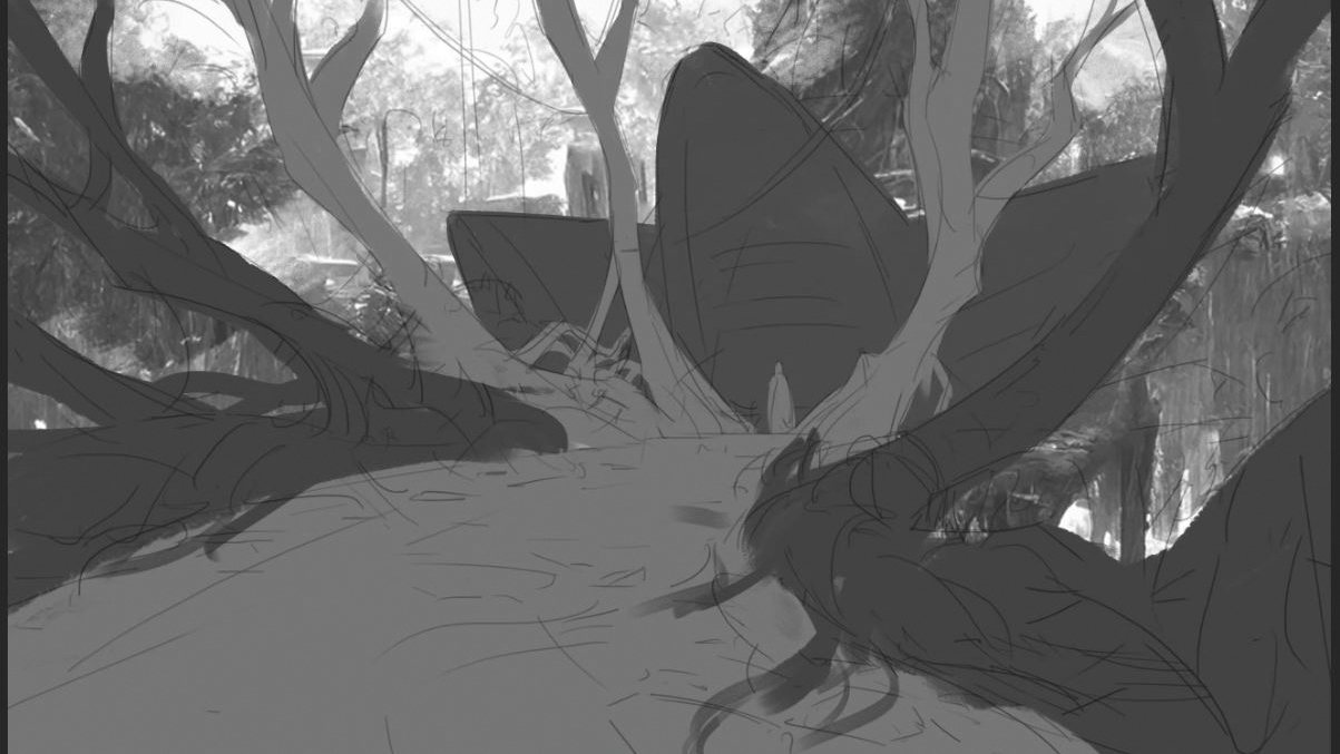
For me, making a bunch of sketches is typically the first step in producing a personal piece. No one creates successful images on every attempt, so I try to get through all the unsuccessful ones as sketches. It’s far better to realise a sketch isn’t working than a piece you’ve sunk 15 hours into! I usually start off with line work, then paint some silhouettes in block value underneath.
02. Finish the sketch
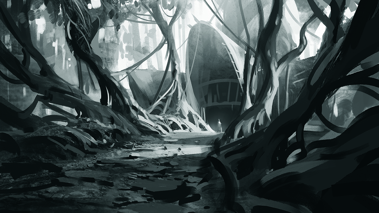
At this stage, try to figure out if your sketch is showing potential before fully committing to it. If it needs to be changed or even abandoned entirely, now is the time. It may help you create a more effective image overall. I am using the block values as masks to paint within and add light, shadow and texture. Then paint on top of everything to add some finer details.
03. Block out the 3D
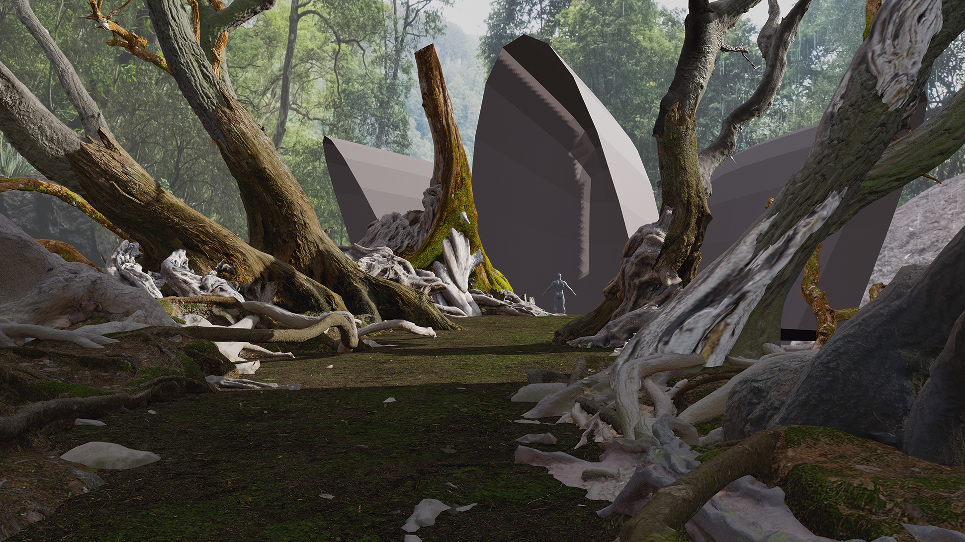
Once I am happy with a sketch, I will begin the 3D blockout. I have used a ton of resources to jump start the image. In this instance, I gathered some photogrammetry from Megascans and Sketchfab. I am matching the 3D to the sketch by using the sketch as a background image in the camera settings, and using proportional editing to warp the models into the correct shapes.
04. Mood and lighting
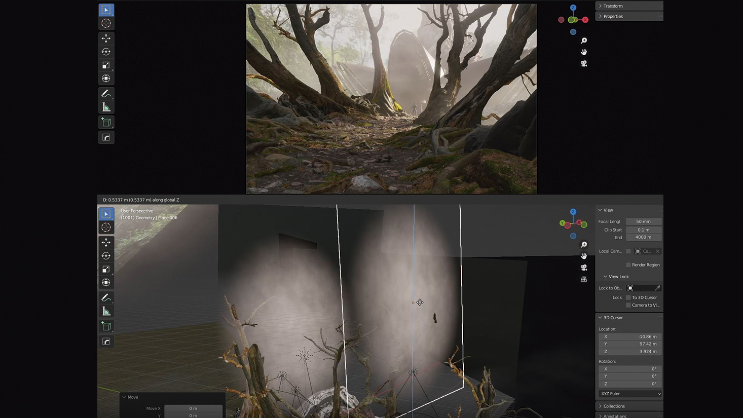
I like to try to establish the mood of the image with lighting and atmosphere as early as possible. I am using one directional light with some spotlights to highlight certain areas. Additionally, I’m using a Principled Volume shader applied to a cube to add fog and some emissive fog planes dotted around the scene. I’m also casting shadows into the scene using off-camera geometry, blocking off the directional light.
05. Set dressing
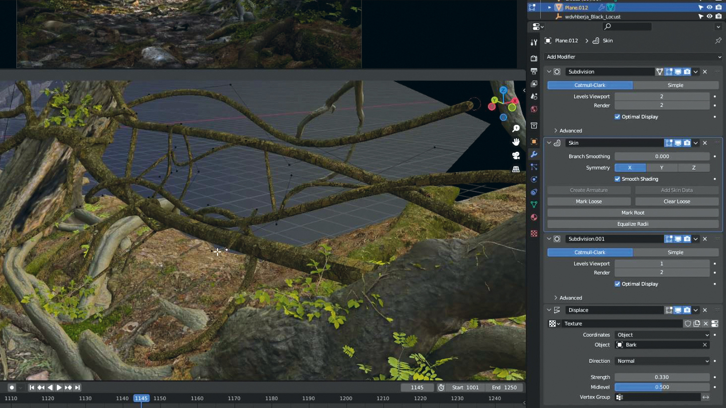
Next I’m adding some flora from Megascans. I am also creating vines by starting with an edge and extruding it. Now for some modifiers. First, I add a Subdivision Surface, then a Skin modifier to add thickness. Next, I’m adding another Subdivision Surface on top of that to provide more geometry for the Displacement modifier on top of everything, which is using a bark texture.
06. Unify the scene
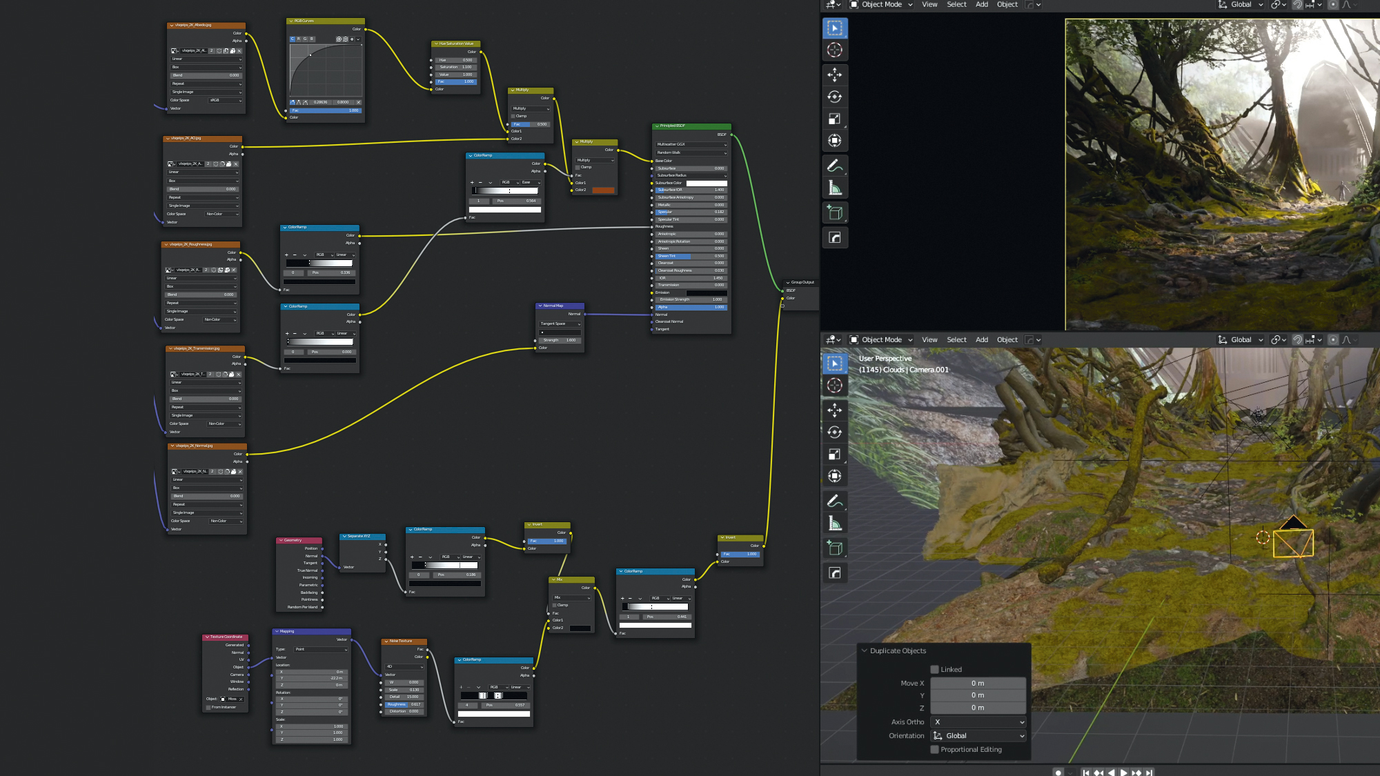
Next, use a Mix Shader node to combine moss with the pre-existing material. This will unify all the models in the scene. Add a Geometry node and feed the Normal into a Separate XYZ node. You will get a mask of everything facing upwards from the Z output. Using this, I can have moss only grow on the tops of objects. Dial in the mask with some noise on top.
07. Character base
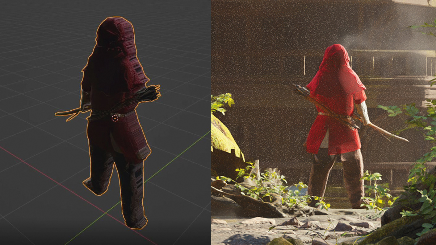
Now, to create a really simple base for the character, I am using an image from Photobash.co. After tweaking it in Photoshop, I imported the image into Blender using the ‘Import Images as Planes’ addon. Cut out the character with the knife tool and extrude it to add thickness. Then bevel the edges and smooth them in sculpt mode. This will provide a rough base to paint on top of.
08. Make some architecture
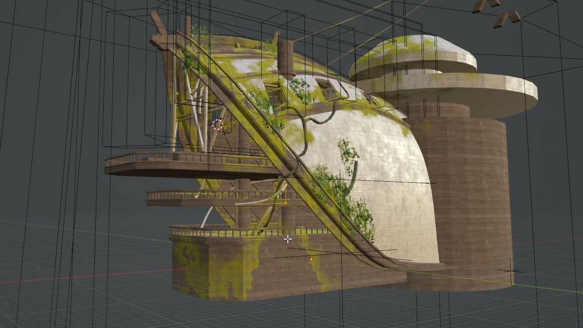
Creating the building started out with blocking out the shapes using a Subdivision Surface to get the rough shape of the canopy. Then work into that by extruding loops to create structural beams and using Boolean objects to cut holes into the mesh. Finally, I used the same Skin modifier techniques I used for the vines earlier to create bamboo supports.
09. Time to render
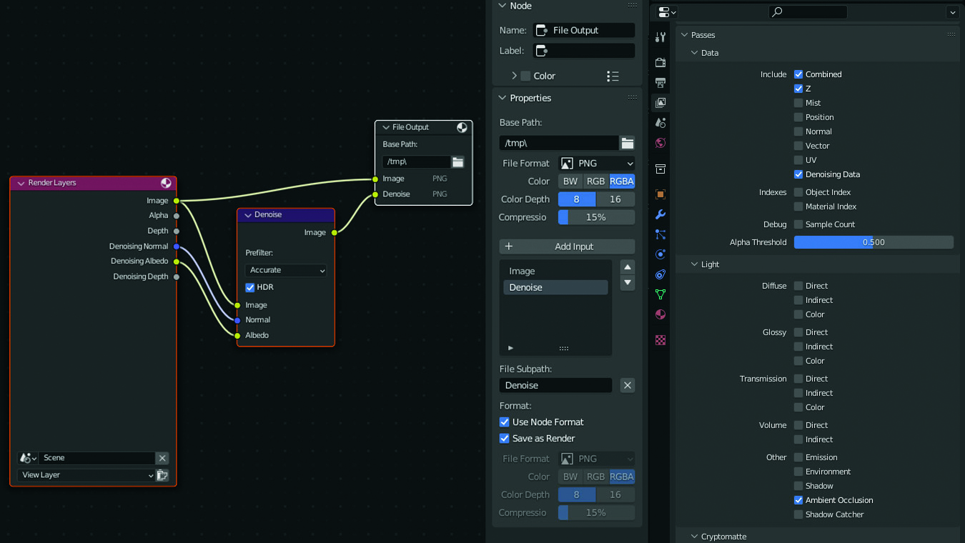
Using Cycles with the Denoiser requires a bit of setup. Firstly, enable Denoising Data in the View Layer Properties tab. Next, we will create a simple node setup in the compositor. Create a File Output node. Press ‘N’ for the node properties. Input your file path and add inputs to save different passes. Add an Image and a Denoise input. Then, add a Denoise node and input the corresponding outputs.
10. Destroy the render
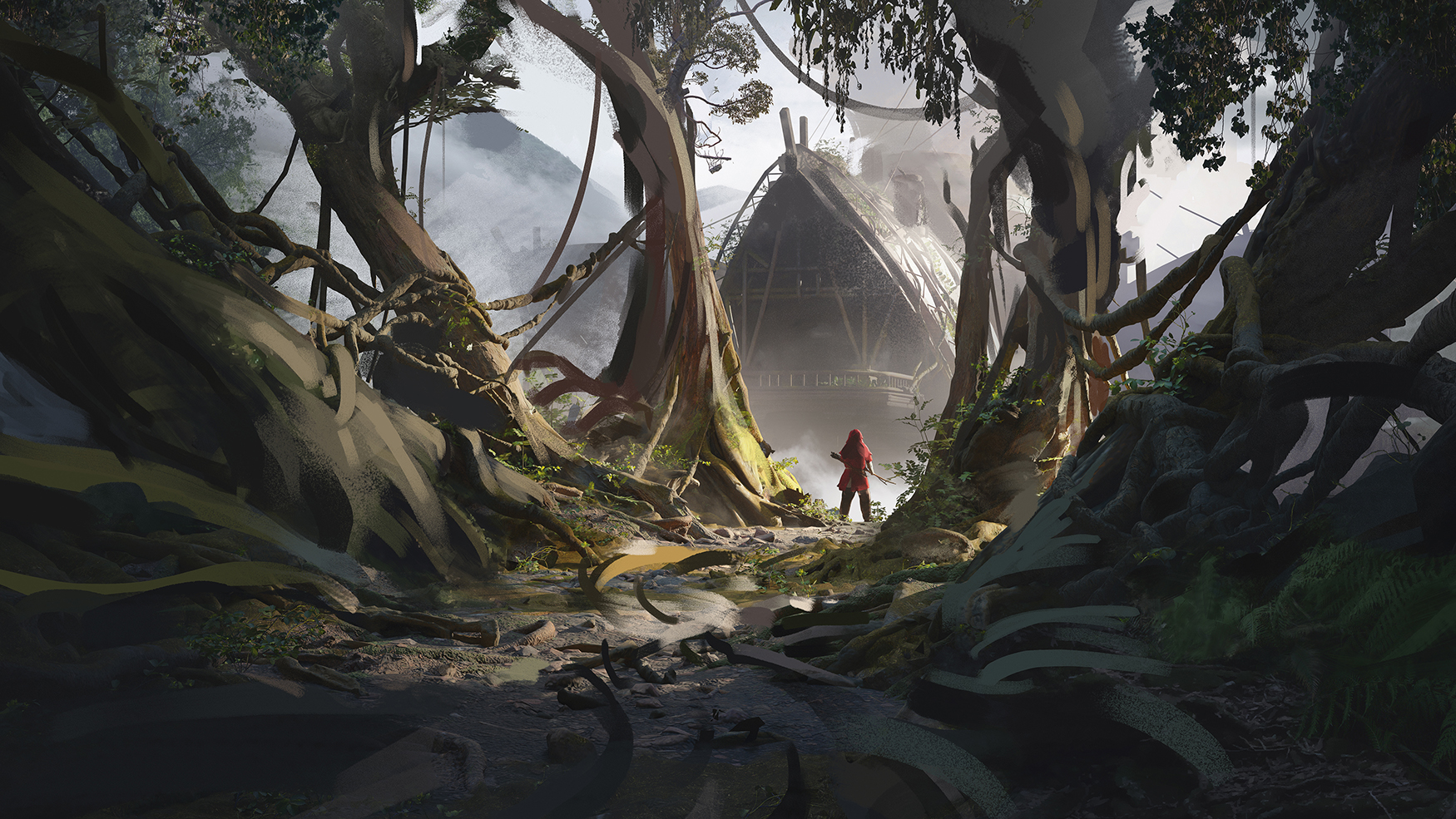
When moving into Photoshop for the paintover, I try to paint as loosely as possible. I treat this as a secondary sketching phase, making a game plan for the rest of the image. This has the advantage of covering up the 3D render, quickly getting rid of the CG feel. It’s important to avoid being precious. If you feel that big changes need to be made, now is the time.
11. Photobashing
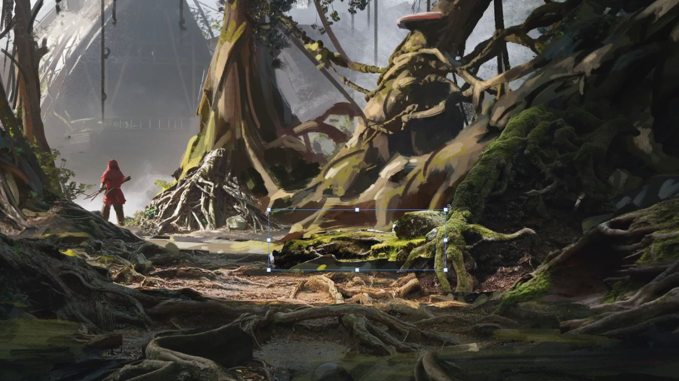
At this point, I like to start photobashing. Once I’ve masked the image I’m using, I will then try to integrate the colour and value using adjustment layers. I generally start with a curves layer, matching values using the RGB curve, then adjusting the colour channels individually. Try to slow down at this stage. Taking the time to integrate the photos properly will really improve the quality of your image.
12. Paint the character
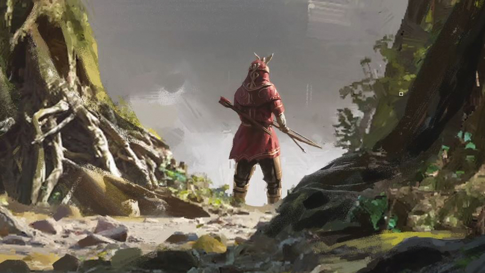
Taking a break from the environment, it’s time to work on top of the base character we created previously. The base we made for ourselves already had the correct proportions, lighting and colours, making it a great base to work with. Now it is just a case of adding details. I tried to vary the material types between cloth and gold to add interest to the character.
13. Polishing
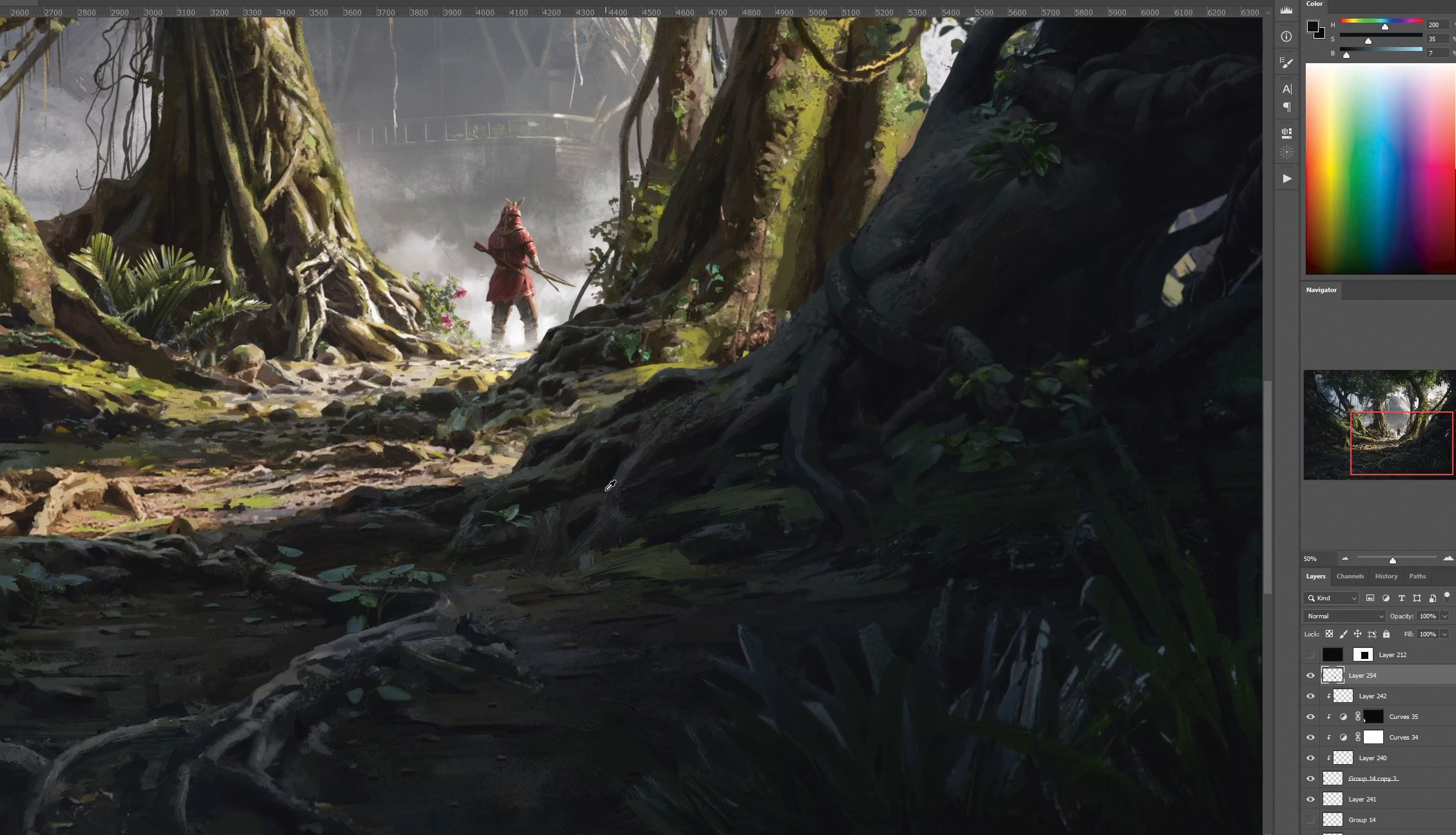
I find the polishing phase of an image quite therapeutic, painting over everything that’s already there with a small brush to unify it all, bringing it closer to final. At this stage, try to relax and take your time! Put on an audiobook and keep chipping away at the image until you either run out of time, or you’re happy to call it done!
14. Finish him
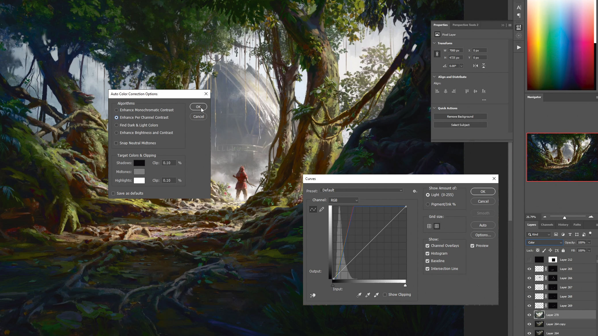
Time to add the finishing touches. Merge your layers down, right-click and go to Blending Options, then uncheck one of the colour channels. Scale the layer a little to add chromatic aberration. Then add a 50% grey layer, go to filters, and add noise. Also desaturate that layer. Set it to Soft Light and dial in the opacity. This will add a subtle film grain to your image.
This article originally appeared in ImagineFX. Subscribe to the magazine at Magazines Direct.

