There are some colors that are guaranteed to bring a chic and refined feel to a scheme, and Sherwin Williams’ Iron Ore SW7069 is one of them. A dark and mysterious charcoal – with more depth than gray but less severity than black, Iron Ore can be used in any room, but used the right way, it can add a contemporary and luxurious feel that’s refined and timeless.
Sue Wadden, director of color marketing at Sherwin Williams reveals that Iron Ore is one of the Sherwin Williams' most popular colors. And when you consider the shade’s versatility, it’s not hard to see why. ‘Iron Ore SW 7069 is a timeless shade –the moody gray instantly adds a sense of comfort to any room, making you feel at ease,’ says Sue.
How to decorate with Iron Ore
Iron Ore pairs particularly well with either pale neutrals, which allow this deep gray to take center stage, or with warm earthy hues, which help to balance heat and create a welcoming feel. ‘The shade pairs very well with browns like El Caramelo SW 9106 for a sophisticated, warm, modern look,’ says Sue Wadden.
This striking shade can also be used to create a feature wall, to accent smaller details or to go all out and color drench a room. With so many potential ways to use Iron Ore, it’s well worth taking a deep dive into this best gray paint. We’ve chatted to interior designers and architects across the US to find out how they’d use it within a scheme.
Use in the kitchen for a sleek and statement look
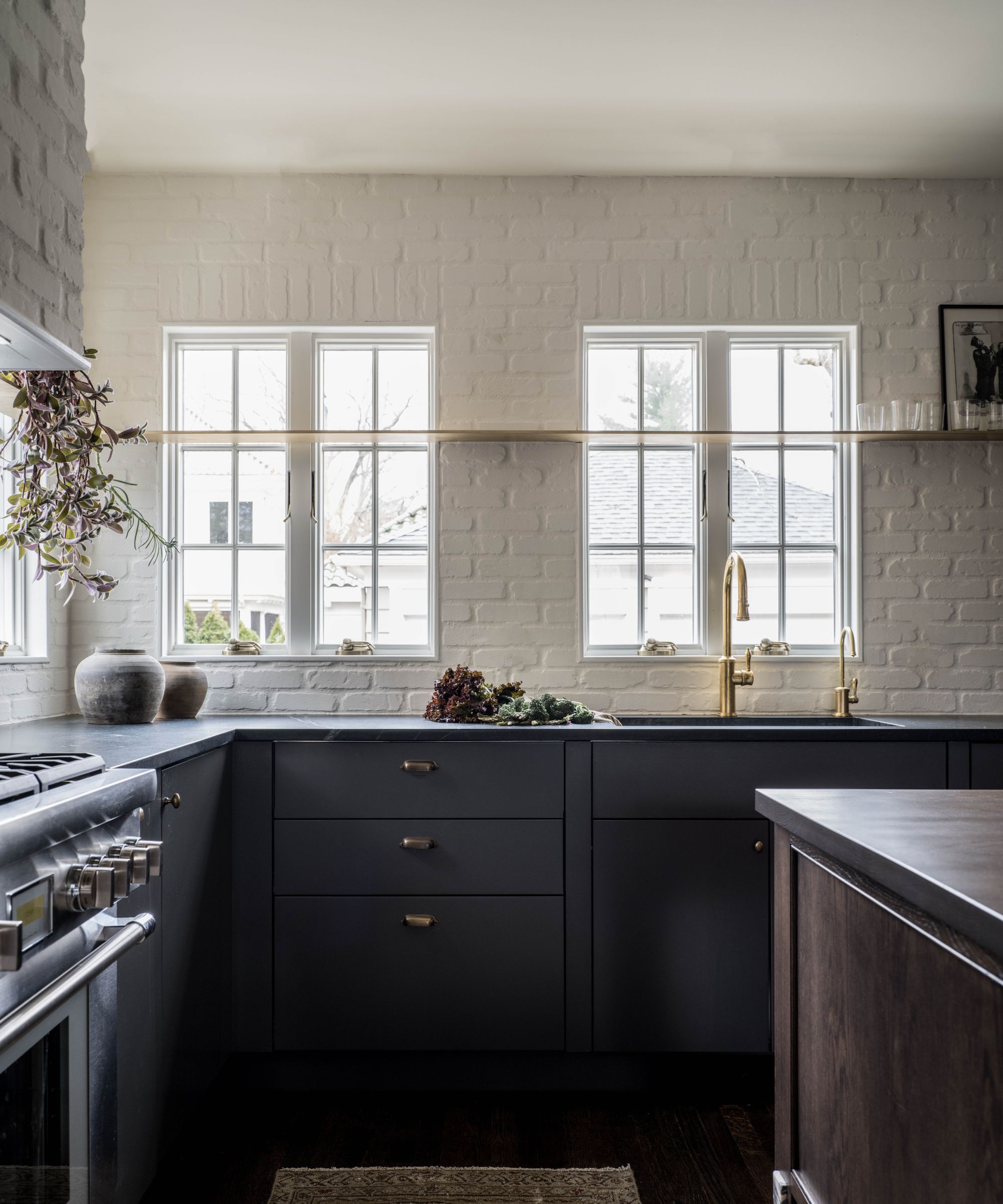
Blair Moore, creative director and principal of Moore House Design says that Iron Ore can work really well in a kitchen.
Blair used Iron Ore recently in a colonial modernist home on Rhode Island. They used Iron Ore on the kitchen cabinets and the transformation of the space was huge.
‘This shade works wonders in a variety of spaces, but for our design, we found it truly shines in the kitchen,’ says Blair. ‘Once we applied the Iron Ore paint onto these modern kitchen cabinets, the entire kitchen underwent a remarkable transformation. The space exuded a moody yet contemporary vibe and our client couldn't get enough of it,’ says Blair.
Blair and her design team decided to balance the richness of Iron Ore with a custom-brewed mocha stain for the center island. ‘The dark wood brought a touch of warmth and depth to the space, especially considering the kitchen's tight layout,’ says Blair.
‘To add some texture while still maintaining that broody vibe, we introduced a limewashed brick facade. One of my favorite touches though is the custom brass inset shelf we designed – it's the perfect blend of elegance and functionality and brings a punch of warm metallic to the room.’
Consider your room’s natural light sources
Becky Shea, interior designer and founder of Becky Shea Design, says that the amount of natural light your room receives is vital for determining how to use Iron Ore in your space. ‘It's hard to go wrong with darker shades like this, but it's very important to note how much natural light your room gets,’ says Becky.
As a general rule, the amount and type of natural light – be it cool north-facing light or warm south-facing light – in your space should determine how you use color, and this is especially important with a particularly powerful shade like Iron Ore.
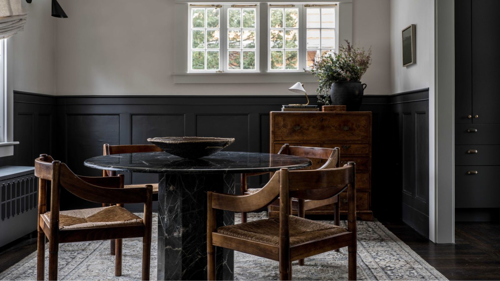
‘Rooms with less light due to tree cover or lack of windows aren't necessarily off limits with a color like this, but you'll want to balance its use accordingly.’ Using Iron Ore on the lower half of your walls and a light and bright white at the top will work to balance out the scheme and provide a sophisticated color contrast.
Becky also suggests that when working in a room with less light, you could use this to your advantage. ‘Iron Ore used all over in a dimly lit space will create a particularly moody and mysterious feel. This works especially well for short-use spaces, such as powder rooms or pantries.’
‘If you've got plenty of natural light in your room, you can use a lot of Iron Ore and the natural light will prevent the space from feeling dark and moody. I've gone full-on base molding through to the ceiling plenty of times and it works really well,’ says Becky.
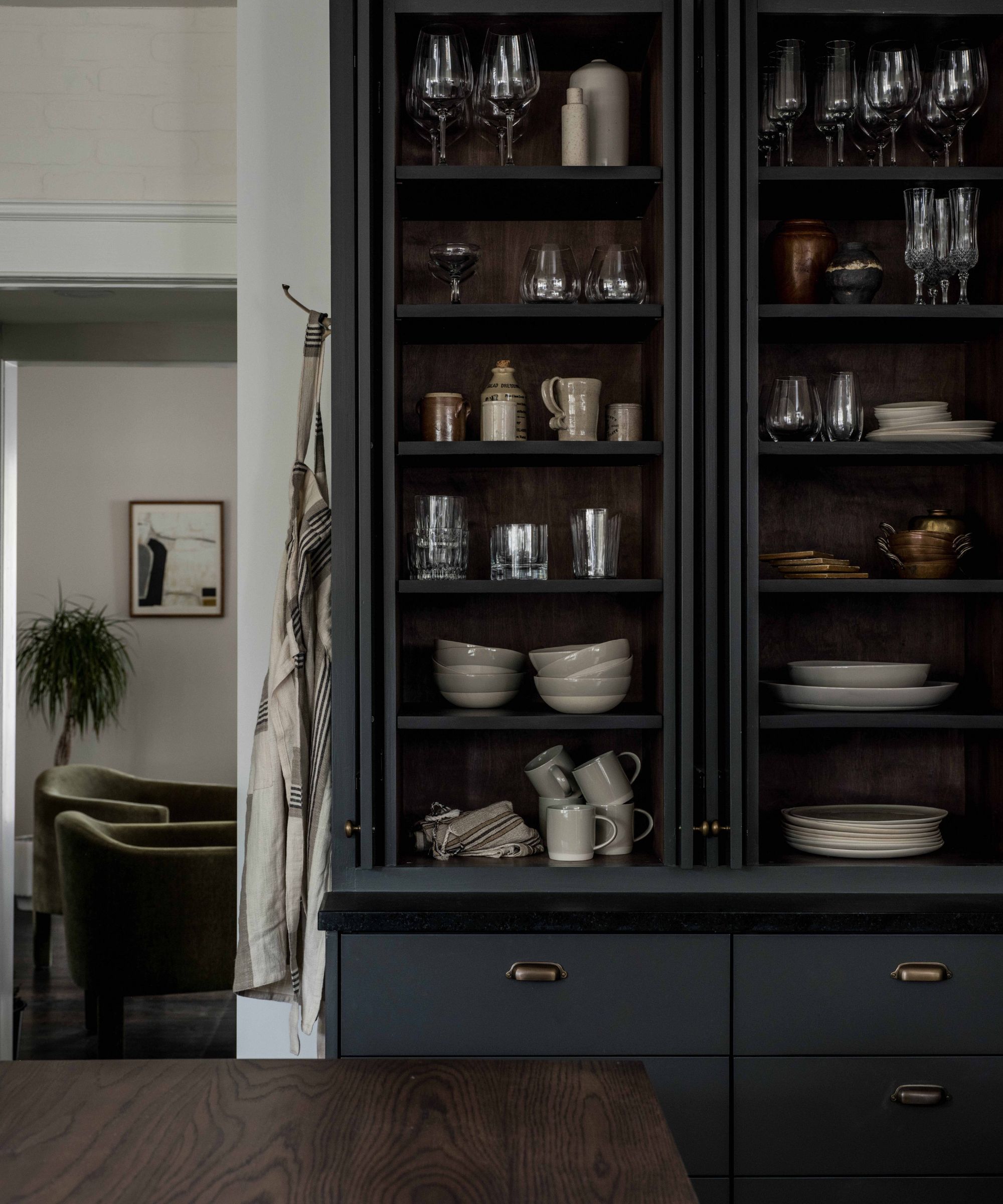
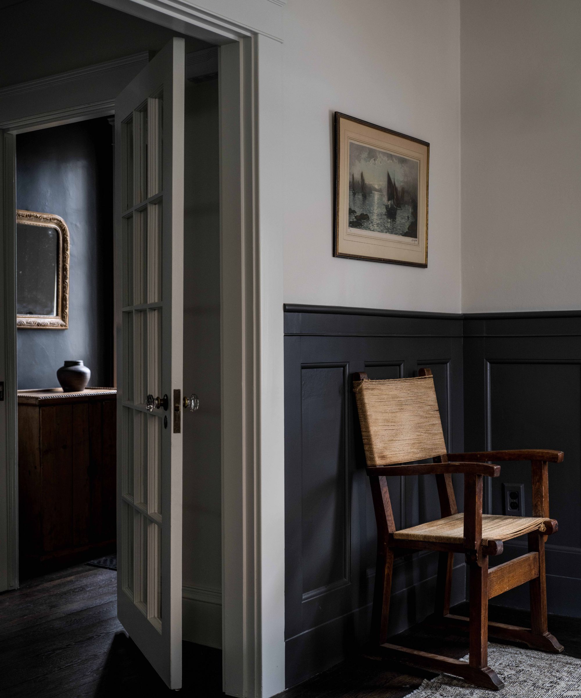
Combine Iron Ore with neutral shades
Shani Core, founder and principal designer of her Palm Beach-based interior design firm, suggests using Iron Ore when decorating with neutrals.
‘This rich, deep chocolatey gray is a moody neutral with dramatic character. Tones of camel, cream, and white along with lots of greenery are the perfect complements to this deep shade,’ says Shani.
These light hues will form a sharp contrast for a statement, sophisticated space. In black and white schemes, black absorbs light, and white reflects it, so the shades balance each other out to create a scheme that’s easy on the eye. This will work in a similar, more pared-back, way for Iron Ore and light neutral hues.
Shani says that combining Iron Ore with camel is a particularly effective combination is south-facing rooms. ‘Direct sunlight would bring out more of the chocolate tones in this shade,’ says Shani, so if you’re considering using it in a south-facing room, soft camels will sit alongside this beautifully for a warm and earthy feel.’
Create contemporary kerb appeal with an Iron Ore exterior
Kristine Renee, Interior Designer and Co-Founder of Design Alchemy, says Iron Ore is one of her favorite exterior paint colors.
‘Iron Ore is one of our go-to charcoal paints. It is definitely tried and true here at Design Alchemy. It's the perfect mix of rich espresso and black hues – perfect for a statement exterior refresh,’ says Kristine.
Kristin states that Iron Ore, when used outside, works really well with shale blue accents. ‘We will often paint the exterior of a home – both body and trim – in Iron Ore, and go with a slate blue pop, such as Benjamin Moore’s Templeton Grey, for the front door,’ she says.
‘Iron Ore appears much darker in the shade, which is definitely something to keep in mind,’ says Kristine. When choosing an exterior paint color, always look at your tester on sunny and cloudy days, and at different points throughout the day, to get an accurate idea of how it will look.
‘Iron Ore looks great on all exterior elements, come rain or shine,’ Kristine adds.
Use Iron Ore as an accent hue
Audrey Scheck, designer and founder of Audrey Scheck Design, loves using Iron Ore as an accent color.
‘Iron Ore is one of our go-to colors when we want to create a more dramatic, moody space. We’ve used this shade throughout multiple of our client’s homes and it’s always a winner. It’s very versatile and works well when used in all sorts of different ways.’
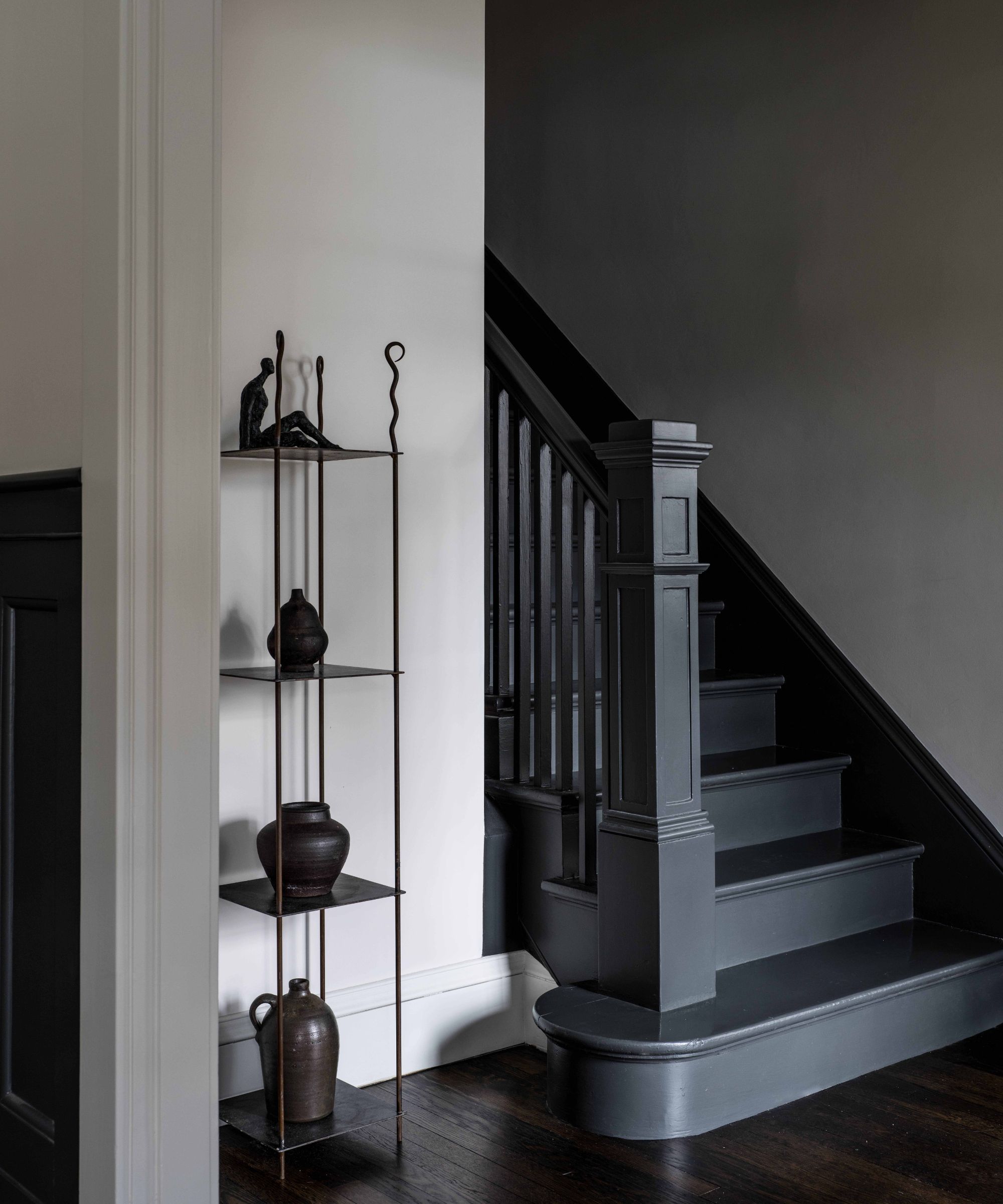
‘We love to use it for accent features like trim, doors, cabinetry, and stairway railings,’ says Audrey. When used as an accent against a neutral color, Iron Ore creates depth and contrast. ‘And when used against earth tones like brown, beige, or burgundy, the cool undertones of Iron Ore balance out these warm hues for a space that feels comfortable, contemporary, and inviting.’
Using Iron Ore as an accent is a great way to use the shade if you dabbling with a dark color for the first time. Even just a small amount used the right way, like on molding or on small pieces of furniture, can create big impact.
Max out cozy vibes by color drenching
Trish Knight, interior designer and co-founder of Knight Varga Interiors says Iron Ore works super well in living rooms and media rooms.
‘I adore this color. Iron Ore is a cozy, sophisticated soft black with subtle brown and green undertones. The shade darkens up at night without ever looking harsh, making it the ideal shade for living rooms and media rooms,’ says Trish.
Trish loves the idea of painting paneled walls in a living room or media room in Iron Ore. ‘This would create a deeply relaxing and soothing space and if you keep the lights low it will create a real cinema feel for movie nights.’
‘Since Iron ore has a very low light reflective value it will absorb light rather than reflect it, so this is important to consider when deciding how to use it in your home,’ says Trish.
Brighten with greens, oranges and creams
Devin Kimmel, architect and managing principal of Kimmel Studio Architects says Iron Ore works well with greens, oranges and cream colors.
‘Iron Ore pairs nicely with earth-tone palettes including rustic greens, rust oranges, and creams, complimented by blonde or ash-stained woods,’ says Devin.
Devin designed a scheme that incorporated these shades perfectly. ‘We designed a modern lakehouse lodge in Tennessee, and in the lower-level living room, we paired Iron Ore with Sherwin Williams’ Dried Thyme and Drift of Mist for a laid-back feel. The three tones combined with honed natural stone, rustic oak floors, soft textiles, and pops of rust orange, created the perfect space,’ he says.
Iron Ore may at first appear like a dramatic, and potentially tricky shade to use. But, as all of these interior designers make clear, treat it more like a neutral and don't let the darkness intimidate you. It's a very soft color that's surprisingly versatile, just be sure (as when choosing any paint color) to order swatches so you can see what it does in your home, with your lighting.