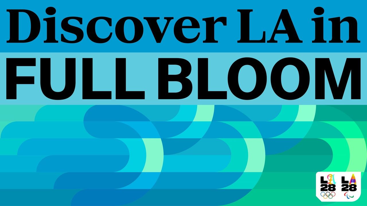
Olympic branding is rarely one and the same – it's a chance for the host city to flex its creative muscles and build a unique identity that stands for the spirit of its people. Redefining what an Olympic identity can be, the recently revealed LA 2028 Summer Olympics brand is a shining example of design with soul; a creative tapestry that weaves together the diverse stories nestled in Los Angeles.
While the LA28 identity is impactful in many ways, it's the typography that brings the design to life. Inspired by the rich signage of the city streets, it captures a bold heritage spirit that transcends the confines of traditional typography trends. Delving into this transformative design system, I caught up with Monotype's senior executive creative director, Charles Nix, to discuss the underrated power of typographical design as a cultural preservative.